


ABOUT
MarketMove is an online platform for everyone to buy, trade & earn crypto. Its’ mission is to make the crypto space more transparent and accessible. So the company needed to let go of a typical crypto project branding and represent itself as a trustworthy, modern business.
TASK
To create a visual identity that combines the best of the crypto and corporate worlds. It had to embrace the energy and excitement of a crypto project and the trustworthiness of an established brand. Is it possible to look dynamic and credible at the same time? Our answer was ‘yes’.
SOLUTION
A visual identity that combines constant movement with solid shapes.
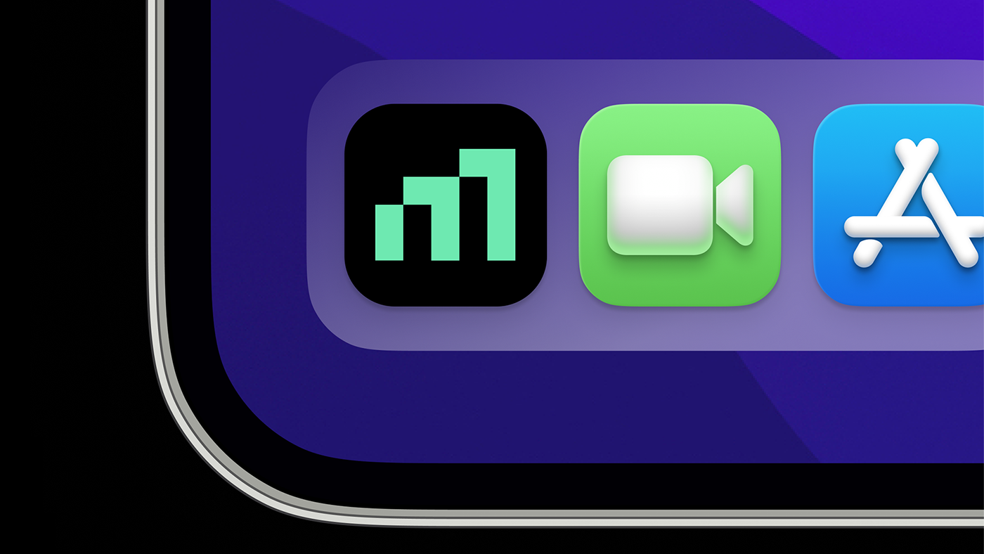
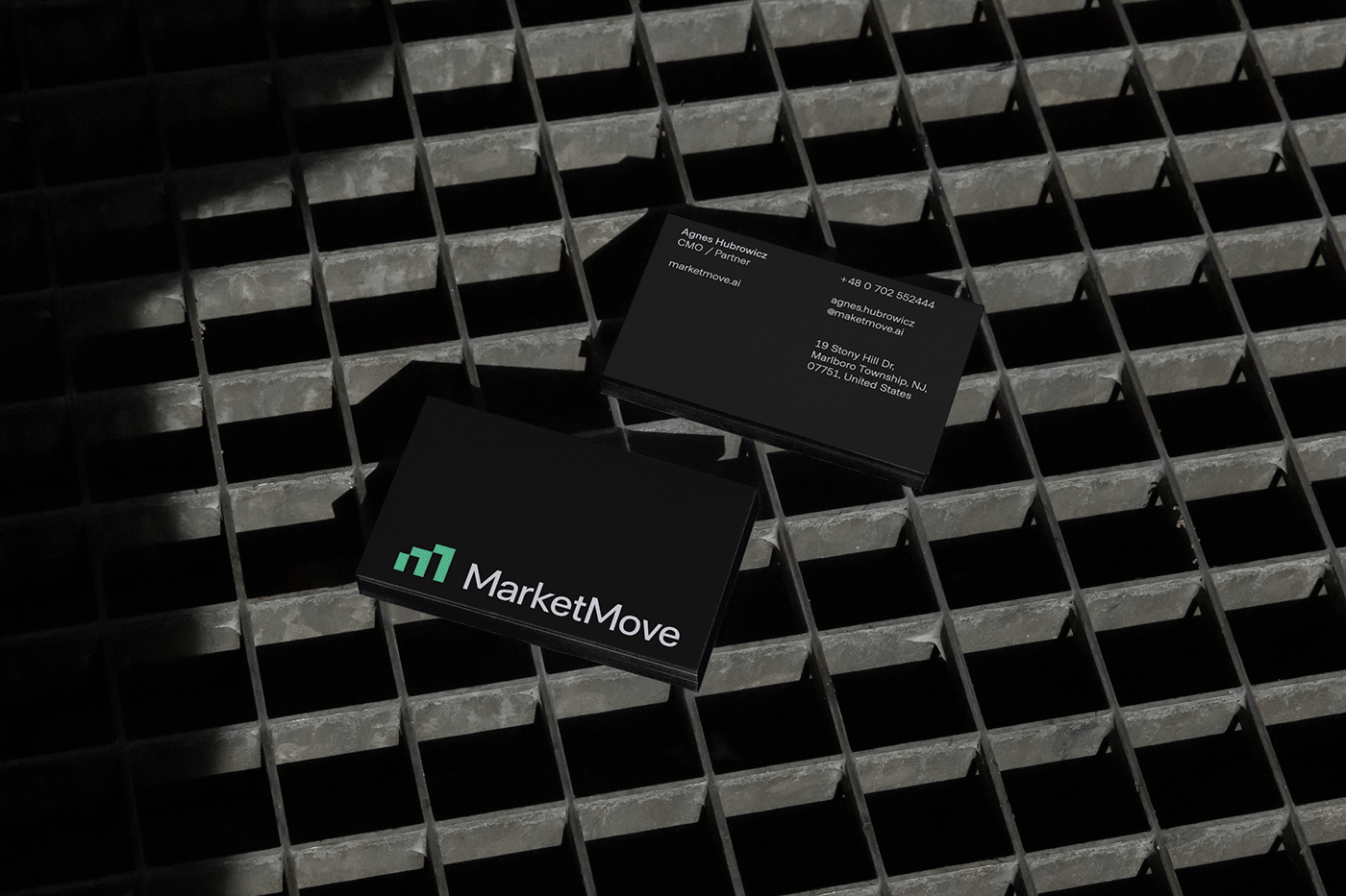
The logo is a dynamic letter M, made of three vertical rectangles. In crypto as well as investing in general they are also known as candlesticks and are used in charts to show changes in the market. These dynamic shapes occur consistently throughout the visual identity, ensuring that the key idea of steady movement is reflected in every brand touchpoint.
The vibrant colour palette is dominated by mint green, due to its positive associations in a crypto space as it indicates portfolio’s growth. Meanwhile, an extended palette of warm supporting colours adds liveliness and ensures that we stay away from becoming a dull corporation.
However, the use of sound, fundamental geometrical shapes, and minimalistic, not busy layouts provide a feeling of credibility and enforce the idea that this crypto project is here for the long run.


CREDITS
Client: MarketMove
Agency: Fireart Studio
Design & Art Direction: younique studio
Strategy: Kotryna Calova
Thanks for watching!


