


KiotViet - Brand Identity
Re-branding
(1) #Context
Make life easier
KiotViet is Vietnam's foremost sales management ecosystem, serving small businesses across all sectors since its inception in 2014. By integrating robust data analysis tools, KiotViet enables users to gain deep insights into their business operations, facilitating informed decisions to enhance performance and competitiveness. As a result, KiotViet has emerged as the preferred solution for small businesses.
Bratus created the new brand and design system to bring the product powerhouses together and help them achieve their ambitious vision.
(2) #Challenge
Revolution transform SME business management with an All-in-One Ecosystem
KiotViet faced the challenge of repositioning its brand. The primary goal was to evolve from a software solution to a comprehensive business ecosystem and revamp all product applications. Additionally, it aimed to establish closer connections with users and position itself as a national symbol (Quốc dân) of daily intimacy.
Bratus collaborated to translate this strategy into a brand concept and visual identity, preserving brands' essence while propelling them into the future. This marked a significant moment for KiotViet, requiring a bold leap in visual identity to align with growth objectives and better reflect its core values.
Bratus collaborated to translate this strategy into a brand concept and visual identity, preserving brands' essence while propelling them into the future. This marked a significant moment for KiotViet, requiring a bold leap in visual identity to align with growth objectives and better reflect its core values.

(3) #Brand Concept
Work-Life is "Balance"
We've placed the concept of "Balance" between work and life at the core of our brand strategy and creativity. This isn't just a notion but also a profound commitment to the role of technology in addressing business management challenges. Optimizing business efficiency and productivity saves time and enables individuals to care for themselves and their families and explore the world around them.
We've established a content action system with diverse messages and themes to activate marketing campaigns and social activities in line with this concept.
We've established a content action system with diverse messages and themes to activate marketing campaigns and social activities in line with this concept.

(4) #Logo
The symbol for action
The logo embodies associating a "pie chart" to represent business and market data, a "check mark" for quick and easy execution, and a arrow icon for business goals. The intertwining of these elements forms the foundation for creating brand sub-icons. Additionally, the two intersecting segments construct an abstract representation of the letters 'K' and 'V', enhancing the logo's identity further.
This allows for the interchangeability of the template segment with various symbols, ensuring consistency and flexibility in crafting sub-brand logos.
(5) #Brand Architecture
Powering Growth with System
We have meticulously planned and developed a cohesive brand architecture system for the corporate logo, product app logos, and industry-specific app logos. The Master Logo embodies shared characteristics in shape and color palette, establishing a consistent visual language.
It offers flexibility in shape to accommodate future expansion and adaptability, ensuring the brand can grow and evolve seamlessly over time.


(6) #Brand Expression
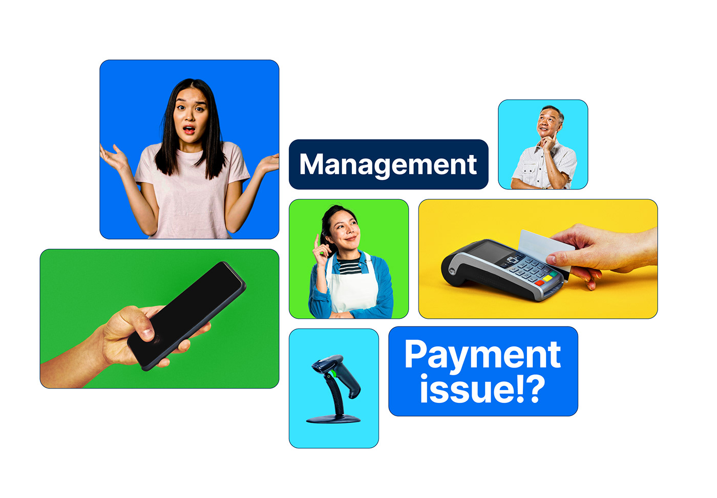
Simplify issue
The new branding strategy focuses on enhancing awareness of achieving work-life balance through gently and efficiently optimizing business management issues based on technology across all communication touchpoints.
The strategy employs authentic imagery and a humorous, light-hearted tone, making challenges more approachable and gentle.

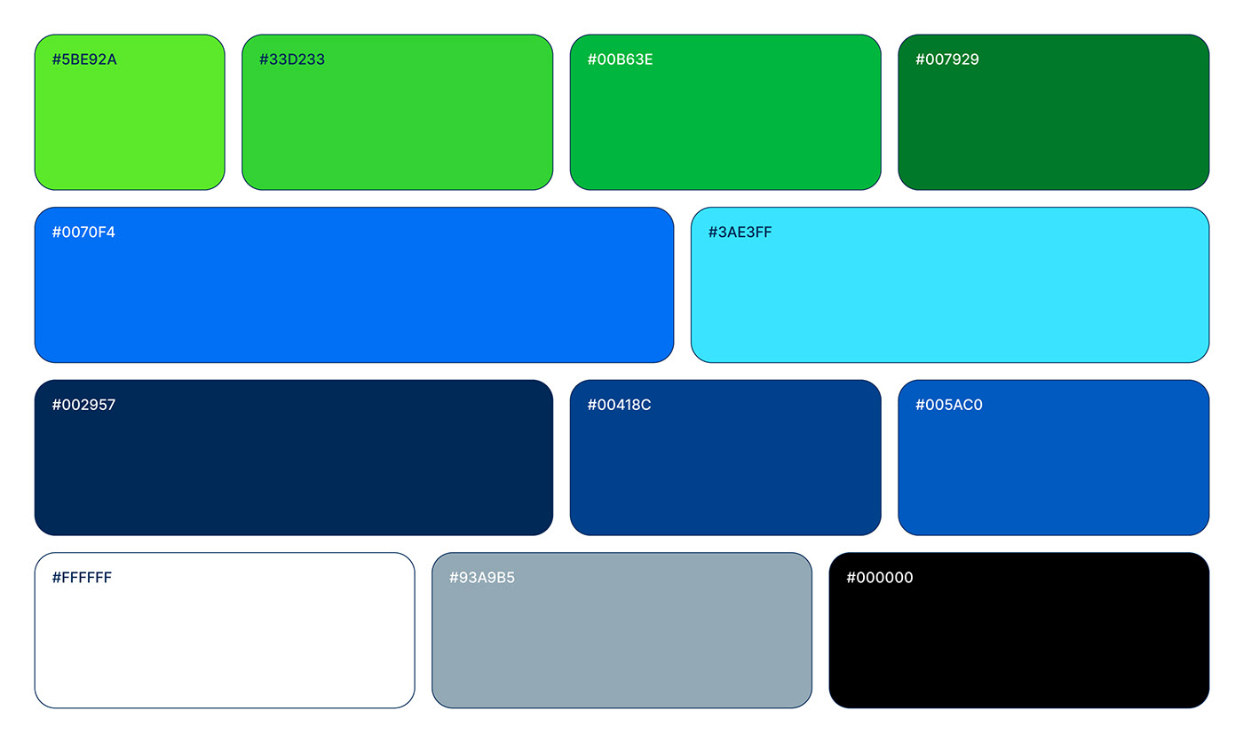
#Tones of Life & Work
The new palette has been developed based on the Old identity theme, optimized for the digital environment
and supplemented with flexibility, technology, youthfulness and dynamism.
"Improve People's Work and Life Quality Daily, Everywhere, Every Time"


#Tools for Services
Multiple apps for many fields of business and easily used for staff and managers.

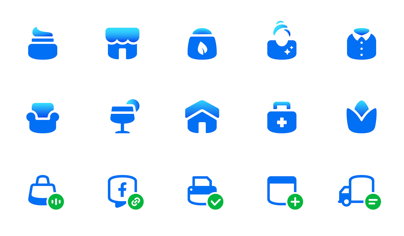
#Web Iconography
The icon system for the website is developed from the typical structure of the visual system and optimized design tailored for various industries.

"Easy Business Management Solution
For Everyone"

🔵 Credits
Client: KiotViet
Branding Agency: Bratus Agency
Creative Director/Brand Designer: Jimmi Tuan
Project Manager: Hien Nguyen
Project Lead: X.Hoang
Senior Designer: X.Hoang, Nam Nguy
Showcase Direction: Nam Nguy
Senior Designer: X.Hoang, Nam Nguy
Showcase Direction: Nam Nguy
Visual Animation: Le Quy, Si Tran
Identity Film Story Board: Jimmi Tuan
Identity Film Animation: Si Tran, Le Quy
_
"Special thanks to the KiotViet Project Team"
Tran Quynh Hoa - Chief Marketing Officer
Le Vu Phuong Uyen - Marketing Manager
Nguyen Van Nam - Marketing KV Manager
Le Vu Phuong Uyen - Marketing Manager
Nguyen Van Nam - Marketing KV Manager
Vu Thanh - Product Design Manager


