Monmude
Monmude is a brand which helps people with mental health reach their mindfulness. They bring nutrition into helping people with mental health feel positive effects within a short period of time, since nutrition has always been underestimated in the process of healing mental health. However, Monmude is more of a “cool” brand which stands side by-side with their customers in the path of “feeling like themselves again”, not giving out that “soft or academic” vibe that makes the customers uncomfortable of expressing their thoughts.
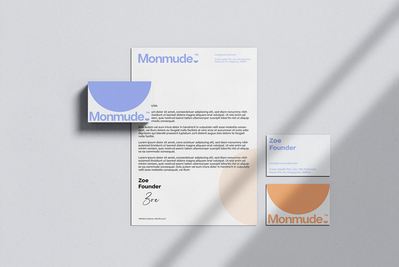
With this brand, the Minimalist Design style is combined with bold geometry for a cool, personal and authentic feel. The Monmude brand logo is designed based on a minimalistic style to focus on highlighting the brand's name. The semicircle represents the core values of the brand. The corners of the letters M, N, U and D are refined as a curved part of the semicircle. A ™️ character in the corner balances out the elements of the logo.
The two colors JORDY BLUE - inspired by nature and represent trust, friendliness and science - PEACH ORANGE - a smart, balanced expression - create a good contrast that is recognizable and exciting. Beatrice font is a perfect choice for the brand's font - unique and authentic.
Concept/ idea: Cường Lưu, Linh Trần
Logo/ Visual Social: Cường Lưu, Linh Trần
Support Design: Tú Phạm
Support Design: Tú Phạm
Account: Hà Phương (Cate)
La Grafik Studio - Brand Identity - 2022
------------------
Thank you for watching!
Special thanks to the photographer in Unsplash.