Oma Appel
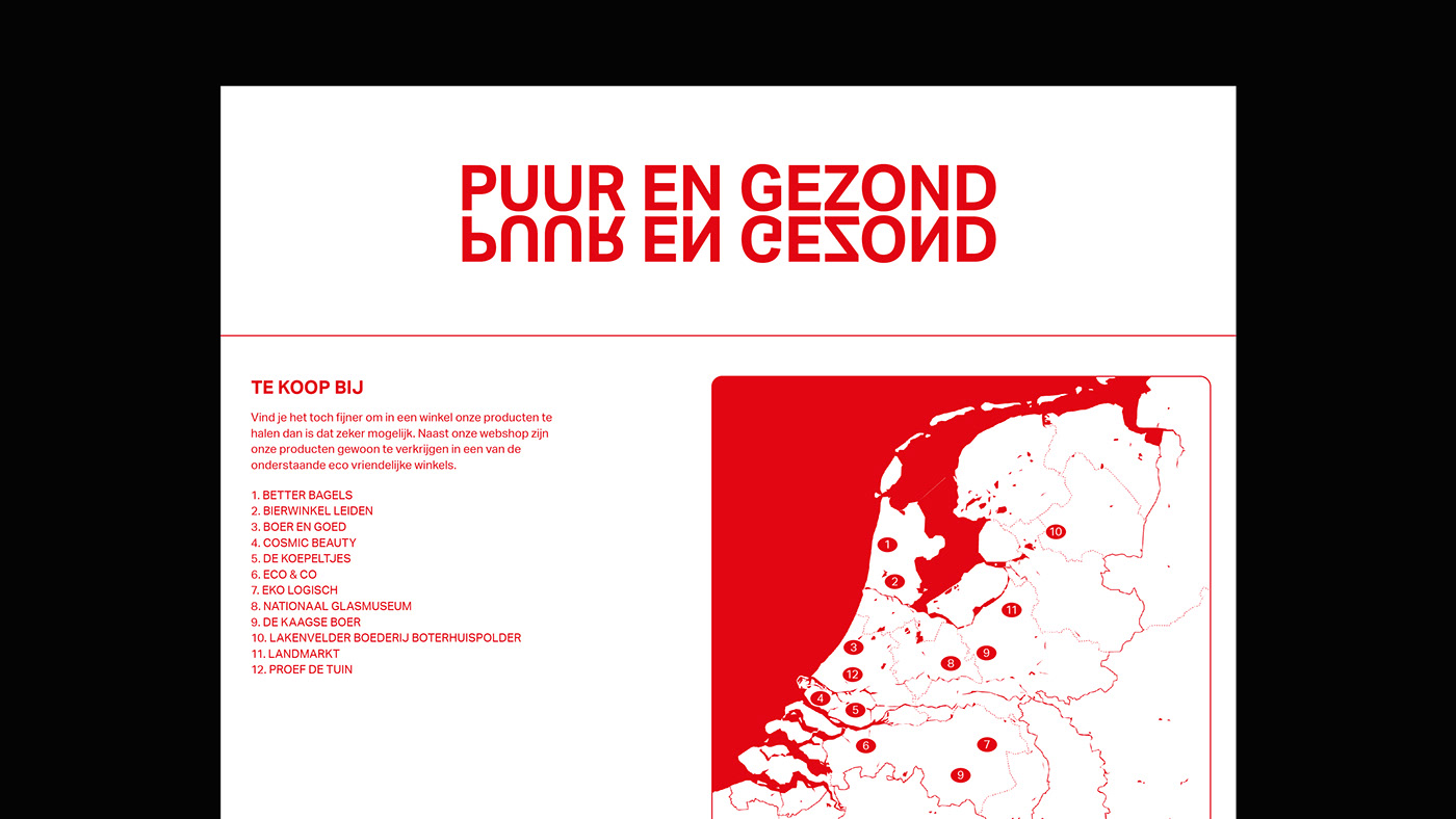
which translates to “Grandma Apple” is a small craft company producing organic jams and chutneys that are locally sourced. All used ingredients are harvested from gardens within the “green heart” which is a small countryside area surrounded by the biggest cities of the Netherlands.
which translates to “Grandma Apple” is a small craft company producing organic jams and chutneys that are locally sourced. All used ingredients are harvested from gardens within the “green heart” which is a small countryside area surrounded by the biggest cities of the Netherlands.
Our challenge was to come up with a logo and visual identity that translates the passion and love for authentic and home cooked food. In search of this nostalgic feeling we looked back into dutch vintage packaging designs throughout the 1960’s and 70’s. In this design research we see a heavy use of typography and bold colours. This rationale gave us the direction to go for a typographic approach.
For creating a recognisable logo and to help understand what the product is about we translated the word apple from the company name into a symbol. To keep ourselves true to our typographic rationale it resulted in a symbol that is visually representing an apple created from bold letters. The mirrored lettering lends itself for a flexible design system to connect all brand elements together.
European Design Award 2023:
https://awards.europeandesign.org/#/Winners/257426
Red Dot Design Award
https://www.red-dot.org/project/oma-appel-66038
https://awards.europeandesign.org/#/Winners/257426
Red Dot Design Award
https://www.red-dot.org/project/oma-appel-66038