


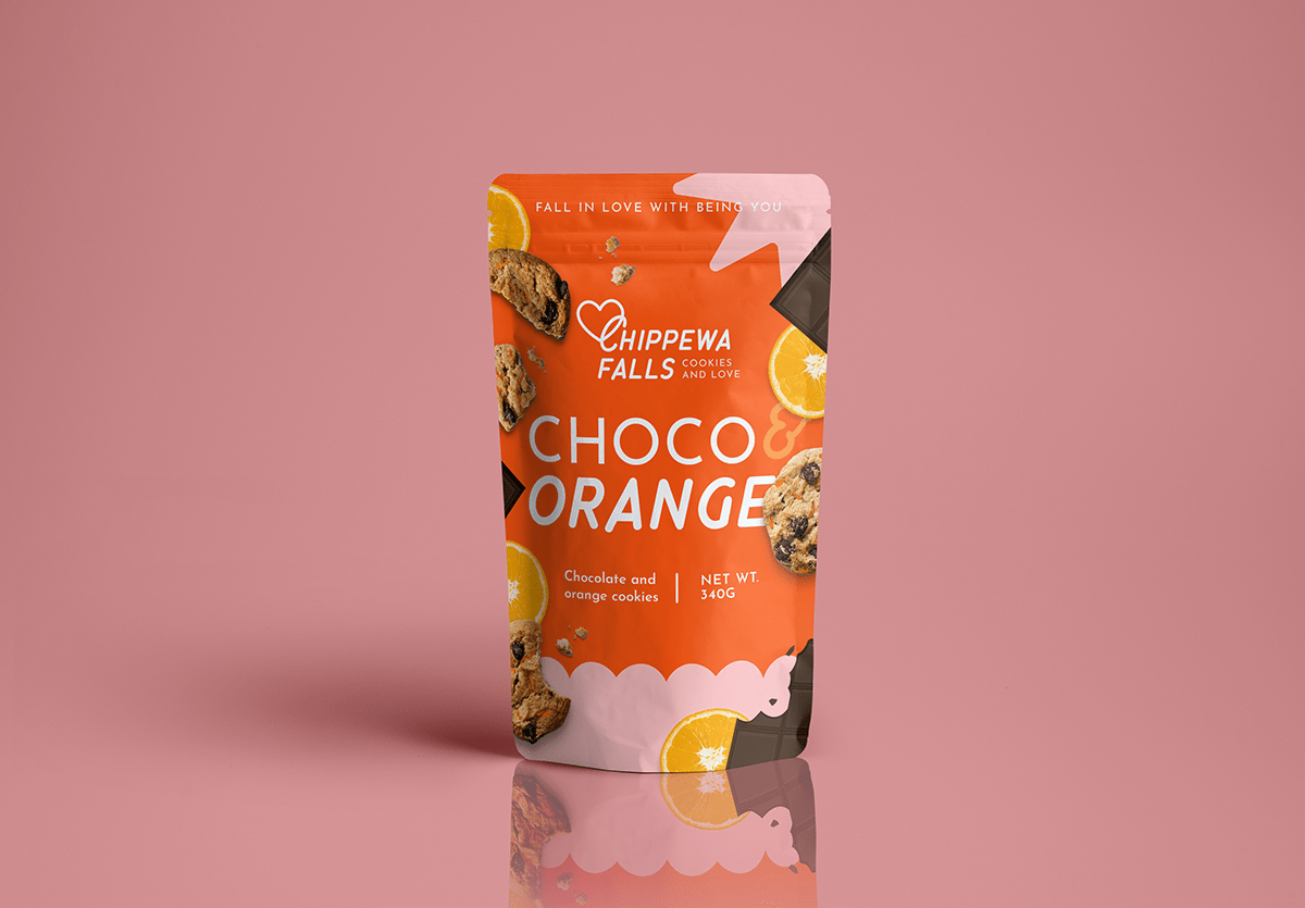
Chippewa Falls
A great cookie has been a life savior for many of us on those stressful days, and now, with Chippewa Falls, you can find soft on the inside and crunchy on the outside, tasteful cookies, to make loving your self even easier.
Fall in love with being you!
The goal was to create a branding and a packaging that could represent love and youthness inside this modern aesthetic the match so well with the target audience. To give this clean and yet tasty look, I decided to use photos of the cookies and it's ingredients, combined with basic and vetorial elements all over the packaging. The colors also came in to reforce the love atmosophere.
Graphic and packaging design: Alexandra Pombo / www.roledaale.com / @roledaale
Chippewa Falls is a cookie brand created as a study project.


To create the logo, I used the font "Chippewa Falls" by Chank Fonts, available at Adobe Fonts, it also was the inspiration for the name of the brand, since this project is part of a collection where I create study brands inspired by fonts.


