


Clear Skincare’s rapid growth across Australia and New Zealand, has seen them double in size in two years. With almost 100 clinics and more in the pipeline, a brand audit and refresh was needed to modernise and realign their identity.

A return to the brand’s clear vision
A comprehensive brand audit of all marketing channels was conducted to identify a distinct new direction that could be developed, in a retail arena that has become increasingly competitive. As Clear Skincare has grown from a single clinic in Sydney’s eastern suburbs, their brand needed an update to be inclusive and distinctive. In a series of workshops we defined the brand’s core values and how they should be reflected in essential brand elements. Returning to their original minimal aesthetic, we redesigned their logo, slogan and typography.

New brand faces that reflect new audiences
After visiting clinics and interviewing staff in new locations, we expanded the image library to be more inclusive, reflecting the diversity of the new markets, including women and men in all Australian states and New Zealand. The freshly curated photography also portrayed life beyond the clinic, positioning Clear Skincare as a lifestyle brand, giving clients continued confidence outside the clinic by using their exclusive product range. Point-of-sale, signage, advertising and digital marketing were all updated with the brand’s new look.

Embracing the brand’s medical foundations
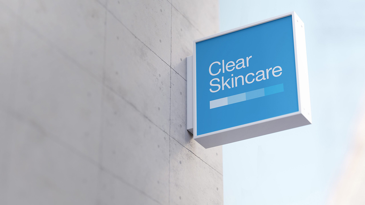
Clear Skincare makes the most advanced treatments and effective skincare accessible and affordable to millions of people via their retail clinics and products. Doctor-developed and results-driven, we realigned their colour palette to their medical roots. To increase brand recognition, we rationalised many logos into a single format — a simple square badge.
Optimising email communications
With weekly email campaigns, the marketing team required a series of versatile templates. The emails were optimised for desktop and mobile, re-structured to increase brand recognition, and made modular for easy building. Animated elements were designed to encourage open-rates and user interactions.


A birthday celebration in bright colours
The annual Birthday Sale, one of the major sales of the year, was a celebration of colour and fun. Inspired by the square geometry of the Clear Skincare logo, we created a bespoke font made of geometric shapes. The vibrant typography was used to build eye-catching storefronts, scratch cards and online promotional banners.

Getting summer-ready with Clear Skincare
Heading into summer, the Holiday Sale embraces warm colours and tones of the festive season. With promotion across print and digital channels, we created a versatile campaign using morphing organic shapes. A series of social media carousels was developed, featuring animated type and video footage of treatments.

A fierce new year campaign
Lunar New Year is a major event for some Clear Skincare markets, so a national campaign was developed to celebrate the Year of the Tiger. We illustrated the campaign, with bold line drawings and an electric colour palette, for in-store and digital channels.


