


MAITÁ COSMÉTICOS
PT
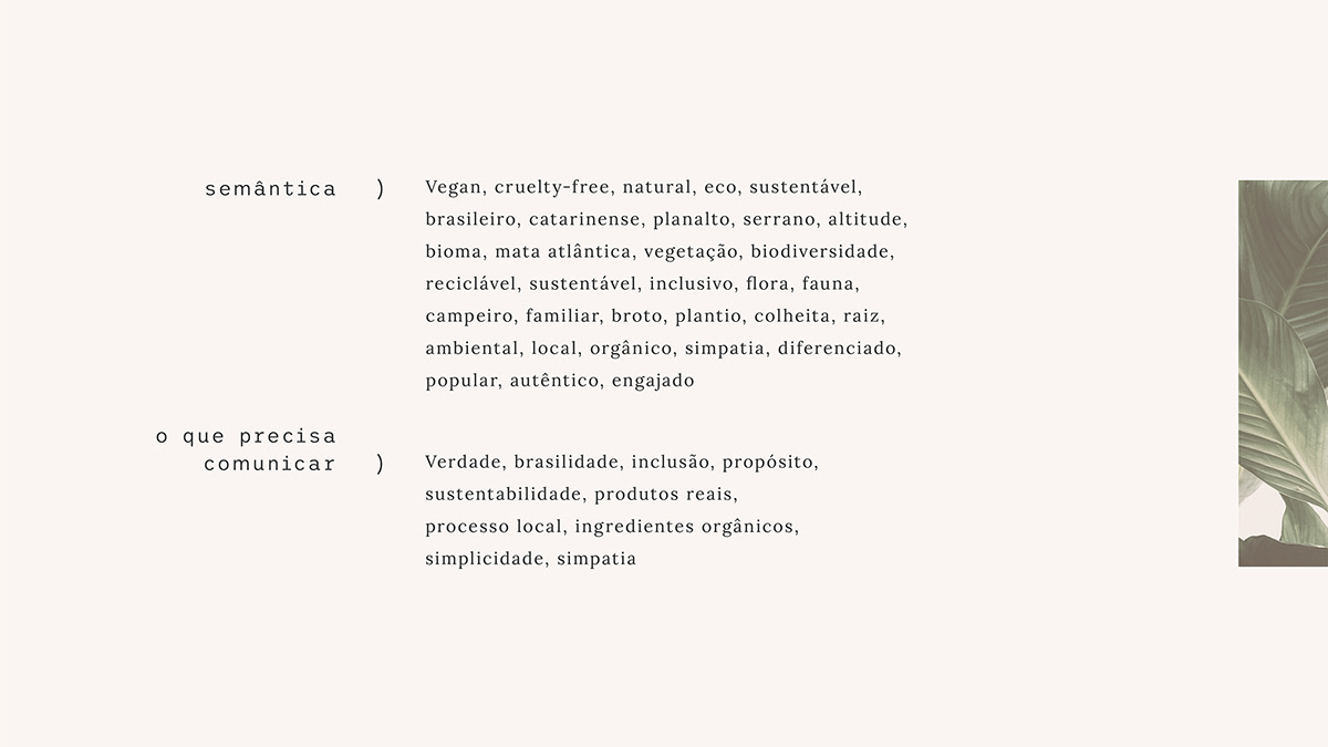
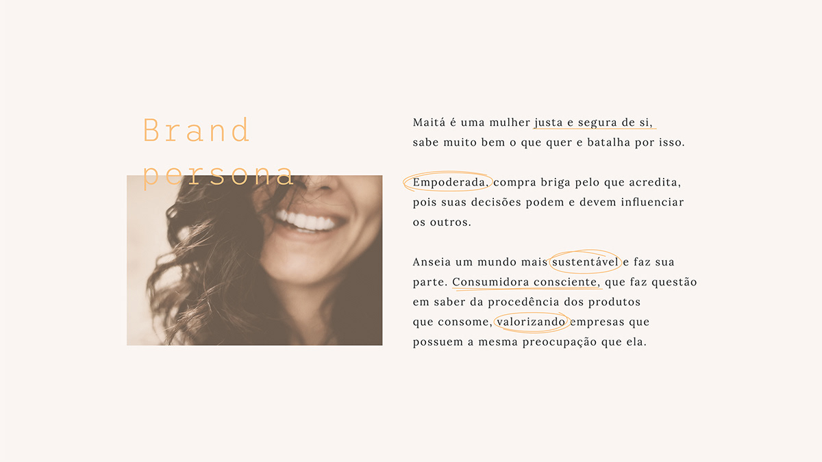
Maitá é uma linha de cosméticos que acredita no consumo consciente e no impacto que boas atitudes têm na sociedade. Neste projeto, trabalhamos em todos os pontos da marca: naming, conceito, logo, identidade visual e embalagens. A ideia principal foi transmitir o propósito da empresa, trazendo ao mercado uma marca humana e verdadeira, que simboliza tanto o indivíduo como sua colaboração no coletivo da sociedade.
EN
Maitá is a cosmetics line that believes in conscious consumption and on the impact that good actions have in society. In this project, we worked on all aspects of the brand: Naming, concept, logo, visual identity and packaging. The main idea was to transmit the purpose of the company, bringing a true and human brand to the market, that symbolizes both the individual and their collaboration in collective society.
PT
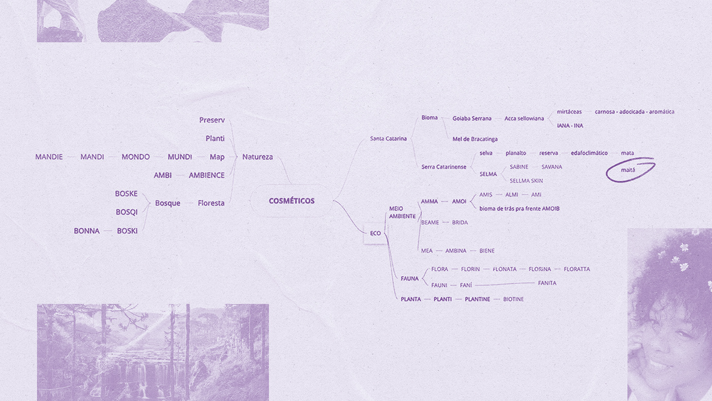
Na construção do nome buscamos algo feminino e forte. Queríamos deixar claro que esta seria uma marca com personalidade, que tivesse corpo, mente, coração e alma, gerando assim uma identificação mais pessoal com o público. Maitá é natural, é tudo o que envolve a biodiversidade brasileira e sua riqueza ecológica. Um nome próprio, uma amiga da Mãe Terra.
EN
While building the name we searched for something feminine and strong. We wanted to assure that this would be a brand with personality, that had body, mind, heart and soul, generating thus a more personal relationship with the public. Maitá is natural, it is everything that surrounds brazilian biodiversity and its ecological richness. A suitable name, a friend to Mother Earth.

PT
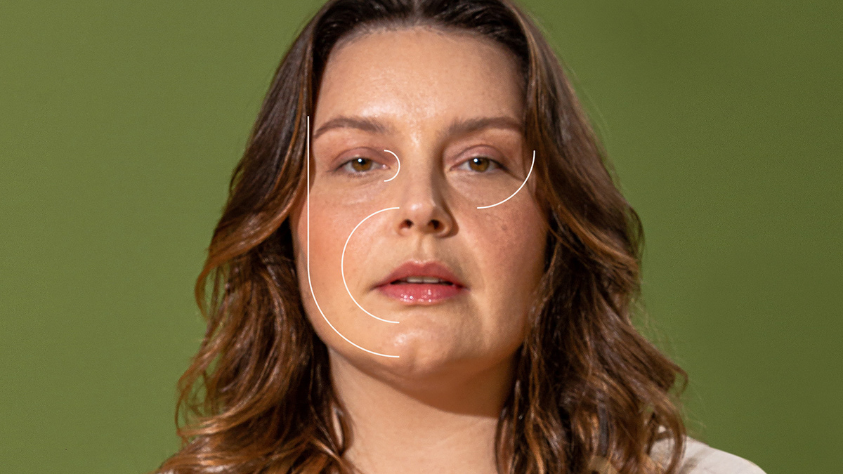
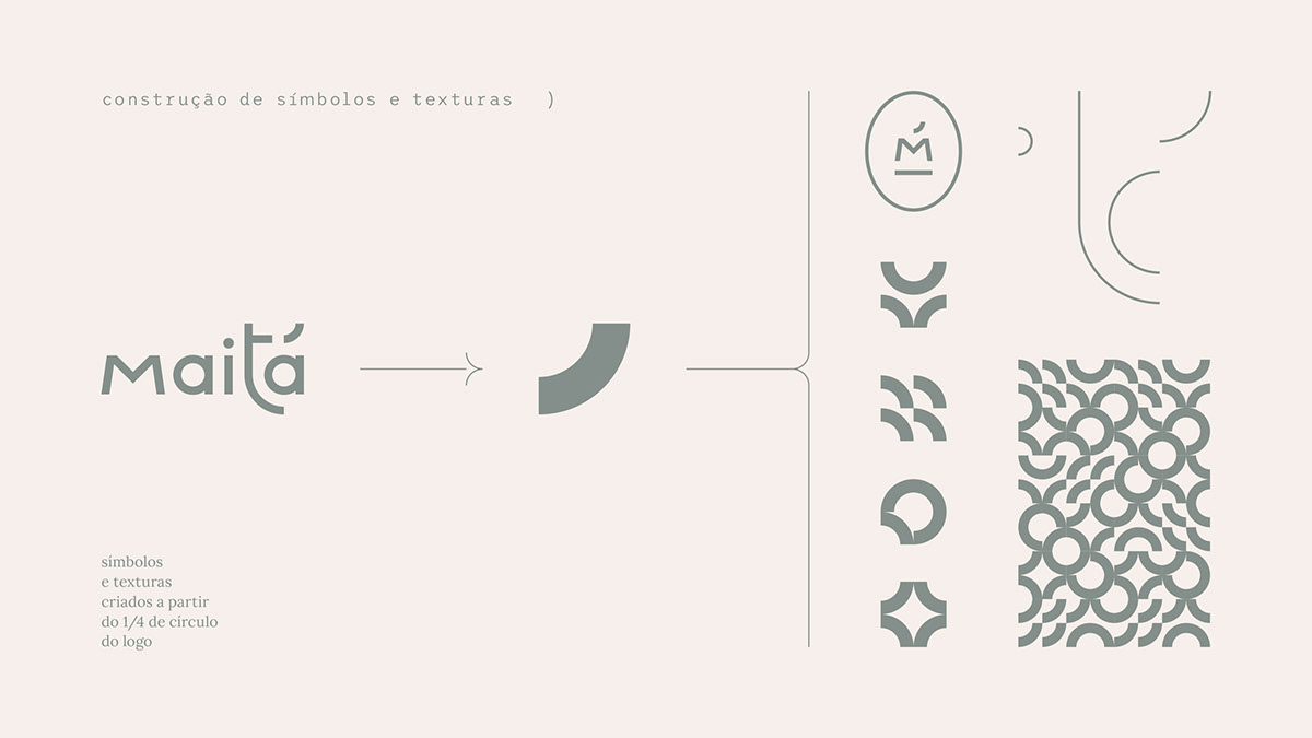
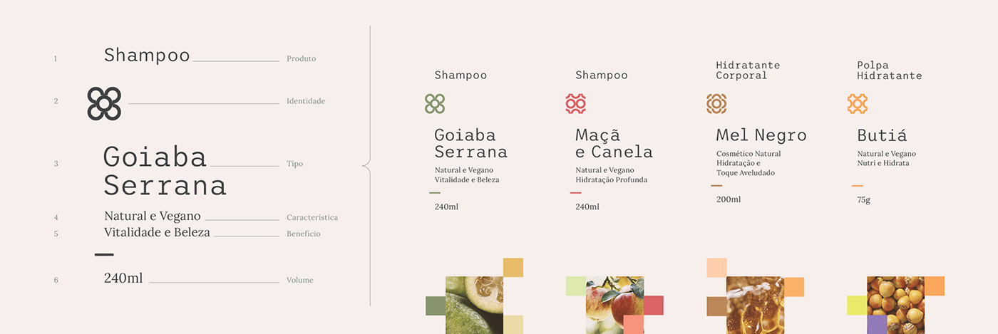
Nos inspiramos nas expressões e na fisionomia do rosto humano para a criação de uma série de formas e traços curvilíneos que estão presentes na marca e em toda identidade visual. É na tipografia do logo que encontramos a forma base, que é o 1/4 de círculo. Dele, os principais traços surgiram e dali evoluíram para texturas, símbolos e formas.
EN
We were inspired by the expressions and features of the human face into creating a series of shapes and curved lines that are present on the brand and in all of the visual identity. The typography of the logo carries the base shape, a quarter circle. From it, the main lines appeared and from there, they evolved into textures, symbols and shapes.

PT
Natureza, pessoas e matéria-prima, dai saíram os tons que cercam a marca. Uma paleta variada e mutável, pensando na individualidade do seres-vivos.
EN
Nature, people and source materials were the inspiration for the color tones that surround the brand. An eclectic and versatile palette, inspired by the individuality of all beings.

PT
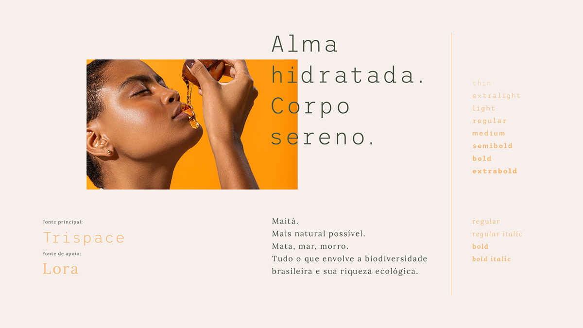
As fontes escolhidas foram pensadas para equilibrar a identidade visual. Trispace: moderna, variável e espaçosa, ajuda a abraçar o design com estilo. Lora: humana, confiável e amigável, passa o tom respeitoso da marca.
EN
The chosen fonts aimed to balance out the visual identity. Trispace: modern, variable, and spacious, helps to wrap the design with style. Lora: human, trusty, friendly, shows the respectful tone of the brand.

PT
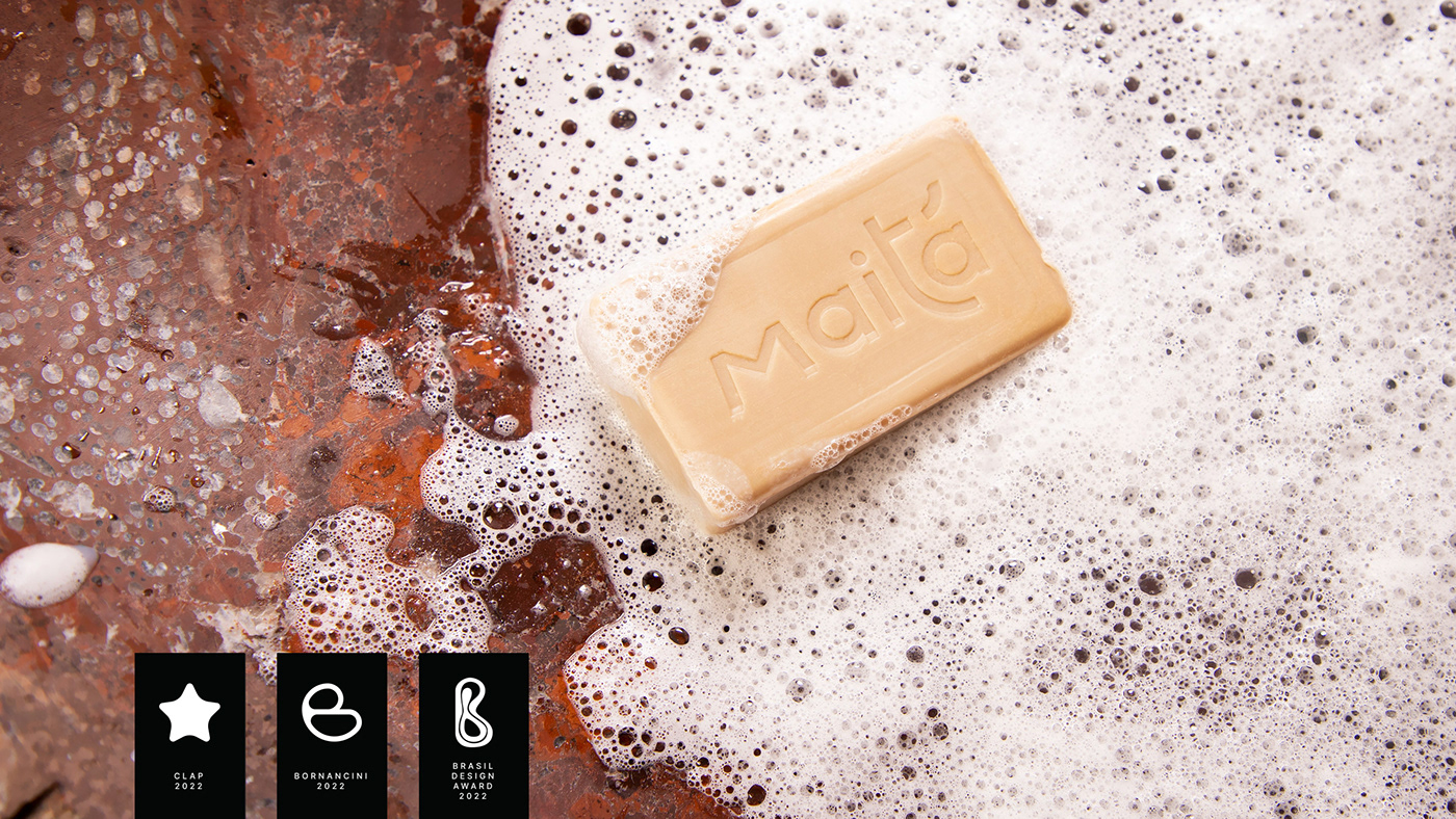
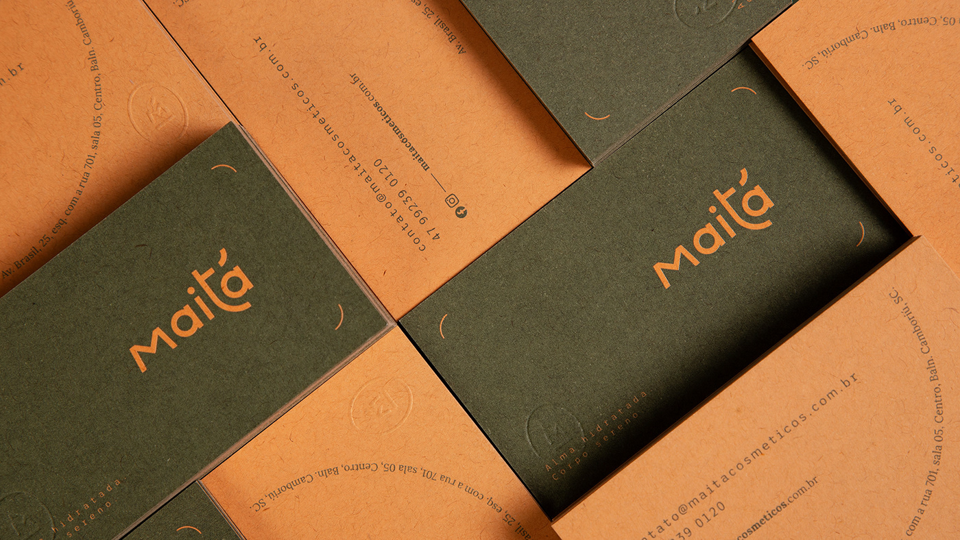
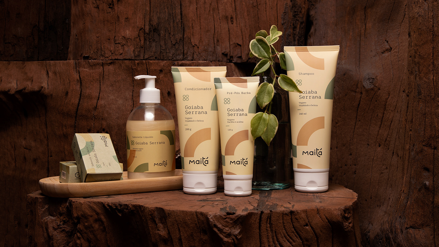
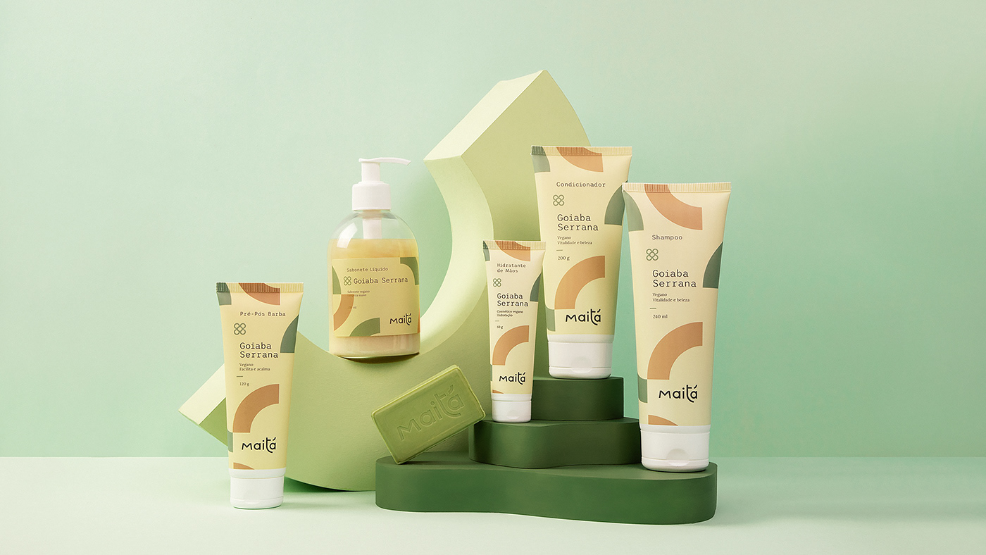
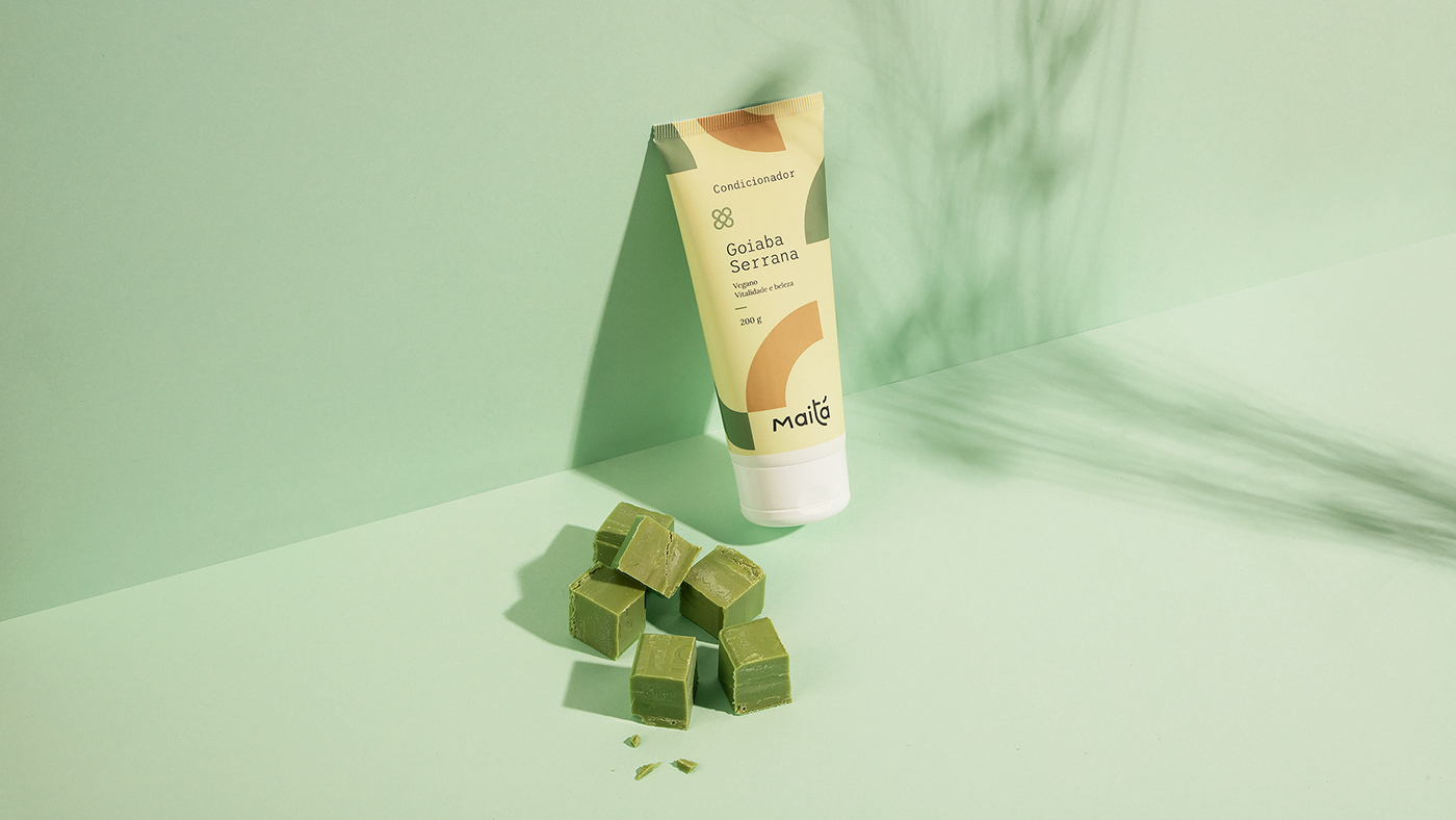
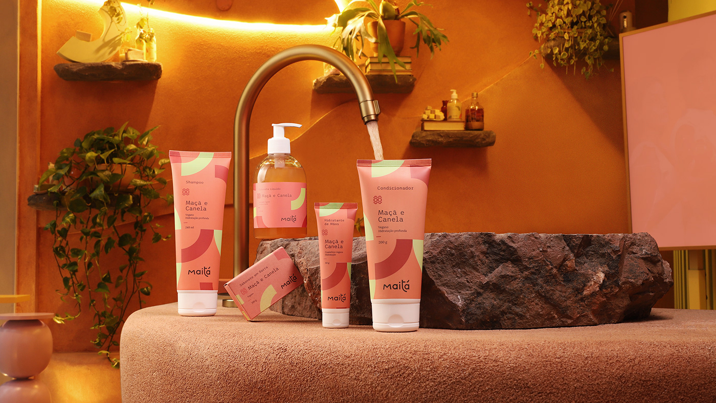
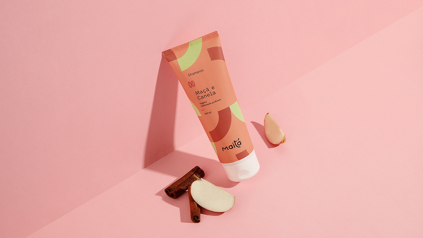
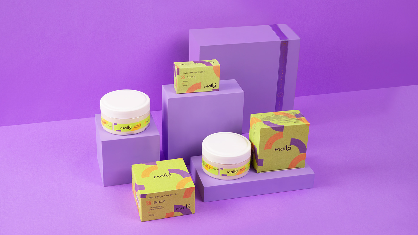
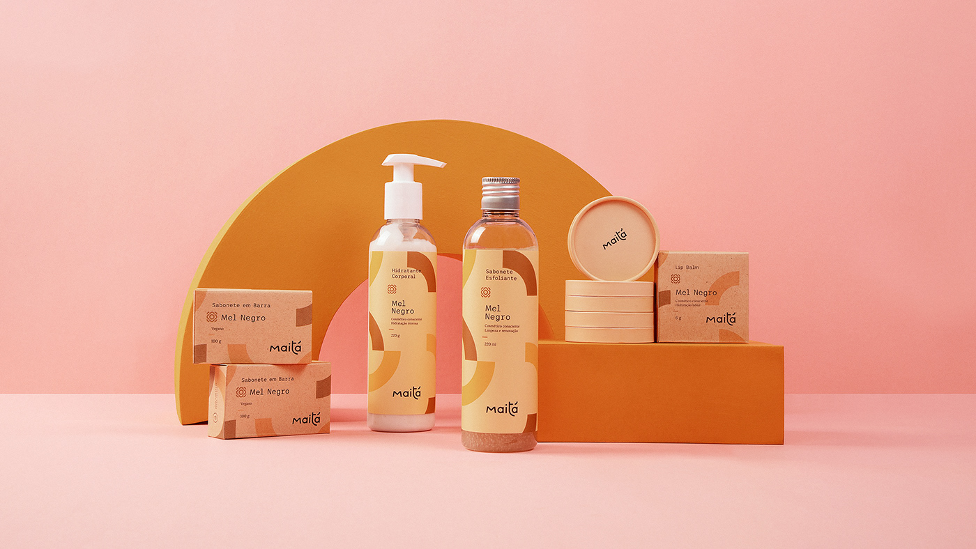
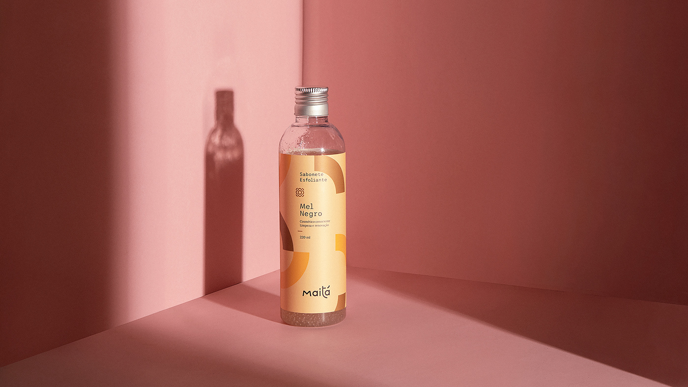
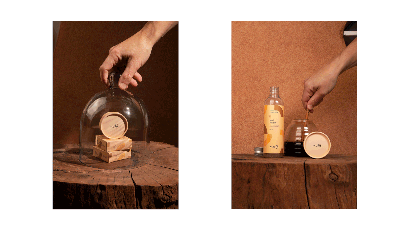
Para as embalagens, criamos uma textura única que representa o poder de expansão e possibilidade de aplicações, onde um fragmento se multiplica e gera um grupo de elementos nos mais variados ângulos, mostrando que a marca é protagonista o tempo inteiro. As cores, inspiradas nas matérias-primas de cada produto, ajudam no reconhecimento visual e sensorial. E em relação ao emprego das informações, estabelecemos uma hierarquia para diagramação, transmitindo a mensagem de forma clara e objetiva. Esses escolhas foram de papel fundamental para gerar destaque e criar diferenciação perante os concorrentes e também externar os conceitos de coletividade e pluralidade da empresa.
EN
For the packaging, we created a unique texture that represents the power of expansion and possibility of applications, where a fragment multiplies and generates a group of elements in the most diverse angles, transmitting the idea that the brand is the main character at all times. The colors, inspired by the source materials of each product, help the visual and sensory recognition. The display of information was planned using a hierarchy for diagramming, transmitting the message in a clear and objective manner. These choices were fundamental to highlight and distinguish the brand from its competitors and display the concepts of community and plurality of the company.


PT
A Maitá traz o bioma brasileiro e os processos naturais de produção na sua essência. Uma marca que está consciente do mundo em que está inserida e o impacto que causa. Uma marca feita com amor, que desenvolve cosméticos em parceria a natureza e com produtores regionais brasileiros, passando o conhecimento que recebe para os seus clientes através de produtos reais e para todos.
EN
Maitá brings the brazilian biome and the natural processes of production in its essence. A brand that is aware of the world in which it is inserted in and of the impact that it causes on it. A brand made with love, that develops cosmetics through a partnership with nature and with regional brazilian manufacturers, transmitting the knowledge it acquires to its customers through products that are real and for everyone.
ENTREGAS
PT
Naming / Marca / Identidade visual / Embalagens
EN
Naming / Logo / Visual identity / Packaging
CRÉDITOS
Atendimento: Alex Reuter.
Naming: Karine Bono.
Designers: Alex Reuter, Guilherme Rosa, Juliano Jover.
Implementação: Amanda Brandão.
Arquitetura: Vanessa Larré.
Fotografia: André Vandelo.
Fotografia de arquitetura: Fábio Severo.
Tradução: Dihego Kowalski.


