


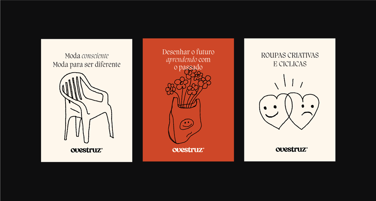


PT: A ovestruz é uma marca de roupas acessórios de upcylcing, roupas feitas a partir de retalhos que sobram de outras roupas. Com o viés sustentável, a ovestruz busca uma moda criativa e cíclica, produzindo um impacto positivo no nosso ecossistema.
Para a criação da marca, buscamos uma alternativa que assim como suas peças, seja cíclica e se renove a cada ano, não queríamos algo descartável e sim algo atemporal. Para a logo utilizamos uma tipografia orgânica e fluida, tradicional porém sem ser chata. Com uma pegada vintage, ela trás o afeto e a nostalgia com uma repaginação do agora e uma visão para o futuro. Assim como o propósito da marca, trouxemos o velho para algo novo. Em suas cores, optamos por cores sóbrias priorizando o bege e o cinza escuro, cores atemporais e que podem se aplicar em todos os contextos. Para apoio trouxemos outras cores primarias, para que auxiliem em não deixar a marca tão chata. Os ícones foram pensando como complementos, principalmente para as partes impressas como etiquetas e cartões de agradecimento, a ideia do avestruz vem da primeira versão da logo, onde antigamente era utilizado o avestruz pelo trocadilho com o nome da marca. A ideia de toda a construção da marca foi feita pensada em algo moderno, com um olhar para um futuro nostálgico, além da leveza de uma marca com impacto ambiental positivo e sustentável. Trouxemos algo leve, significativo mas ao mesmo tempo com grande impacto visual, algo coerente com toda a estética da marca.
EG: Ovestruz is a brand of upcylcing accessory clothing, clothing made from scraps left over from other clothing. With a sustainable bias, the ostrich seeks creative and cyclical fashion, producing a positive impact on our ecosystem.
For the creation of the brand, we looked for an alternative that, like its pieces, is cyclical and renews itself every year, we didn't want something disposable, but something timeless. For the logo we used an organic and fluid typography, traditional but without being boring. With a vintage footprint, it brings affection and nostalgia with a redesign of the present and a vision for the future. Much like the brand's purpose, we've brought the old into something new. In its colors, we opted for sober colors prioritizing beige and dark gray, timeless colors that can be applied in all contexts. For support we brought other primary colors, so that they help in not making the brand so boring. The icons were thought of as complements, mainly for the printed parts such as labels and thank you cards, the idea of the ostrich comes from the first version of the logo, where the ostrich was formerly used as a pun on the brand name. The idea of the entire construction of the brand was made with something modern in mind, with a look to a nostalgic future, in addition to the lightness of a brand with a positive and sustainable environmental impact. We brought something light, meaningful but at the same time with a great visual impact, something consistent with the brand's entire aesthetic.


