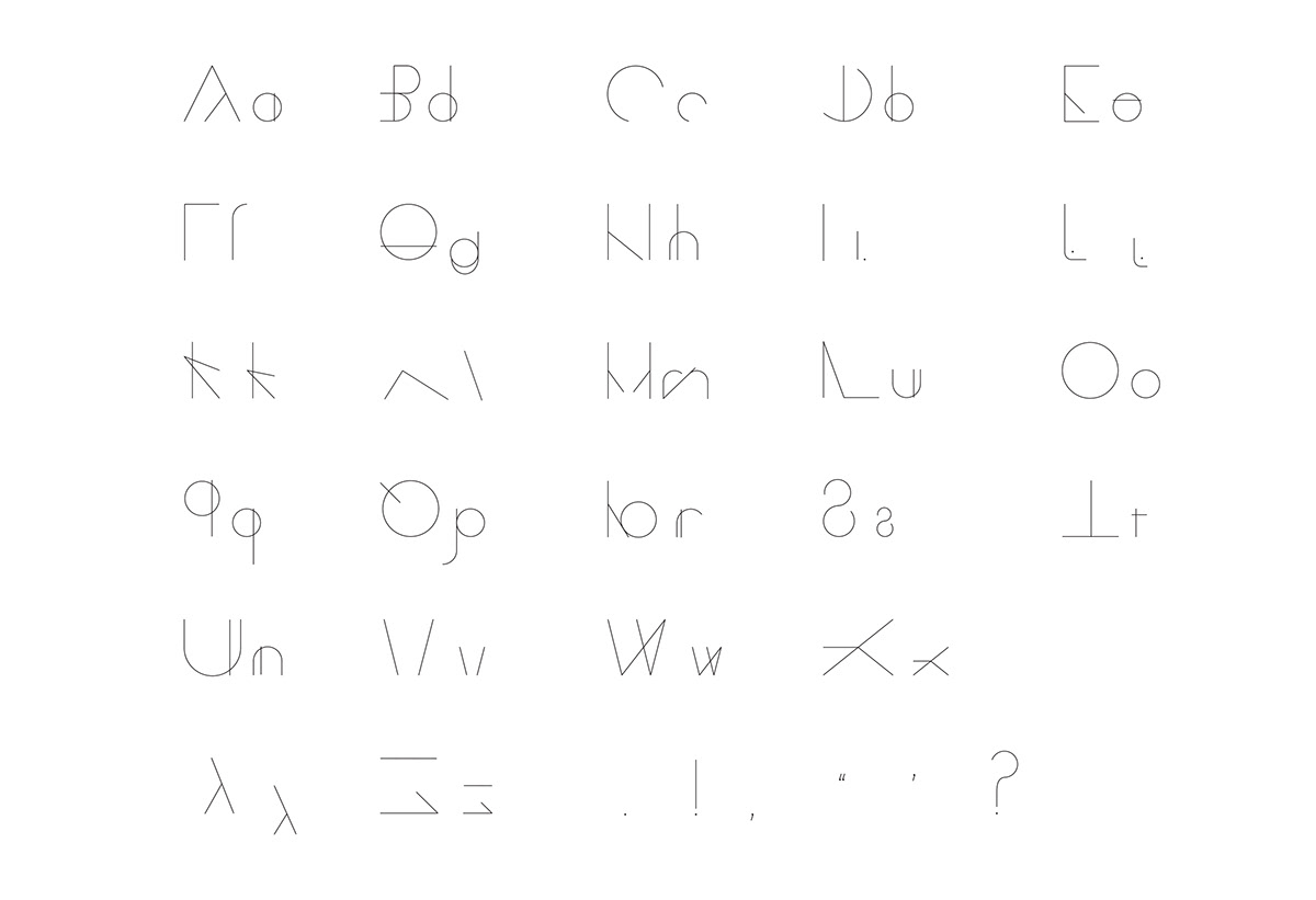
Project Criteria: To design a typeface focusing around the learning disability, dyslexia. I created two versions, a readable type face and then a broken typeface. The idea is to express what it feels like to have dyslexia, with conflect of letter recognition and the difficutly in decoding sentences. This is also refected in the promo video and the promotional lenticular graphic.