"To make goodness more genuine and happiness purer". Gaga wants to bring consumers not just delicious food and a quality environment, but a lifestyle that combines companionship, growth and happiness. What we discovered during the rebranding process is that there is a warmth flowing through the gaga team, the source of the warmth that comes from gaga's love of life, which is pure and slow, determined and elegant - the logo of gaga was designed with these keywords.
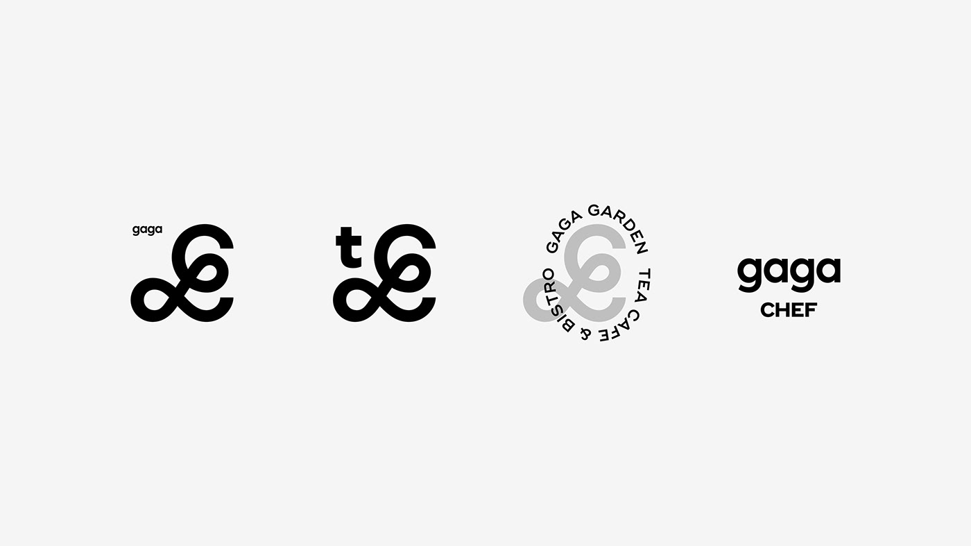
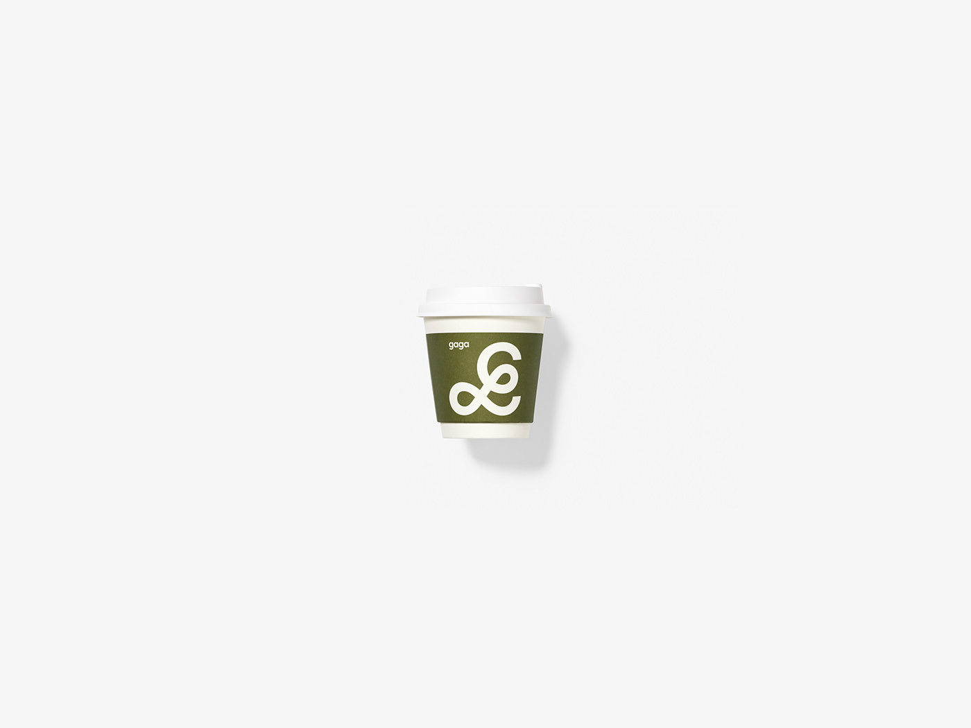
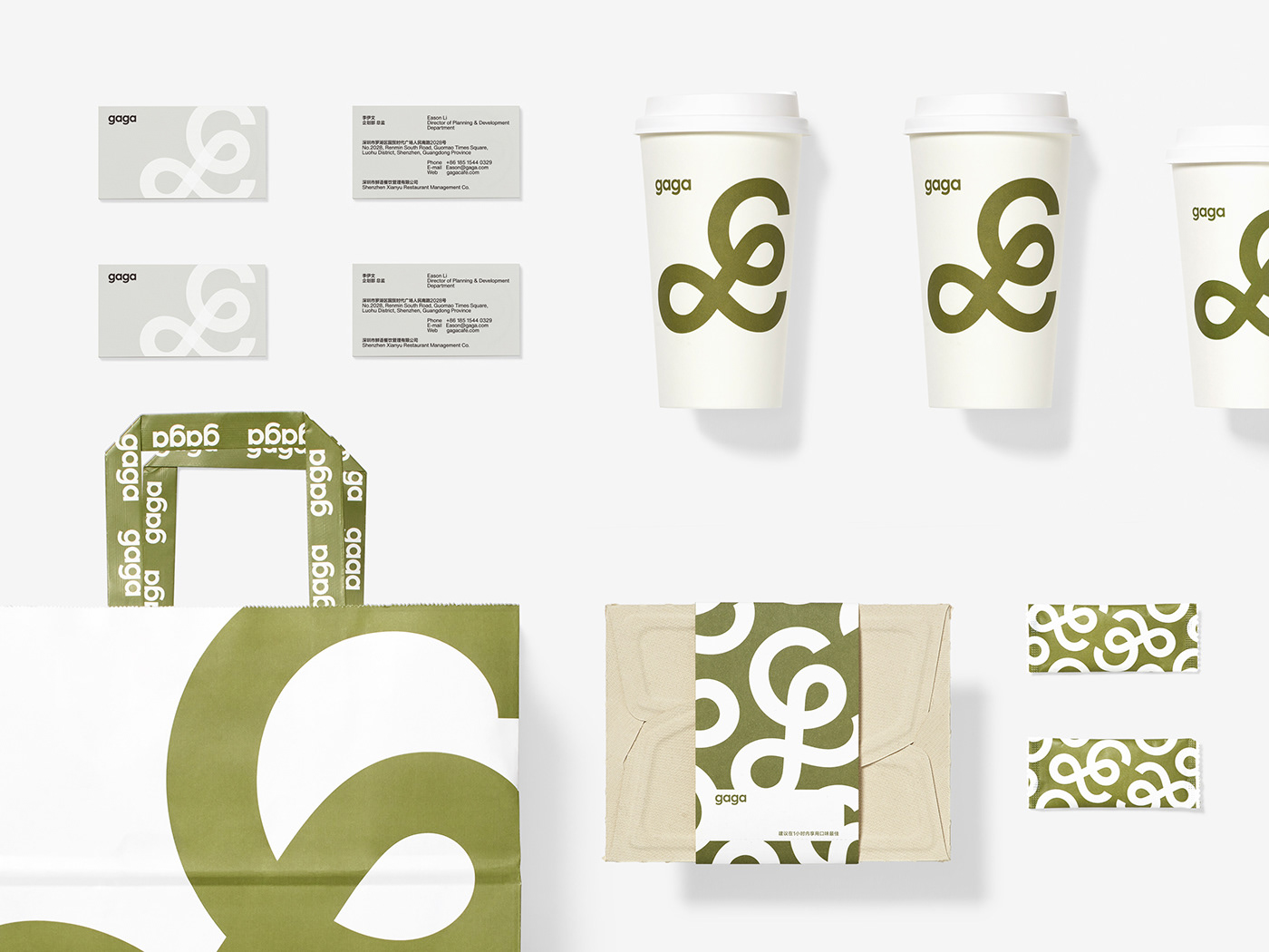
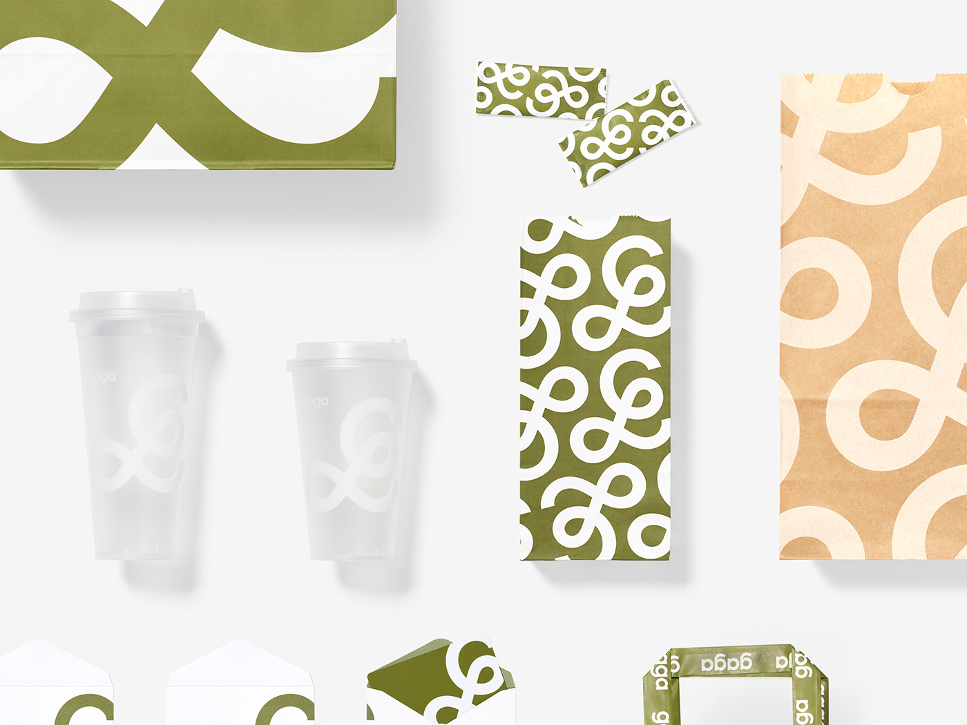
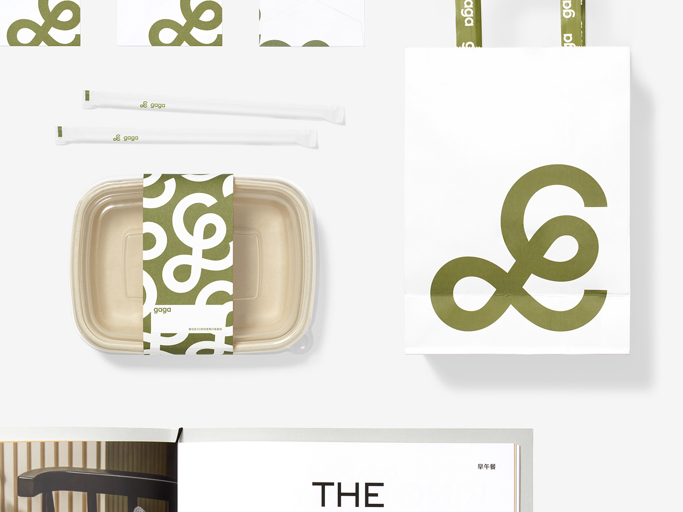
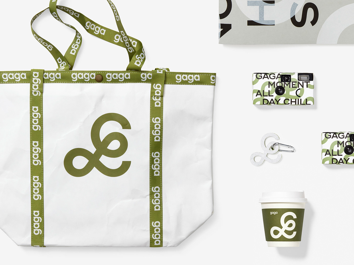
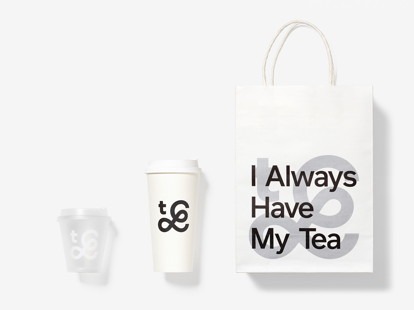
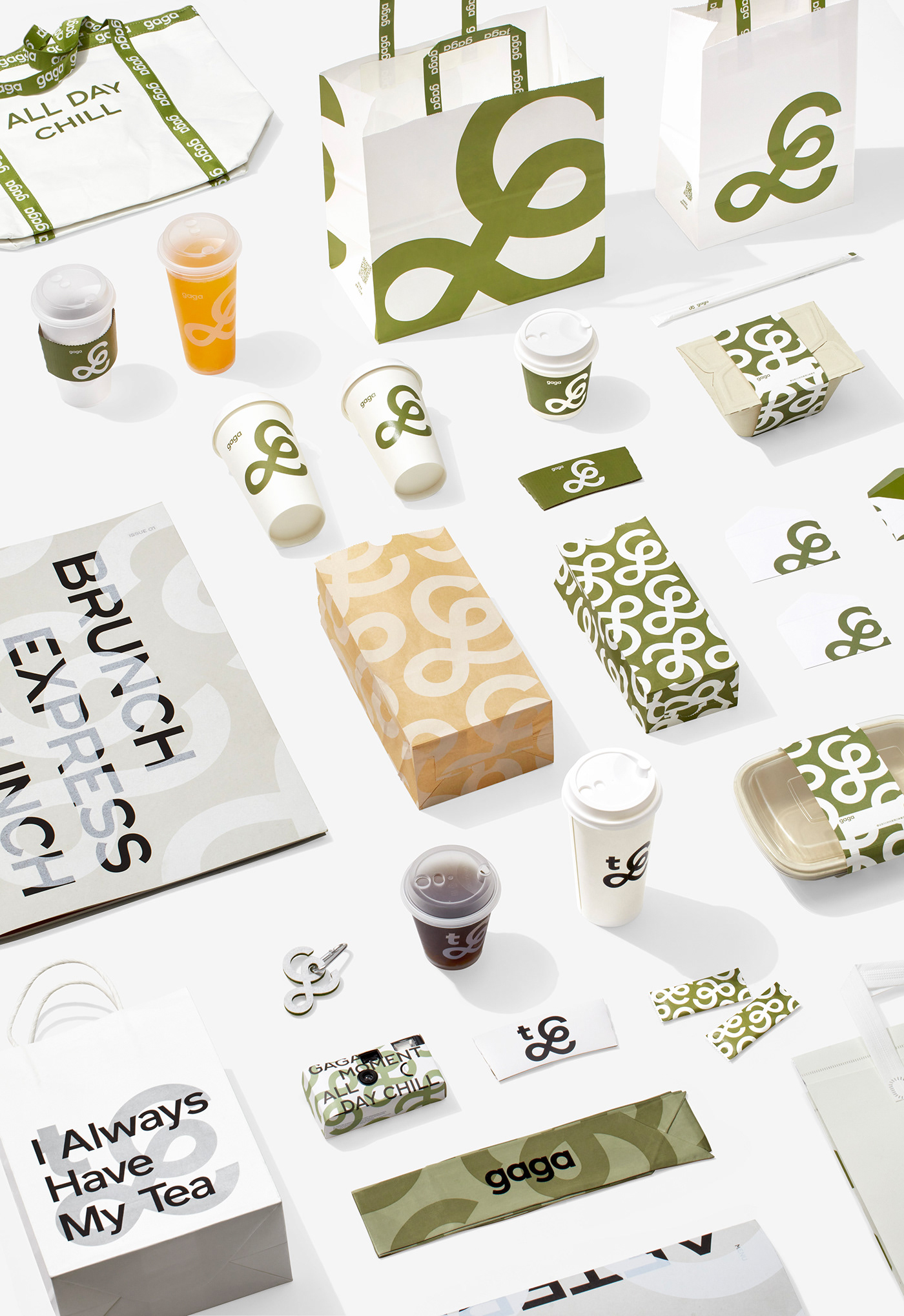
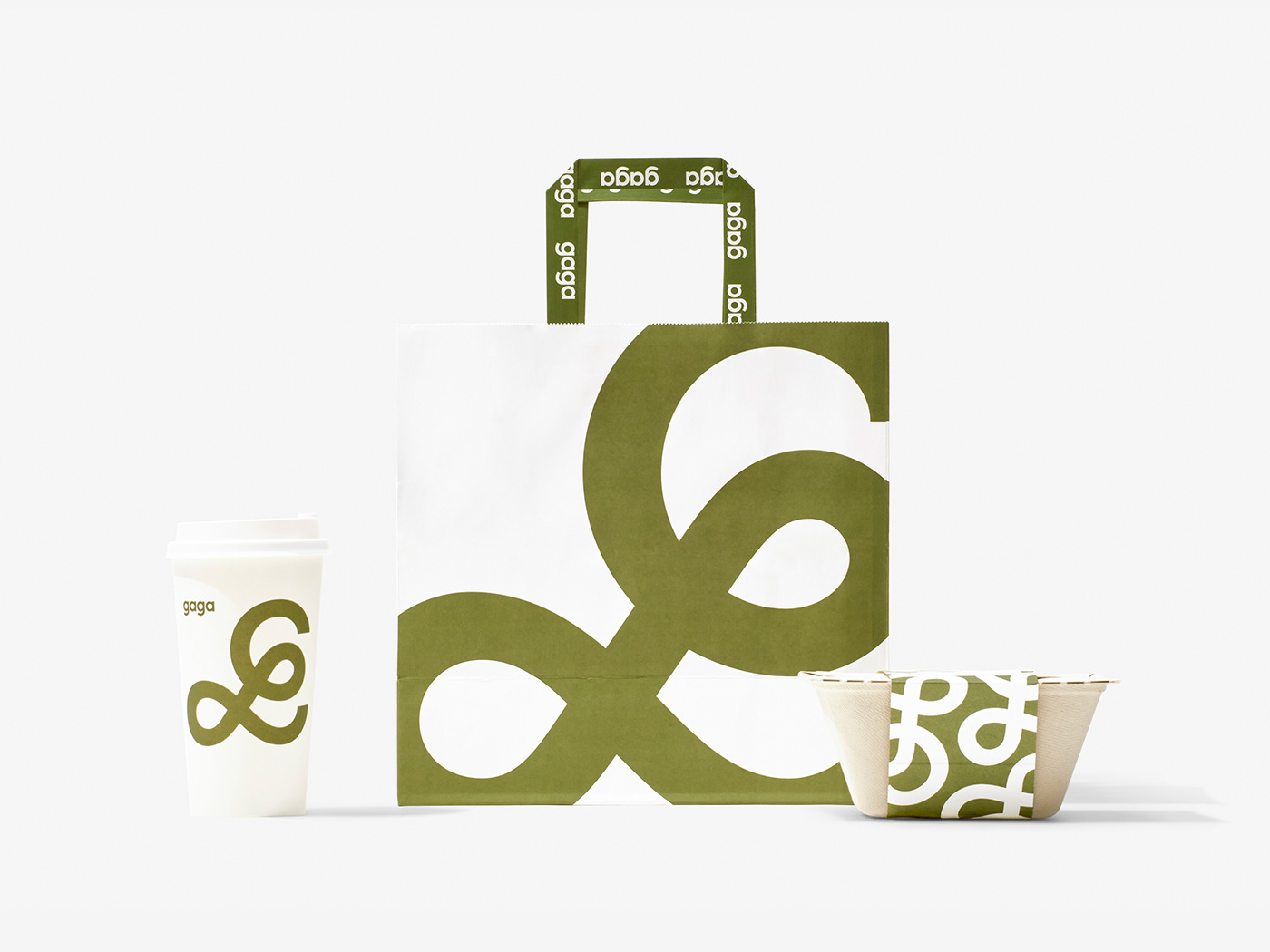
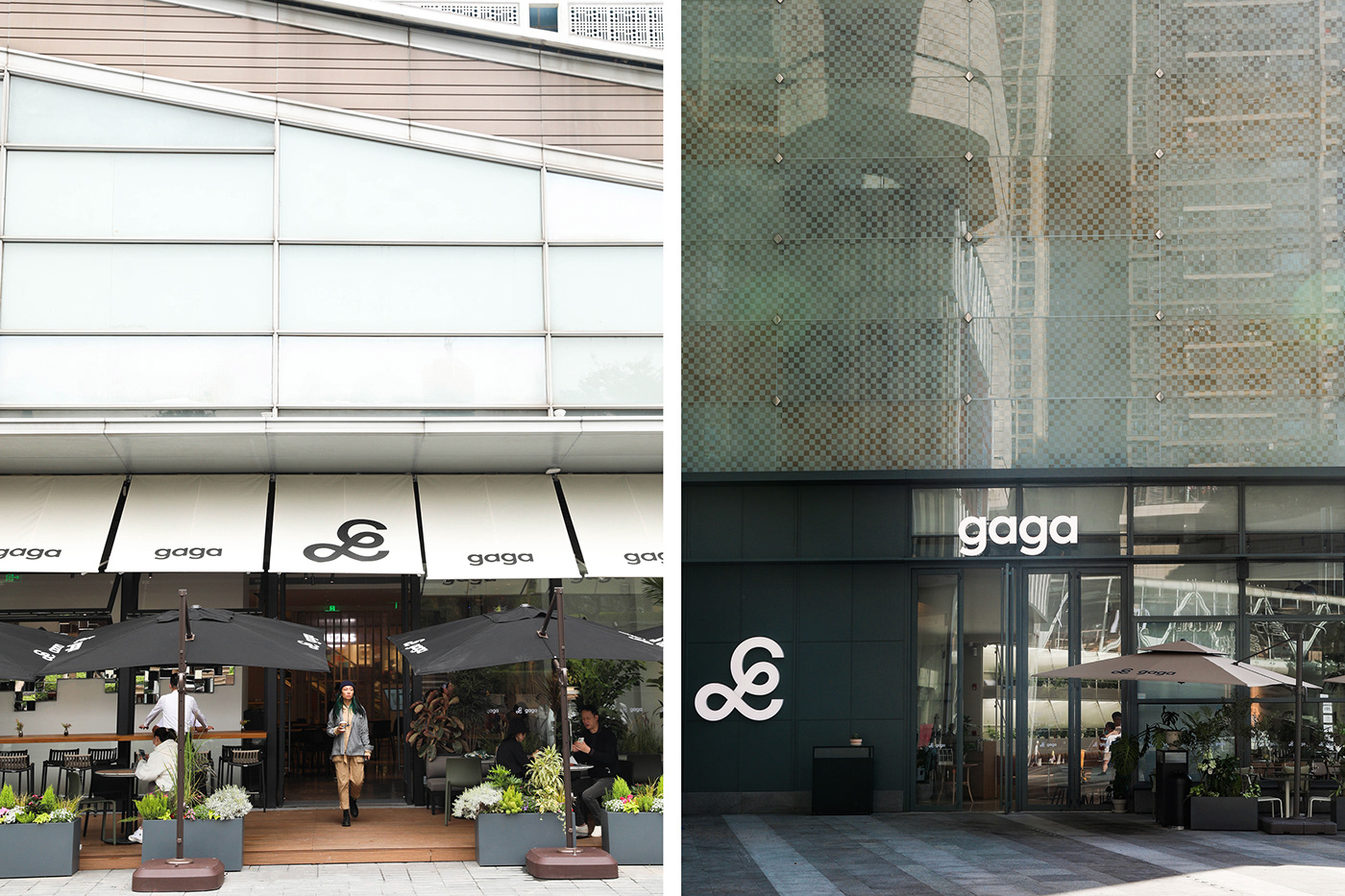
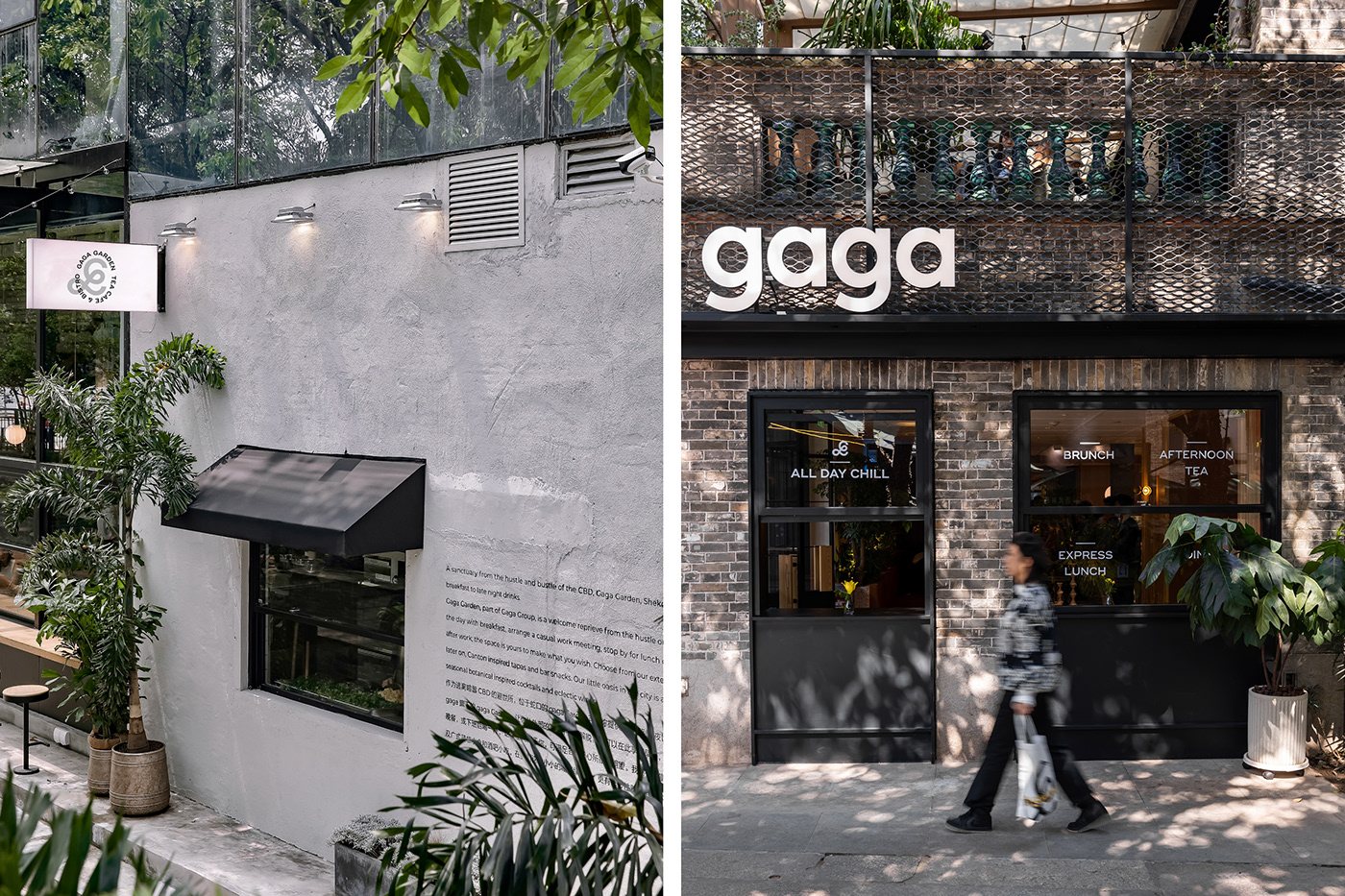
The logo of gaga is composed of two parts: the symbol and the logotype. The symbol is the most significant element of gaga's visual identity, taken from the handwriting of the Latin letter g, which is romantic, sprawling and modern. The story of this handwriting goes back to the founding of gaga, when the founder's daughter wrote her name, gaga, and we have kept the meaning of this beautiful story and redrawn it with a modern twist to give it a new, gentle and dignified character. The symbol can be scaled up, down, tiled or cropped to create different scenes and feels, and we can also make text wrapping and overlays on it for gaga sub-brands, including gaga garden, gaga chef and gaga tea bar.
The logo of gaga is composed of two parts: the symbol and the logotype. The symbol is the most significant element of gaga's visual identity, taken from the handwriting of the Latin letter g, which is romantic, sprawling and modern. The story of this handwriting goes back to the founding of gaga, when the founder's daughter wrote her name, gaga, and we have kept the meaning of this beautiful story and redrawn it with a modern twist to give it a new, gentle and dignified character. The symbol can be scaled up, down, tiled or cropped to create different scenes and feels, and we can also make text wrapping and overlays on it for gaga sub-brands, including gaga garden, gaga chef and gaga tea bar.
ART DIRECTOR: Nod Young / Guang Yu
DESIGNER: Liao Liao
YEAR: 2020
CLIENT: gaga