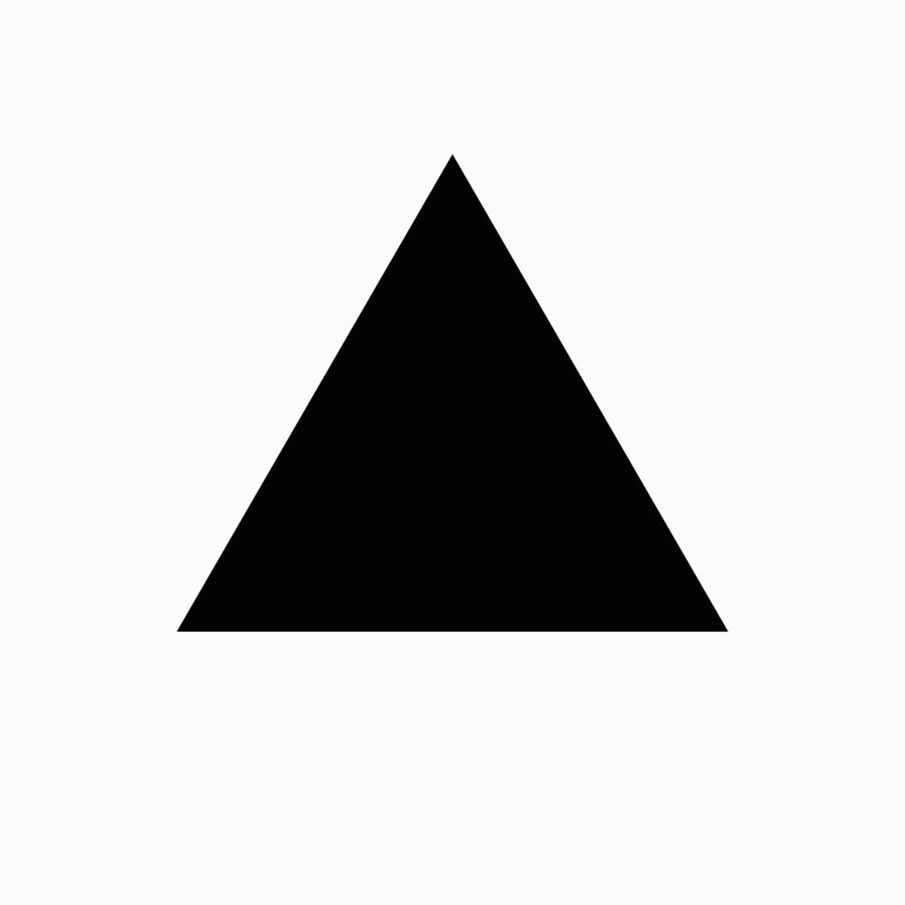
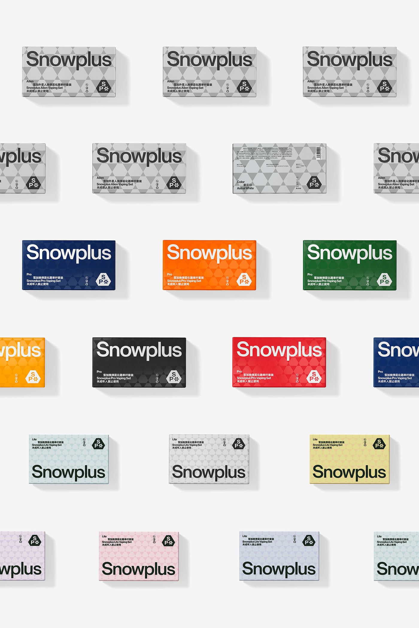
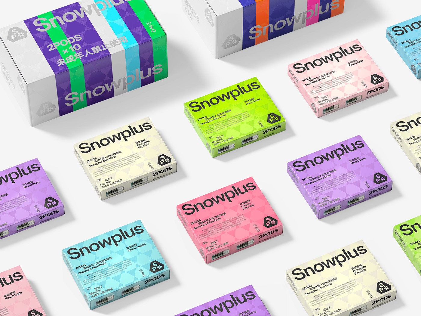
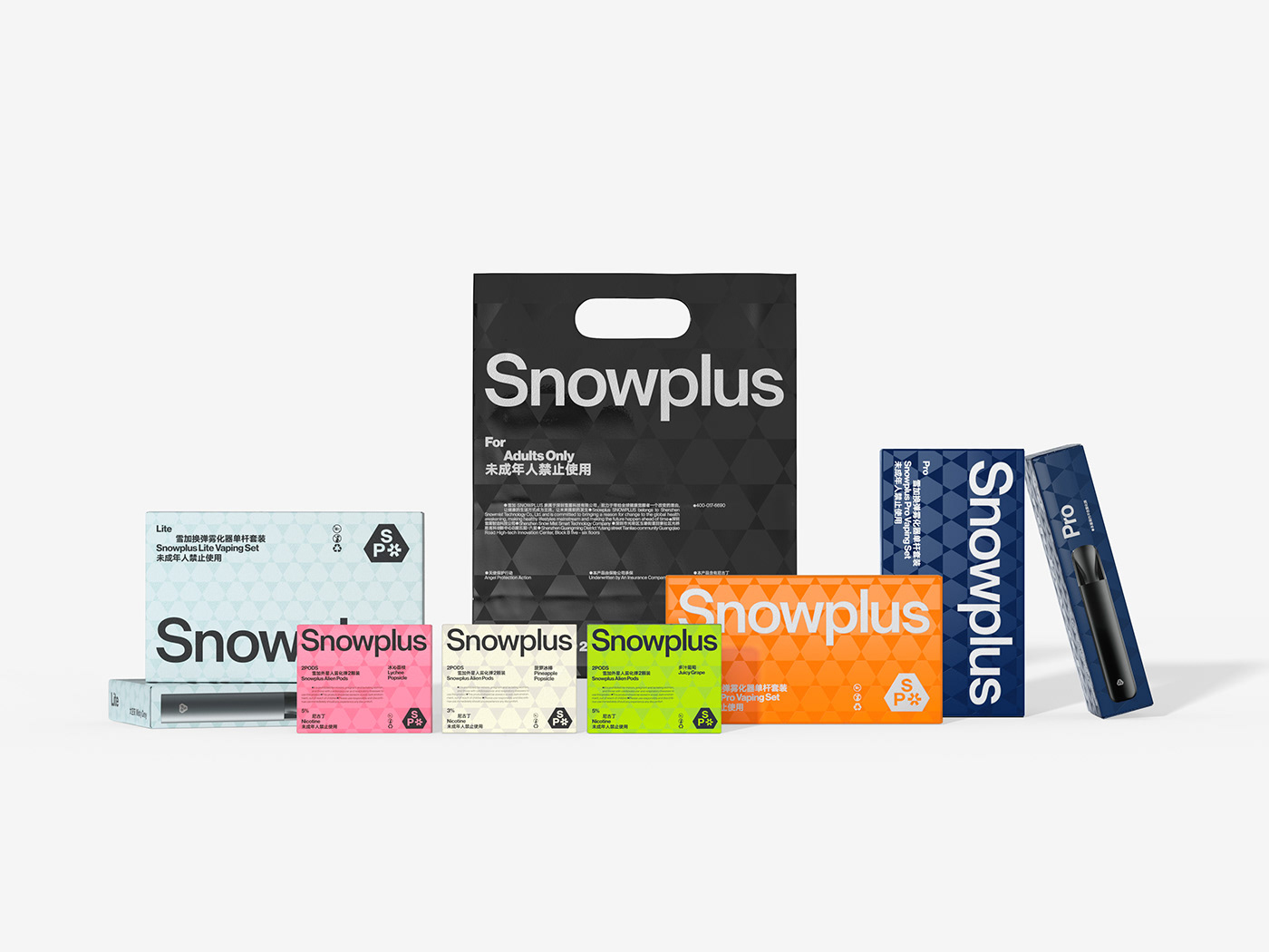
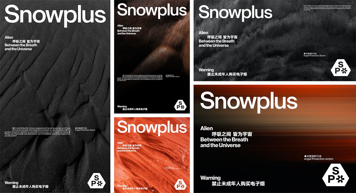
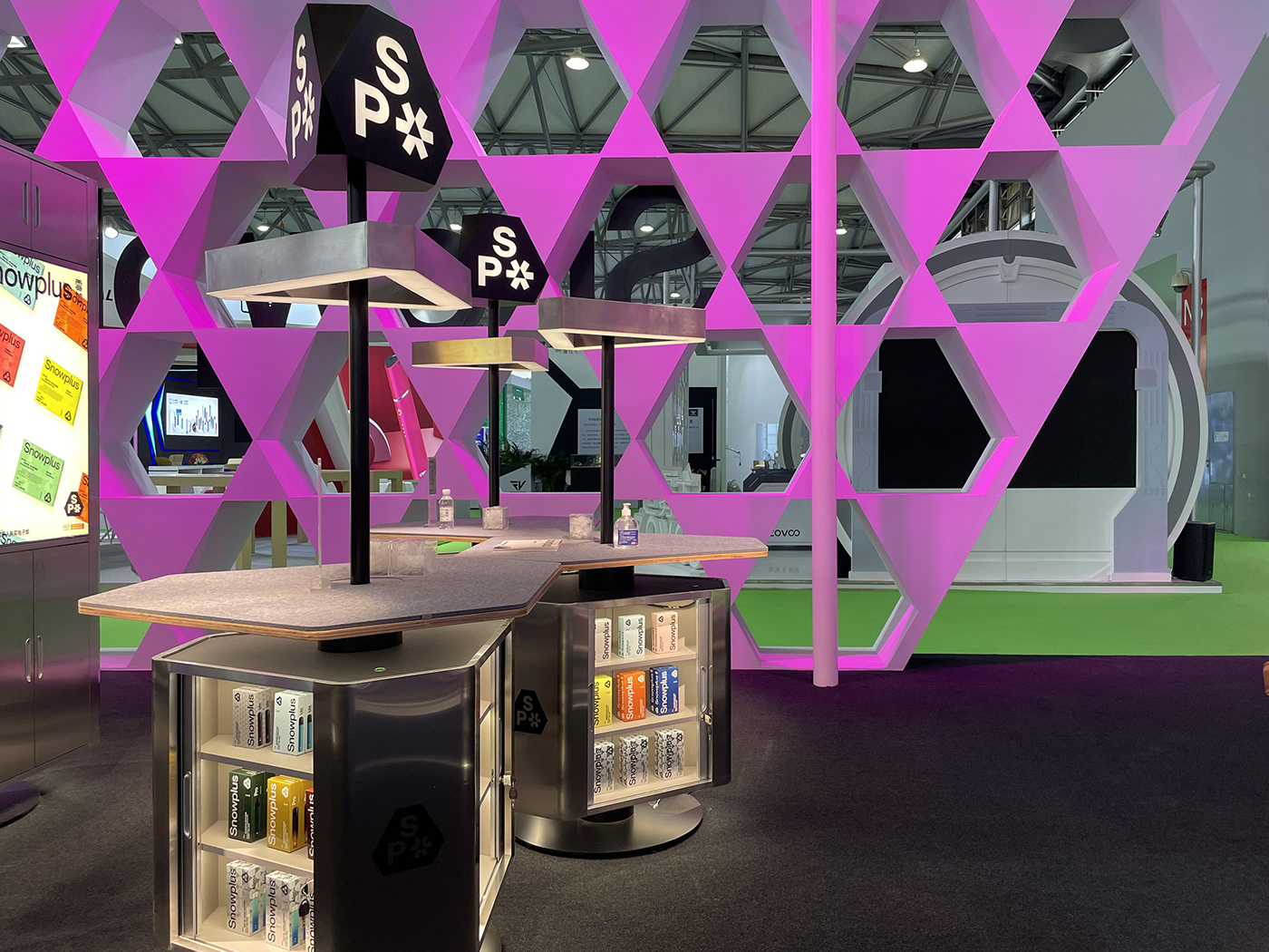
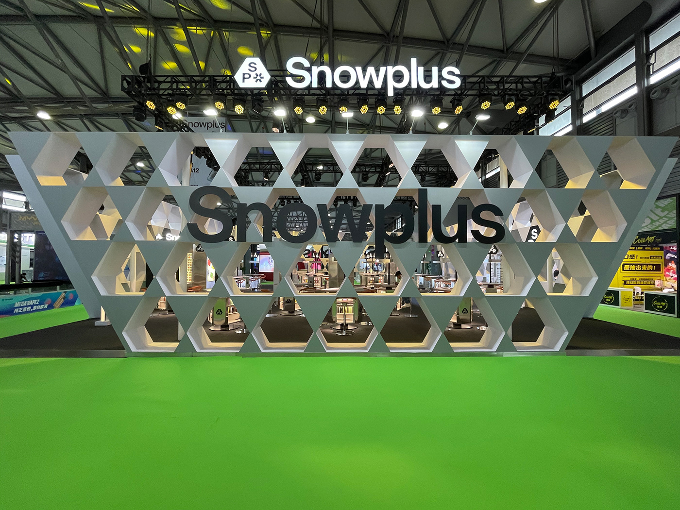
The logic in design can sometimes be contrary to common sense. For example, tradition and stability could sometimes be better to demonstrate innovation, while seemingly simple and relaxed graphics can carry a wealth of meaning. In the design of Snowplus, we chose the most stable triangle, based on which we made morphological changes. After nearly a hundred revisions and comparisons, we settled on a special shape that was both visually comfortable and pioneering in design -- Snowplus' unique irregular hexagon. And then, we design a small, perfectly embedded snowflake according to the shape of the hexagon. The acronym "SP" for Snowplus forms a tight and stable logo. The polygonal shape and radial snowflake conceals a tribute to classic sci-fi. In the design of the ackaging, we have taken the technological aesthetic of Snowplus one step further, the packaging is covered by hexagonal pattern and then printed with a special technology that makes it luminous and colorful under the light.
ART DIRECTOR: Nod Young / Guang Yu
DESIGNER: Han Lu / Wang Xiaoshuai
INTERIOR DESIGN: SPACESTATION
YEAR: 2021
CLIENT: Snowplus
DESIGNER: Han Lu / Wang Xiaoshuai
INTERIOR DESIGN: SPACESTATION
YEAR: 2021
CLIENT: Snowplus