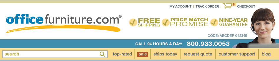
Before: site header
Stakeholder wanted to modernize their website, make it more aesthetically attractive, and more simple and easy to understand. I began with the header design.

Proposal: site header
I developed a color palette based on the logo colors, using the boldest hues for the logo. Supporting colors were desaturated or a lighter value. This version contains a more prominent logo, smaller promotional messaging, and less focus on calling the telephone number, because the majority of the site's users complete transactions without calling.
Stakeholders wanted more emphasis returned to the promotional messages and the phone number and headset model image.

After: site header
I was able to maintain a larger logo size than the original, a more subdued presentation of the promotional messages and the phone number.
Product landing pages: before
Because the customer demographic is largely small-office-home-office, I looked at competitors’ websites, noting the use of flat design and cohesive color palettes without distracting link text. The stakeholder wanted product images to be larger.

Product landing pages: after
I increased size of product images, applied the new color palette, used red only to indicate sale products and prices, removed underlined links, and created visual interest by varying size and color of visual elements (watch video, price point/sale, product name, and product reviews).


