freŝa - шикі және зәйтүн майларын өндіретін отандық өнім. Бұл жоба адамдардың өмір сүру сапасын жақсарту және отандық өндірістің табиғи және пайдалы өнімдерін тұтыну мәдениетін қалыптастыру үшін жасалған.
Өнім бірегей өндіріс технологиясы бар майларды ұсынады. Бұл өнімде бояғыштар, рафинация, жылыту, ағарту және хош иістендіргіштер жоқ.
Дәмді өнімді жақсы көретіндер табиғи дәм мен дәм палитрасындағы бүкіл түрін бағалайды.
Freŝa майлары табиғи, дәмді және пайдалы! Дәл осы философияны біз идентификацияны дамыту кезінде басымдылық қойдық.
Freŝa испан тілінен аударғанда "балғын", "балғындық" деп аударылады. Сондықтан, логотипті жасауда, майдың ең маңызды бөлігі, тұқымдарға мән бердік. Сондай-ақ, бұл дизайн ағаштардың жапырақтарына ұқсайды, бұл өз кезегінде өнімнің балғындығы туралы қосымша түсінік береді.
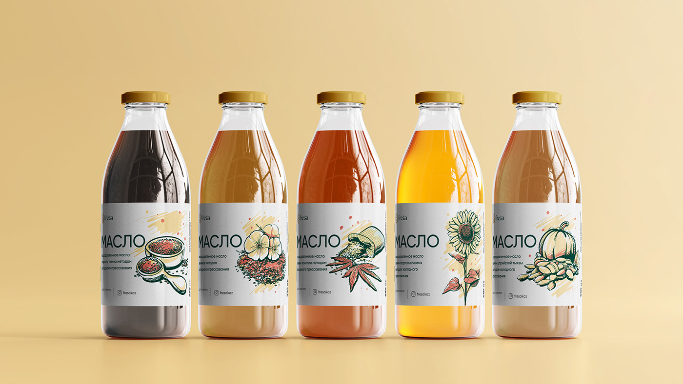
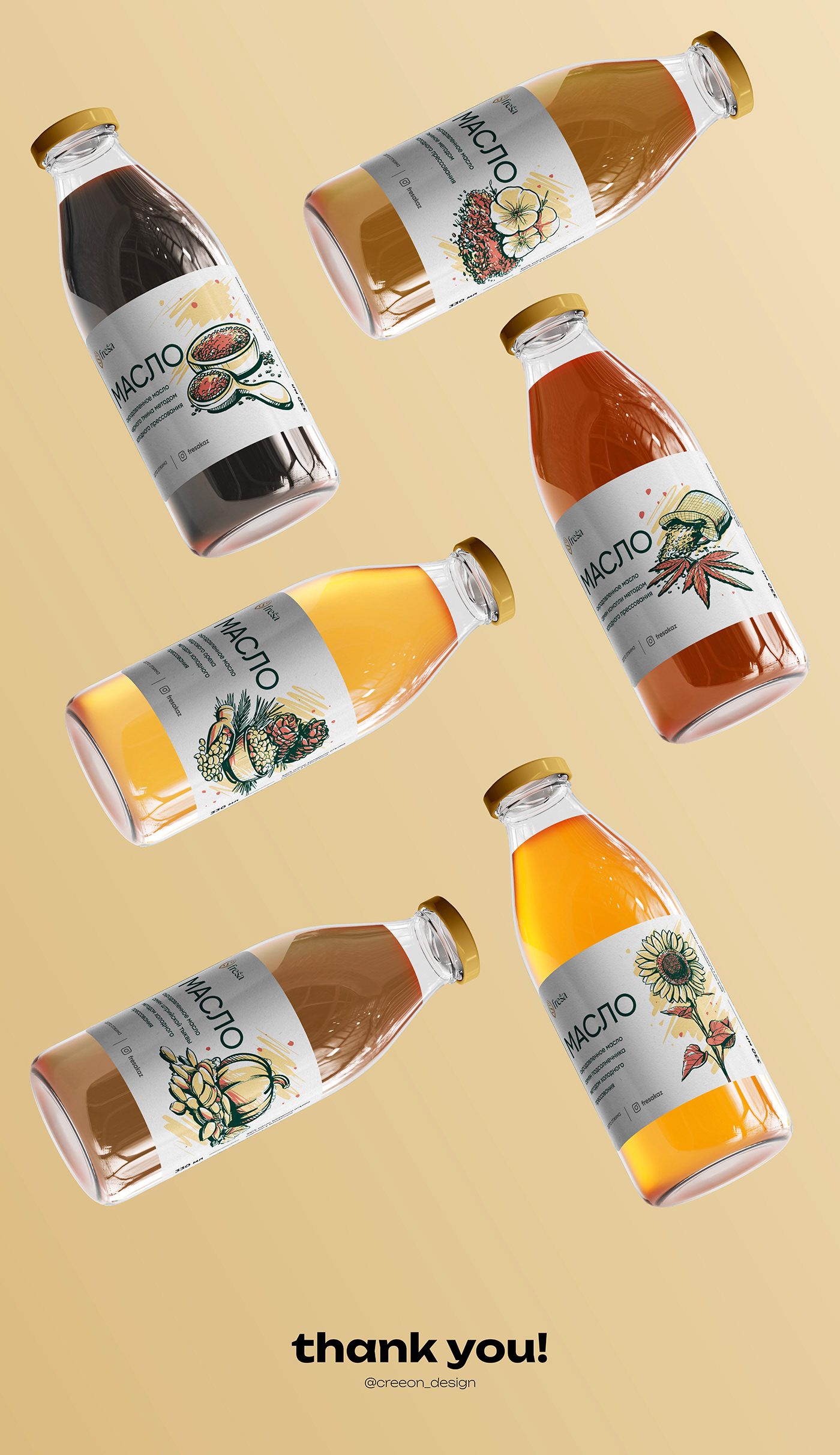
Қаптаманың дизайнын жасау кезінде, біз, балғын және табиғи дизайнды жасау керек екенін анық білдік. Қаптама дизайны әртүрлі сорттағы тұқымдардың иллюстрациялары бар ақ фонда жасалған.
Осындай көрнекі техниканың көмегімен, біз, freŝa өнімі тек балғын ғана емес, сонымен қатар табиғи, дәмді және пайдалы екенін көрсетіп, аудиторияға жеткіздік.
freŝa is a Kazakhstani product, which focuses on a production of raw-pressed and olive oils. This project was created in order to better people's life quality and form the culture of consuming natural and healthy product of a Kazakhstani origin.
The product offers the oil made with an unique technology without dyes, refining, heating, bleaching and fragrances.
Tasty food lovers will acknowledge the natural taste and a wide palette of aftertastes.
freŝa oil is healthy and tasteful! We kept the exact philosophy when designing the corporate identity.
The word freŝa is translated from Spanish as "fresh" and "freshness". Therefore, the logotype was inspired by the main ingredient of the production of oil - seeds. Additionally, the form reminds the leaves of the trees, which also symbolises the freshness of the product.
In the process of designing the package, it was clear that we needed to build clean and natural design. The design of the package was created on the white board with the live illustrations of the various types of seeds. By using a visual trick, we showed and conveyed our audience that the product freŝa is not only fresh, but also naturally tasty and healthy.