
We weren't sure about this project on an artistic level, since anime aesthetics wasn't something we were expecting to explore in the near future.
But, on the other hand, we are people who kinda enjoy pressure, so that two of the biggest brands in the world were putting high stakes on this made the project very appealing.
Benzema would be a major character in the story, the new Real Madrid kits should look perfect on screen, and lots of influencers and players’ cameos would be expected. Sounded like lots of legal stuff to keep in mind.
We couldn't even imagine all the difficulties and crazy plot twists a big production such as this might bring about, added to the fact that we had never done anime before… so of course we jumped in.

Luckily, it was in the early stages of script development (which is probably still under some final adjustments) that we understood the importance of having more low-key, simpler animation moments to counterbalance the high paced narrative.
After some quick storyboarding rounds, we made just a couple (billions) of animatics until we found the right rhythm. The interesting part was finding connections between shots that would make things flow better.
Small transitions and clever frame compositing that made all the difference.

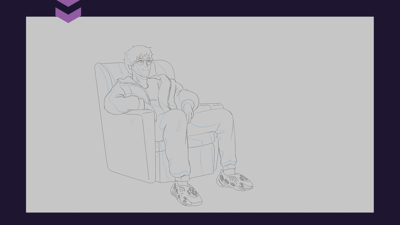
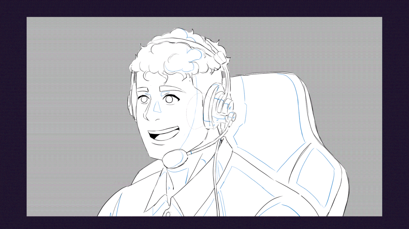
The client had very clear ideas in mind for each character look, so we started by doing some studies, trying to find a balance between anime and our never-done-anime-in-my-life style.
“Hentai fan art vibes” was the zone we always tried to avoid at all costs.


.


.


.
.


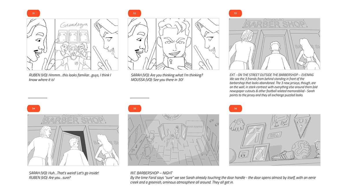
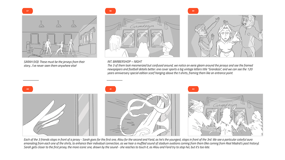
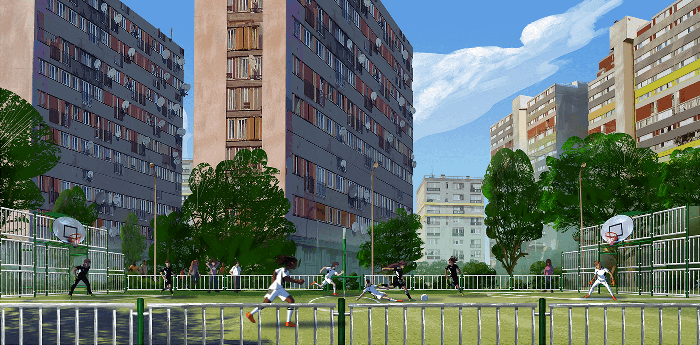
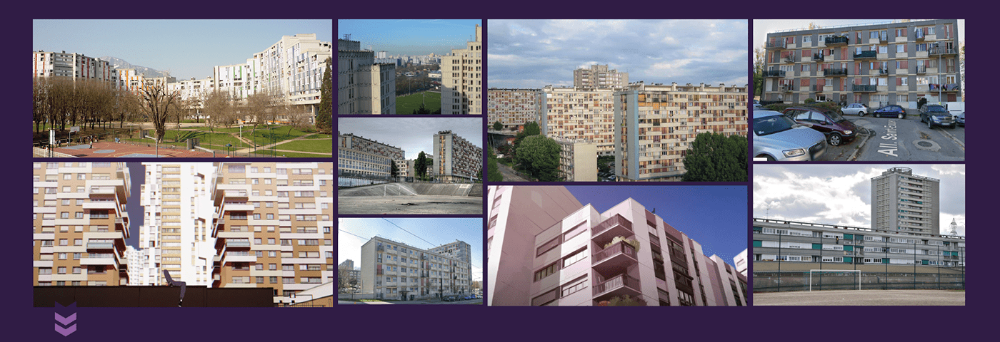
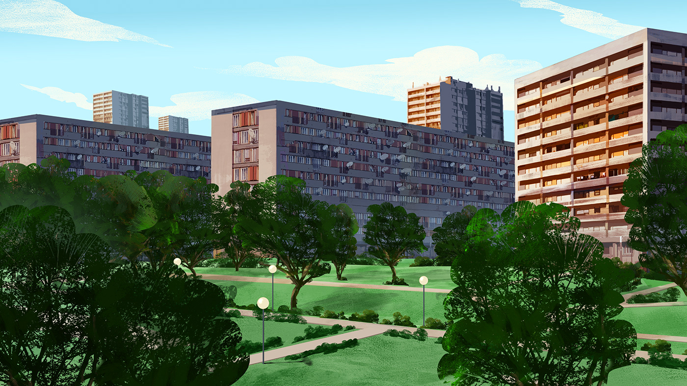
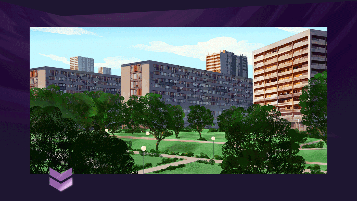
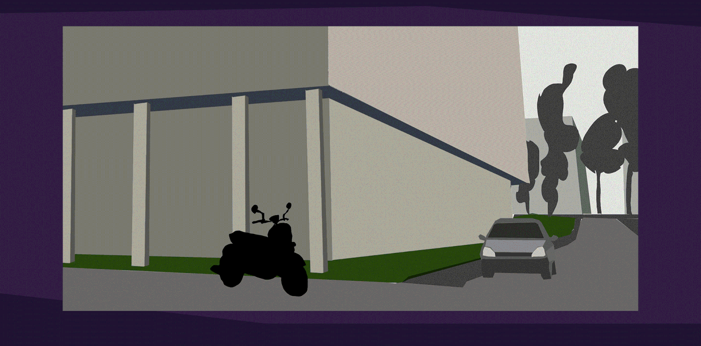
Backgrounds were going to be divided into two parts: the suburbs and the evil Bernabéu.
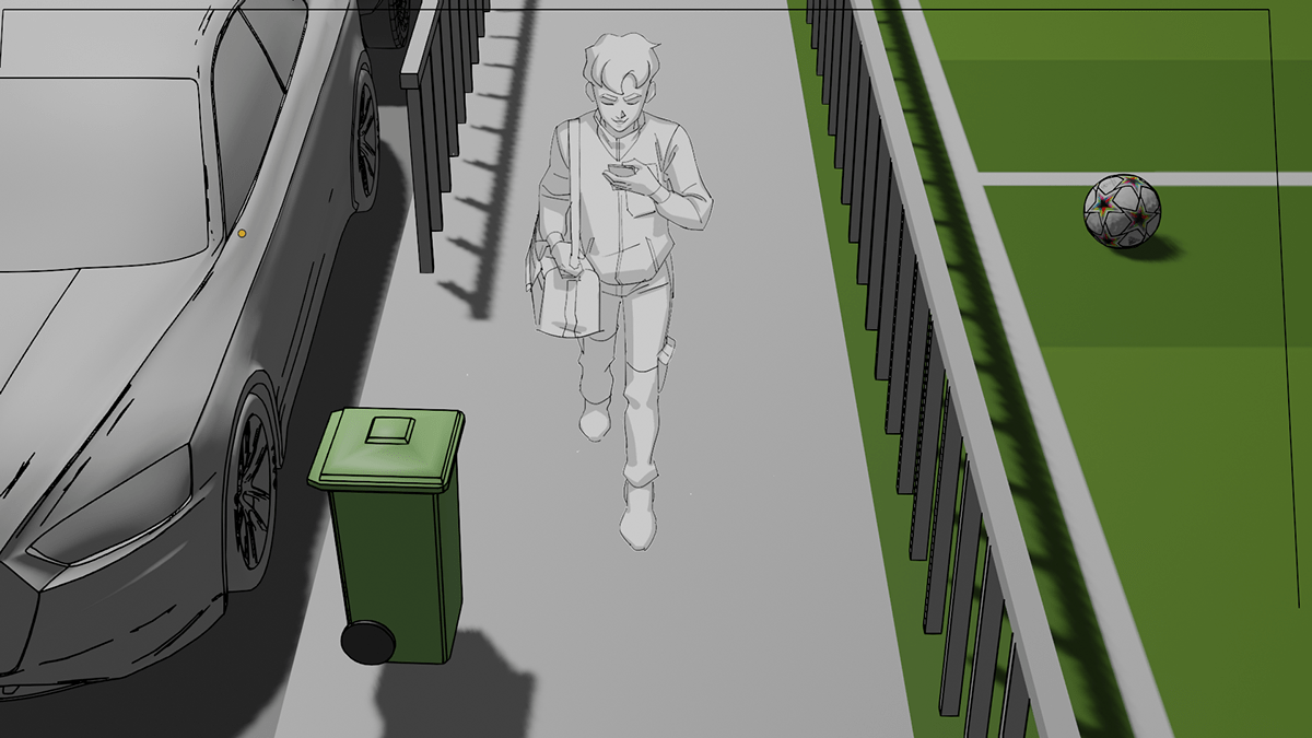
We knew the story taking place in the suburbs had to be quite true to reality.
That’s why we used matte painting, while stylizing the forms so that it is not an exact copy of reality but rather a faithful representation.
For example, there are cars that are incomplete, they are only shapes modified with brushes and colors.
In some cases we then did basic 3D layouts as reference for the illustration, which helped a lot to speed up the process.


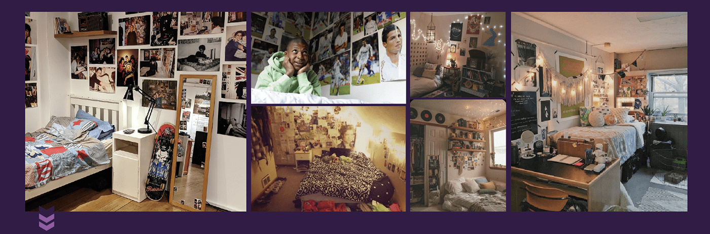
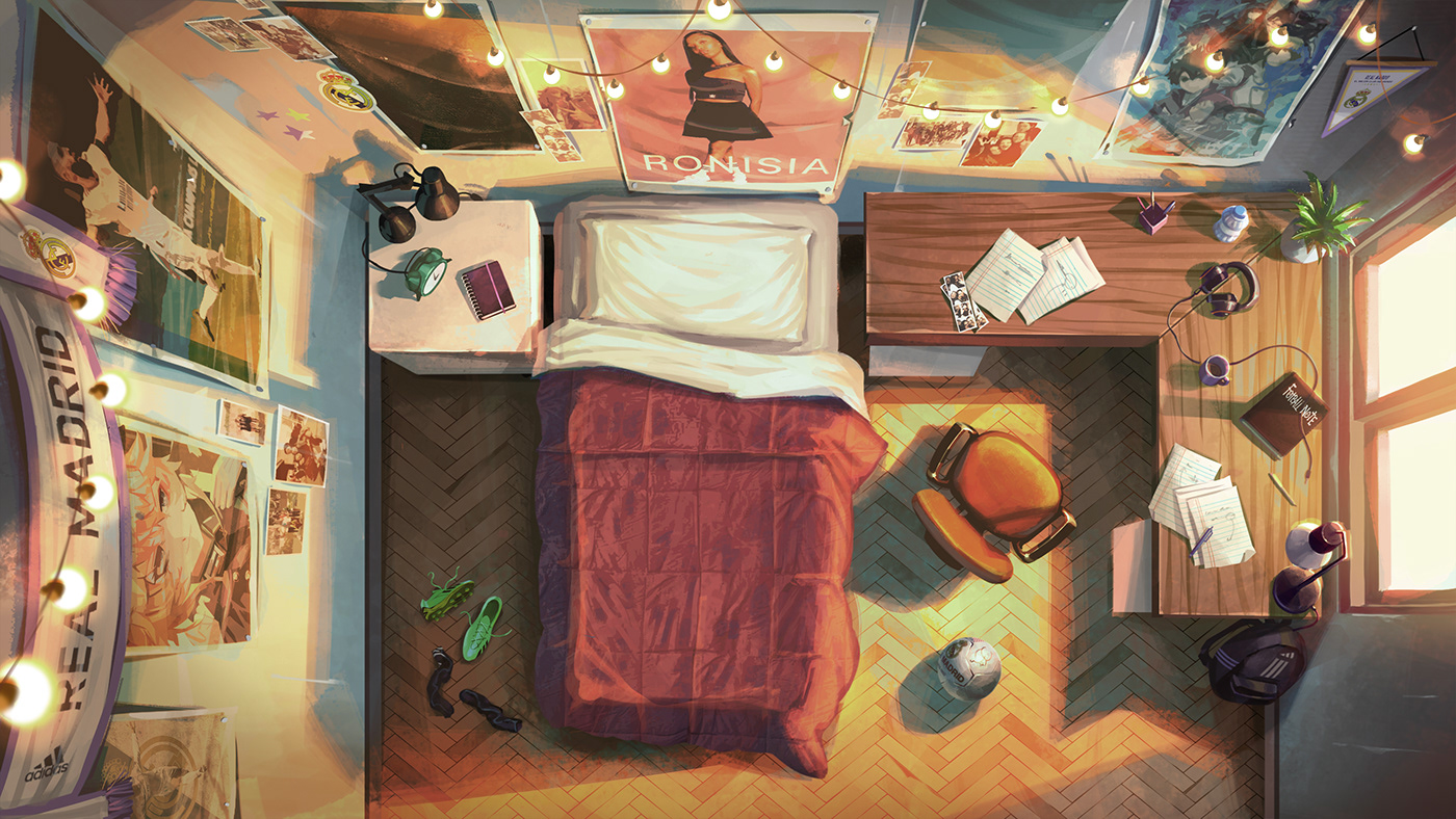
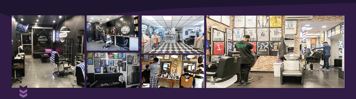
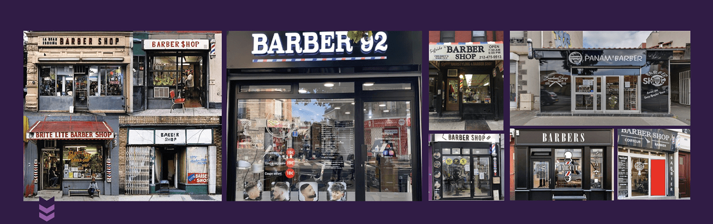
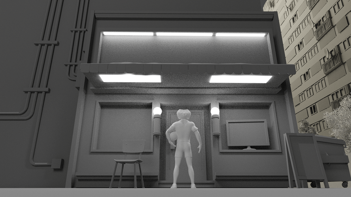
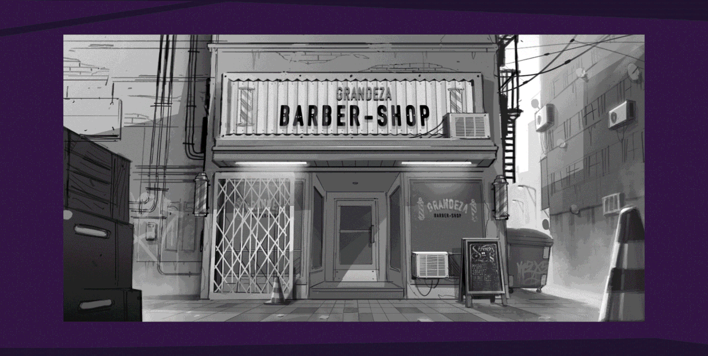
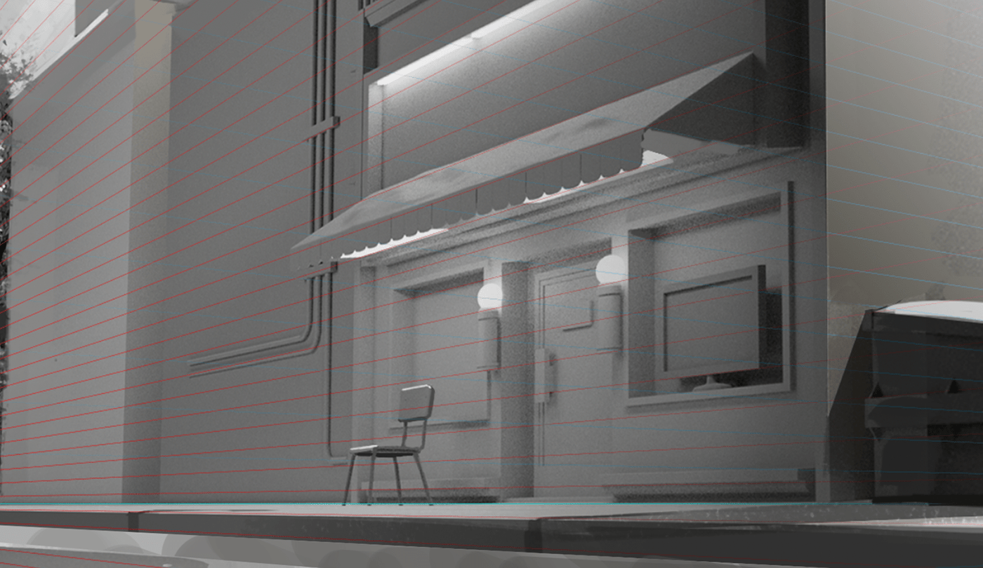
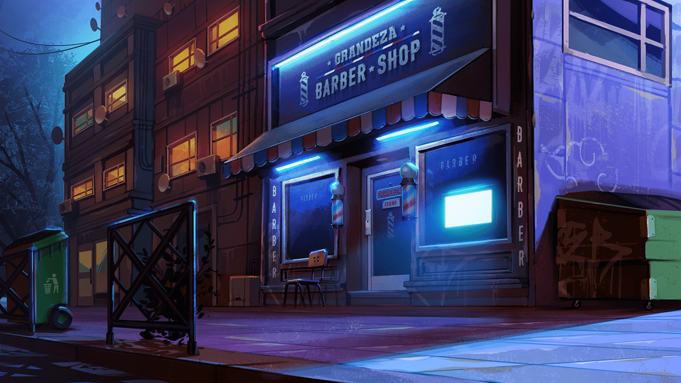
For the interiors (Sarah's bedroom and the barbershop) we had to change the production technique, as a combination of matte painting and illustration was going to limit us more than help us. We went with full illustration instead.
It was difficult for us to achieve those spaces because they were subjected to many changes, as they had looooots of objects and references the clients wanted to include.
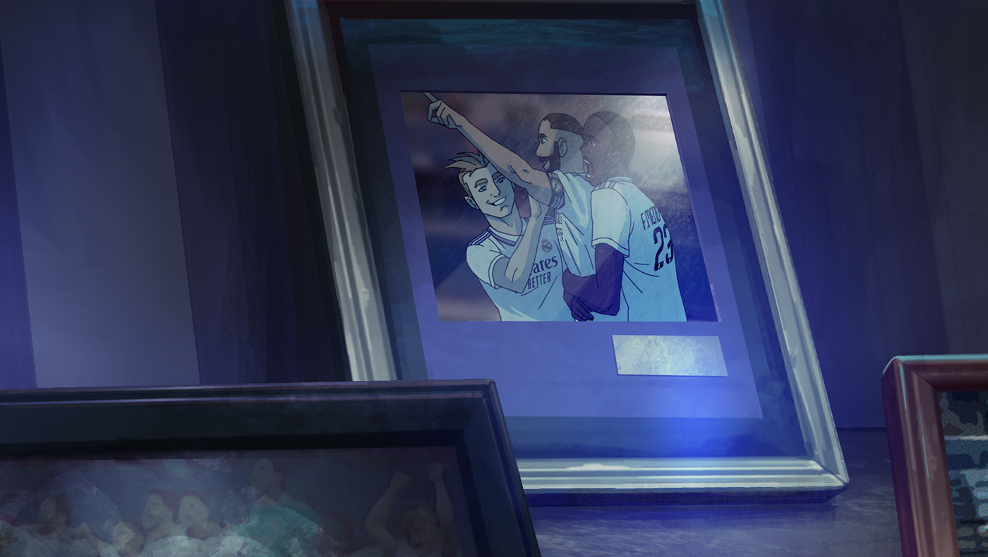
The barbershop in particular was a tough one because it had lots of Real Madrid and Adidas product placements AKA memorabilia.
And you know how this rolls: when it comes to clothing and advertising, a high level of detail and accuracy is expected.
We had to keep an eye on everything on display: the cleats, the scarf, the ball, etc.
A lot of complexity that translated into hours of work.


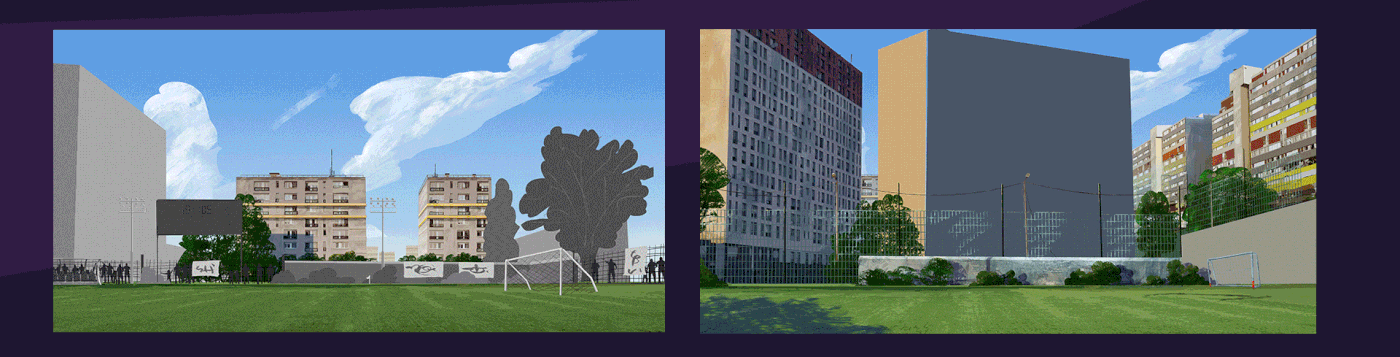
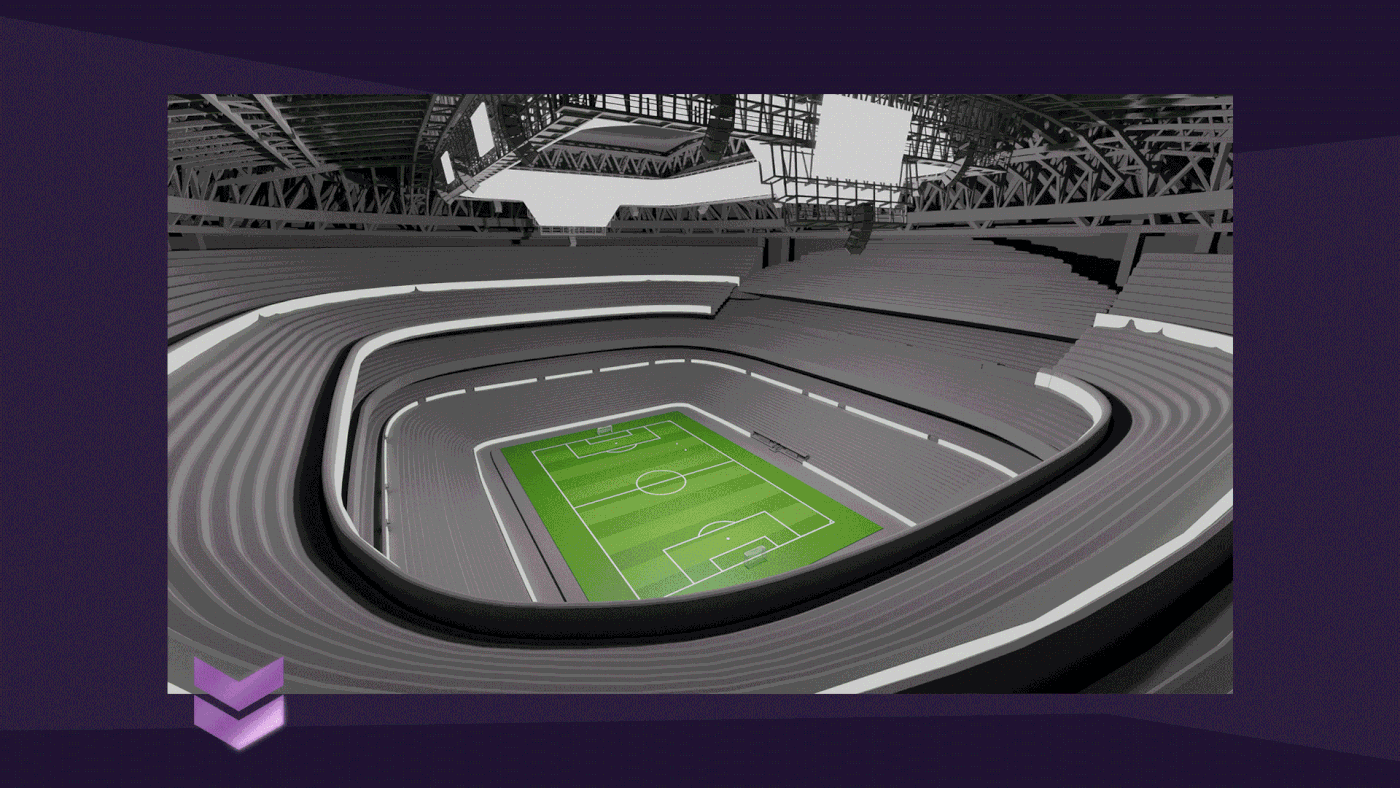
As for the stadium, we had to work with the future Santiago Bernabéu design, which will be completed sometime in 2023. Maybe earlier, but the aliens building it are very secretive about the project.
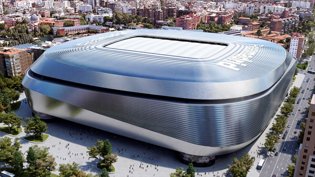
So this brough us a big brain freeze: how faithful do we have to be? How faithful CAN we be, if every piece of reference about SB23 are just the same architectural renders?
We worked with a 3D model of the current stadium, and from there a lot of work was done in the back and forth with the client to reach the expected result.
We mounted this colorboard once we had clear ideas for every background in the movie (even if they were rough shapes), so we could uniformally tweak the palette into a more Real Madrid oriented one.
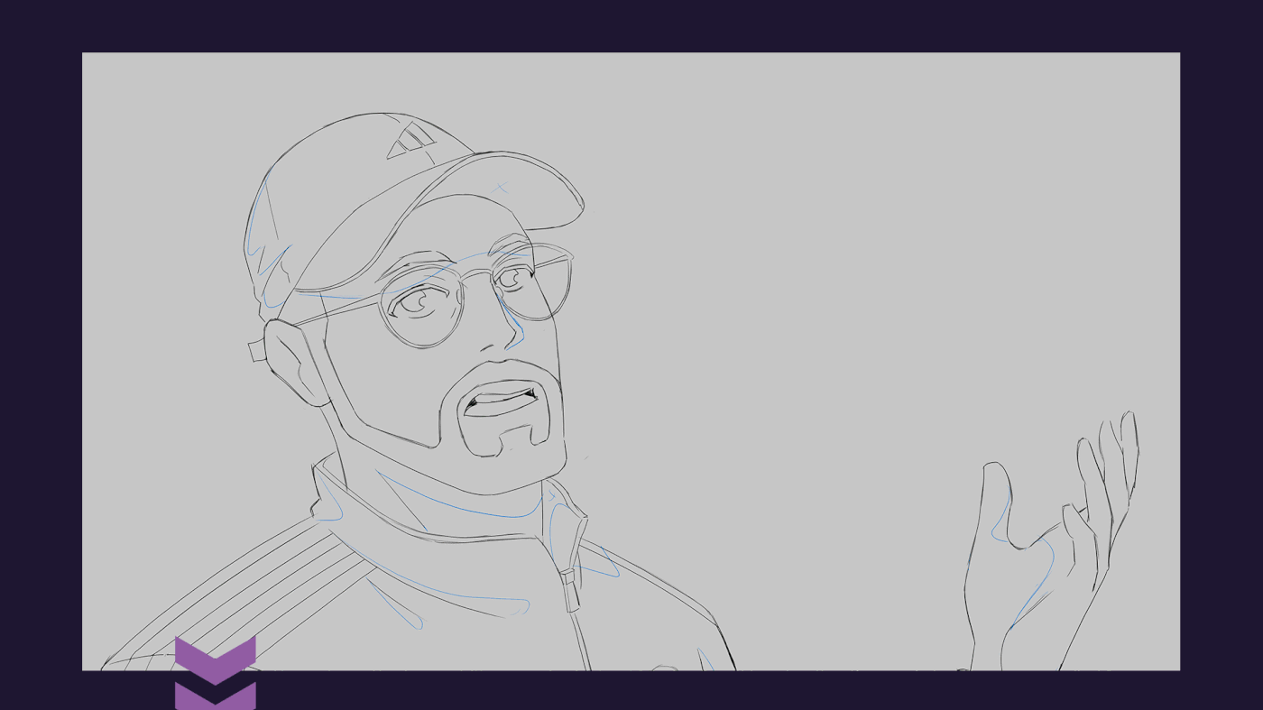
Here, have a fresh bowl of preliminary explorations and rough styleframes.


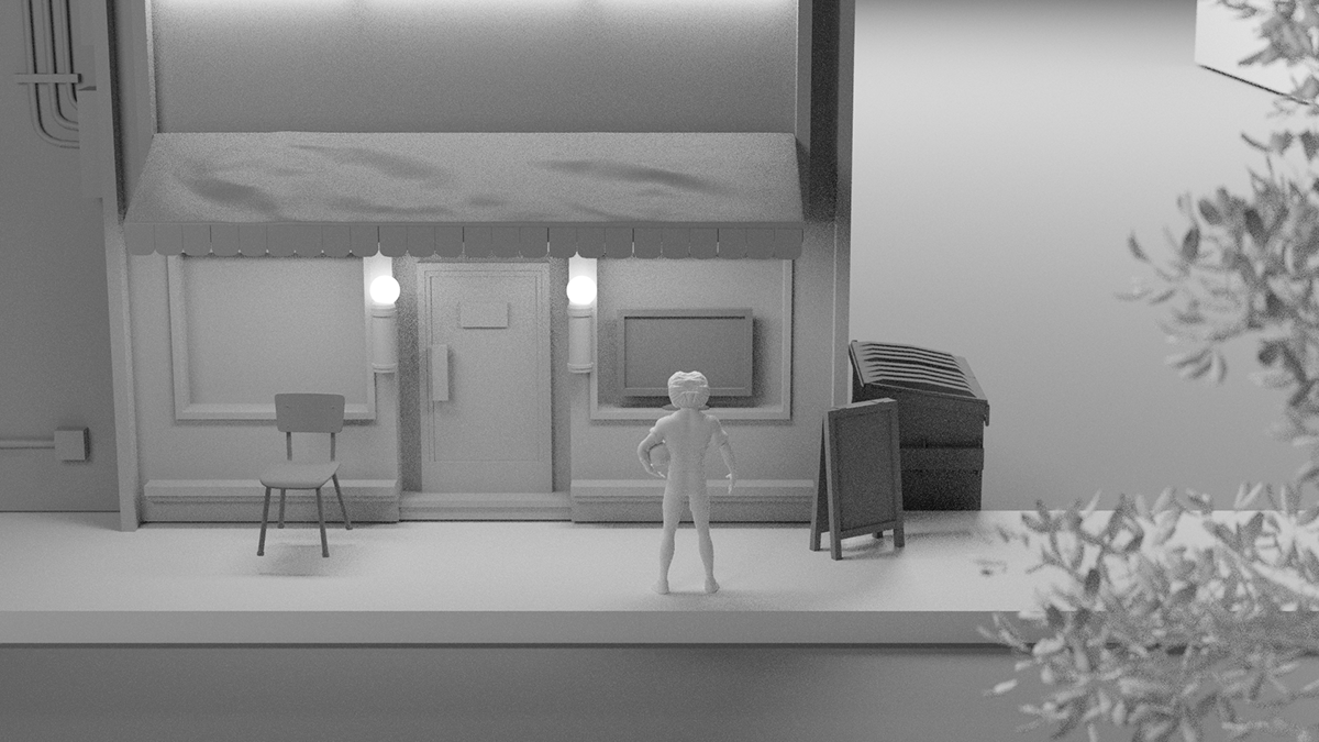
The animation strategy was ready: two animation sub teams, one for simple shots, the other for complex shots.
Animating on 3s and 4s as much as possible and not worrying about kits textures and logos.
Animating smallest details if they add value, and keeping it simple.
And respecting the volumes at all costs!
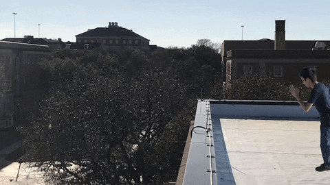
We soon discovered that simple shots were really difficult, and that complex shots were solved with simple, great layouts.
Check this one.
That walk had several passes until we nailed the right acting. We had envisioned it as a stiff movement, maybe a 4 frames walk cycle. But it didn't feel right. So we just gave him more life. See how Ruben speaks, listen to the messages, and interacts with his friends!
The next shot seemed more complex because we feared we would be spending quite some time trying to nail good volume transitions during the whole running cycle. But it came out very naturally, even with the camera movements!
Now, who´s up for some animation entrails?


.


.


.


.


.


.


.


Obviously comp was going to get chunky.
Lots of glows and defocus (but proudly, no motion blur!) to achieve depth and cinematography, and giant background plates that we could scale and move around to reinforce camera movements.
So this is it.
This was a massive challenge that led us to new knowledge and skills. That's our main reason for choosing projects: the potential they have to transform and enhance our views and tools. We even learned some new tricks with the ball.
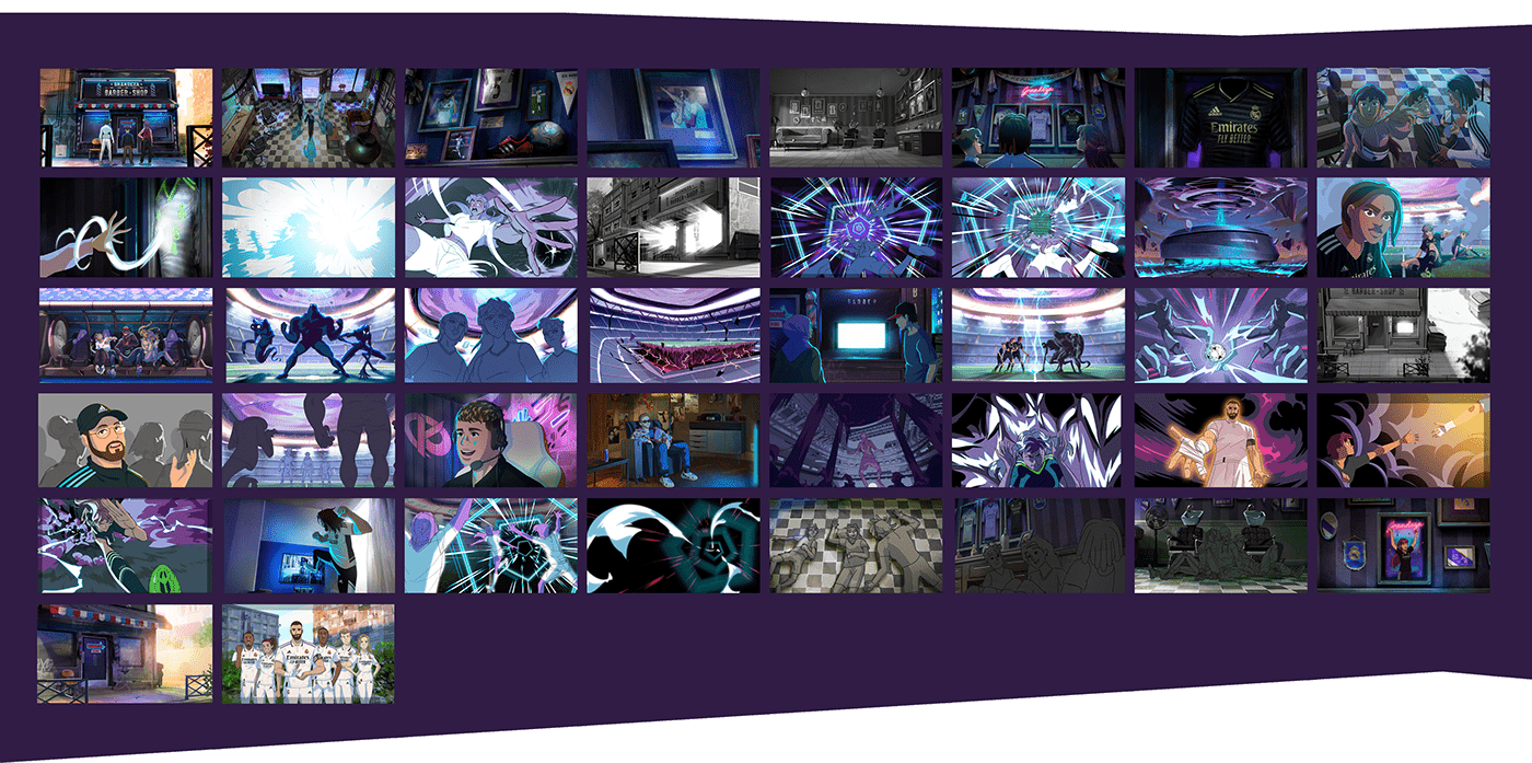
So to celebrate that, we made this poster once the production formally ended, dedicated to the characters. Will we ever meet again?
Que viva el fútbol!