


Mi Breja
Biritas e Salves @biritasesalves
naming • branding • identidade visual • ponto de venda • redes sociais
naming • branding • visual identity • store • social media
contexto
Uma marca que já nasce com objetivo de se diferenciar no mercado.
Desde o primeiro contato com as sócias, elas sempre trouxeram uma imensa vontade de se diferenciarem no mercado e começaram a fazer isso desde a sua concepção.
São poucos empresários que tem essa mentalidade antes de abrir o negócio. Quando fomos procurados pelas empresárias, a ideia já era conceber uma marca com todos seus diferenciais e potenciais bem posicionados e claros para o público.
Foi um processo coparticipativo muito interessante e divertido! Fizemos 3 seções de naming com as sócias, fizemos duas entrevistas de público entre as sessões, até chegarmos no nome final: Mi Breja.
A marca já carregava os atributos de inovação e diferenciação, mesmo antes de ser concebida. A ideia sempre foi: criar uma distribuidora de bebidas, com serviço e produtos de alta qualidade, preço justo, diversidade e totalmente diferente das distribuidoras “toscas” e com preços abusivos, que são a maioria no mercado, pelo menos brasiliense.
context
A brand that was born with the aim of differentiating itself in the market.
From the first contact with the partners, they always brought an immense desire to differentiate themselves in the market and started to do this from the beginning.
There are few entrepreneurs who have this mindset before opening the business. When we were approached by businesswomen, the idea was to design a brand with all its differentials and potentials well positioned and clear to the public.
It was a very interesting and fun collaborative process! We did 3 naming sessions with the members, we did two public interviews between sessions, until we reached the final name: Mi Breja.
The brand already carried the attributes of innovation and differentiation, even before it was conceived. The idea has always been: to create a beverage distributor, with high quality service and products, fair price, diversity and totally different from the “rude” distributors with abusive prices, which are the majority in the market, at least in Brasilia.
sobre o cliente
A Mi Breja nasceu com o objetivo ousado de se diferenciar num mercado onde a concorrência é muito acirrada, com pouca diferenciação de produtos e preços, além da baixa qualidade de serviço.
Essa ousadia fez com que a marca já nascesse com irreverência no nome, criatividade e carinho que o público é recebido em seu ponto de venda. Investimento desde o início que reflete hoje em elogios em todos que frequentam o gramadinho mais charmoso da cidade.
Breja mi mucho e vida longa à Mi Breja!
about the client
Mi Breja was born with the daring objective of differentiating itself in a market where competition is very fierce, with little differentiation of products and prices, in addition to the low quality of service.
This boldness made the brand born with irreverence in the name, creativity and affection that the public is received at its point of sale. Investment since the beginning that reflects today in praise from everyone who frequents the most charming lawn in the city.
Breja mi mucho and long live Mi Breja!
conceituação
Desde as primeiras reuniões de naming, rimos demais pois o briefing era “pode viajar, sem limites”. É muito difícil termos projetos em que a liberdade total é permitida. Fizemos uma geração de muitos nomes, muitos mesmo.
A alegria e descontração do ambiente, também tinha que ser estampada na marca, desde o nome à sua representação gráfica. O trocadilho, Mi Breja / Me beija / Minha Breja, é representado no tipograma bem característico e de arranjo original, onde o “r” dá um tom de “ˆ” para a entonação do carinhoso termo “brêja” da bebida mais consumida no Brasil, e claro, reflete no item de maior faturamento da empresa.
A marca gráfica foi criada para ter diversidade de aplicações ganhando em autenticidade e originalidade. Uma marca moderna e que representa Brasília como capital criativa, com assinaturas modulares e criação de padronagens tipográficas, que enriquecem o universo visual da marca.
conceptualization
From the first naming meetings, we laughed a lot because the briefing was “you can travel, without limits”. It is very difficult to have projects where total freedom is allowed. We made a generation of many names, many indeed.
The joy and relaxation of the environment also had to be stamped on the brand, from the name to its graphic representation. The pun, Mi Breja / Kiss Me / My Beer, is represented in the very characteristic typogram and original arrangement, where the “r” gives a tone of “ˆ” to the intonation of the affectionate term “brêja” of the most consumed drink in Brazil, and of course, reflects on the company's highest revenue item.
The graphic brand was created to have a diversity of applications, gaining in authenticity and originality. A modern brand that represents Brasília as a creative capital, with modular signatures and creation of typographic patterns, which enrich the brand's visual universe.

Assinaturas em versão positiva / Signatures in positive version

Assinaturas em versão negativa selo / Signatures in negative stamp version

Padronagem tipográfica / Typographic pattern


ilustração e estampa
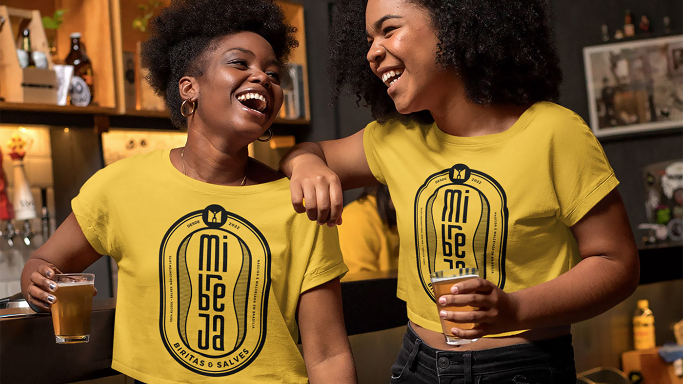
Criamos uma estampa com inspiração em rótulos de cerveja como elemento ilustrativo da marca, sempre com irreverência, trocadilhos e bom humor, para reforçar os atributos da marca.
illustration and print
We created a print inspired by beer labels as an illustrative element of the brand, always with irreverence, puns and good humor, to reinforce the brand's attributes.


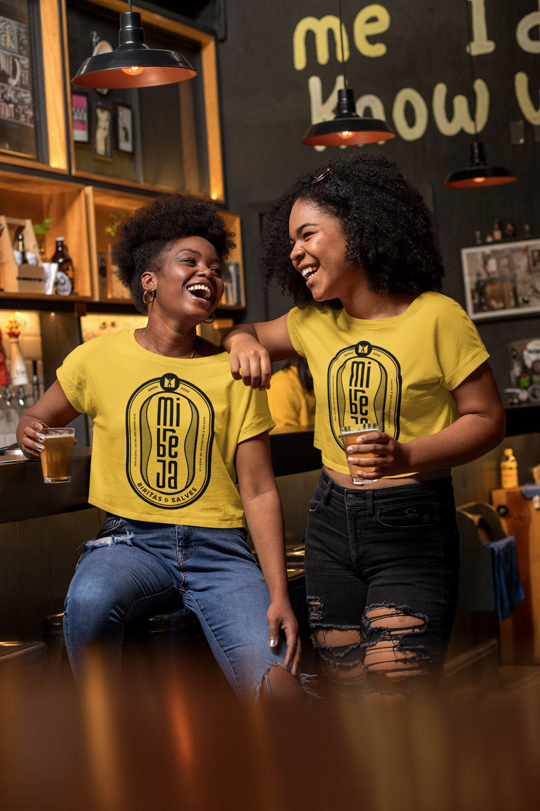

Estampas para casacos Mi Breja / Hoodies design for Mi Breja
ponto de venda
Havia uma necessidade de criarmos inicialmente um letreiro que se destacasse no comércio onde fica a loja, pois situa-se em uma posição contrária à rua onde tem maior circulação de pessoas.
Fizemos um projeto com diversos itens de divulgação e promoção do espaço, como painel da loja, windbanner, placa indicativa, imãs para o delivery, ecocopos, ecobags e até um “cheirinho” para carros, fruto de uma parceria de apoio social aos lavadores de carro da quadra, o que ajudou o público a ter relação e interação com a marca desde seu lançamento, até o reconhecimento, afetividade e pertencimento pela comunidade frequentadora.
store
There was a need to initially create a sign that would stand out in the commerce where the store is located, as it is located in a position opposite to the street where there is greater movement of people.
We made a project with several items to publicize and promote the space, such as the store's panel, windbanner, indicative plate, magnets for delivery, eco-cups, ecobags and even a "smell" for cars, the result of a partnership of social support for car washers. car da quadra, which helped the public to have a relationship and interaction with the brand from its launch, to recognition, affection and belonging by the frequenting community.


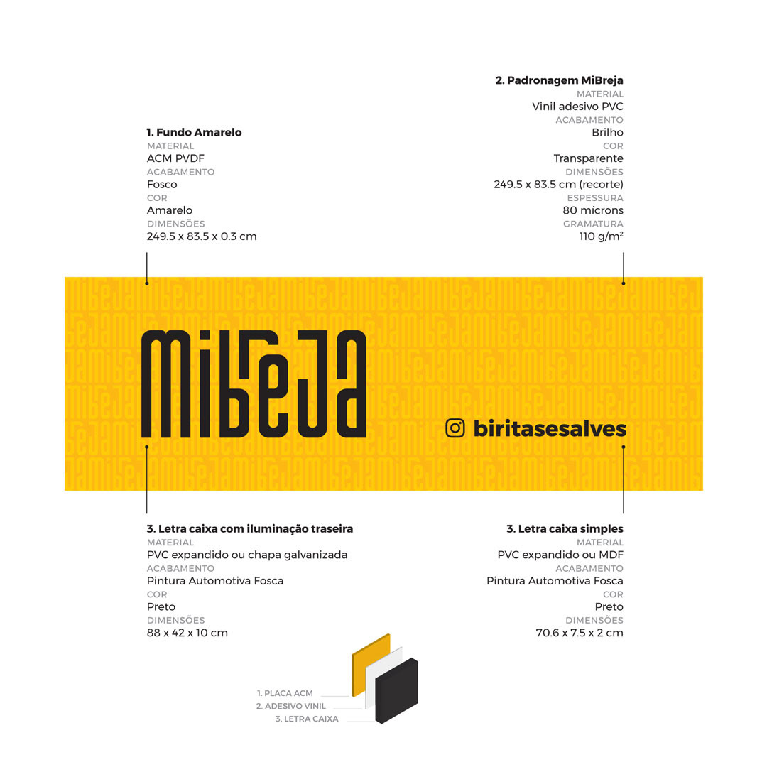

Projeto do painel da loja / Store panel Design


sinalização signaling


divulgação disclosure


Ecocopos / Eco cups
conclusão
A importância do branding, desde a concepção do negócio, como modelo de gestão.
Muitos empreendedores ou gestores costumam se atentar à importância do branding em suas corporações ou empresas somente quando se tem algum contato ou certa experiência profissional. Ou pior, em um momento de crise no qual os recursos financeiros e emocionais estão escassos, muitas vezes à beira de um colapso ou num cenário irreversível.
Talvez a necessidade de profissionalização ou diferenciação em mercados saturados onde o acesso tecnológico é o mesmo para todos concorrentes, fazem com que percebam tal importância muitas vezes tardiamente.
Branding requer planejamento, constância e tempo. Tempo para (re)pensar, (re)entender, (re)aplicar, (re)engajar e (re)mensurar. Por isso, quanto antes essa importância for devidamente valorizada, até mesmo antes de se pensar o negócio, é bem possível que o caminho será só de ida, com o tempo a seu favor.
conclusion
The importance of branding, from the conception of the business, as a management model.
Many entrepreneurs or managers tend to pay attention to the importance of branding in their corporations or companies only when they have some contact or certain professional experience. Or worse, at a time of crisis in which financial and emotional resources are scarce, often on the verge of collapse or in an irreversible scenario.
Perhaps the need for professionalization or differentiation in saturated markets where technological access is the same for all competitors, makes them realize this importance often belatedly.
Branding requires planning, consistency and time. Time to (re)think, (re)understand, (re)apply, (re)engage and (re)measure. Therefore, the sooner this importance is properly valued, even before thinking about the business, it is quite possible that the path will be one-way, with time in your favor.
• • • • • • •
Este e outros projetos também estão disponíveis em:
This and other cases and projects are also available on:


