

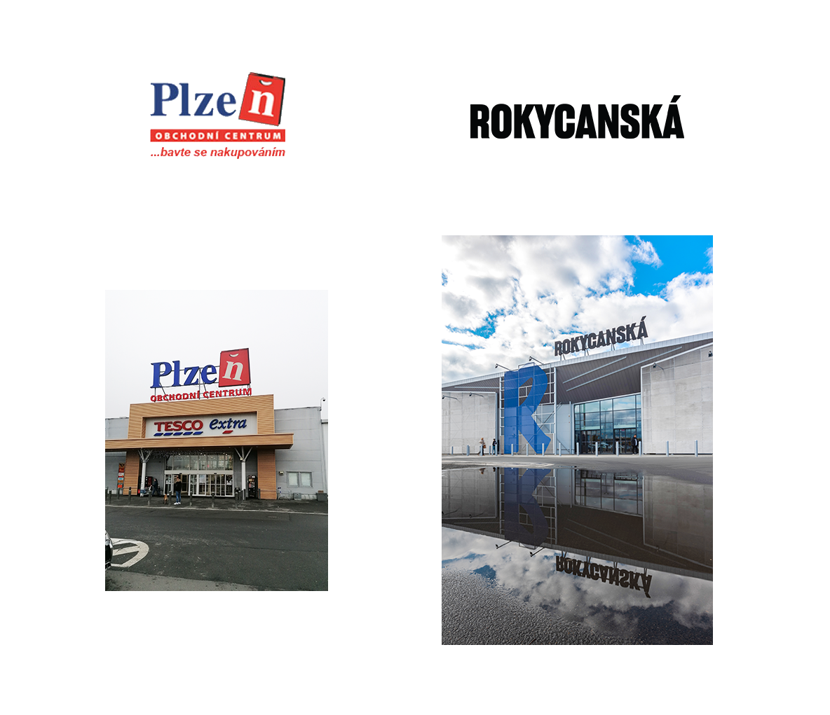
Rokycanská Shopping Center
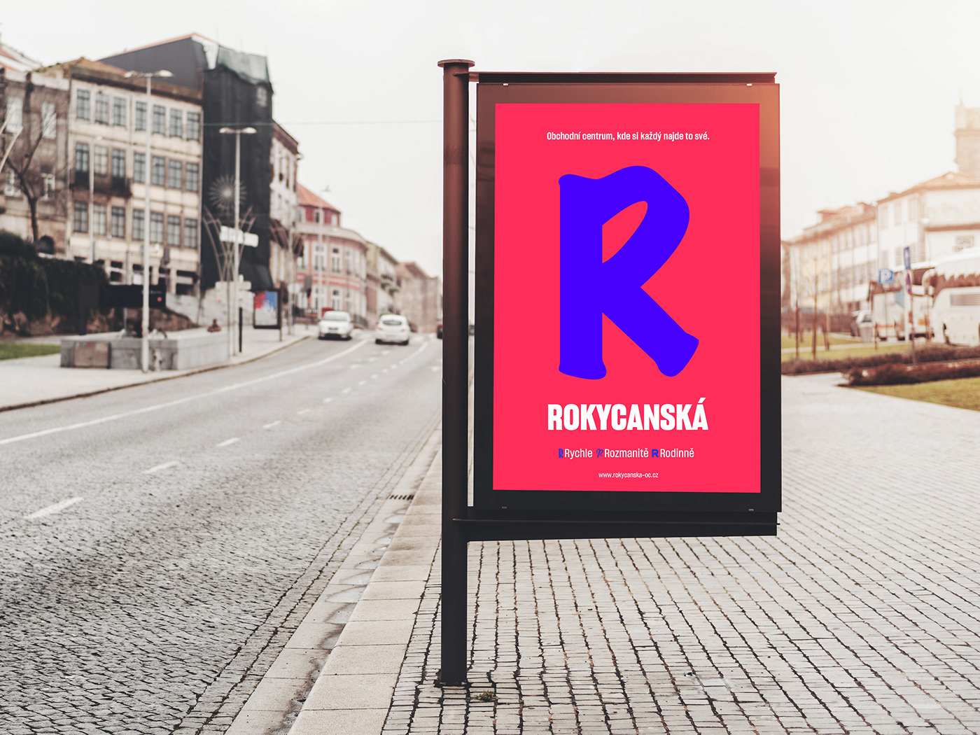
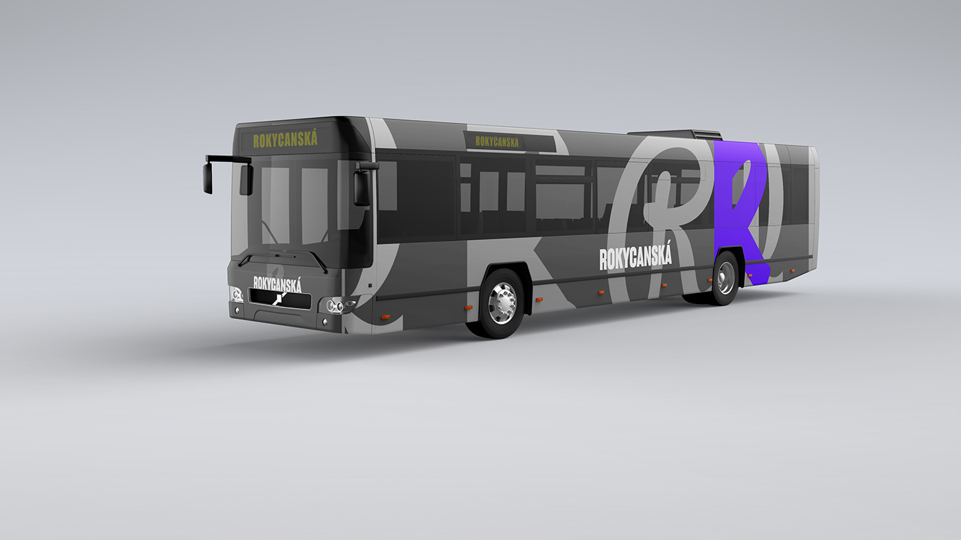
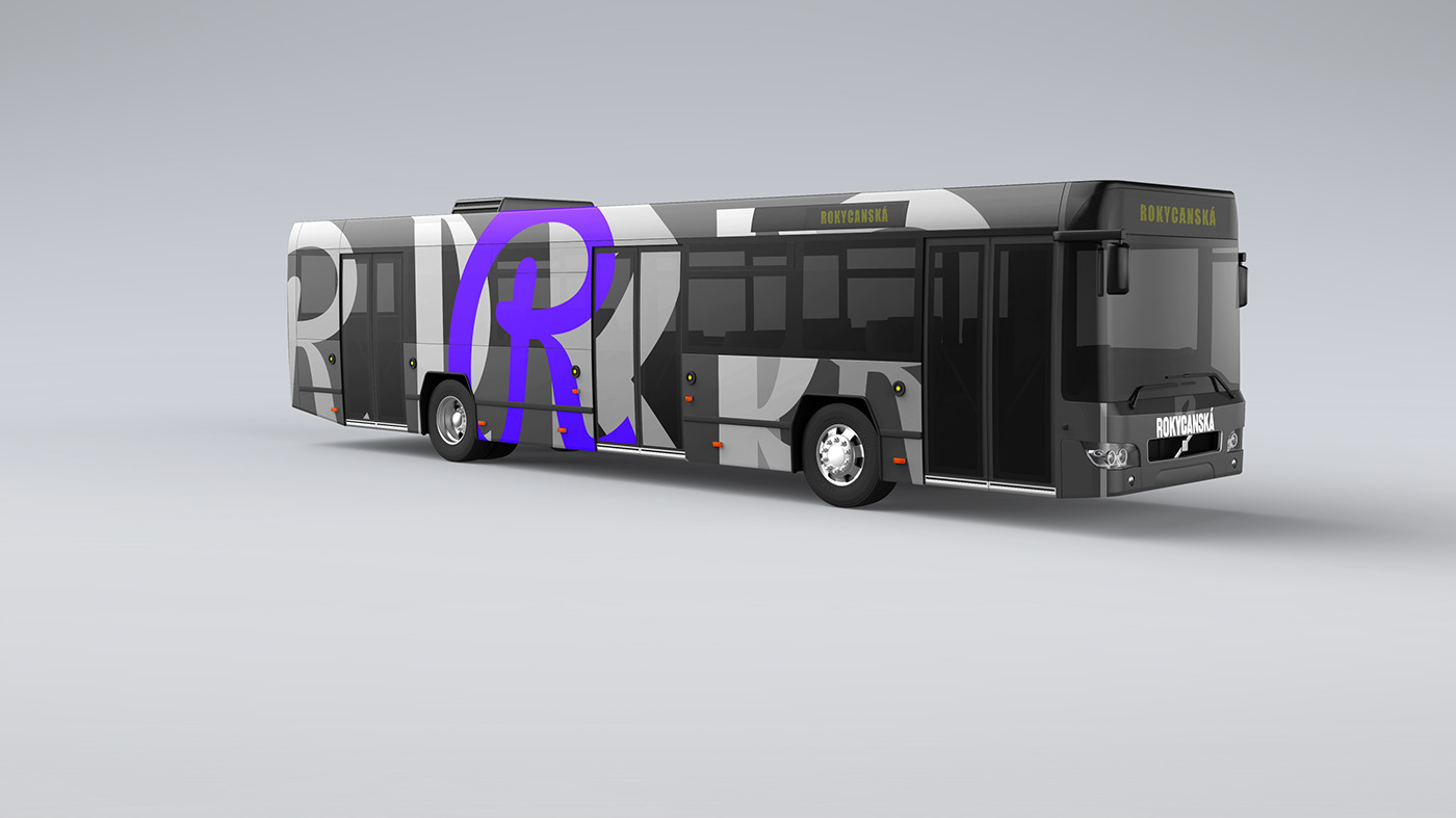
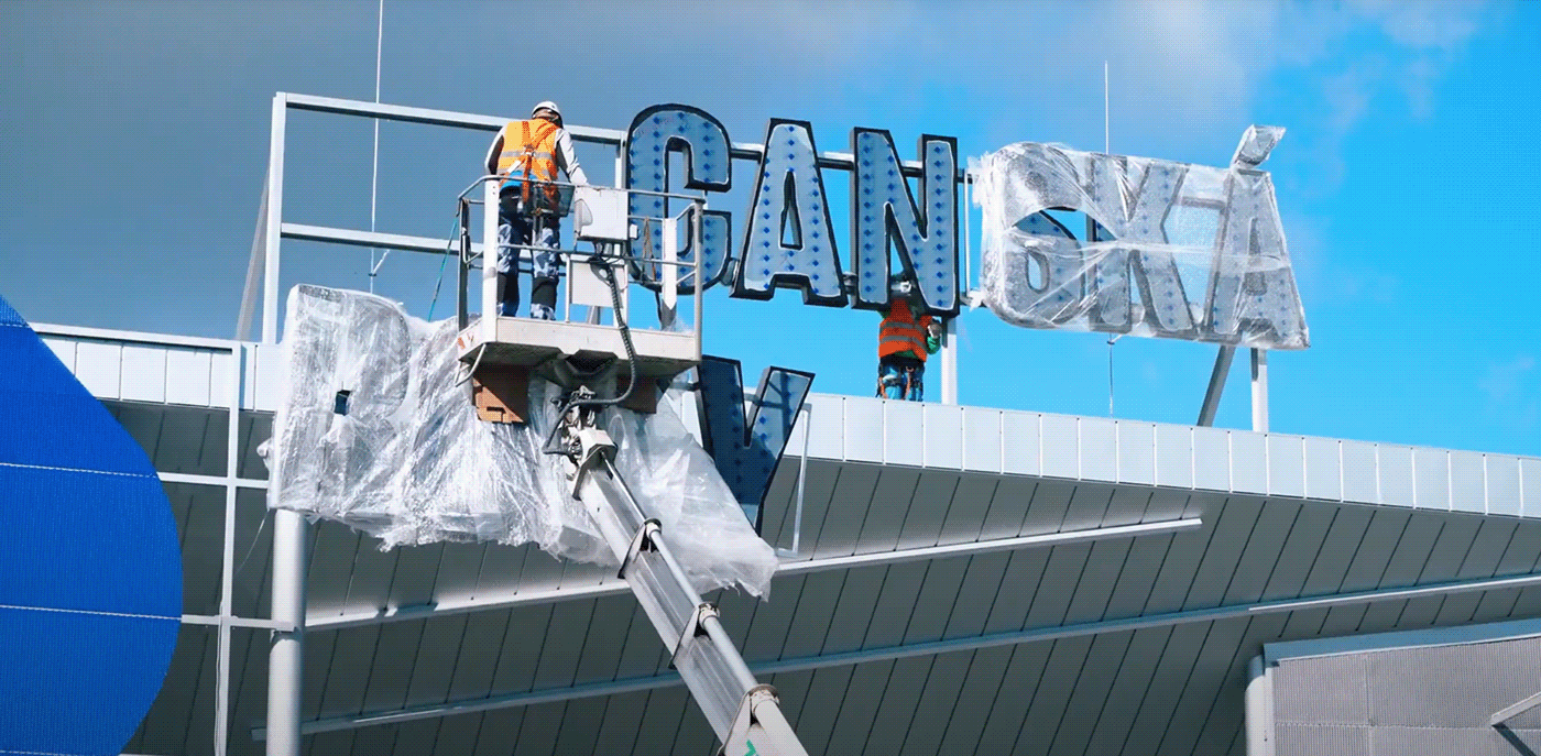
The first shopping center in Pilsen got stuck in the 90s and desperately needed a rebranding. The typical standard of shopping center branding is not very high, so we took a challenge and disrupted this. For the new era, we came up with a new name, based on its location – Rokycanská street – and we pushed the whole visual to something very visible, easily recognizable, yet simple. This is our vision of what a shopping center brand can look like. Built strongly on typography and flat colors.

The primary colors are IK Blue with Magenta, a very vivid and almost "too-much" combination.
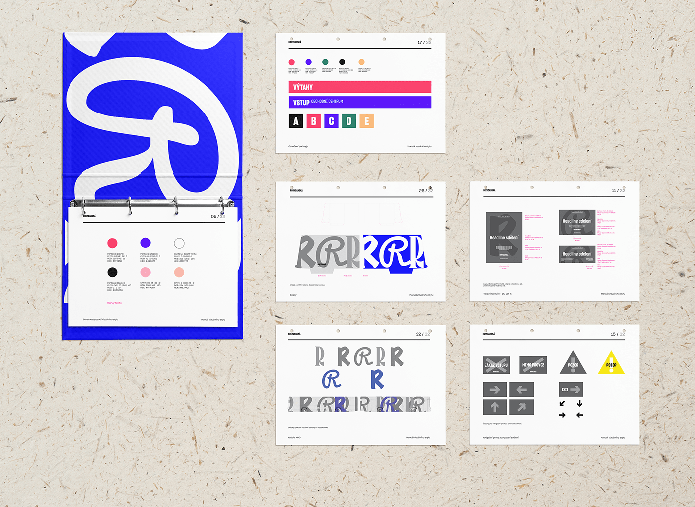
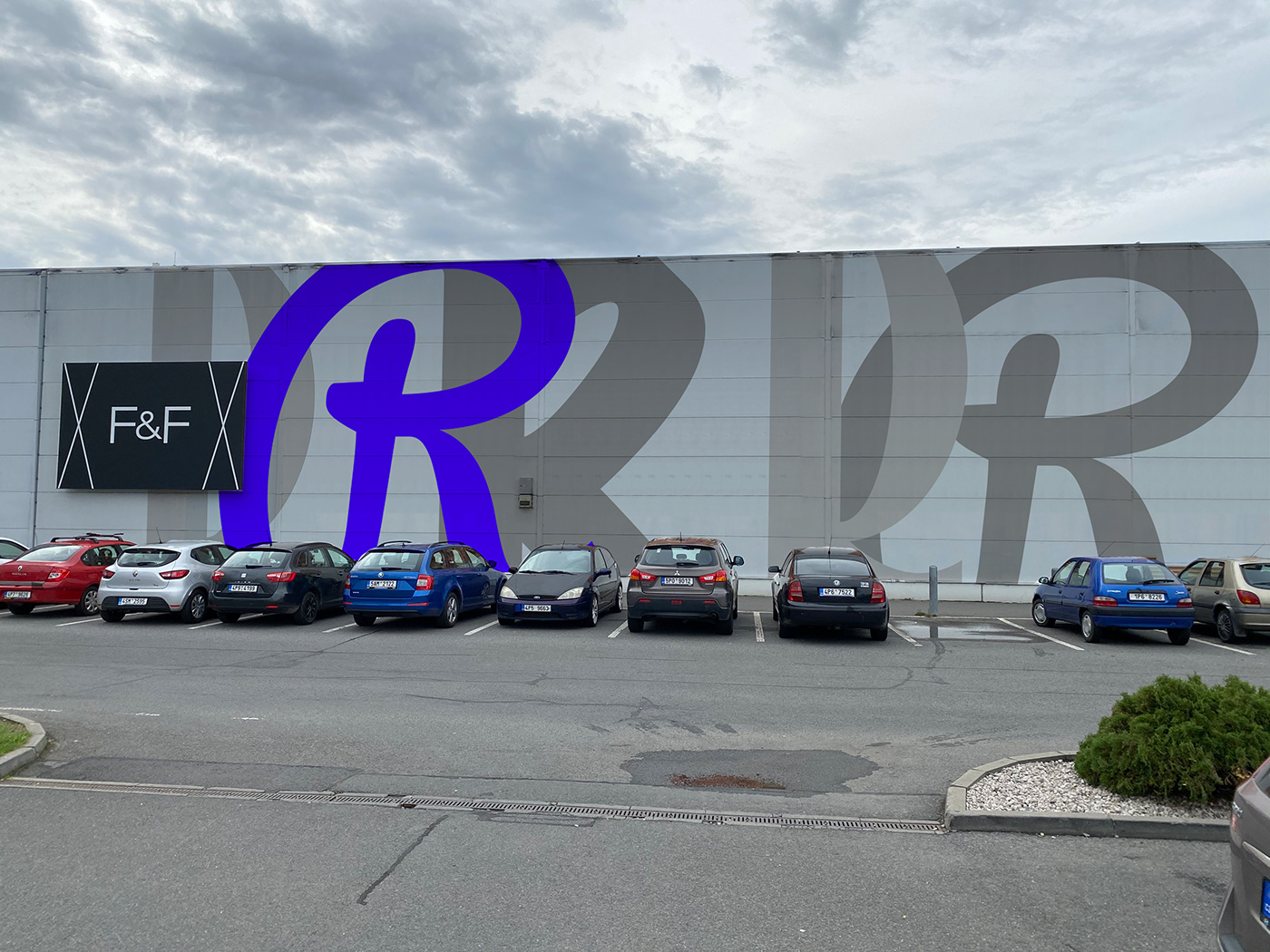
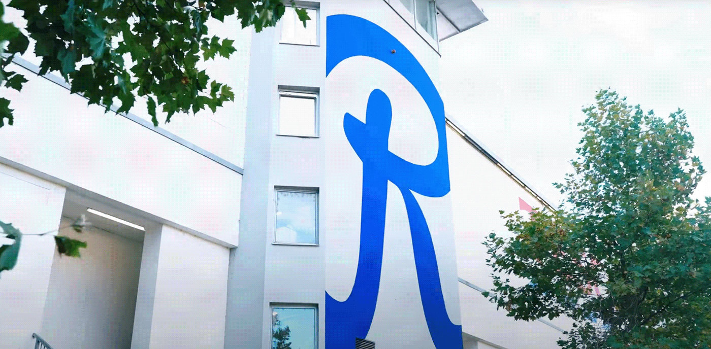
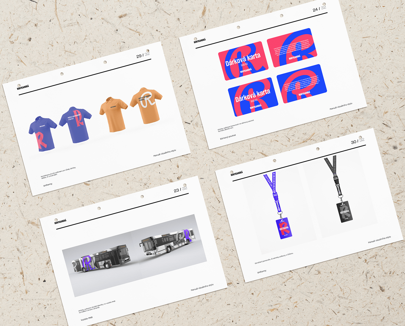
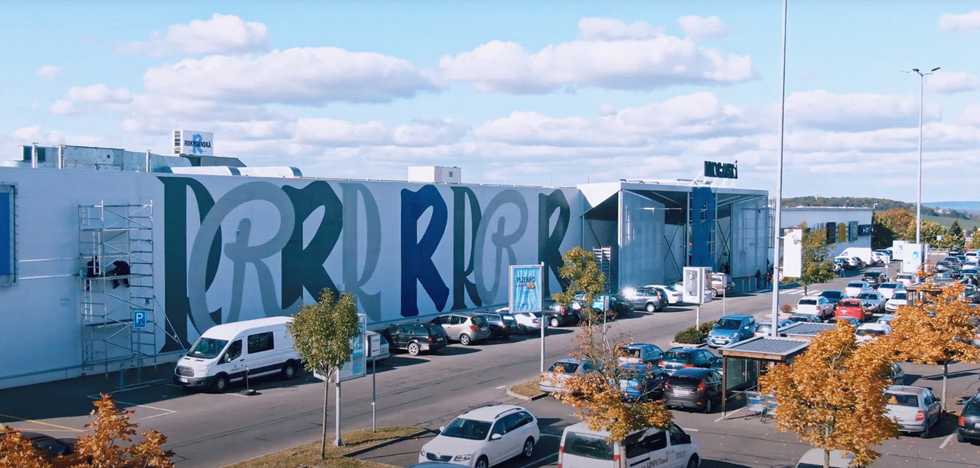
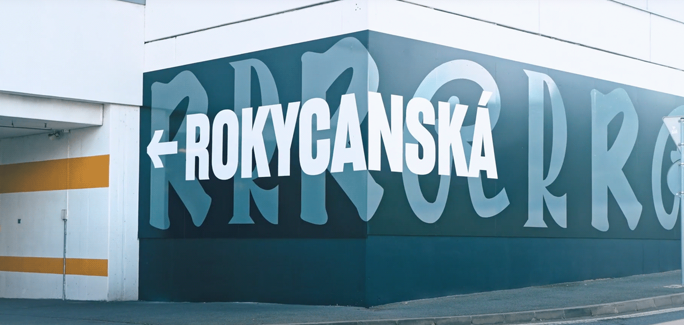
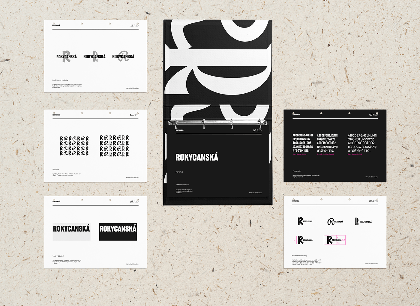
Typography is the main element of this identity. We used multiple typefaces to display the main letter "R", showing Rokycanská many faces.

Thank you.


