UX Tracking App Design
This was my first paid UX project as a designer. The client offers a free-to-use open-source software tracking site. The problem: poor reasoning of the web app's flow. While navigating between the company's dynamic app site and its static marketing site, users could dead-end in various places. Plus, the layout of the tracking page was less than ideal, and it was missing some vital elements.
Using the company's brand colors, I came up with a smooth, attractive layout for the app that solved many of the navigation issues. While the company was not ready at the time to consider such a high-fidelity mockup, I'm very proud to show off the work I did.
Note: I've removed the company's name, logo, and product name from the design to protect their privacy.

The sign-in box is intended to overlay the home page. Users can sign in the traditional way or with a GitHub account.

If users haven't created an account before, they're invited to finish signing up on this page. The email address and password boxes automatically populate with the info the user entered earlier for an easy, seamless experience.

On first login, users are invited to create a domain object so the data tracking (Insights) page can pre-populate with charts and graphs. The cute cat is suggestive of the GitHub mascot, branded for the company. The subhead copy informs users of the "what" and "why" of the process. A line of copy below each button explains the purpose of each domain object. The icons for these objects also appear on the navigation bar.
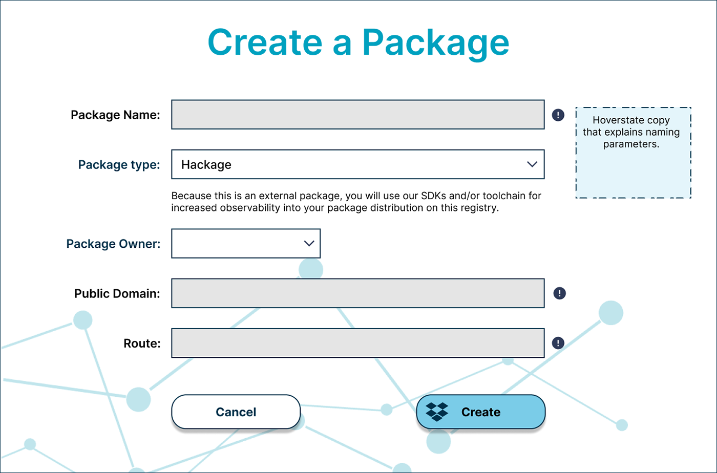
Here is where users can create a package. The little exclamation icons give users hints on naming conventions and URL formats when users mouse over them. The object icon appears on the "Create" button to remind users of where they are.
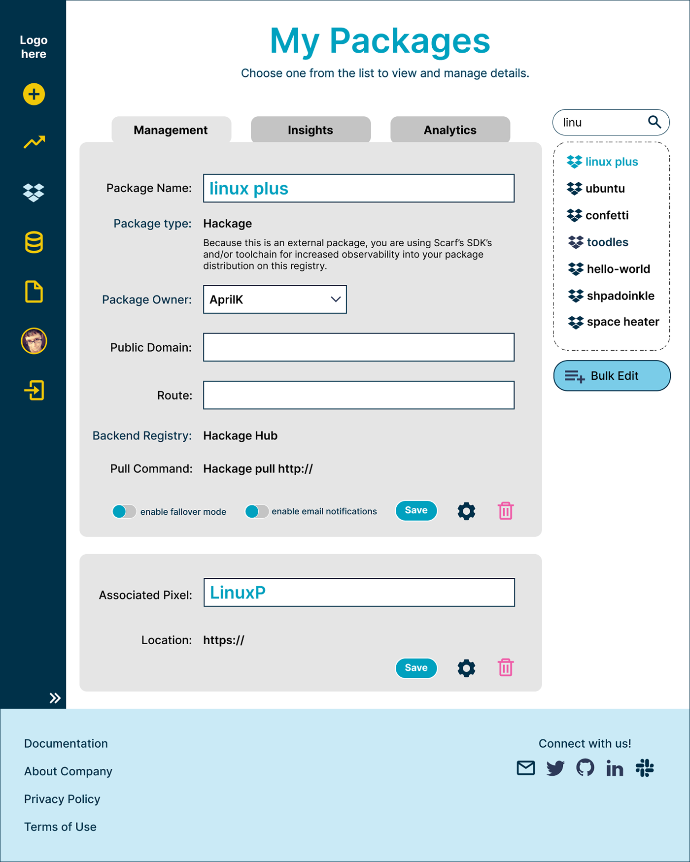
Once the user has created their first domain object, they're taken to the object's management page (above). At this point, the left-hand navigation menu and site footer become visible. Selected files and menu locations are indicated by lighter/brighter colors. A clickable double arrow at the bottom of the nav lets users expand to a wider menu with labels. Users can navigate to the company's homepage by clicking the logo at the top of the menu. A tabbed design keeps the page within the site's scrolling limits.

This is the insights tab of the Packages page. Here, users can see individual stats on each package they've created. A drop-down menu near the top allows them to collate stats over different time periods. A small search bar brings the desired package to the top of the selection list as the user types.

This is the global Insights page, where users can see stats based on their total created objects (by type). After their first login, users start from this page.

If users have not yet created a certain type of domain object, they receive this message on its tabbed page.

Here, users can manage their product account. The avatar they upload appears in the left-hand menu and at the top of the website (not shown) to indicate that the user is logged into the site. Users can make in-line changes to any section and save them without leaving the page or dealing with pop-ups.
I produced some additional screens for this design, but these are the ones I chose to showcase.


