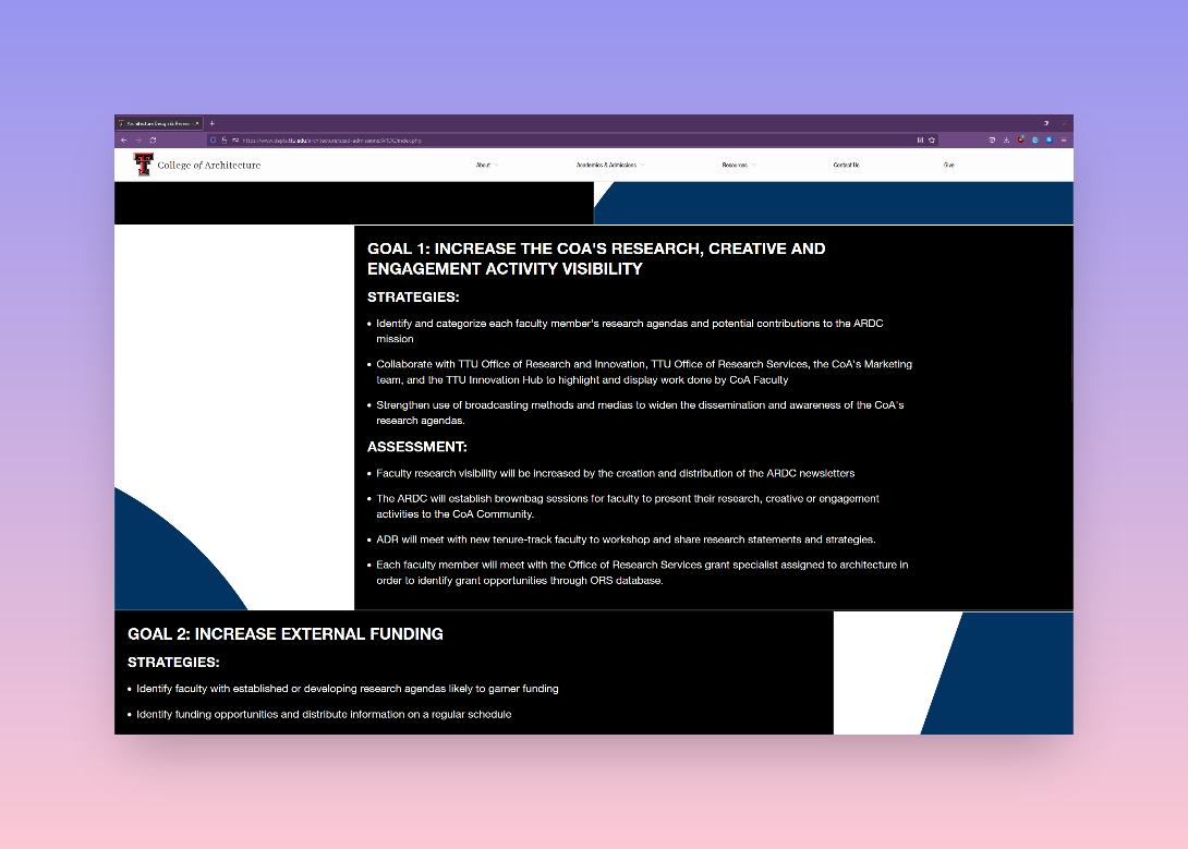
Before starting full-time with the College of Architecture, I was hired freelance to help finish the website. I was tasked with writing a text scaler that would fill the content boxes the same way at any size. I warned the college that this was not user-friendly, but aesthetic was more important that user-friendliness. The site at the time was a set of two grids, both written with CSS Flexbox and with a desktop-first mentality. I then added a third for our people directories using CSS Grid.
Once hired, our university made changes to the CMS system that broke one of the Flexbox grids. I suggested rewriting the Flexbox grid system to fix the issue, and thus set forth updating and refining our site’s code.

The current implementation is the result of this work. The website uses mobile-first CSS Grids based on our print design templates to digitally recreate our 1:1 or 2:1 designs. The grid allows for some flexibility such as content-focused 3x1 designs.
The grids are built as rows. The outer <div> declaration sets the ratio (1:1, 2:1, etc.) and the inner divs serve as the boxes. Each inner container can be set as ‘text’ for proper text scaling/leading or ‘image’ to fill containers with an image. The code rhythm is meant to make page template easy to write and understand in case the original developer (hello!) leaves.


The refinements have also created the side effect of creating a more accessible pages. Images are not hidden as backgrounds and can be captioned. And a bit of redemption: I have rewritten the text scaler to be a user-first design. The scaler factors type hierarchy based on the system’s default font size.
My current work with the website involves improving user-friendliness: better leading and light/dark modes, for example.
