We love Wikipedia. The idea of a constantly updated knowledge base where everyone is welcome to read and contribute is staggering, and we dip into this great pool of content on an almost daily basis at 1910. However, having spent the last three years learning more about typography have made us aware of it’s limitations. While Wikipedia is great for learning, it simply does not provide the best possible environment to do this.
While big parts of the internet have gone through an amazing journey in terms of typography these last years, Wikipedia’s reading experience is still stuck in the 90’s. We wanted to take a few days and propose a direction through which Wikipedia could move forward, focusing on articles and reading without necessarily having to change too much of what it is and should continue to be.
We do realize that this humble experiment of ours is uninformed, and that what we propose here would have to be reconsidered if done for real, but for the sake of getting the point across we wanted to focus on one thing only - making Wikipedia readable.

Wikipedia Today
Wikipedia today is great in terms of content but not in terms of presentation. For a site with the core purpose of delivering articles to readers, the reading experience just isn’t what it should be. The text is too small, the lines are too long and the leading is too tight. Pictures are tiny and the general layout includes a lot of visual noise that distracts you from the actual reading.

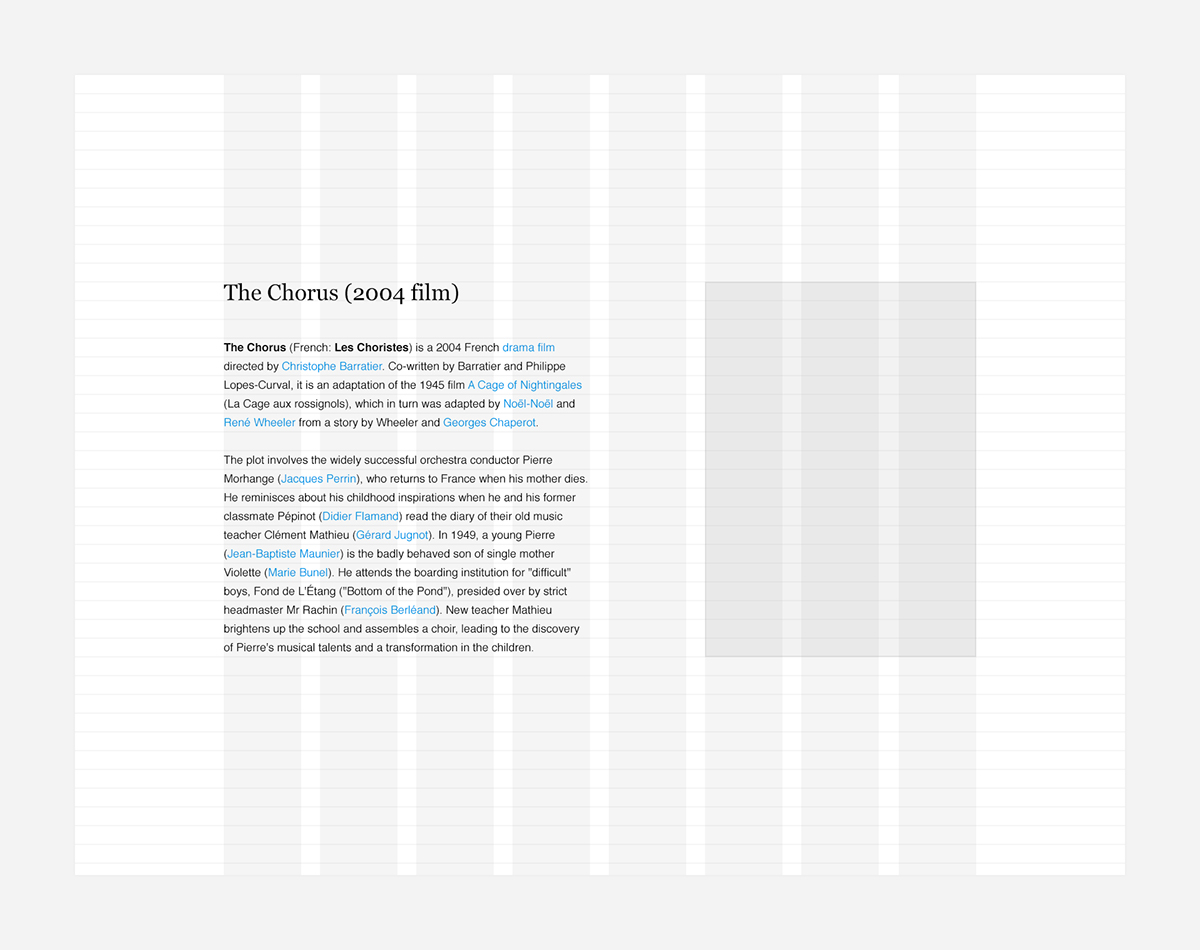
Constructing the Grid
As always when constructing grids we like to start with the typography. We wanted to push the content to the center, use a readable text size, fix the measure at an appropriate length, increase the leading, make the images bigger, and provide a proper structure with adequate white space and an easy to follow hierarchy.
On desktop, we wanted to make room for the main text paragraph and an additional side-bar including images and tables to the right. We also wanted a design that could easily adapt from desktop, to tablet and mobile, without requiring additional apps or mobile versions of the site.
Starting with the text size (as described in detail here) we eventually ended up with an 8 column grid where the body would span over the first four. The grid would then scale down to 4 columns on tablets and 2 columns on phones, moving side-bar content below it’s corresponding paragraphs.
The Desktop
With the primary body column and side-bar already in place, populating the rest of the page was relatively straight forward. We wanted the header to focus on search and made the old side-menu horizontal and placed as a secondary header, not to distract you from the reading while scrolling down the page.
The rest of the elements were basically left unchanged apart from being adjusted to fit the new grid and structure. The typefaces and colors were left similar. The result is a page that still looks and feels very much like Wikipedia, but is much easier to read.

The Tablet
The tablet version scales the grid down to four columns, moving the side-bar content below it’s corresponding paragraphs. Other than that not much is changed. The second header menu is hidden and accessible from a menu button in primary header.

The Phone
The mobile version scales the grid down to two columns with shorter lines to keep the text at a readable size. Secondary sections are closed by default and oped by tapping the headline, to make articles less heavy to scroll through.

Conclusion
While these sketches are far from feature full, we do think they provide an insight into how big of a role typography and grid structure plays in making the web accessible today. This is the Wikipedia we ourselves would like to use, and we greatly look forward to see how Wikipedia will develop in the following years, in regards to making the site more pleasant to read.
–
Original article and high resolution images here.


