


Piaf
Naming, logo and corporate identity for an electronic cigarette manufacturer
Russia.
About the Client
Piaf is a new brand of premium quality electronic cigarettes. The company has just entered the market, but it is already ready to impress its customers with a wide range of bright flavors from twenty mixes on the shelves of vape shops. The advantage of the company lies in the longevity of its products. Piaf electronic vaporizers last longer than competitors' analogues.
Task
Develop a name and identity that can reflect the rebellious nature of the brand and emphasize its premium status.
Naming
We needed to reflect the premium nature of the brand and its idea in the name: the company wants to be a friend for its customers who can be trusted when choosing an electronic cigarette.
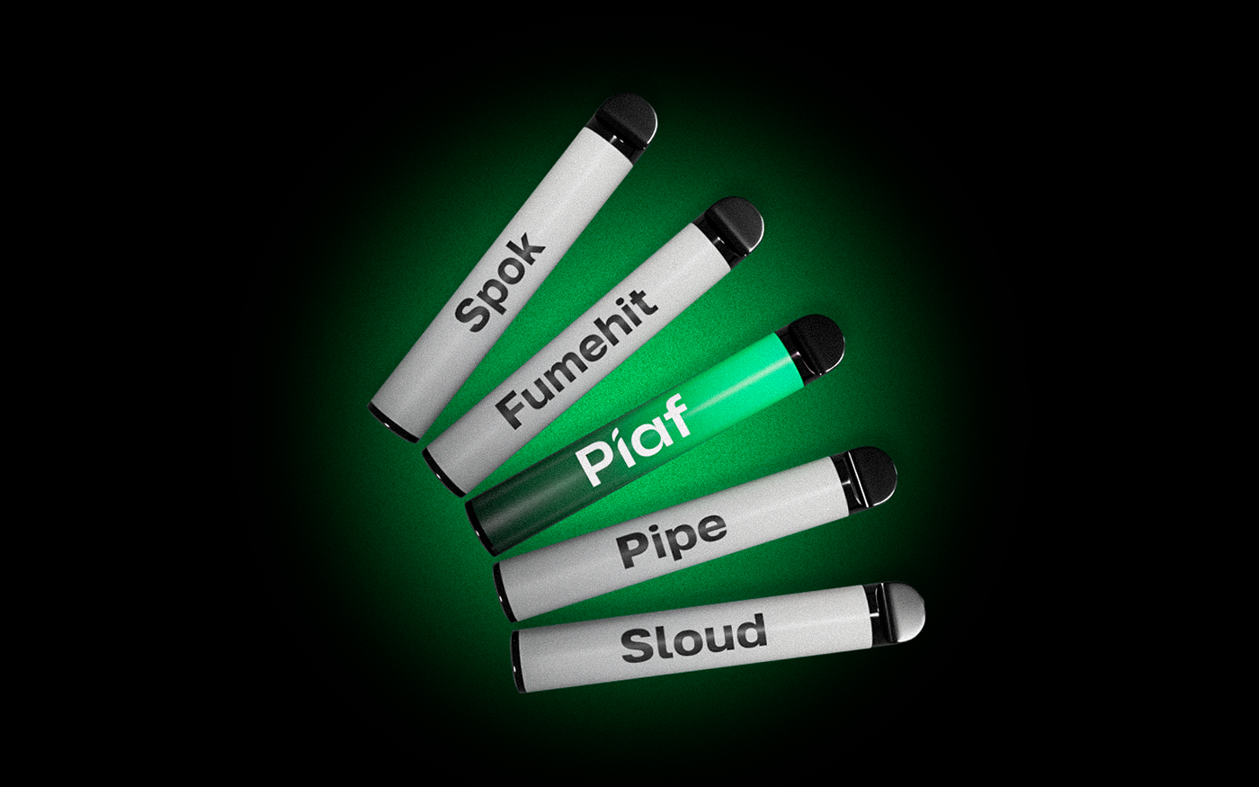
The following options were included in our shortlist:
Spok. It is the signature gesture from Star Trek, which means “live long and prosper”. It is a hint at the longevity of our client's cigarettes.
Fumehit (fume — “smoke”, hit — “success, luck”) evokes associations with the prestige and status that a person gets with an electronic cigarette.
“Pipe” is an element of the elite method of tobacco consumption. The smoking pipe is durable as are our customer's electronic cigarettes.
Sloud is consonant with the word “slow”. Immediately the image appears as a man who is smoking an electronic cigarette slowly, for a long time and a sweet cloud of steam is spreading around him.
The client settled on the “Piaf” variant (consonant with the word puff — "puffing" with a cigarette). The name is formed from the surname of the great singer Edith Piaf, who performed on the stage of Parisian cabarets.

Brand identity
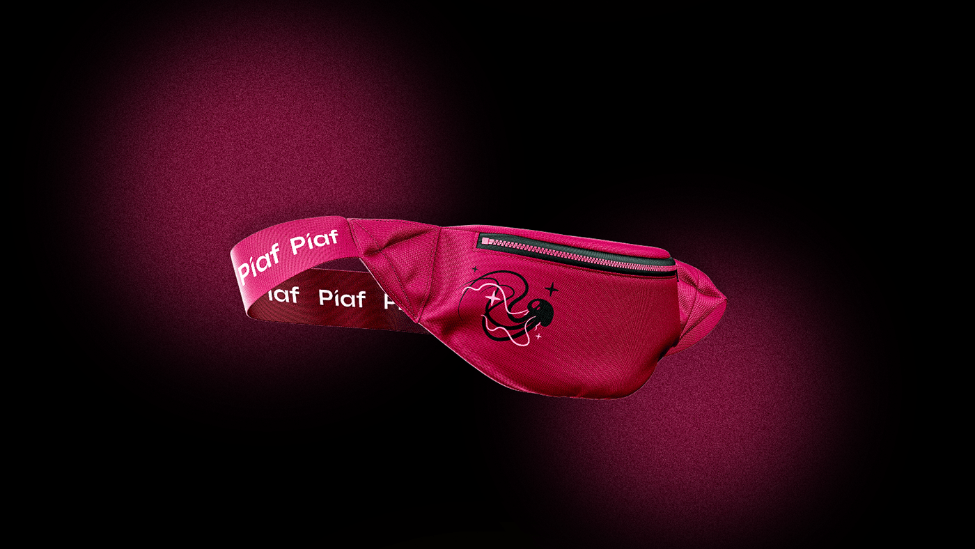
A person who chooses an electronic cigarette for smoking pays special attention to the degree of brightness of its taste. Therefore, we decided to fill the corporate identity of the brand with the plenty of colors and images that attract the attention of customers.
The designers were inspired by the space theme in the process of identity’s creation. The Logomachine team used images of celestial bodies to illustrate the transcendence and fantasticism of the emotions of a person who uses Piaf products.
In the font logo, the letter "i" is made in the form of an electronic cigarette. This is a reference to the products that the company produces. The basis of the font for the logo was a minimalistic Syne, but in the process of our work we customized it and changed several letters.
The corporate palette is based on the image of the night sky: bright green, purple and blue elements highlight on a deep black background. There are no strict confines on the use of colors in the corporate identity: the Piaf team can choose colors for branding media at will.
We chose Golos as a corporate font: it is homogeneous and easy to read. Manufacturers place a large amount of information on the packaging of electronic cigarettes: composition, storage method and technical characteristics of the product. The text should be well read, and a neat Golos copes with this task.
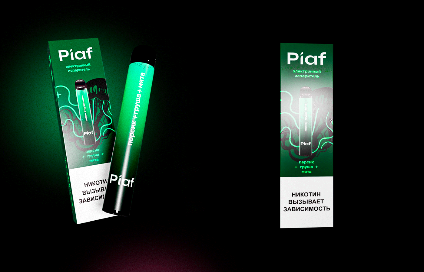
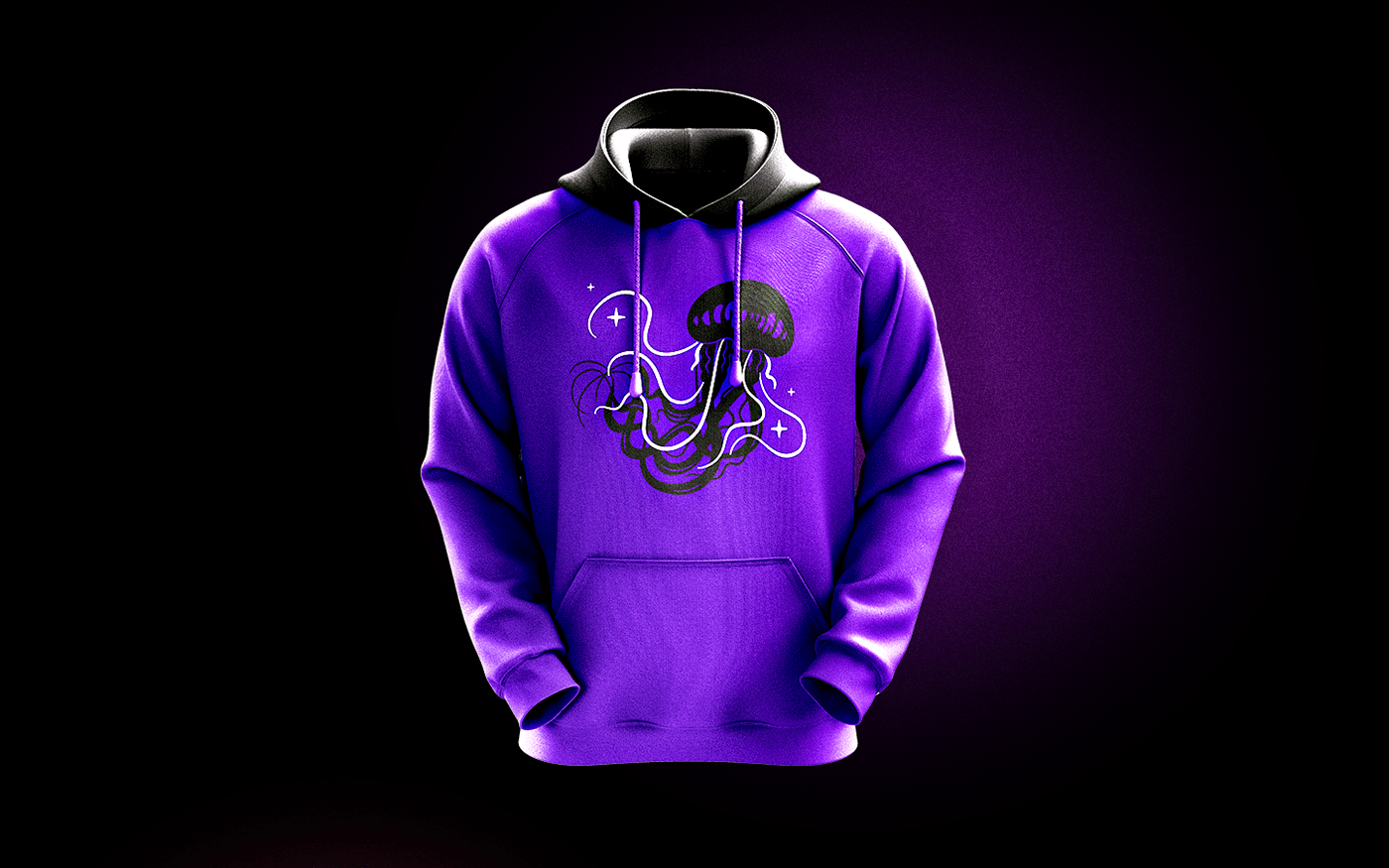
We created two patterns at once so that the company could use them for different product lines and stand out from the competitors with their bright design. The first pattern is “jellyfish”, the second is “brands”.
When developing the first pattern, we used the image of a jellyfish: its tentacles of different thicknesses resemble jets of cigarette smoke. We added stars to the jellyfish so that the sea image did not get out of the general concept.
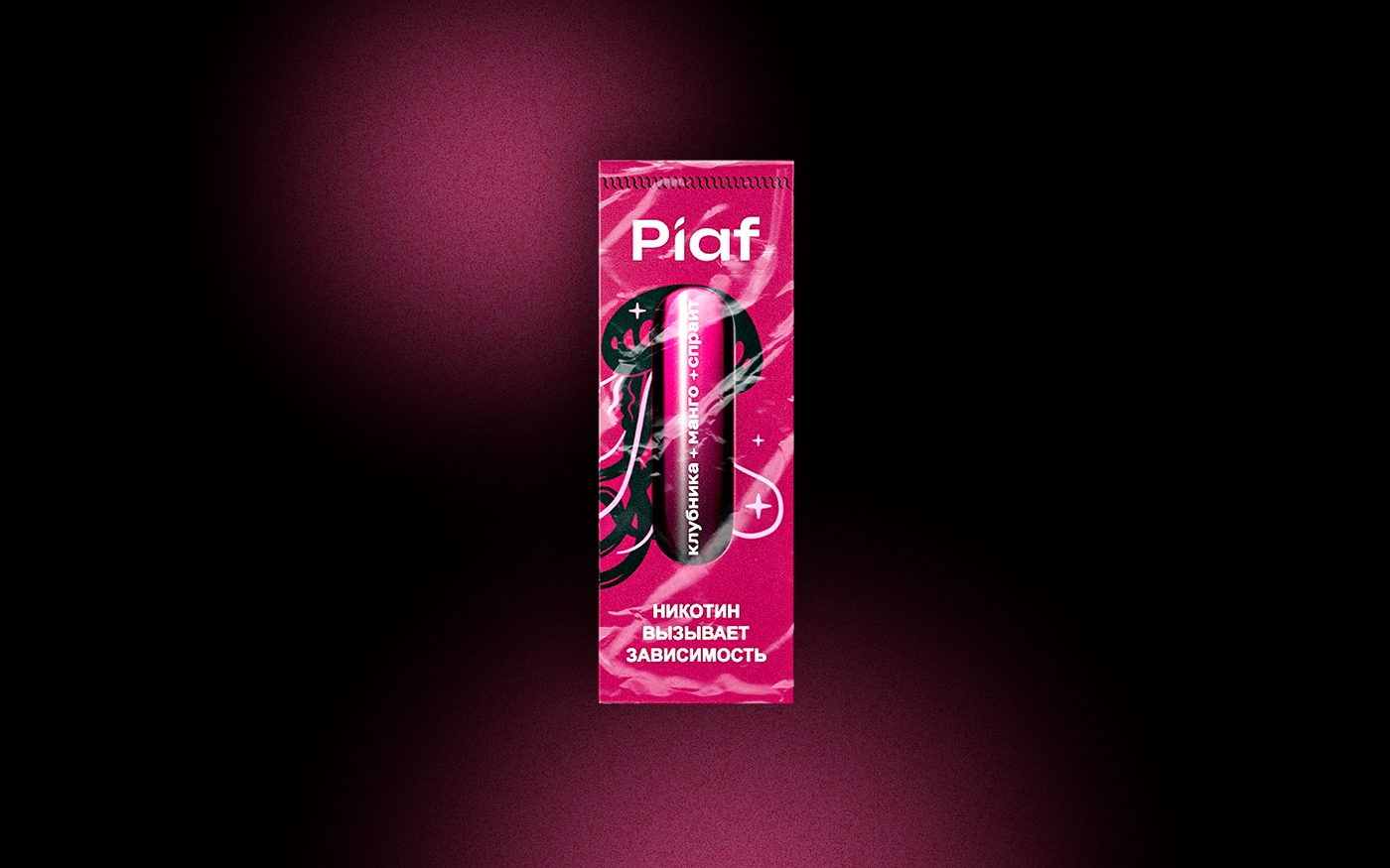
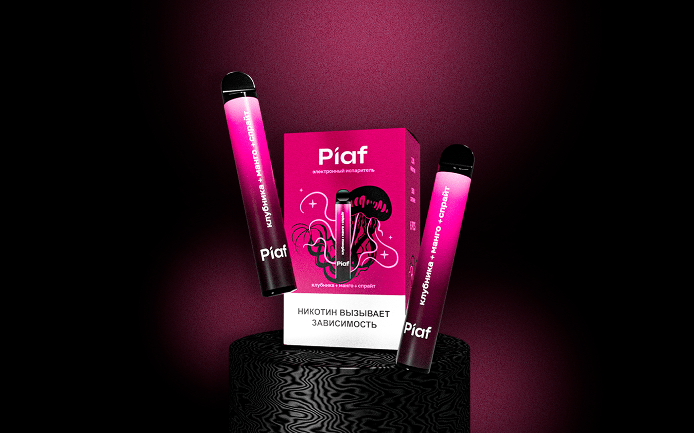
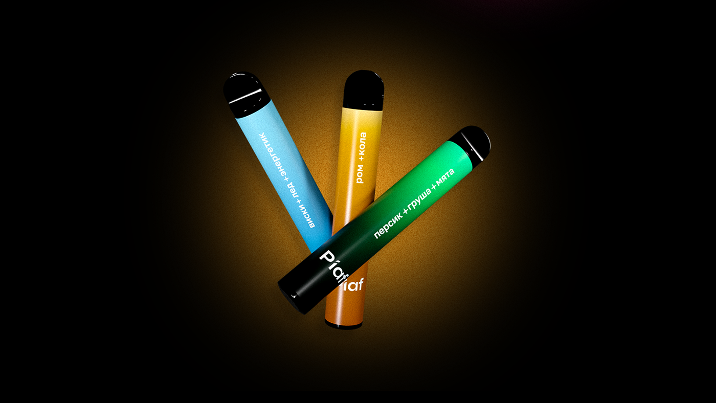

To label the flavors of vaporizers on the packaging, we have developed a "brand" pattern. The law prohibits manufacturers of electronic cigarettes from using images of food in the packaging design, so we have created illustrations that seem to be fruits.


Thank you!
Do you like the Piaf corporate identity?
Share your opinion in the comments!
Logomachine studio


