


Tripolis-Park provides a new vision for today’s workforce; a high-performance office space, with cutting-edge standards in sustainability, wellbeing, and technology.
Tripolis-Park is built in harmony with existing heritage buildings and green spaces. Upgrades to the structure of the existing office complex are combined with a large-scale new structure - the ‘landscraper’. The result is a bold, forward-looking campus that promises to be a dynamic and nourishing work environment.
We’re pleased to have been involved from the early stages, developing all things brand related — from naming and brand identity, through to films, website, books and digital art. What a project. What a team.

Too big to fit
The landscraper design of the new and groundbreaking building, designed by MVRDV, served as inspiration for the logo design: too big to fit on the canvas. The oversized logo doesn’t fit on a business card or a tote-bag for instance. It’s simply too big. Can you make the logo bigger? Of course.


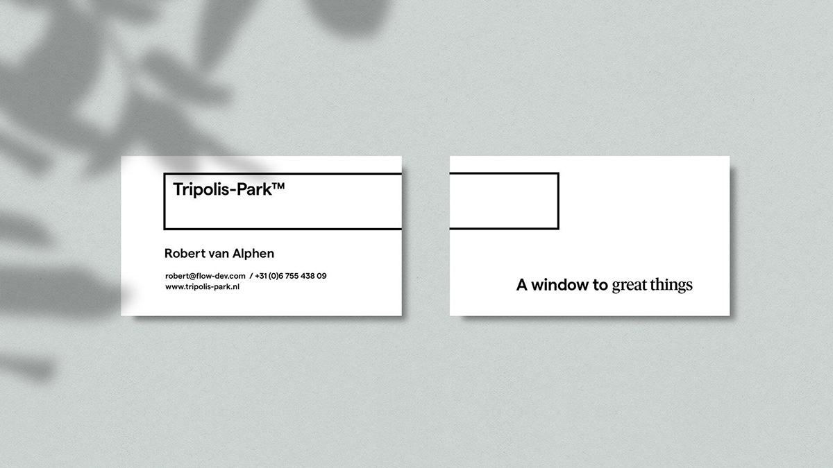


Typography
Tripolis-Park combines modern and heritage buildings. We took the same approach with typography and carefully selected two typefaces: the sans-serif Matter feels modern and trustworthy, with a subtle warm touch, while the classic serif font Ivar feels graceful, and refers to the rich heritage of the campus. The combination of the two creates a distinct character to the design.


Website
Not only the logo is inspired by the spectaculair dimensions of the landscraper. We’ve expanded on this concept and crafted a website with a horizontal layout.

✌️ Thanks for watching


