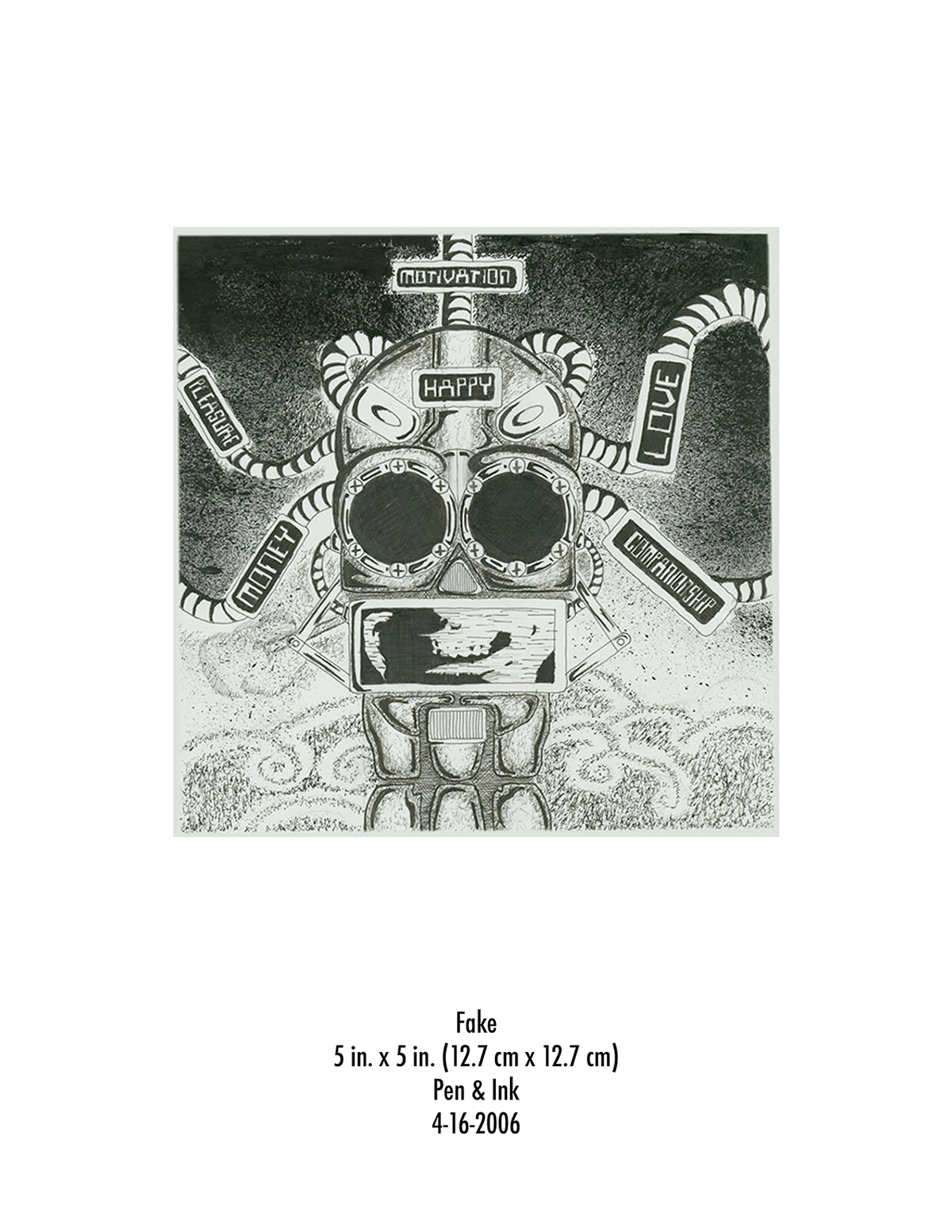
Trying to represent the significance of falsity with an image. Sort of like Pictionary with a few words.
Technique: Black Ink
Technique: Black Ink
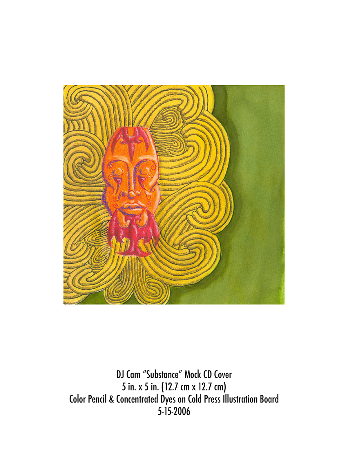
This was assigned to redesign a pre-existing album cover of a musician. I decided to make DJ Cam's "Substance" album a little more relevant. This is the first version. Visually what I would do is listen to the album and make sure I got the general feel and then based on the sound and themes of the album I came up with this image.
Technique: Concentrated ink dyes and color pencil.
Technique: Concentrated ink dyes and color pencil.

The theme was "the artist obsessed".....what is this guy obsessed about?
Technique: Digital illustration (Photoshop)
Technique: Digital illustration (Photoshop)

Gray & black monochromatic color pencil study project.

Gray & black monochromatic color pencil study project.

Originally a beer label but I wanted to use alliteration so it went from a beer to a root beer. This is the black version of the label without any text just to show the detail of the design.
Technique: Digital illustration (Photoshop)
Technique: Digital illustration (Photoshop)

As an assignment for texture on Photoshop, I decided to play around with my horoscope to create a theme for a calendar.
Technique: Digital Illustration
Technique: Digital Illustration

Just a random design based of tribal style tattoos and ink blot tests and attempting the an aging technique.
Technique: Mixed media
Technique: Mixed media

This was a test "sketch" in my attempt on using texture. I liked it so much that I decided to title it on how I was feeling knowing I was going to be an uncle.
Technique: Mixed media
Technique: Mixed media

Decided to do a "flyer" of a pseudo group called "The Cthulu Underground"
Technique: Mixed media
Technique: Mixed media
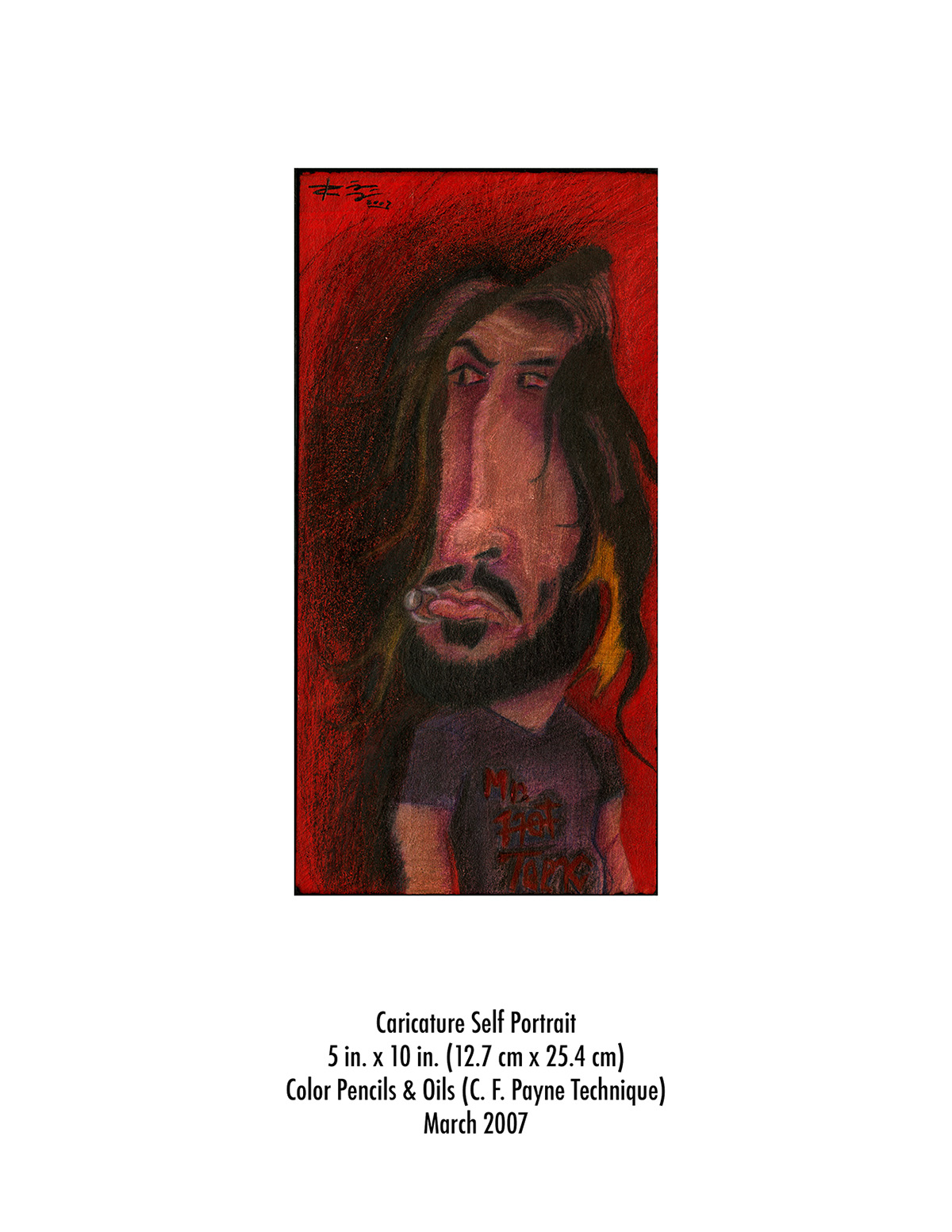
A caricature version of myself using the C.F. Payne's technique.
Technique: Color pencils
Technique: Color pencils


In this I had to design a paint bucket based on the company's products.
Technique: Scanned drawings & Digital Ilustration (Illustrator)
Technique: Scanned drawings & Digital Ilustration (Illustrator)

In this I was assigned to make a self-portrait in the style of a master. So I decided to do Skip Liepke.
Technique: Oils
Technique: Oils

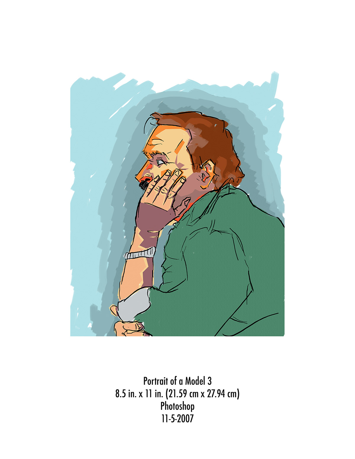
Having a model at hand, this is my first attempt to stylize the picture to more or less what I do as portraits today.
Techinique: Digital Illustration (Photoshop)
Techinique: Digital Illustration (Photoshop)
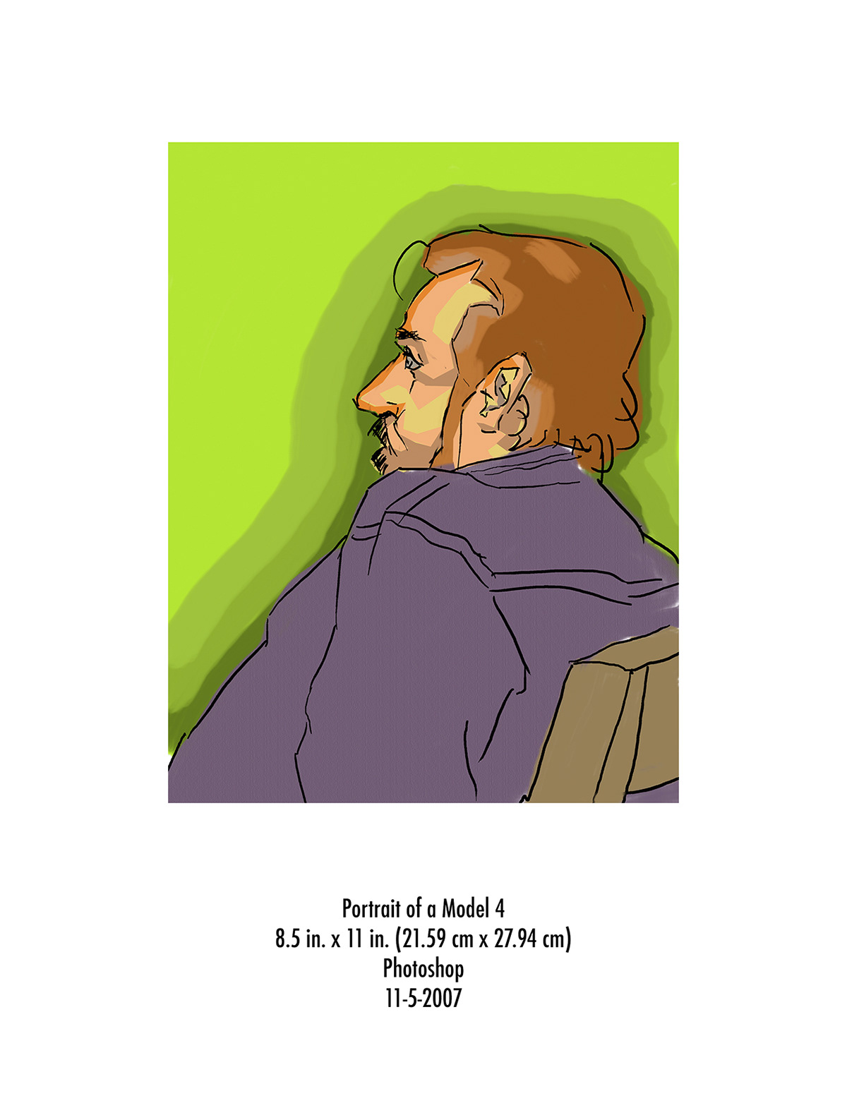
Another attempt to draw a model to the style I do today.
Techinique: Digital Illustration (Photoshop)
Techinique: Digital Illustration (Photoshop)
Another attempt to draw a model to the style I do today.
Techinique: Digital Illustration (Photoshop)
Techinique: Digital Illustration (Photoshop)

Intended to be placed for a Rolling Stone Magazine Cover. It was meant to represent Rob Zombie's movie revision of John Carpenter's Halloween.
Techinique: Scanned drawing & Digital Illustration (Photoshop)
Techinique: Scanned drawing & Digital Illustration (Photoshop)

Another CD assignment of a faux death metal band called "Bruce's Chin" with the album titled "Who's Laughing Now". If you haven't guessed the reference then here's my hint. Deadites and a chopped off hand-turned-chainsaw.
Techinique: Scanned drawing and Digital Illustration (Photoshop)
Techinique: Scanned drawing and Digital Illustration (Photoshop)

A pseudo super band I created which consists two big names in the indie rock/electronic musicians. How would be like of Trent Reznor and Thom Yorke got together and collaborate?
Techinique: Scanned drawing & Digital Illustration (Photoshop)
Techinique: Scanned drawing & Digital Illustration (Photoshop)

I do some electronic music so I decided to do a faux CD Cover as an assignment. Originally done on concentrated ink dyes and some color pencil, I cleaned it up a little digitally so I can add the font as well.
Techinique: Scanned Drawing (concentrated ink & color pencil) & Digital Illustration (Photoshop)
Techinique: Scanned Drawing (concentrated ink & color pencil) & Digital Illustration (Photoshop)

This is a tribute to my late grandfather. He was a musical icon in Costa Rica along with his big band orchestra called "Lubin Barahona & Los Caballeros Del Ritmo". Originally it was made with concentrated ink dyes, pen and color pencil.
Techinique: Scanned drawing & Digital Illustration (Photoshop)
Techinique: Scanned drawing & Digital Illustration (Photoshop)

As an editorial assignment I decided to make a story about Kat Von D. This is the second version. The previous version was too busy so decided to add more form than figure to make the main focus on her face and direct it around her hair.
Techinique: Digital Illustration (Photoshop)
Techinique: Digital Illustration (Photoshop)

This was assigned to redesign a pre-existing album cover of a musician. I decided to make DJ Cam's "Substance" album a little more relevant. This is the second version. This isn't really an album cover but more of a redo of an album cover to become a different medium; a postcard. This was redone digitally and the changes are very subtle. See if you can notice it that easily.
Techinique: Digital Illustration (Photoshop)
Techinique: Digital Illustration (Photoshop)

Another postcard design that orginaly was mean to be a t-shirt design.
Techinique: Digital Illustration (Photoshop)
Techinique: Digital Illustration (Photoshop)

Another postcard. Self portrait.
Techinique: Scanned drawing & Digital Illustration (Photoshop)
Techinique: Scanned drawing & Digital Illustration (Photoshop)

This is my first actual digital album cover for a real artist/DJ. This time I was experimenting with textures.
Techinique: Digital Illustration (Photoshop)
Techinique: Digital Illustration (Photoshop)

This is a flyer for an event which I and a friend helped promote and advertise independently for Sirocco Bar & Restaurant.
Techinique: Digital Illustration (Photoshop)
Techinique: Digital Illustration (Photoshop)

This was for an internal competition in aVventa Worldwide sponsored by Starbucks.
Techinique: Scanned drawing & Digital Illustration (Photoshop)
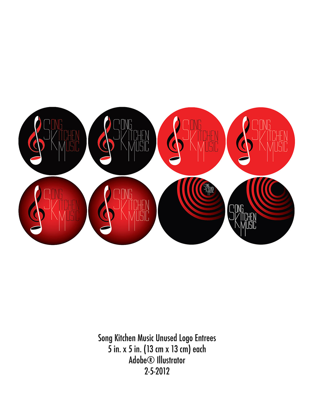
These are some of my logo entrees for a competition for Song Kitchen Music. They were looking for a logo design to start up their company. In the end they weren't selected but I did make it to the second round.
Technique: Digital Illustration (Illustrator)
Technique: Digital Illustration (Illustrator)

This is personal project I made giving tribute to my grandfather for Father's Day.
Techinique: Digital Illustration (Illustrator)
Techinique: Digital Illustration (Illustrator)

Barnum was looking for a new member in the band, thus the process of renovation began.
For the first couple of months there was auditioning and the announcement was presented with a teaser image in the official Barnum Facebook page with the image on top.
For the first couple of months there was auditioning and the announcement was presented with a teaser image in the official Barnum Facebook page with the image on top.
The left (square) being the teaser for the icon and the right being a visual teaser for the style of the Logo.
Once the band found the member, we published the new Icon and Logo on the official Barnum Facebook page, available to to be downloaded in both black and white versions.
Once the band found the member, we published the new Icon and Logo on the official Barnum Facebook page, available to to be downloaded in both black and white versions.
Created in June 2013.

Just a little flyer I did to let people know my services.
I wanted to give it an old school feel of cartoons a la Popeye/Steamboat Willy with a twist of my style.
I wanted to give it an old school feel of cartoons a la Popeye/Steamboat Willy with a twist of my style.

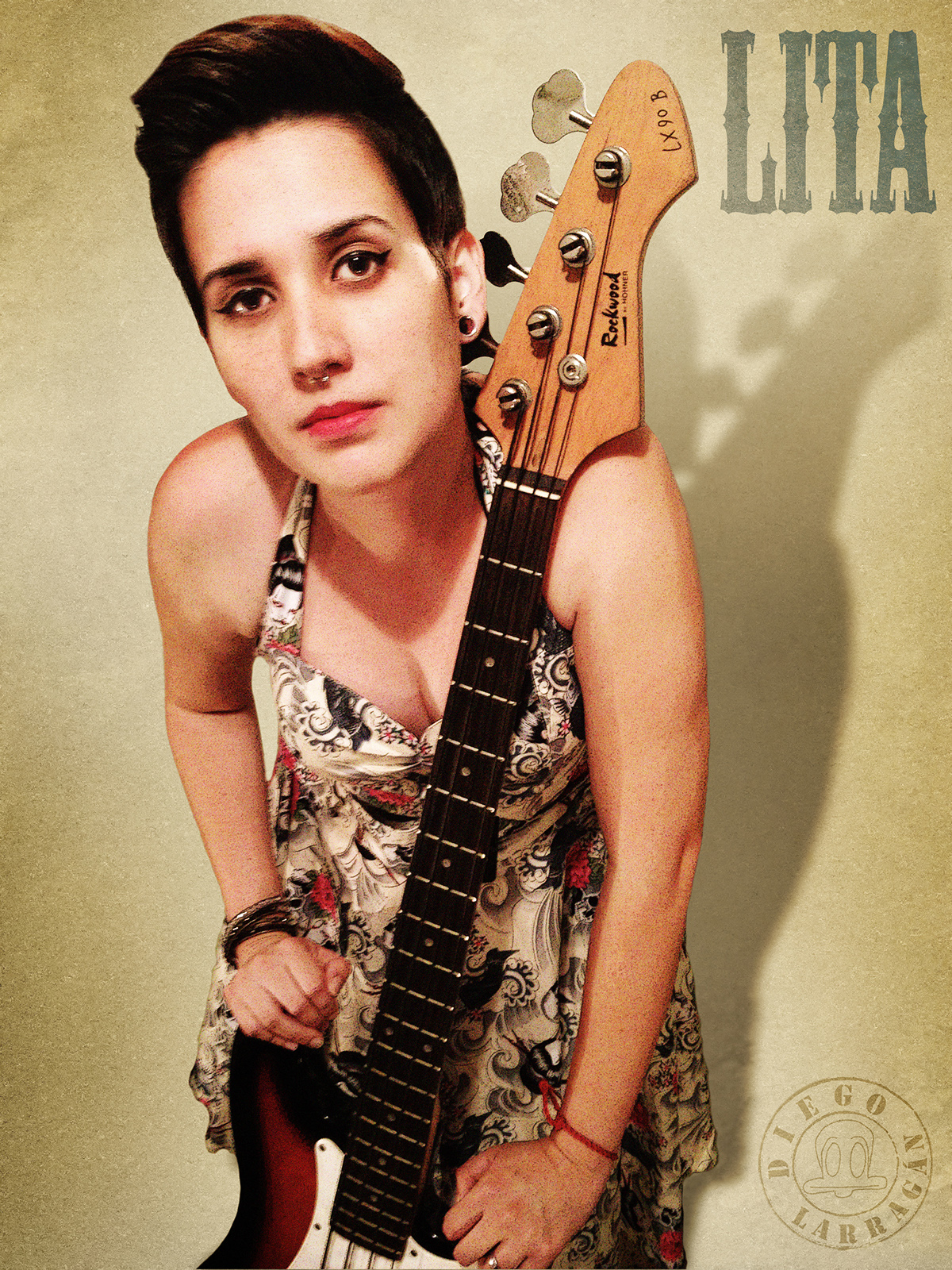
This is 1/3 of my attempt to photograph and edit a picture for Karla Quesada in the style of Pin Up.
This is for a competition called Miss Pin Up 2013 for the Paradise Tattoo Convention 2013 in Costa Rica.
Created and edited August 28th 2013.

This is 1/3 of my attempt to photograph and edit a picture for Karla Quesada in the style of Pin Up.
This is for a competition called Miss Pin Up 2013 for the Paradise Tattoo Convention 2013 in Costa Rica.
Created and edited August 28th 2013.
This is for a competition called Miss Pin Up 2013 for the Paradise Tattoo Convention 2013 in Costa Rica.
Created and edited August 28th 2013.

This shirt design was made for a peace march dedicated to the tragic passing of the two victims of the Manuel Maria Gutierrez Orchestra. The phrase was based from a fellow band mate of the orchestra and I basically made this on a whim and the sent it to SiNEM. They were very please and decided to use this design to be worn for the march. We then started sending out the design to people who are interested to wear it so they can print it out to the nearest shirt print manufacturer. It became pretty successful. My first proud achievement for a good cause.

