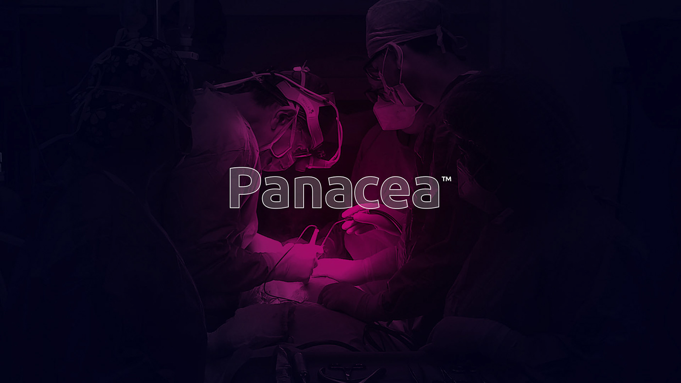
About the project
This identity is inspired by a graphic representation of the silhouette of the Greek Goddess 💁♀️ “Panacea”. At the same time, the word comes from the Greek "panakos" and means "remedy for everything or universal cure" 🌿
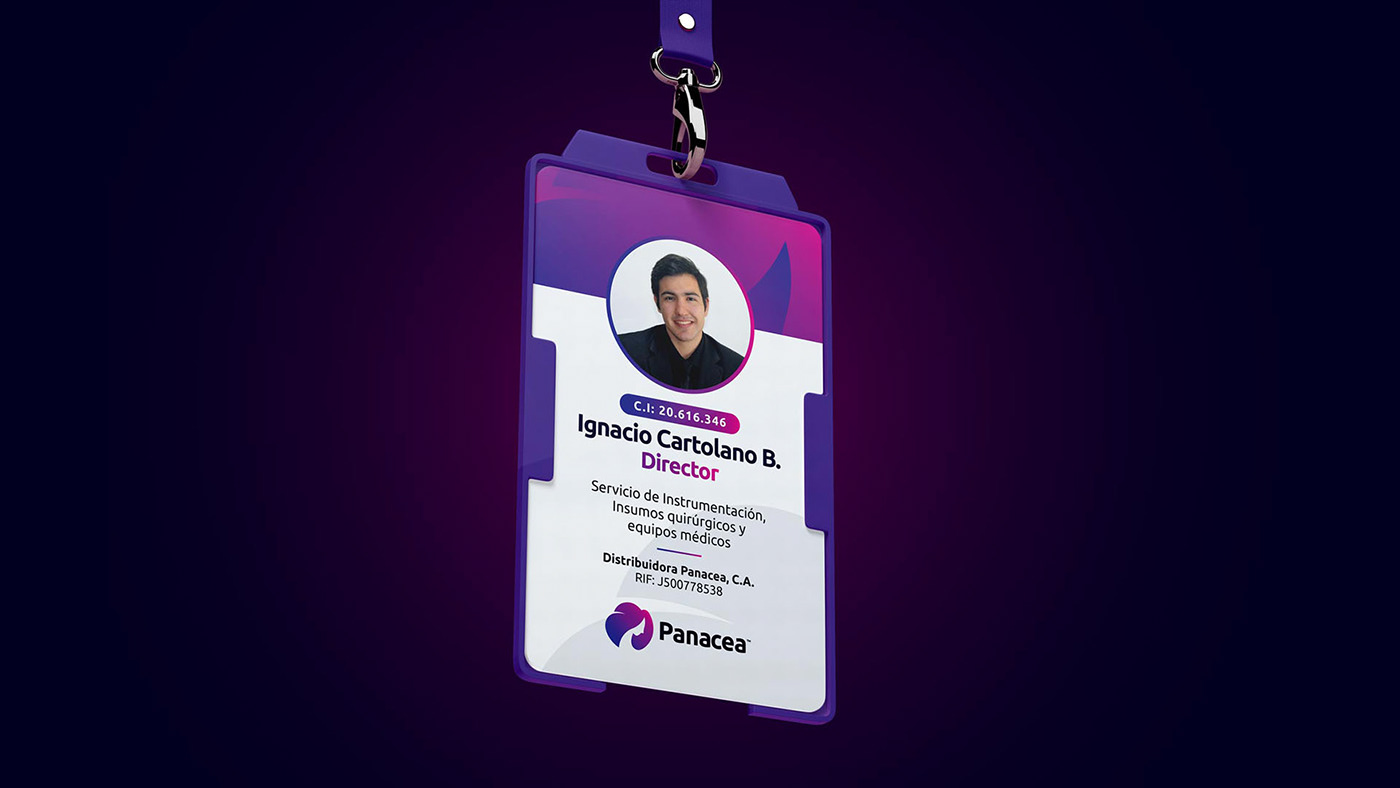
From a technical point of view, 👨🏫 is a fairly versatile and modern logo, its minimalism makes it functional and allows it to be quickly and easily remembered by the consumer ⚡
A competitive advantage on its structure are the colors 🟣 that gives it an incredible prominence.