


Why did we do the rebranding?
Because we believing in the necessity of spreading new blood to the company and adding a fresh spirit to us and the work team
Well, what did we decide to do:
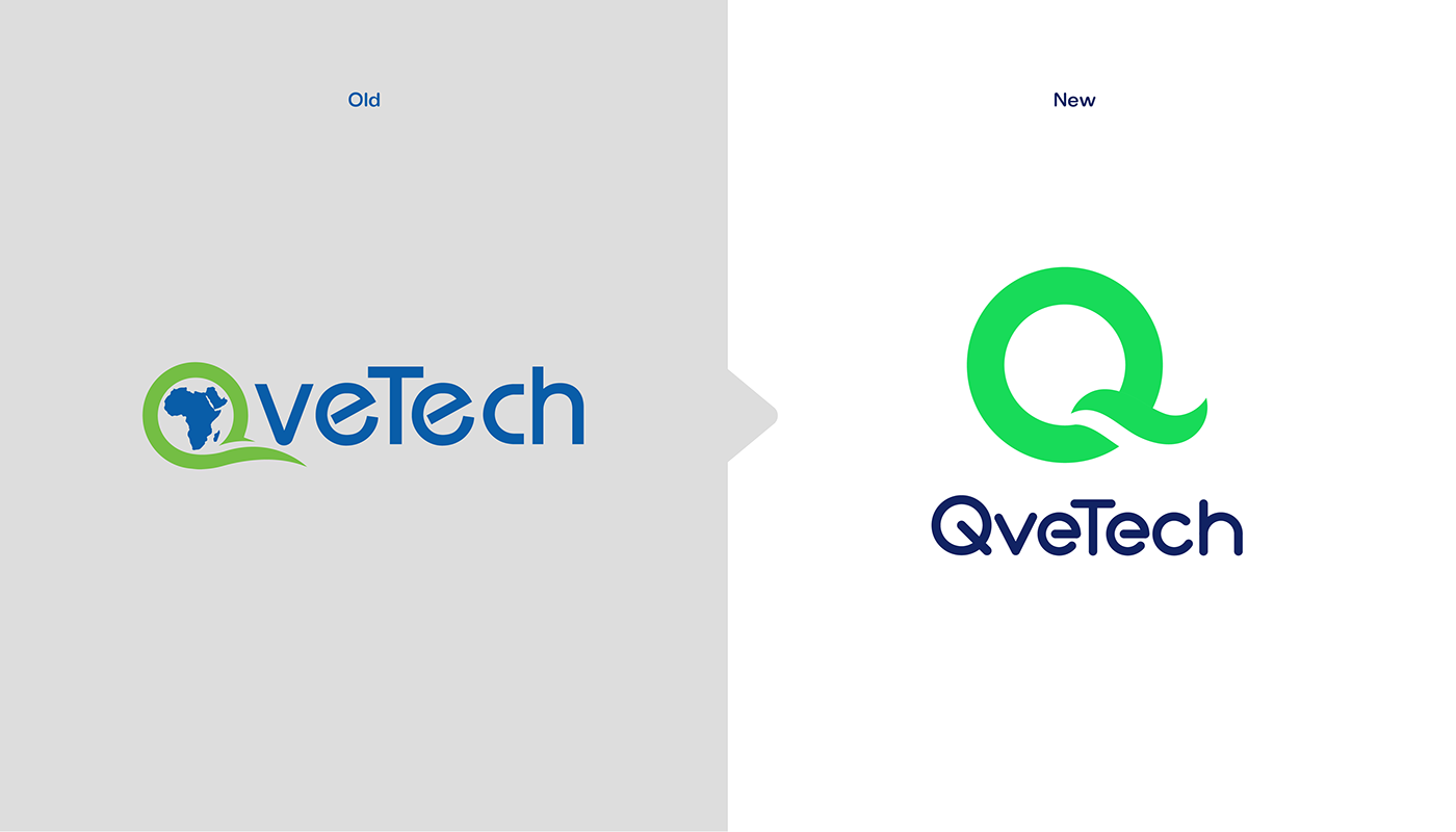
1- We decided to rebranding the brand to be clear in the name and icon.
2- Do all that was needed and missing to do the branding.
3- Arrange our ideas and included them from marketing to design.
So, let's see what happened :)

And we call this special fifth year:
Year Of Brand Development.
Through, Focusing On…
Identity, Awareness, Image & Branding


And now the marketing way is complete for us; to do the artistic and creative part


-
Circles can also be used to create feelings of protection and perfection by appearing bubble-like and without harsh edges. Rings are used to convey love and relationships as they are a visual reminder of wedding and engagement rings.
-
We decided to use it in the pattern too.


We have many topics that we want to share with you, so we developed our icon to be more organized and clear to you.


Designer: Slsabeel Ayman
Art director: Sherif Zakrya
Agency: Qvetech
Marketer: Dr. Rahma Huissen - Dr. Maner Mohmmed


