Magu Kombucha
We're part of Magu Kombucha branding & packaging from the very beginning, year 2018. This project shows how important details are and that a loved product can still evolve, pushing the boundaries further.
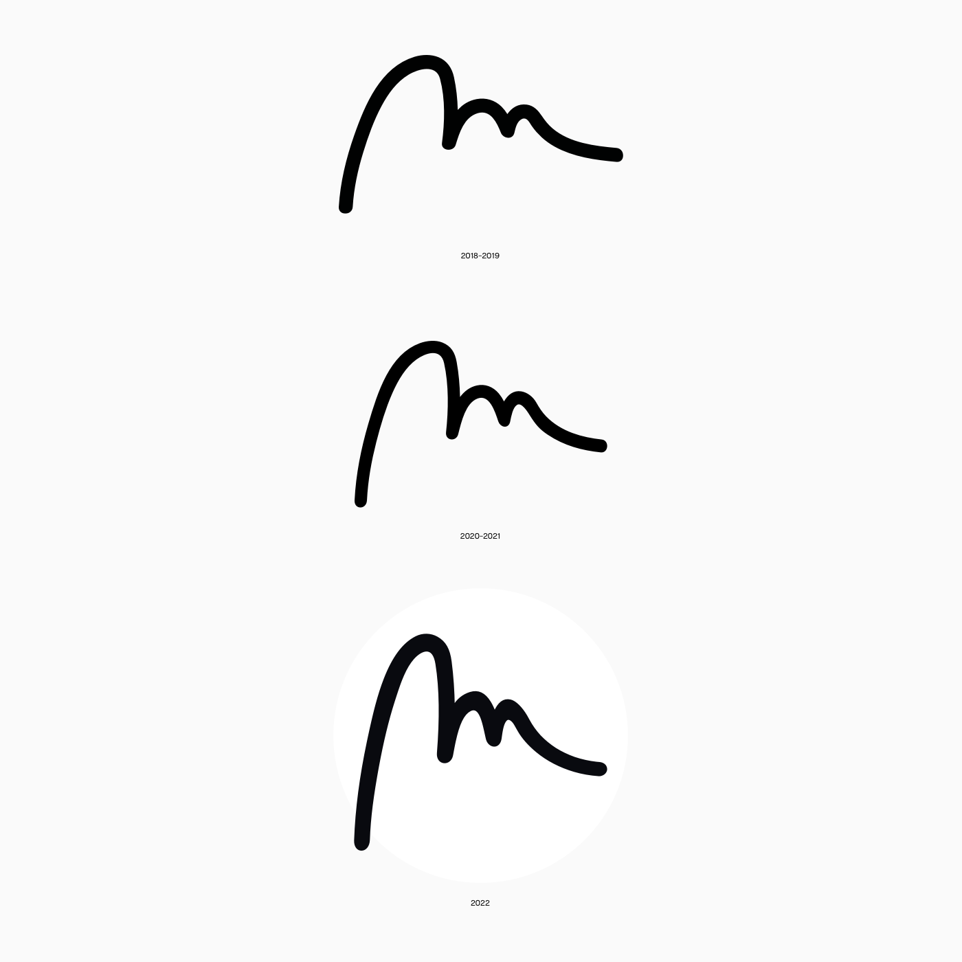
It's just never finished. Take a look how Magu changed from the first version, how something so simple as a hand-drawn "m" symbol could grow up and how minimal packaging can look.
Client: Magu ®
Visualizations: Daniel Kinský
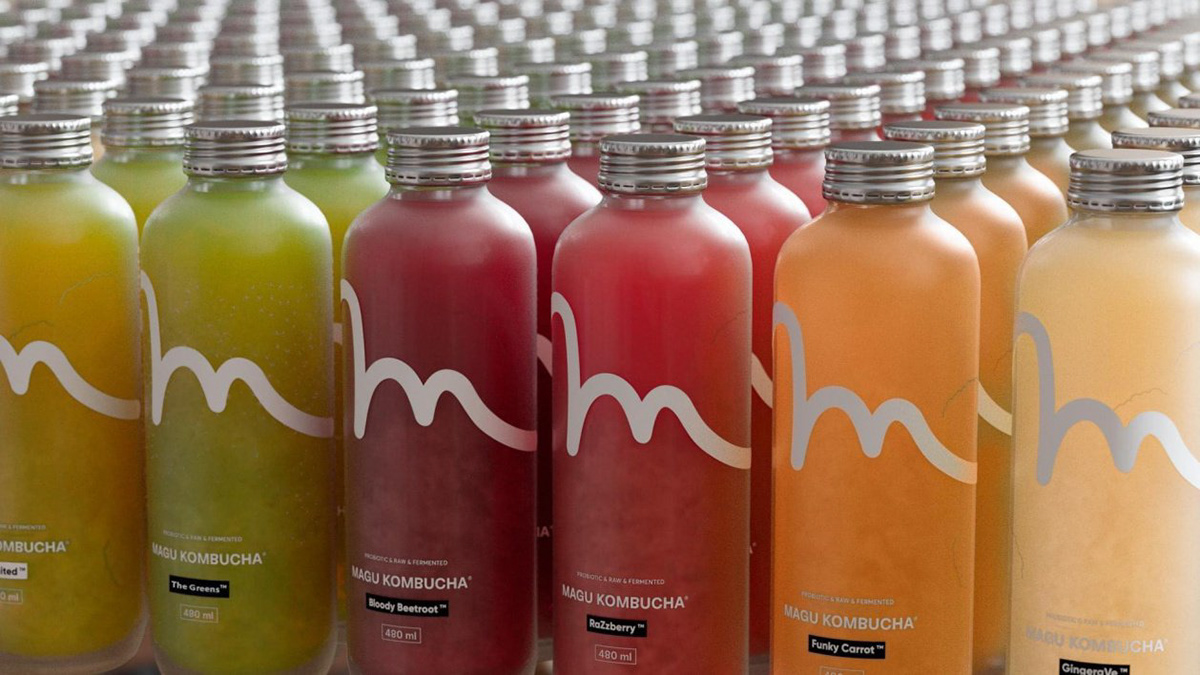
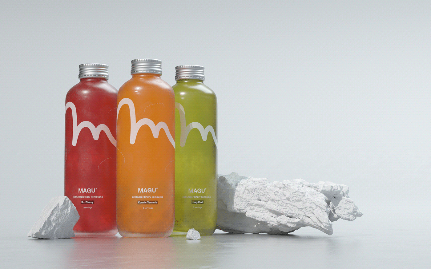
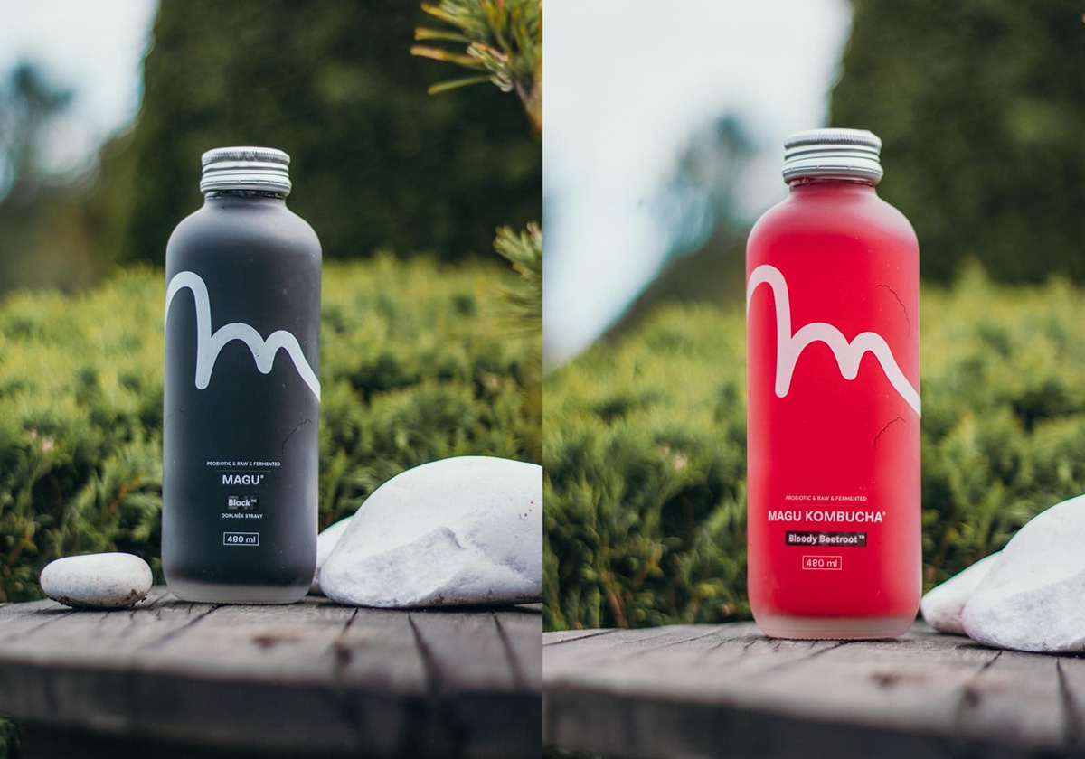
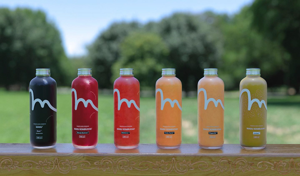
Our first intentions were obvious. A product packaging should show what's inside – the flavour. So the first versions of Magu are showing just that.
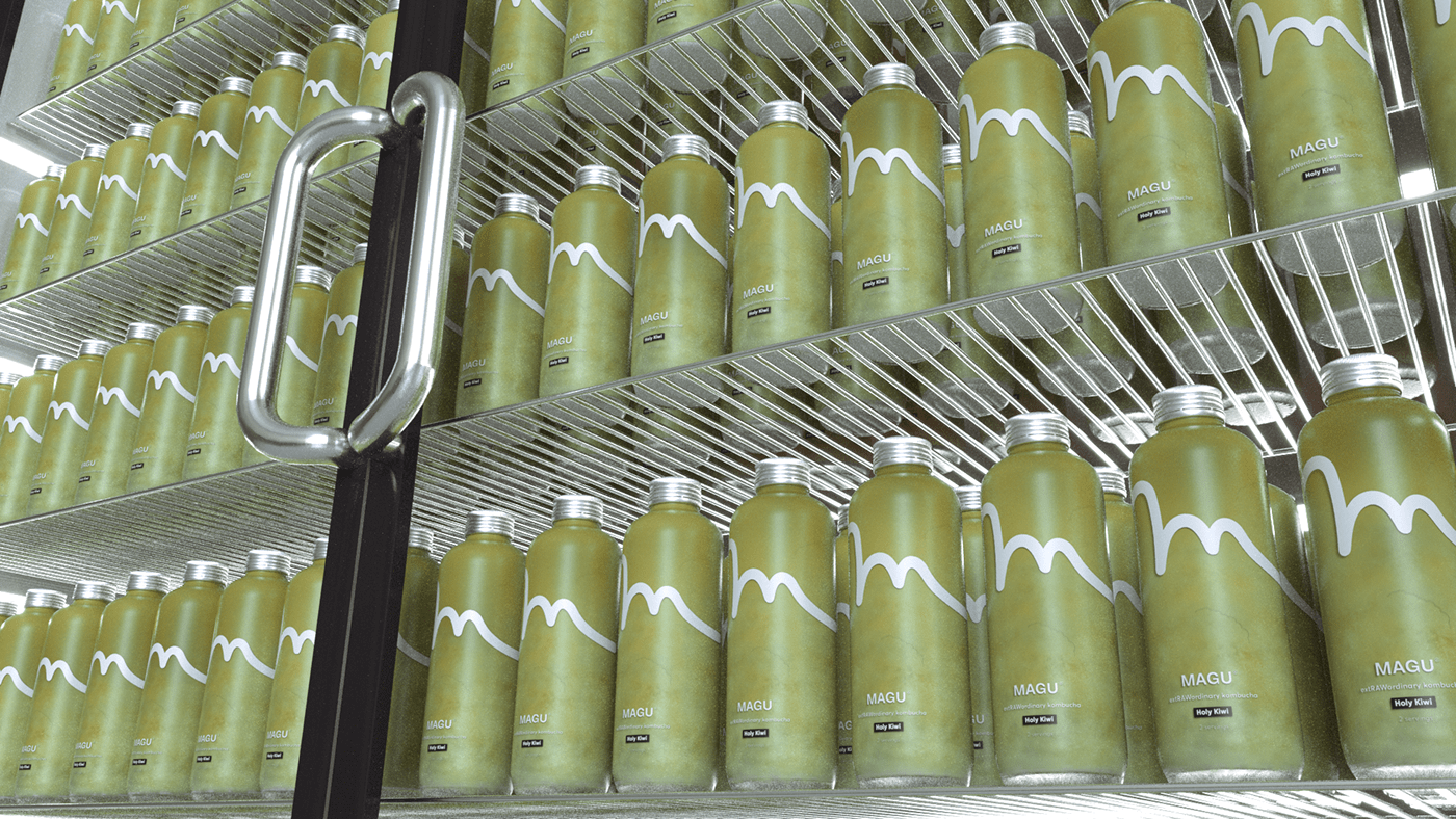
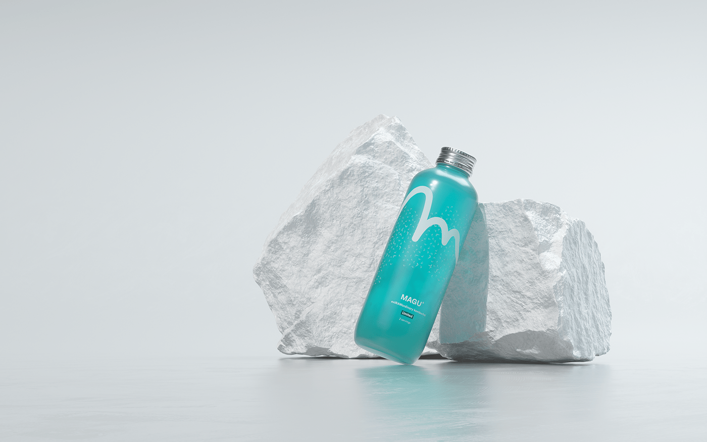
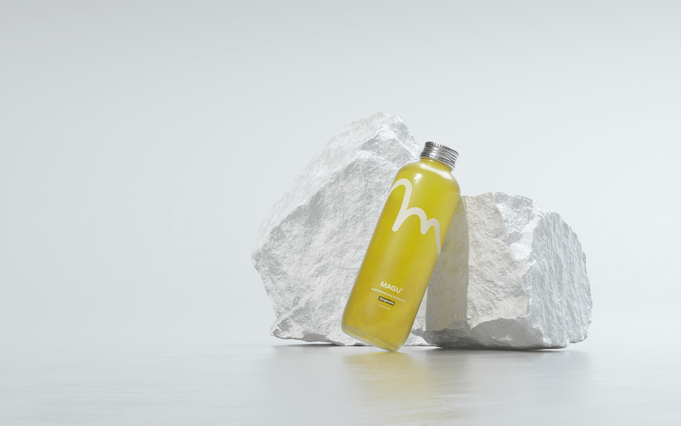
But since Magu is something so much more than a classic beverage, we decided to go a different direction. Let the content of a bottle speak for itself. Let the natural colour give you a hint. We just brand the magic inside a beautifully designed glass bottle with a simple hand-drawn M.
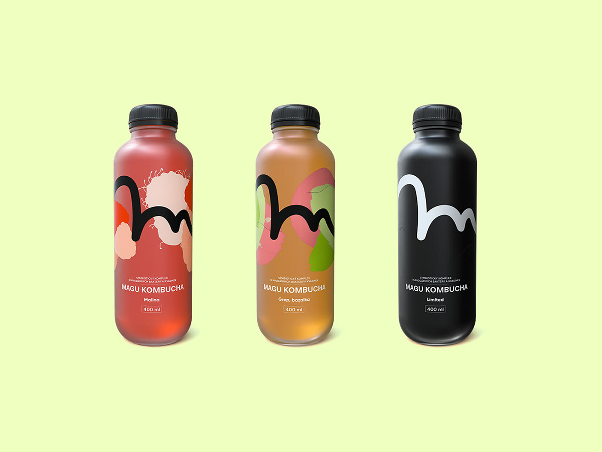
The iconic M symbol is a perfect example of how something that simple can evolve in time. Still keeping its clarity and brand, we slightly changed it multiple times for a better product fit.

There's more to come.
You'll hear about Magu a lot.
Thank you.