

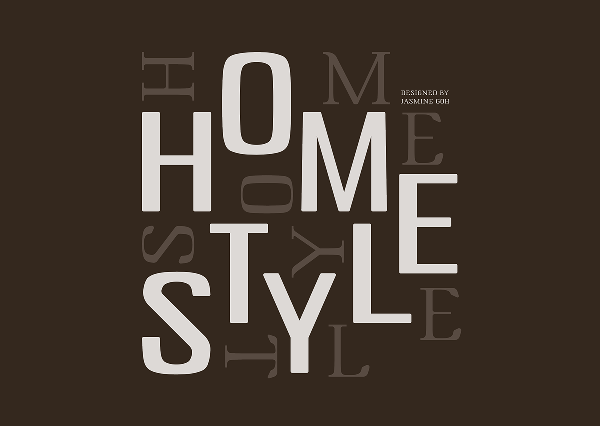
Homestyle
Typography 3 | 2021
Typeface design for body copy, inspired by Singapore Food Culture.
Singapore food culture can be defined by its variety of local dishes, hawker culture, indulgence and sense of belonging to everyday people.
The concept of 'Homestyle' focuses of Tze Char, a Hokkien term used to describe a Chinese food stall which typically provides a wide selection of common, affordable homecooked dishes. These stalls are usually found at coffeeshops, in a non air-conditioned setting. Dishes are served with large portions which make it a great food choice for gatherings and sharing meals among family and friends. It is common to find a variety of food ranging from rice, noodles, vegetables, meat and seafood.


Creating 'Homestyle' began with the intention to recreate a transitional serif typeface, to bring out its sense of nostalgia and casualness based on its position between old Tze Char establishments and the newer generation of hawker food stalls.


'Homestyle Sans' is a sans serif variation of 'Homestyle' which came to light due to an exploration of an iteration of 'Homestyle'. It has a heavier weight, a reduction of serifs, as well as a lower contrast between its strokes. This typeface was created in a similar manner to 'Homestyle', using the shape of a typical Tze Char plate as a base layer to build its other letterforms upon. Although simple, this typeface still has rounded elements, and is much more versatile in its application.
Type Specimen Booklet


Homestyle Poster Design


