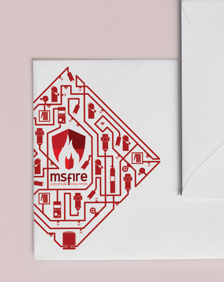
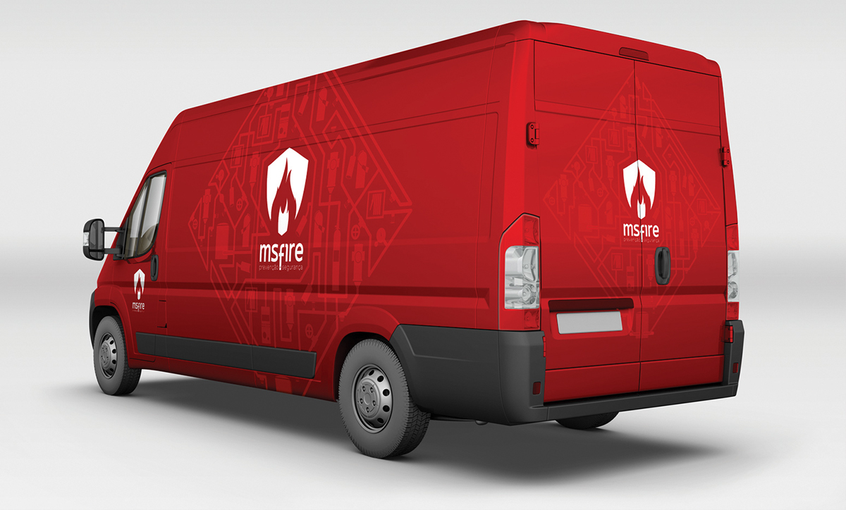
Ms Fire is a Portuguese company that comercialize and instal fire securety and prevention materials.
The fact that this systems act like shields against fire, inspire to create the logo shape.
The icon set was created to make it easier to communicate the MS Fire services and help general people visualize and understand what they really are.
The red colour represents fire and it's a strong and appealing colour.