

Enceres.asia
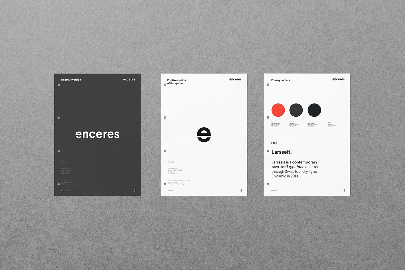
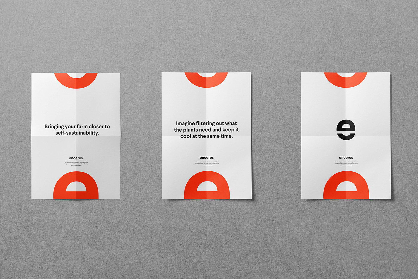
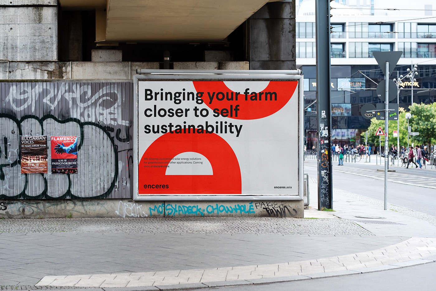
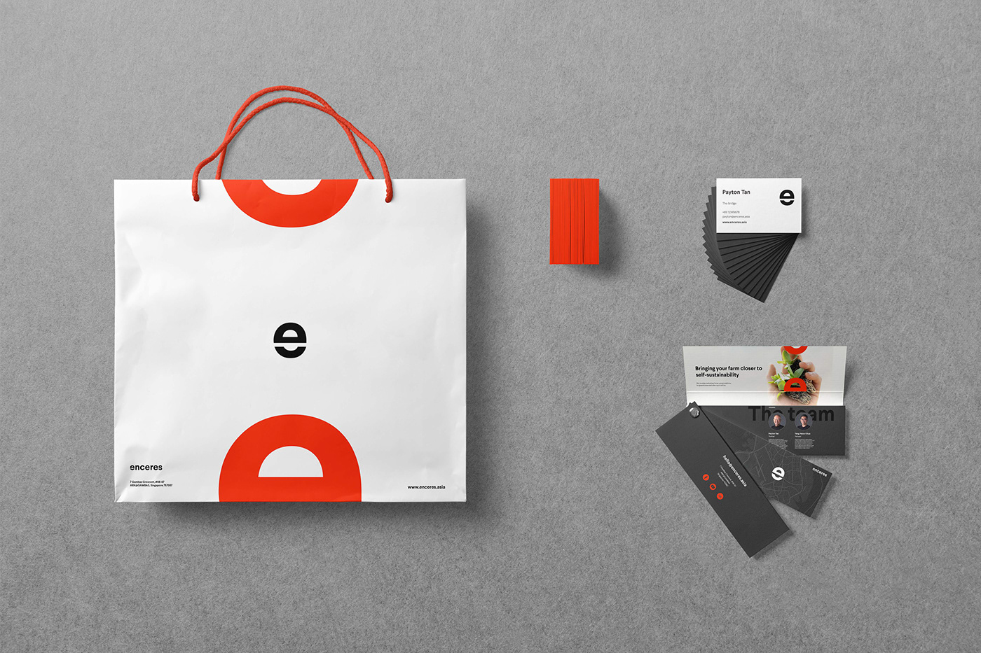
With the global move towards greenhouse farming, the long-term goal is to achieve the highest yields with the lowest impact to the environment. The key challenges that most greenhouses face today are heat management and energy consumption. That's where Enceres come in, revolutionising the greening of greenhouse farms. The main symbol, divided letter "e" stands for a sun rising up, a solar technology, a crop growing from the ground, having strong roots and background. Clean and modern visual was a way to differentiate in the field.
The main symbol is often used in two parts, opening a space in between for the content, resembling a light glowing from the top to a rising crop from the ground.
Main Enceres colors are vivid green, grey and black. A light in the dark.

Check out more about Enceres technology at enceres.asia website, which we designed as well.
Thank you.


