


Unit Architects
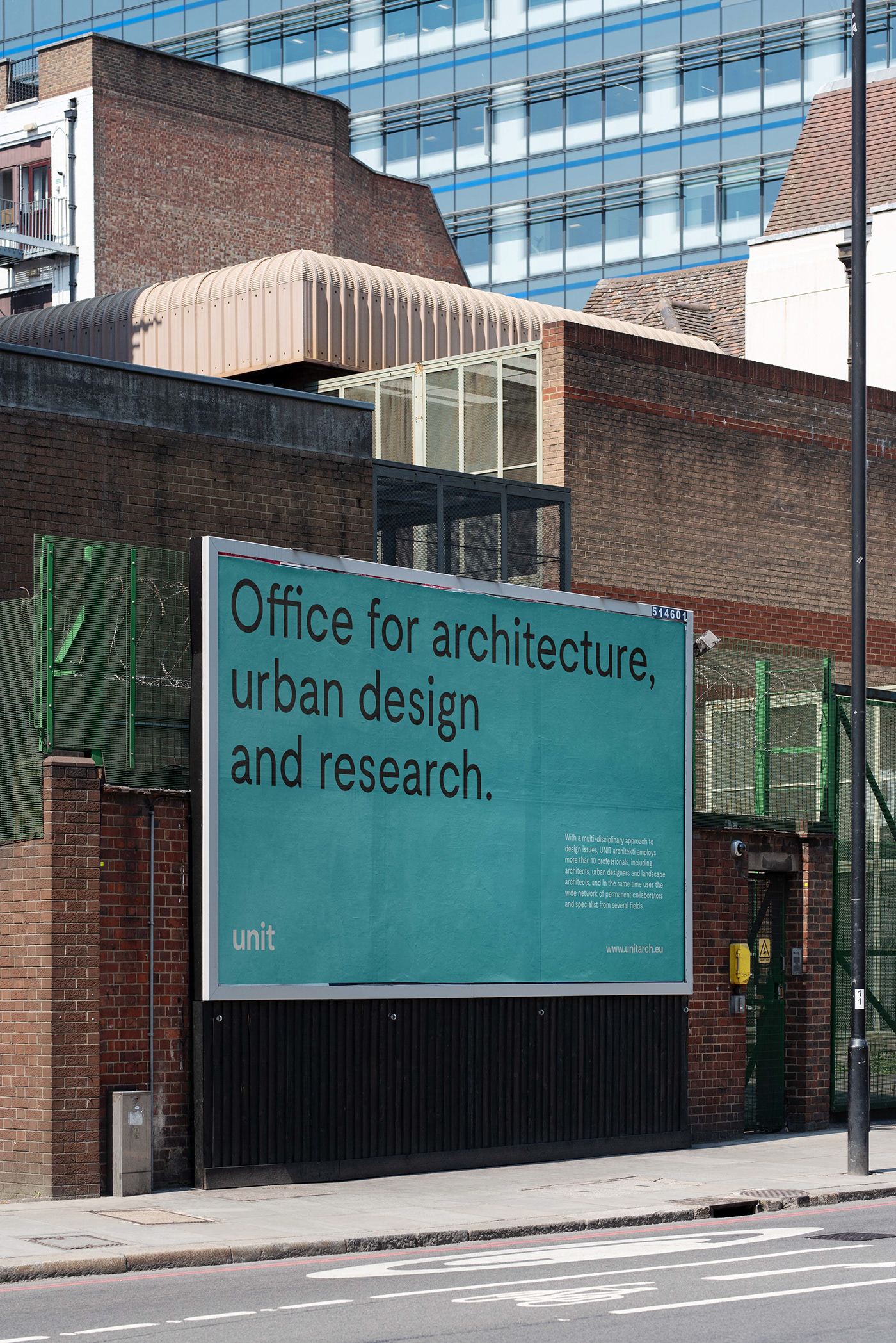
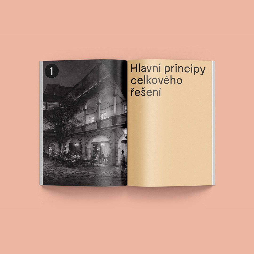
One of the most recognised architecture and urbanism studio Unit looked for a rebrand for quite some time, a classic cliché of having so many projects, you just don't have time for your own. The goal was an evolution, not a revolution, and it took almost two years to have the final guidelines for multiple applications, documents and layouts. The result is clean, minimalistic, focused on typography and clean elements, a long-term visual identity, easy to use.
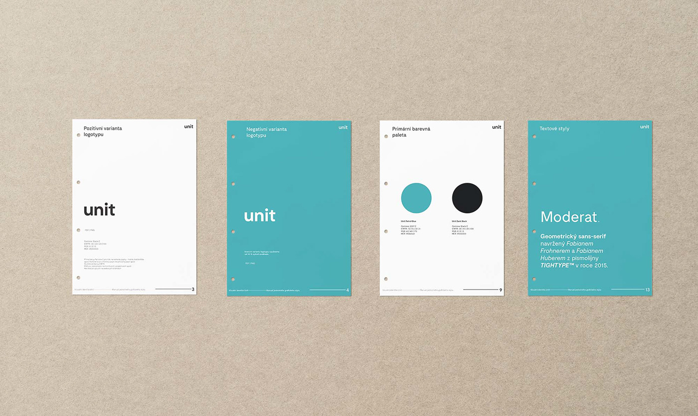
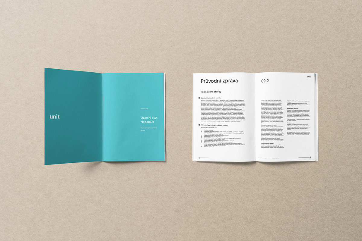
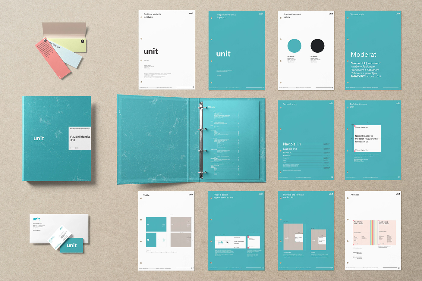
The primary colours follow the original brand, adjusting the iconic blueish a bit. Since most of the visuals are keen on typography, we chose Moderat by Tightype both for the logotype and as the main font.
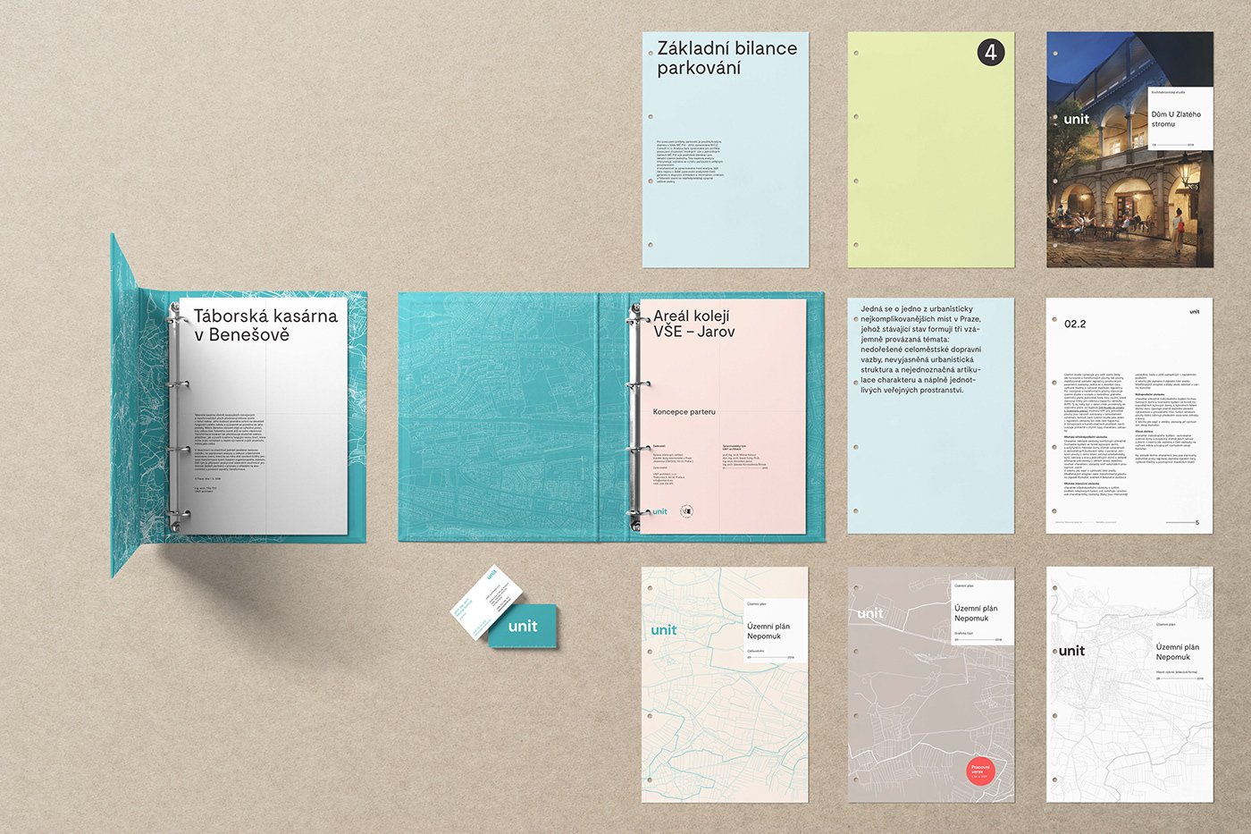
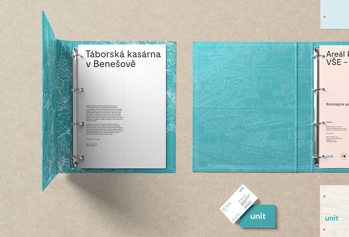
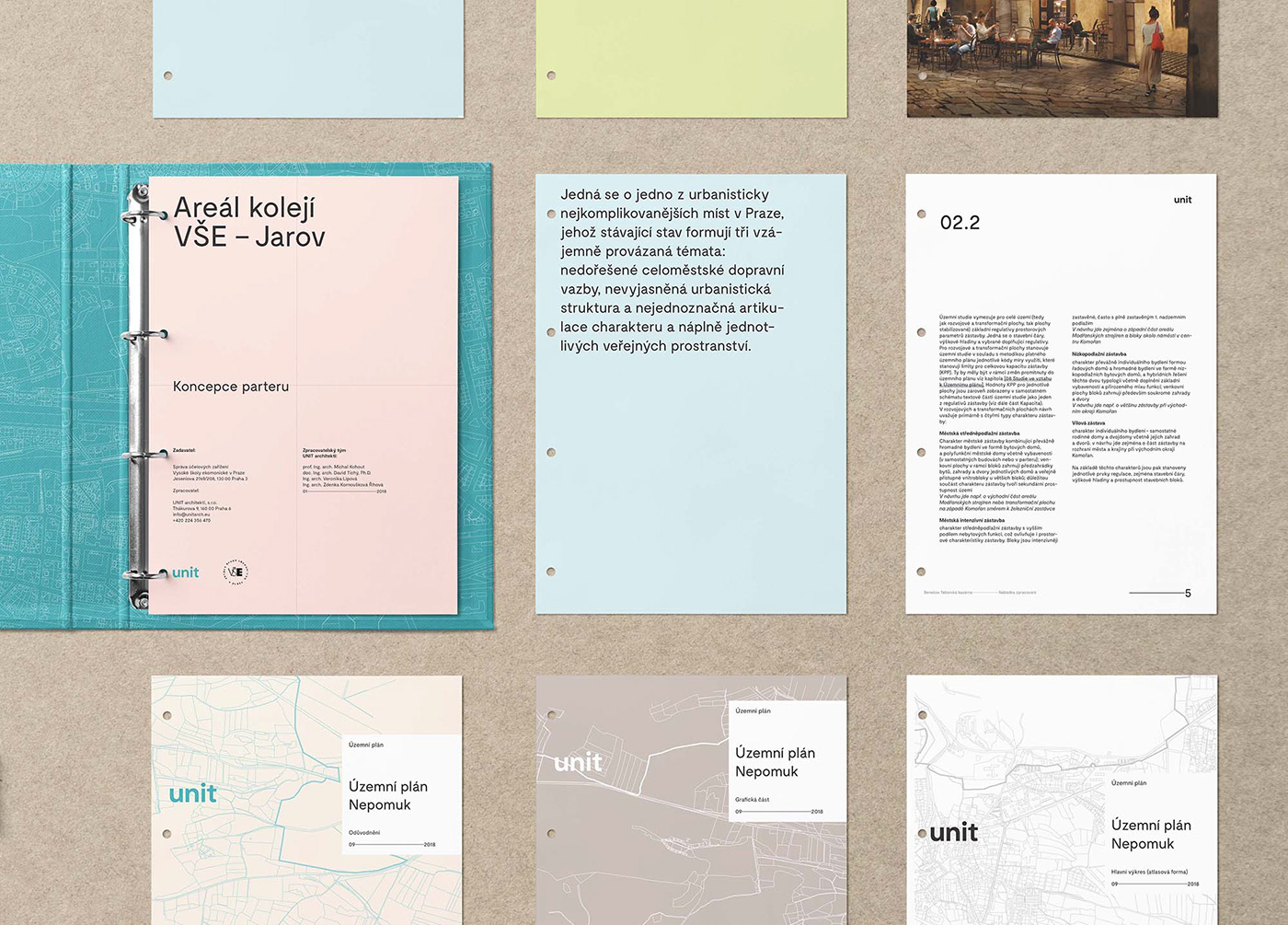
Since Unit is a really wide-spread multiple-skill studio, the amount of different sorts of documents is really massive. We had to find a way to distinguish specific types of covers for each project milestone, plus multiple versions of the generic ones. Each is using a different outlined map as a background, in more than four colour combinations – while still being recognisable as one brand.


The original Unit logo was a square. We were looking for options of how to keep this shape alive in the new brand – using it as a main content/headline label on every document, with multiple-level rules, so it will always be kept clean and recognisable. The Unit square. With a stand-alone logotype.
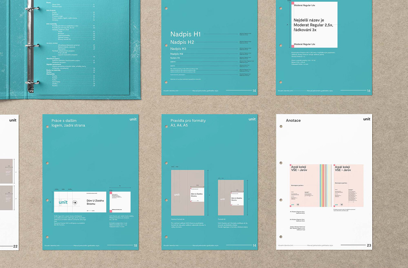
A glimpse of the final brand manual might not give you an idea why this project took almost two years to finish. That's maybe the point. Crafted to perfection, while looking so light and simple. Every set of rules is easy enough for everyone to use. A lot of math and calculations are behind everything. Just as it should be in the architecture world.
Thank you.


