


Say hello to your new home!
Goals and objectives
Sometimes, to make a positive first impression, it is enough to say "hello". Even if you are not exactly a human being, but a new developer who starts selling its first project. That is how Hello House by Nice Development came about, for which we have created a name, visual style and communication materials to greet future residents of the residential complex.
Implementation
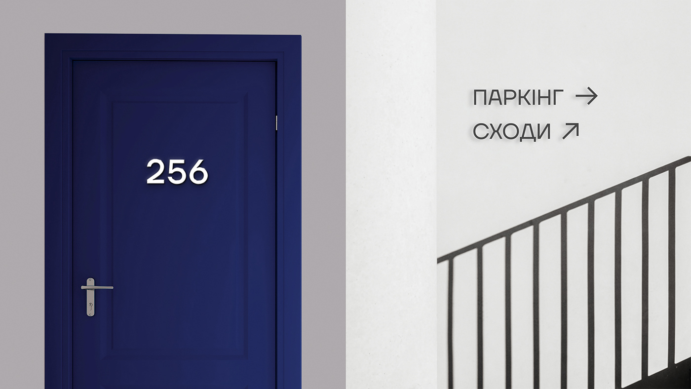
The logo is a stylized combination of the of the apartment planning and the grapheme of the letter "H". The doors at our planning are open, as we are open to everybody. Our «H» symbol is a basis of the identity central element, the framework for communication plots, the main identifier and image of the brand. The calm blue color evokes a feeling of reliability, comfort and calm. Together with the typography and simple design system, the visual style of «Hello House» has become an expressive and accent tool for the successful launch and implementation of the project.


Along with the logo of the main project of the residential complex, we have developed a flexible graphic system of symbols for future developer’s projects. It is based on the principle of combining the image of apartment planning and stylization of the first letters of project name. All symbols are built on a common modular system using the proportions of the golden section.


Made by YARCHE in 2021
CEO – Danylo Martynov
Strategist – Stanislav Raksha
Senior Designer – Yaroslav Kryzhanivsky
Concept Designer, Motion – Yurii Kuzin
Graphic Designer, Post-Production – Vlada Orel
Photo credits: Anastasiya Tempinskaia,
Brina Blum, Chewy


