


the evolution of human communication
As people have been changing throughout history, they have been including communication methods to this change. Communication created journalism and journalism has created many fields itself during this evolution. It has, on the other hand, succeeded in integrating itself into those field that have been created.


Communication have entered a new evolution era with the digital revolution. Digital communication and journalism have also taken their share from this irresistible and fast evolution.
finding the right solution


The computer era —like almost everything in life— gave humanity a different kind of thinking and sharing behaviour. We used different methods and various items to write digitally. Keyboards turned into screen keypads with time. Especially for the millennials, everything really changed fast. The digital revolution also forced journalism to change. Now almost everyone, including journalists, is writing digitally. Some have already started writing articles just with voice dictation. The Generation Z, on the other hand, is witnessing a period in which artificial intelligence is able to write newspaper articles.
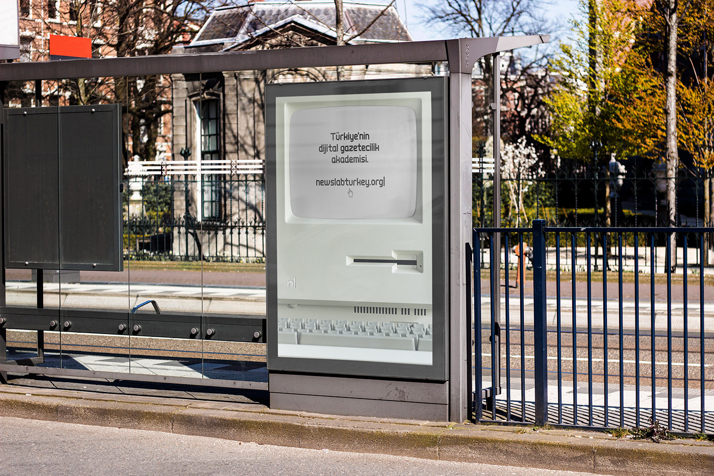
The concept of Newslabturkey was right in front of me —also literally as I am writing this— a living graphical element which was brought to our lives by the digital world: the lovely and immortal cursor.
creating the cursor concept


The cursor idea has become an ideal conceptual graphic element of the Newslabturkey rebranding and I thought that it could give the brand its breath and also transform the brand voice to a dynamic one in a more attractive way.
The idea had to work with the font itself naturally, so before anything else, I needed to determine the details of corporate typography. This typographic solution had to be an organic one because it was going to be used for an organisation that serves in an area where writing is so important.
The client is a non-profit association and they didn’t have an extra budget to license the fonts so I wanted to find a solution through Indian Type Foundry’s lovely service Fontshare. I chose the Clash Display because of its retro yet modern/digital vibe to generate the wordmark also the headlines and captions. For the body text, Zodiak was shining with its beautiful curves, styles and legibility.

To be able to mimic the cursor effect and make the animations, I used the vertical line glyph from the font itself. I didn’t use the fullwidth vertical line because I wanted to use the wordmark in lowercase and didn’t want the cursor (the vertical line glyph in this case) to dominate the overall voice of the concept.
After many screen and print tests, I determined the typographic hierarchy according to certain proportions. Since we need to make these tests applicable both in print and primarily on the screen, I designed the design templates according to typographic rules and proportions to guide people who will use them.


The client has already a website running so we had to implement the corporate typography and brand voice to the existing website. Webfonts worked properly. I also wrote some css rules to implement the design properly. We also implemented the corporate typography to the newsletter although some of the email clients refuse them.


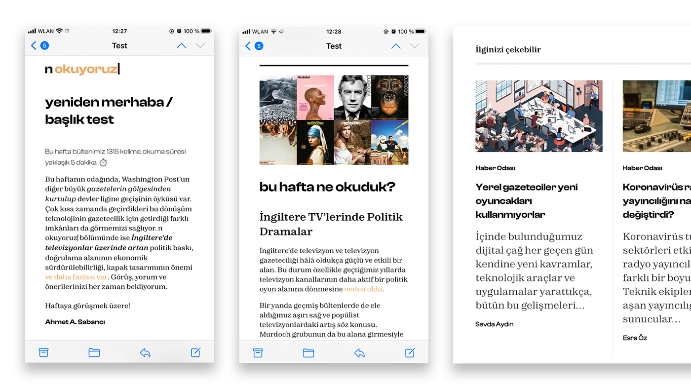
webfont implementation tests (newsletter and website)
defining and designing the brand architecture
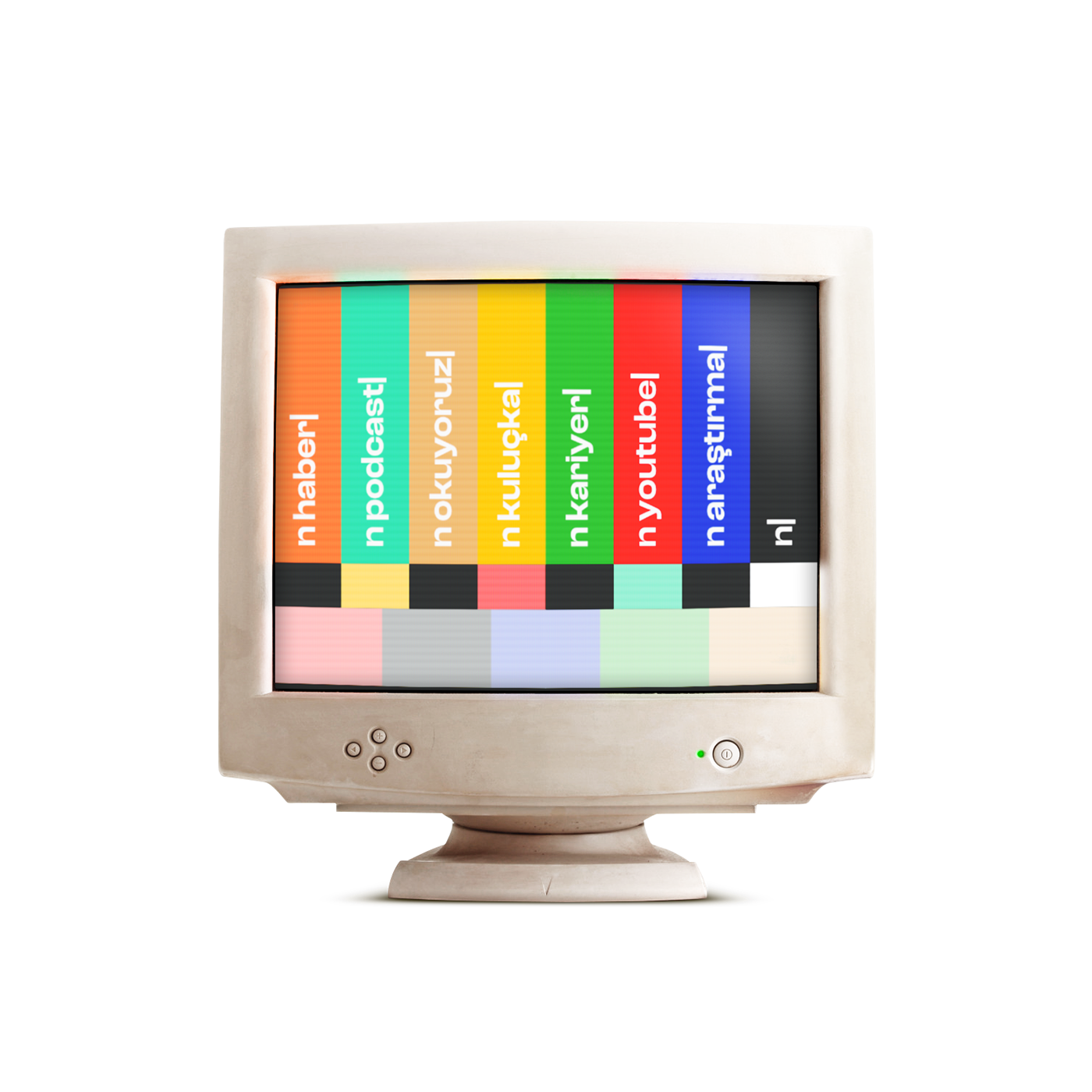
There are seven sub-brands/sections Newslabturkey is working on. Through the color coding method, I was able to differentiate them from each other. That way the sub-brands had their dynamic visual language separately without damaging the main brand voice.


brand activation: sound design and video production
When producing the videos my aim was to create a connection between the modern and retro digital worlds as the mission of Newslabturkey also represents a bridge between the retro/old school and modern/digital journalism.
The goal was to build the brand and client interaction by building the bridge between retro and modern digital. So, I started to record some analog sounds such as mouse, keyboard clicks and collect some of the retro digital sounds like the 56k modem connection sound. I have produced and designed four videos with them. Three videos are for re-usage (such as video production, streaming needs / intro, outro, ad etc.) scenarios and one of them is for the main brand launch video.
make sure that your sound is on ↓
For the brand launch video, I wanted to mimic the Windows 95 UI and connection effect. I used the official Windows 95 pixel based font W95FA which didn’t support some of the Turkish letters so I also designed them, updated the font and implemented it to the UI and produced the brand launch video with the sounds, W95 UI, some gifs, 56K modem connection sound and the Newslabturkey outro.


follow me
Portfolio: oocalan.com
typography
Clash Display, designed and published by Indian Type Foundry and Zodiak, designed by Jérémie Hornus, Gaetan Baehr, Jean-Baptiste Morizot, Alisa Nowak, Theo Guillard, published by Indian Type Foundry via Fontshare.
credits
Hugo Barbosa, Glenn Carstens, Tima Miroshnichenko, Pixabay, Victor A, Mr. Mockup, Graphic Pear, mockups-design.com, graphicsfamily.com, wordstar emulator by pcjs.com. Windows® is a registered trademark of Microsoft Corporation. Newslabturkey is a brand of Dijital Araştırmalar Derneği, İstanbul.


