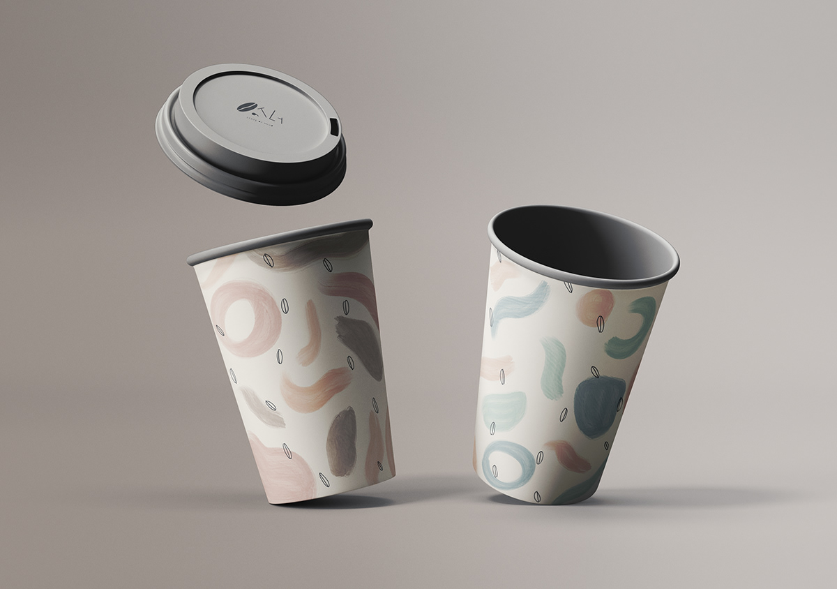
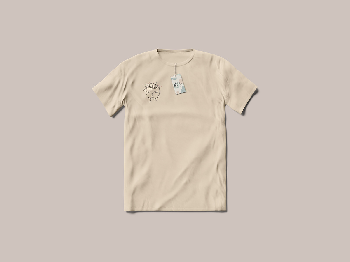
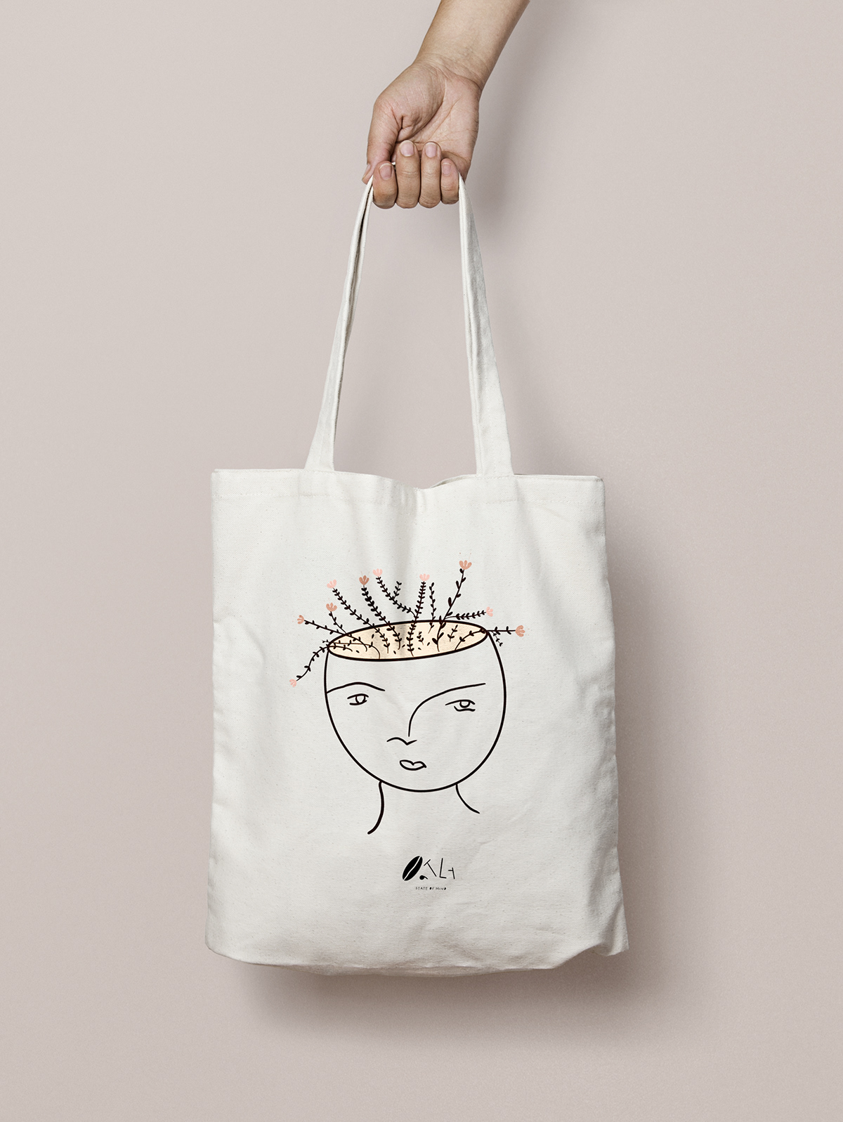
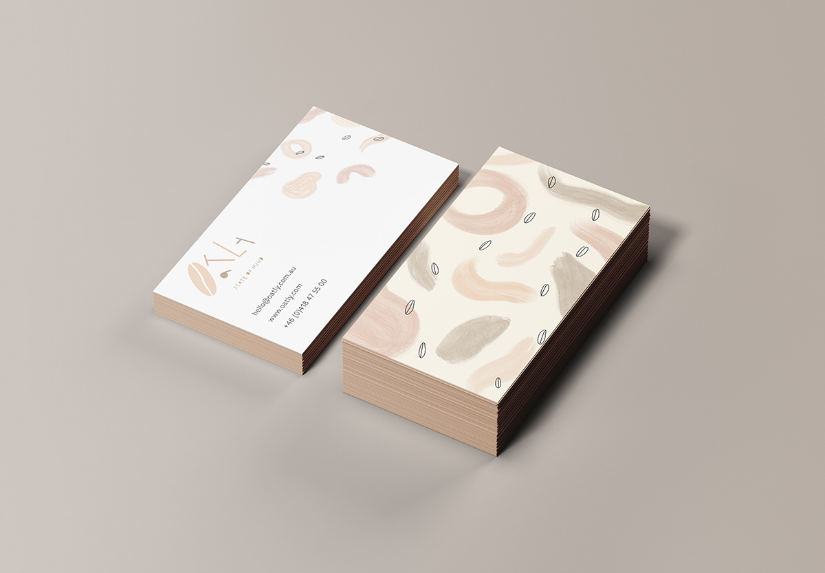


This project is dedicated to the conceptual re-branding of oat milk company “Oatly”. The rebranded Oatly logo uses the symbol of an oat for the O as I wanted the icon and typography to merge together simultaneously, without one overpowering the other. The mixture of brown and beige water coloured strokes represents the creamy and milky textures of oat milk which is admired by all Oatly drinkers and used for their morning coffees and granolas. The letters are positioned upon different angles and vary in size, promoting the main brand value of inclusiveness. The sub-title “state of mind” refers to the idea that Oatly drinkers share a forward thinking mindset. That being; conscious of the environment, as well as their health. The letters of the sub-title have been filled in to mirror the same effect applied to the main Oatly title, thus tying the entire mark together.


