

IntenderAi Branding
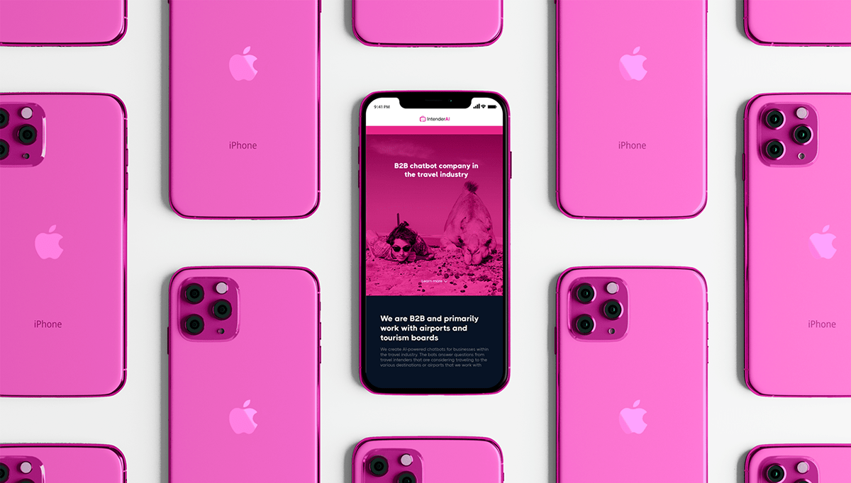
IntenderAi is create AI-powered chatbots for businesses within the travel industry. The bots answer questions from travel intenders that are considering traveling to the various destinations or airports that we work with. IntenderAi are B2B in collaboration with airports and tourism boards.

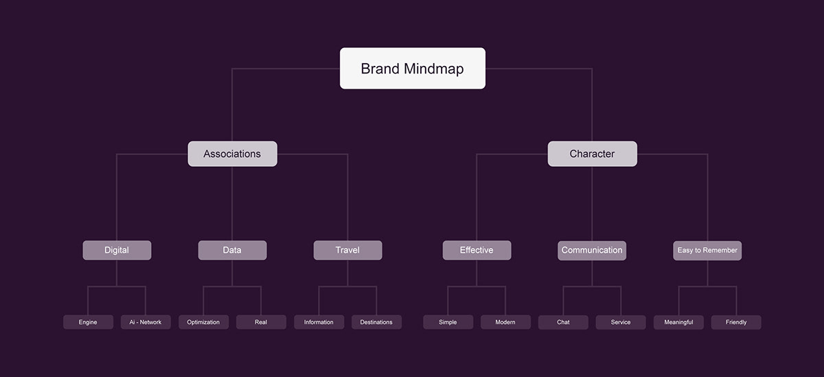
Brand mind map
My main goal in this project is to make the brand more recognizable among all services and chatbots for today's travel industry. IntenderAi's goal is to be the best travel chatbot service, so customers and travel business associates can recognize the company when they see its logo.
As usual, our branding process starts with a visual positioning based on the information I get from the client. After I discussed my vision with their team, I decided to start this work from scratch. From then on, I started my work with a unique and gradual process that I call the "desian cone".
Sketches
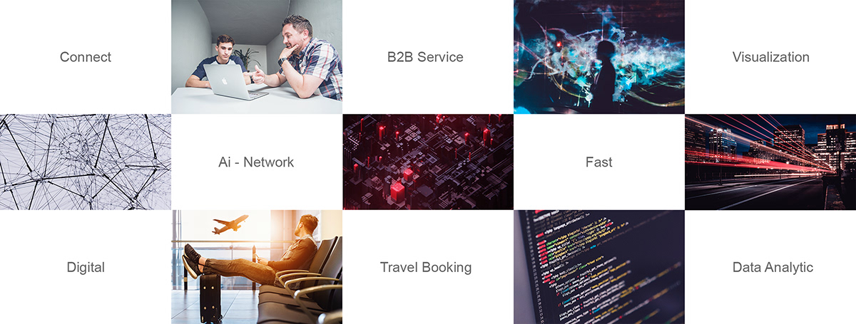
Based on these attributes, I started working on the sketch. At this stage, I mostly work with simple hand rough drawing. I combine various nouns and metaphors with business aspects and prepared some sketches for further examination.

After drawing a rough sketch of the idea in my imagination, I finally gave 3 initial concepts to the client, with each character of the idea. and this is the result.

Revision
At the beginning of a branding job, I discuss with my clients how they envision the branding process. There are two avenues to consider: effective and purposeful. The first approach considers the use of elements where it must appear simple, the second approach must symbolize something that is in accordance with the company's vision.
After a while, I had a conversation with the IntenderAi team. They decided to choose the second logo. The main point of this revision is that the direction I developed is more effective logo, less object like: one object but all encompassing. Businesses in that segment mostly have flat logos. Today, more and more companies are leaning towards simplification, clarity and modernism, so it's pretty clear to me why the IntenderAi team decided to lean in that direction. Flat, simple and clean logos are now everywhere. The trend is still growing.
The original logo should be cleaner and simpler, but retain the idea and metaphor. The brand colors have also been defined, without a total rework, so that's how the logo looks like.

Color Scheme
When it comes to color, I chose a few deep pink and pale violet red tones. This proposed color range is brighter and fresher and is largely adapted from the company's character. It is very technology and hospitality oriented.


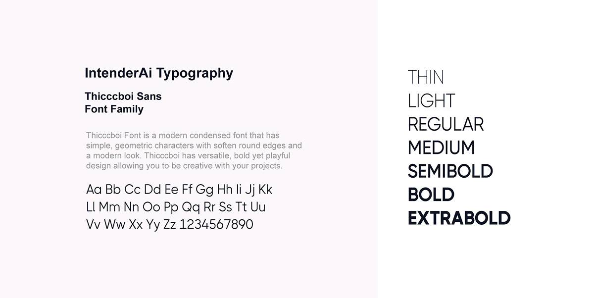
Recommended Typeface

Thanks For Watching!
Contact me if you want to hire me :
Another portfolio check here :


