


KUNE
Background
KUNE is a young food-tech startup that was established in Nairobi, the capital and the most developed city in Kenya, with a high concentration of students and workers, who need quality meals with reasonable prices. KUNE positioned themselves as the big kitchen of Kenya that spreads the mission of serving prepared meals with affordable prices for everyone.
Issue
KUNE needs a comprehensive brand identity for its first appearance on the market. A generic look with a warm feel is required to reflect their attribute of an average daily product for everyone, and to make it more friendly to reach a wider range of consumers. The biggest challenge was how to find a simple visual that makes people understand at their first look, but it needs to be unique for branding also.
KUNE needs a comprehensive brand identity for its first appearance on the market. A generic look with a warm feel is required to reflect their attribute of an average daily product for everyone, and to make it more friendly to reach a wider range of consumers. The biggest challenge was how to find a simple visual that makes people understand at their first look, but it needs to be unique for branding also.
Solution
We turned the sun into a big idea, as the belief of "Good food worth sharing". Just like the sun spreads light and energy to all creatures on the earth, KUNE shares good food to everyone and makes them delighted, hence connecting them together. To visualize that idea, we borrow the imagery of the sun ray to develop the visual identity as it is the perfect symbol to tell the story of spreading and connecting.
We turned the sun into a big idea, as the belief of "Good food worth sharing". Just like the sun spreads light and energy to all creatures on the earth, KUNE shares good food to everyone and makes them delighted, hence connecting them together. To visualize that idea, we borrow the imagery of the sun ray to develop the visual identity as it is the perfect symbol to tell the story of spreading and connecting.

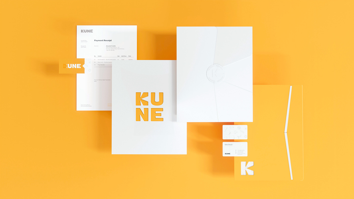
LOGO
We used the image of the sun's rays as inspiration for the logo of KUNE. The letter "K" was created first, as it has the best association with the sun's rays, followed by the rest of the characters which have the same typeface's structure. There are several versions of the logo which could be well adapted to corporate identity and any other types of promotional and packaging design.


TYPOGRAPHY & COLOR
The typography: Rubik & Rubik Mono One
Rubik is a suitable family to express the shape of natural food and its deliciousness due to its thickness variations and round corners. Its sister, Rubik Mono One is chosen for headline and display position as its structure is compatible with the logos.
Color palette
The primary color palette was inspired from the sunlight to reflect its optimism and happiness, and the secondary palette was taken from food ingredients to indicate the freshness and quality of KUNE's products.


KEY VISUALS
Beside the sun ray imagery that was applied in most of the identity items, we also create the ingredient circle that reflects the mission of KUNE - spreading and connecting with colorful raw-shaped illustrations.


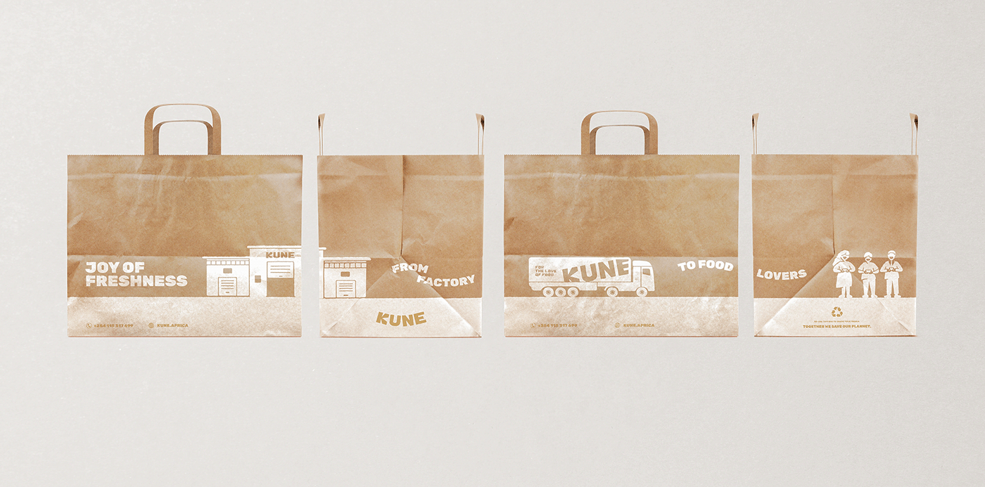
PACKAGING DESIGN
As the main touchpoint to connect with consumers, KUNE's packaging was raised up to be the spotlight of the whole identity. Turning the constraint of fixed material into advantage, so much effort has been put on to create the eco-friendly and yet user-friendly packaging. Every decision on using any key visual was seriously considered to make the packaging look fresh and delicious from the outside.


KUNE is also proud of its service to the meals on the consumers' table when it is still hot. That is why the process of delivering food directly from the factory to food lovers was illustrated in every paper bag to state that commitment.


*Some of the items above are optional versions and might be different from reality.
Thank you for watching!
***
Client: KUNE Africa
Location: Nairobi, Kenya
Creative Director: Andy Ho
Project Manager: Van Duc Hoa
Brand Designer: Huy Tang, Pim Truong
3D Visualization: Tiep Nguyen, Thanh Tang
Motion Graphic: Ky Nguyen
Copyright © 2021 by Bracom Agency . All rights reserved
www.bracom.agency


