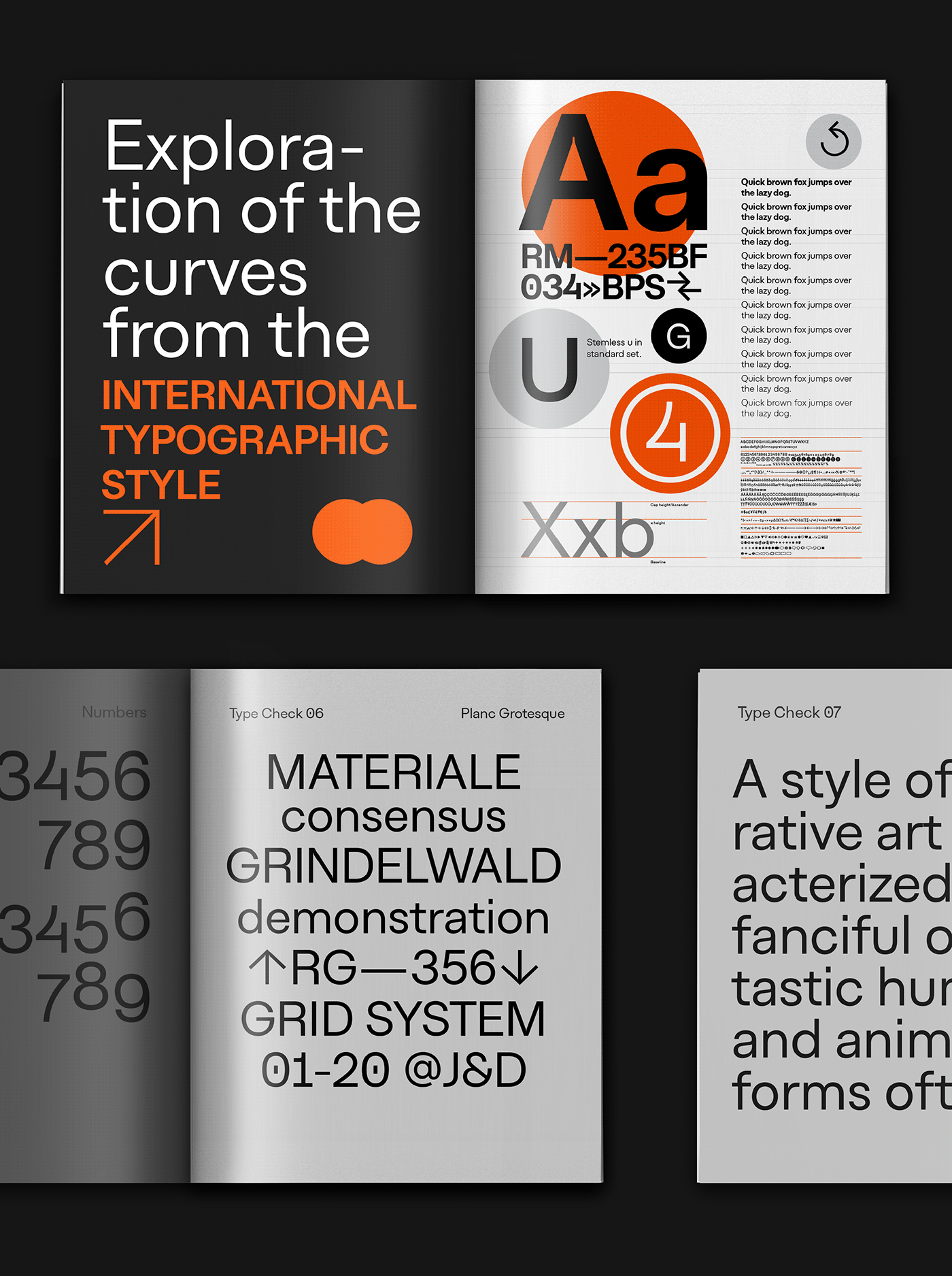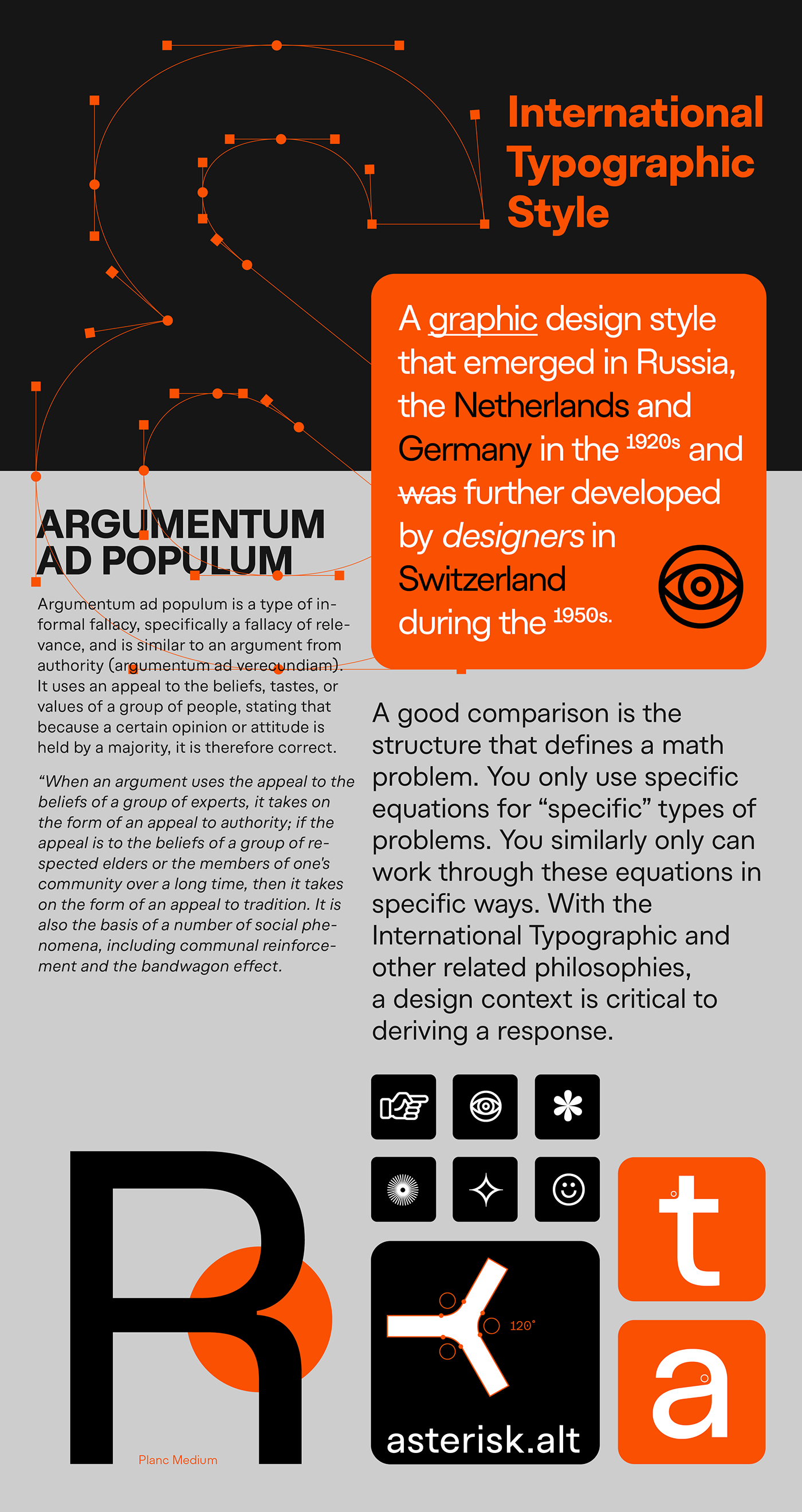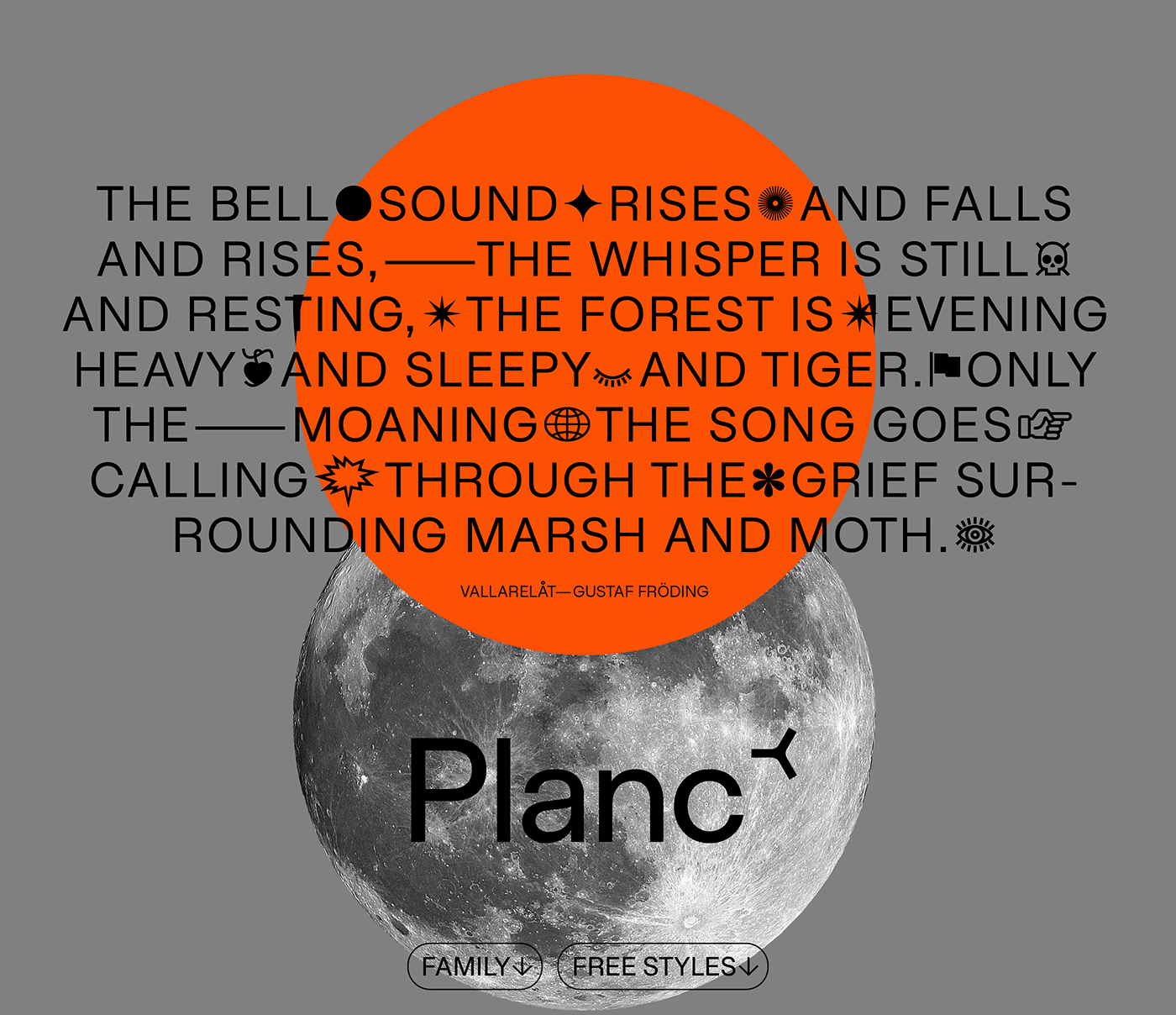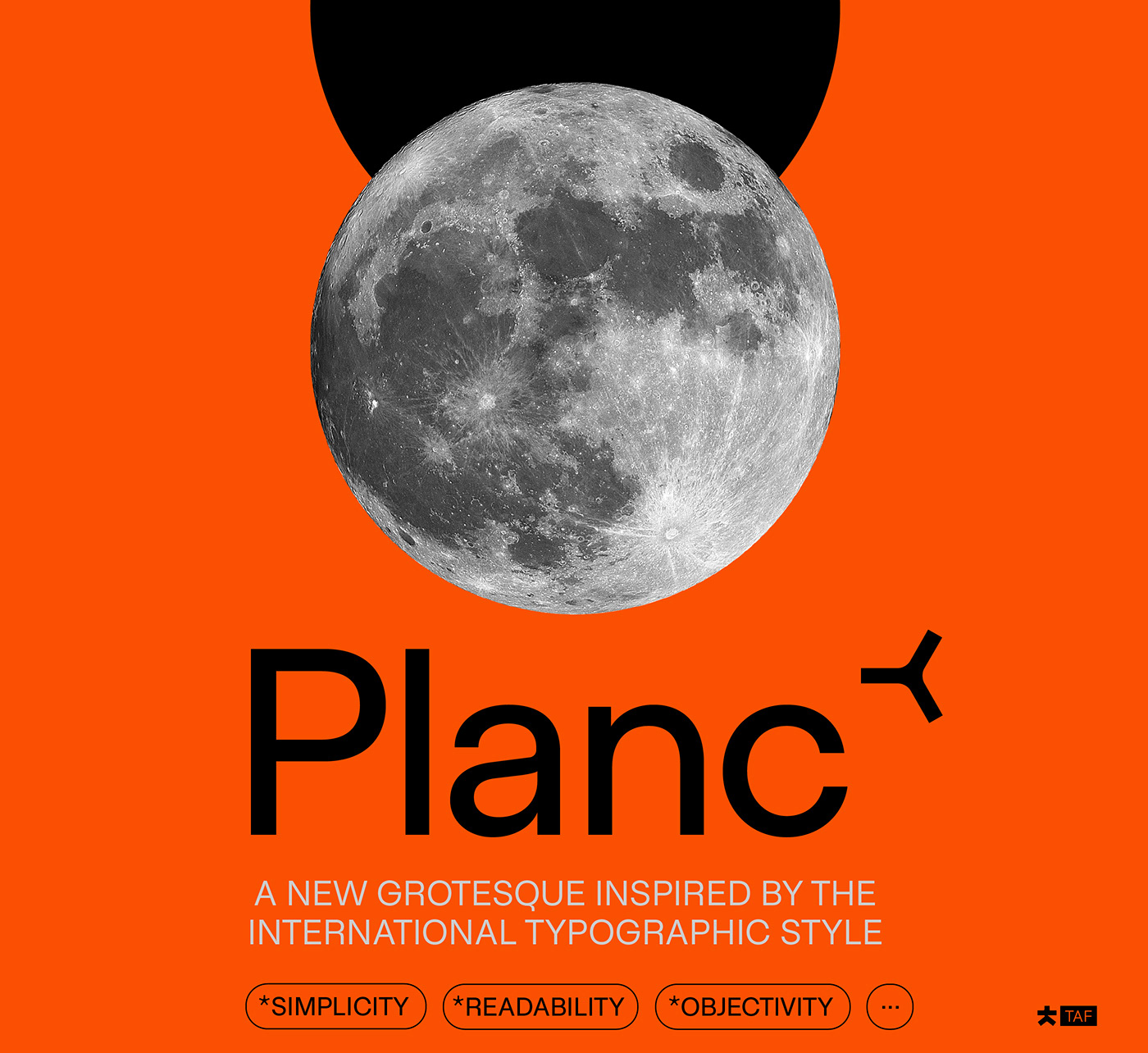
Planc has emerged as an approach to reconsider the grotesque font anatomy in a contemporary way. Its relaxed proportional structure differentiates Planc from the usual grotesque anatomy, meeting the grotesque font requirement that can keep up with today.
In addition to the solid structure on the horizontal axis, with its smoothed curves, Planc provides a comfortable reading flow and avoids being dull. Its minimalist approach comes from Planc's reduced dysfunctional details. As a clean design principle, it contains innovative letterforms.
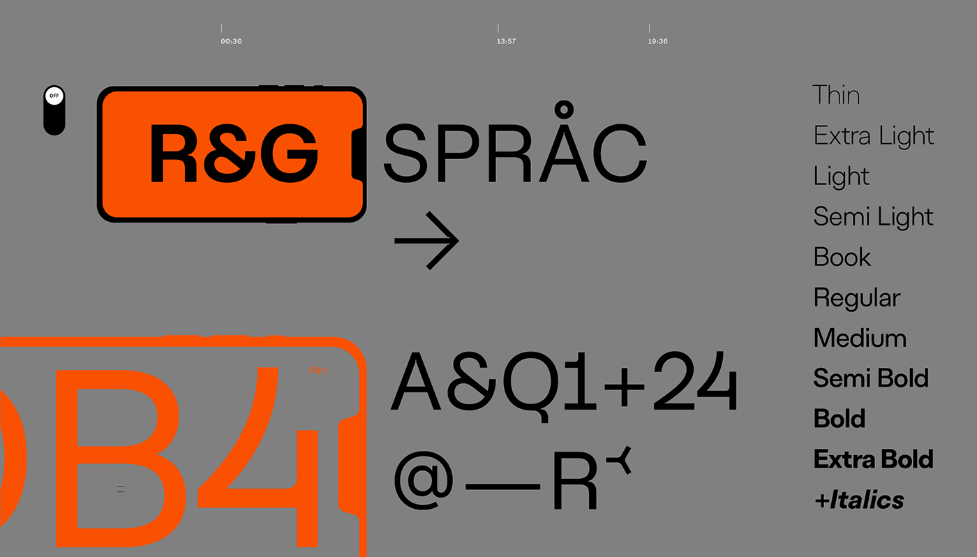
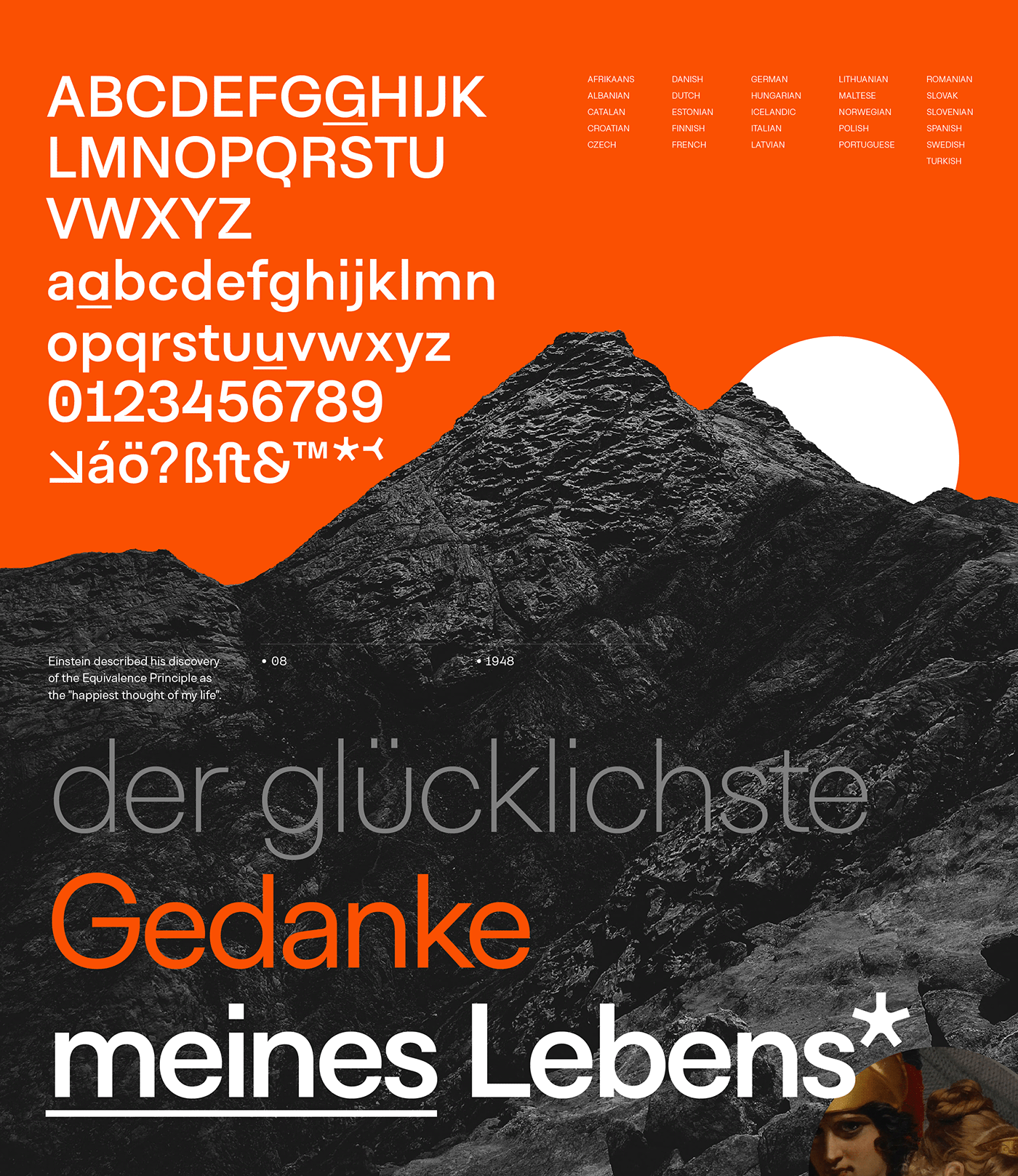
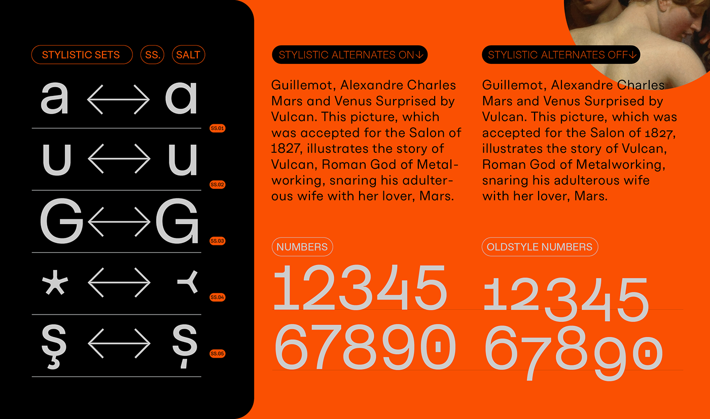
Planc font family consists of 10 weights including matching italics with extended Latin character set. It is a designer-friendly typeface with extra symbols, standard-old style,tabular-proportional numbers, arrow sets, and stylistic alternates.