

Malsch
Visual Identity
_
Malsch is a food brand focused onFried folder with differentiated proposal. The company believes that everything must be done with details, from cleaning and organization to how to serve and present the pastries. Malsch values experience and good relationships with people.
A Malsch é uma marca de alimentos focada em pastel com uma proposta diferenciada. A empresa acredita que tudo deve ser feito nos mínimos detalhes, desde a limpeza e organização até a forma de servir e apresentar os pastéis. A Malsch valoriza a experiência e o bom relacionamento com e entre as pessoas.
It's not just about selling pastries, it's taking the feeling of friendship through a welcoming environment with an incredible experience.
Não se trata de vender somente pastel, mas de trazer o sentimento de amizade através de um ambiente acolhedor e experiência incrível.
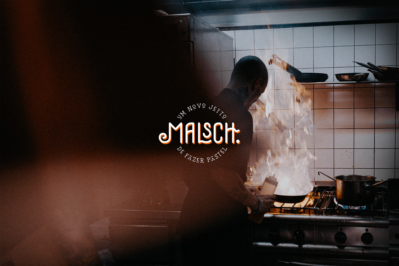
The brand's lettering style has irregular proportions and is rounded to simulate the cut shape of food. The typography is tall enough to be imposing and is designed to work well on facades.
O estilo das letras da marca tem proporções irregulares e são arredondadas com o objetivo de simular o recorte dos cantos do pastel. A tipografia é alta para passar imponência e foi pensada para funcionar bem em fachadas e letreiros.
In relation to competitors, Malsch positions itself in a completely different way, focusing on experience and environment rather than the product itself. This change in positioning and behavior resulted in a different look, all its competitors used red and yellow as the main color, so to represent the brand while maintaining a warm color, we opted for orange.
Em relação aos concorrentes a Malsch se posiciona de forma completamente diferente, focando na experiência e ambiente, e não no produto em sí. Essa mudança de posicionamento e comportamento resultou em um visual diferenciado, todos os seus concorrentes utilizavam o vermelho e o amarelo como cor principal por isso para representar a marca mantendo uma cor quente escolhemos o laranja.
The shape of the symbol that accompanies the brand was based on the shape of a mouth opening, simulating a bite.
O formato do símbolo que acompanha a marca foi baseado na forma de abertura de uma boca, simulando uma mordida.


© ALL RIGHTS RESERVED | AVINCER STUDIO


