
Burnaby Lake Greenhouses was Western Canada’s largest indoor plant grower. Their scale allowed them to grow and distribute an impressive range of consistently high-quality products. However, this position was challenged by a significant shift in the market. Their traditional, grocery store customers were ageing and downsizing while the next generation was purchasing boutique, craft brands from garden centres. This design project was challenged with refreshing the brand story to resonate with this younger (and nerdier) urban gardener.
Insight
The company is a fourth-generation, family-owned business with deep ties to the Netherlands. Three generations of VanderEndes are actively involved in ownership, management, and operation. They have a proven ability to retain an ‘extended family’ of long term, highly knowledgeable staff. At their core, they deeply value nurturing local talent rather than following the (industry standard) practice of recruiting outside expertise.
Strategy
Our work centred on this family’s authentic story. By honouring the past while celebrating the future, they positioned themselves as experts with deep knowledge and conferred skills, while moving forward in a spirit of innovation.
Solution
The design built on the existing brand while developing a graphic language that was exquisitely crafted and distinct from their competitors.

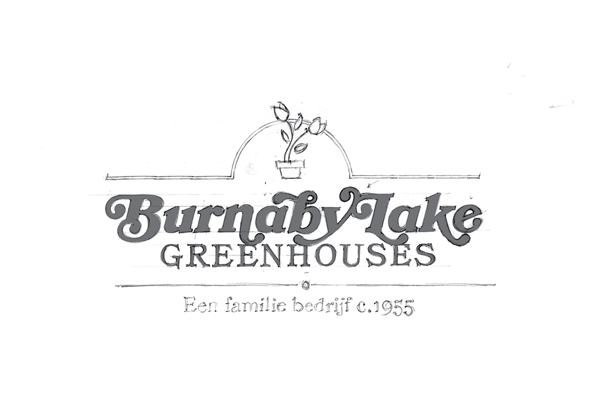
In the back of the greenhouse complex, we uncovered their first delivery truck (now converted to a storage container). Hand-painted on the side were the faint remains of the first iteration of their brand mark set in c.1913 Cooper Black Italic. This pencil concept renders it with typographically sophisticated, custom alternate characters.

An early iteration developed stories around the growing process. Among them, the use of bicycles to move around the greenhouse… and an intentional nod to their Dutch heritage.
We landed on a version with a strong link to the current brand identity.

We layered in a flexible concept where the symbol would change with each season and new application.

A monogram version for use in social and digital applications.
Corporate

Full colour, horizontal lockup with Netherlands tagline.

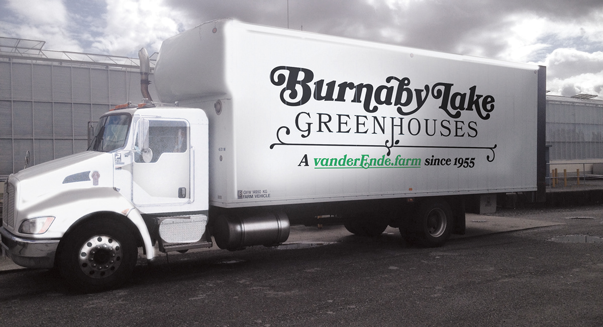
The new vehicle livery.
Retail and social

A series of icons continually refreshes the brand while illustrating the range of flora.


A series of social stories, rendered in the style of silent films, showcased the deep multigenerational expertise of the vanderEnde family.


