
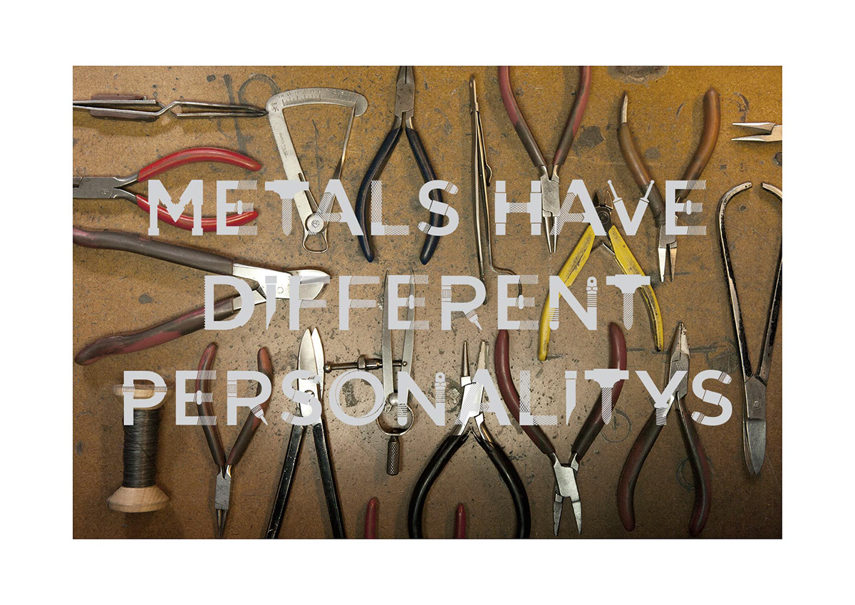
The “Sirkel” font is based on explorations of the work and studio of Jeweler Jan Bekker. I was inspired by the simplicity, honesty and geometry of his tools. The basis of the font is the textures, patterns and construction of these tools.
To give the viewer context I photographed the tools using the studio as a backdrop for the font. Based on conversations with Jan, I selected quotes made in passing that give the viewer insight into his choice in craft and his methodologies. I chose to silk screen as a medium to reference the hand made nature of his jewelry.
Going into the project I had an initial idea of what I wanted to create but the final work was completely influenced by my conversations and interactions with Jan and his space.
See more of his work here


All the prints were made Silk Screened with Clear ink mixed with metal powder.


