A Brand New Personal Branding
2020 has been a different year for all of us and also for me as it has redefined my vision towards graphic design. The changes that came out from this redefining journey managed to inspire me building a new concept for my monogram. The result is a more straightforward and modest look identity. This new brand identity attempts to achieve a more systematic and rationalised feeling by eliminating the unnecessary, thus making more references to Swiss design and reflecting more my personality and attitude towards design.
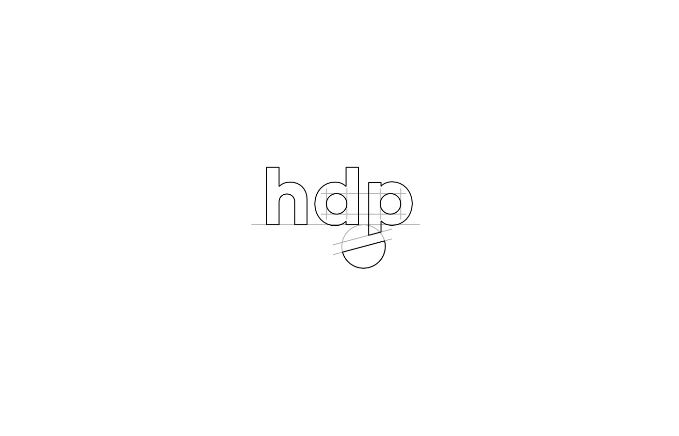
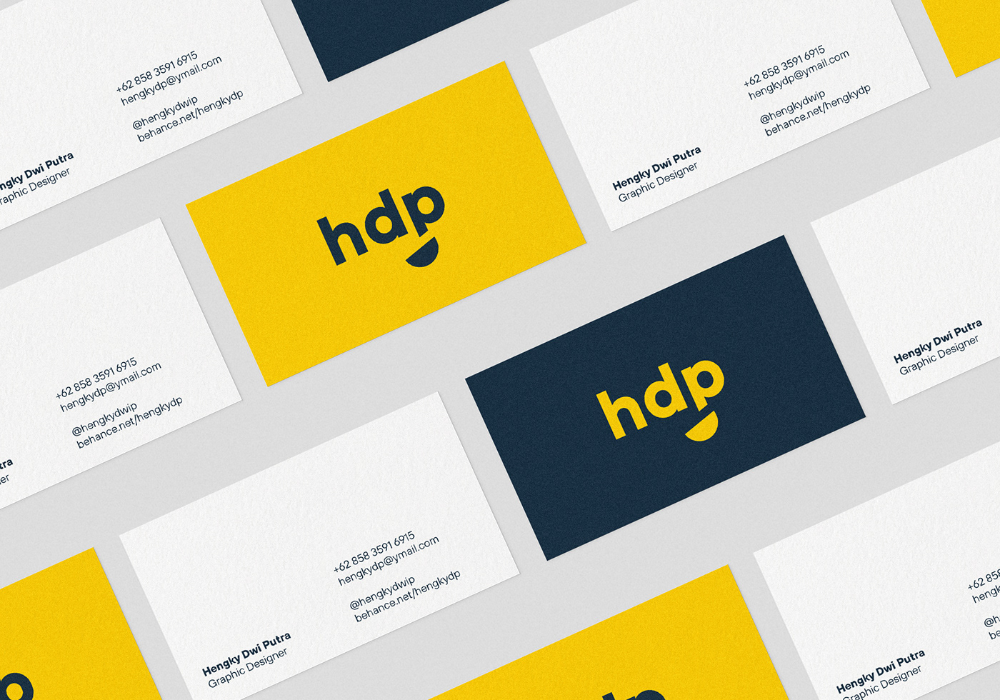
The monogram, however, still maintains the same concept from the previous design, featuring my initials but in lowercase this time and a smiley face. The circular counter in 'd' and 'p' letter becomes the eyes while the added half-circle shape, rotated in 15 degrees becomes the smiling mouth.
Using TT Hoves as the new typeface, this geometric typeface also provides a contemporary feeling to the monogram and whole design, for working across all print and online media.