


Don’t grow up, it’s a trap – they say. The thing is, we all age, regardless we like it or not. But there's a tremendous upside to aging—you gain experience along the way. The experience that makes you a better listener, a better problem solver, a better partner. The experience that makes you think twice before you commit. Because when you commit, you need to deliver - you know that from experience. As you mature, you can see your wardrobe change with you too. The clothes you used to love so much do not reflect who you are anymore. You feel you need a change.
We needed the change.
We grew up.
We grew up.
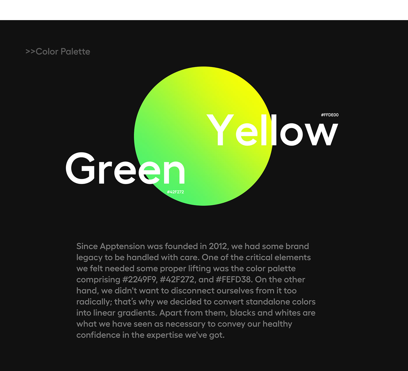
The name Apptension combines two words: application + tension.
The first segment—application—symbolizes the fact that we do all things digital. The latter shows our approach to building digital products: we try to maintain the dynamic, stimulating tension between creativity and technology, between what's obviously feasible and what we're striving for. Tension is a force that can form mountains, drive cultural shifts, and eventually lead to a new equilibrium. And we love it. That's why we decided to make use of this reference when refreshing our brand ID and represent the tension through what we know best—3D graphics featuring bent meshes and deformed lines.


Thanks for watching!
Now do not hesitate to follow us on Behance or other social media of your choice.


