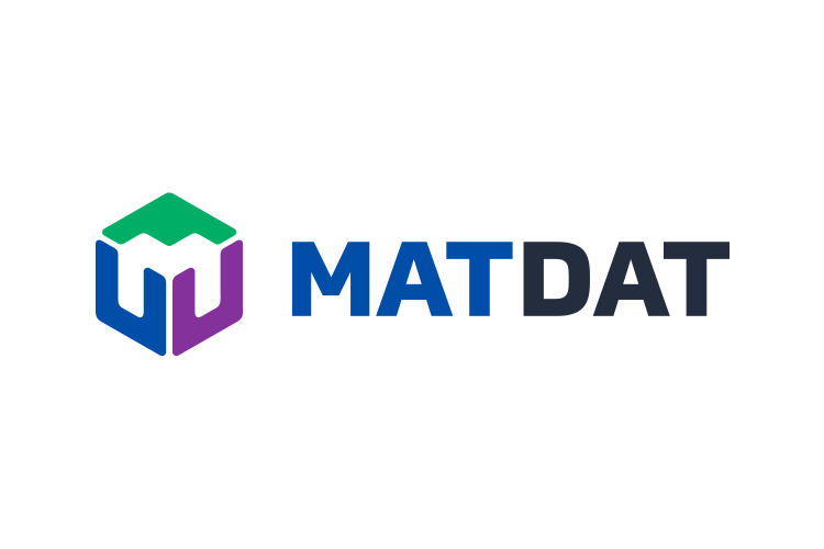
MATDAT is a web platform that offers integrated services aimed at scientists and engineers. After they've outgrown their old website and visual identity, they felt the need to set the foundations of a more professional brand identity before their big website overhaul.
The client wanted a brand identity that communicates precision, reliability, sophistication and simplicity. The logo shape represents an ecosystem of integrated services which fit together like a puzzle, and the negative space within the symbol forms the letter M.


I've also created a comprehensive 40-page brand identity guidelines document, which include logo variants and proper usage instructions, color palette, typography guidelines and examples, photography usage recommendations, as well as samples of graphic patterns that may be used in promotional materials.


Each of the three products has its own logo and color which are used on the product promotional brochures and website.


