CONCEPT
-
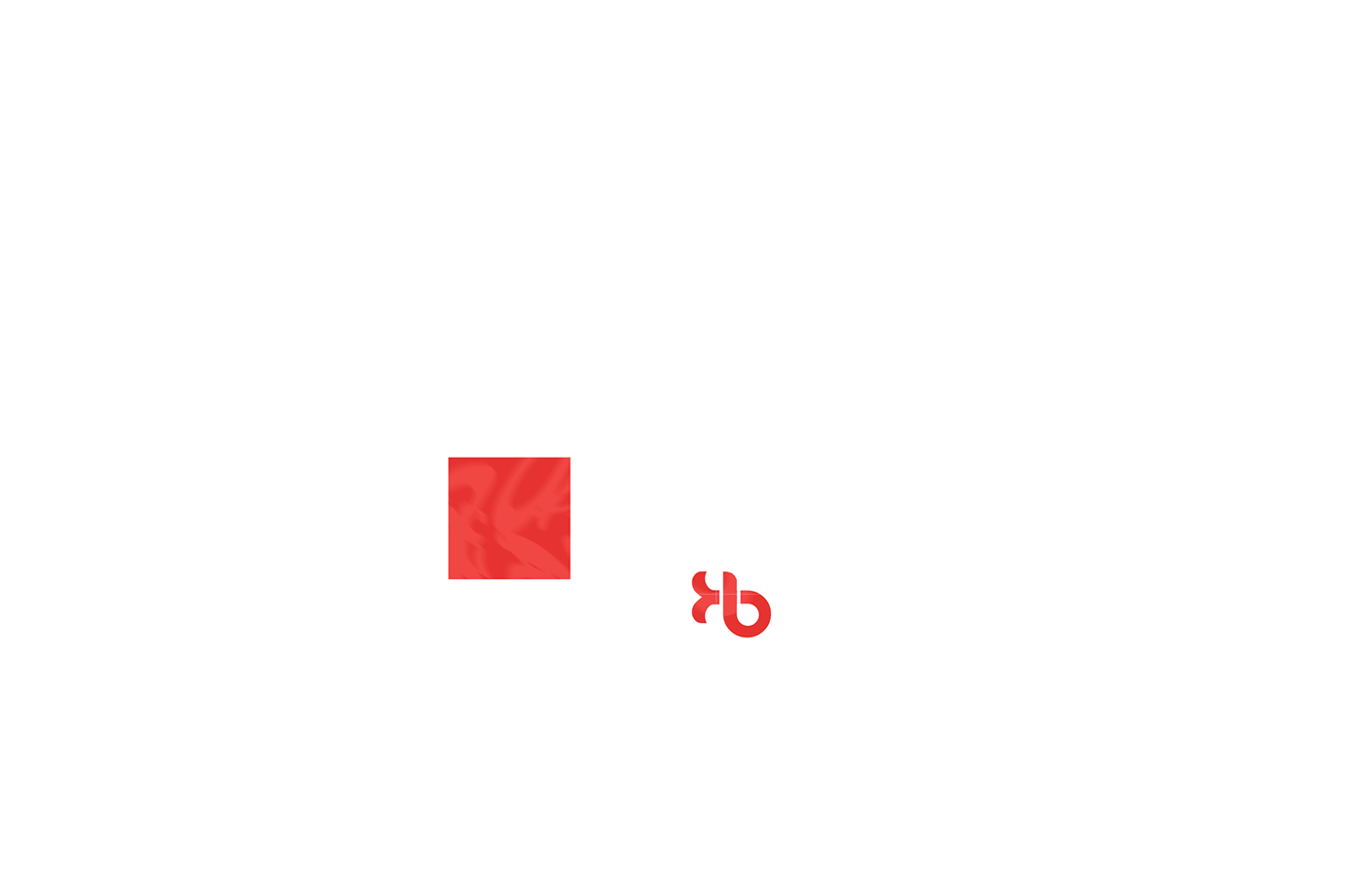
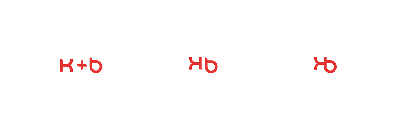
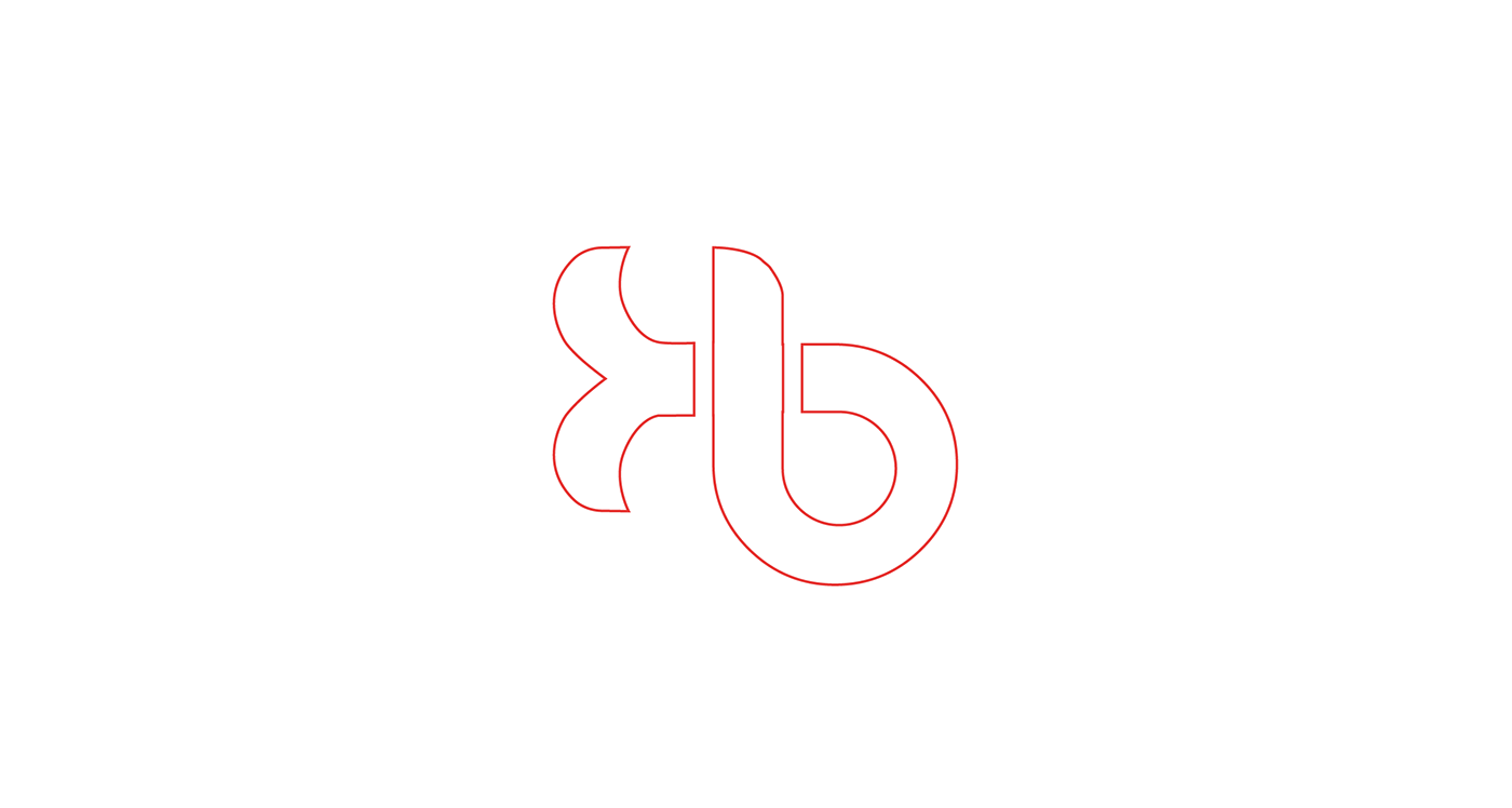
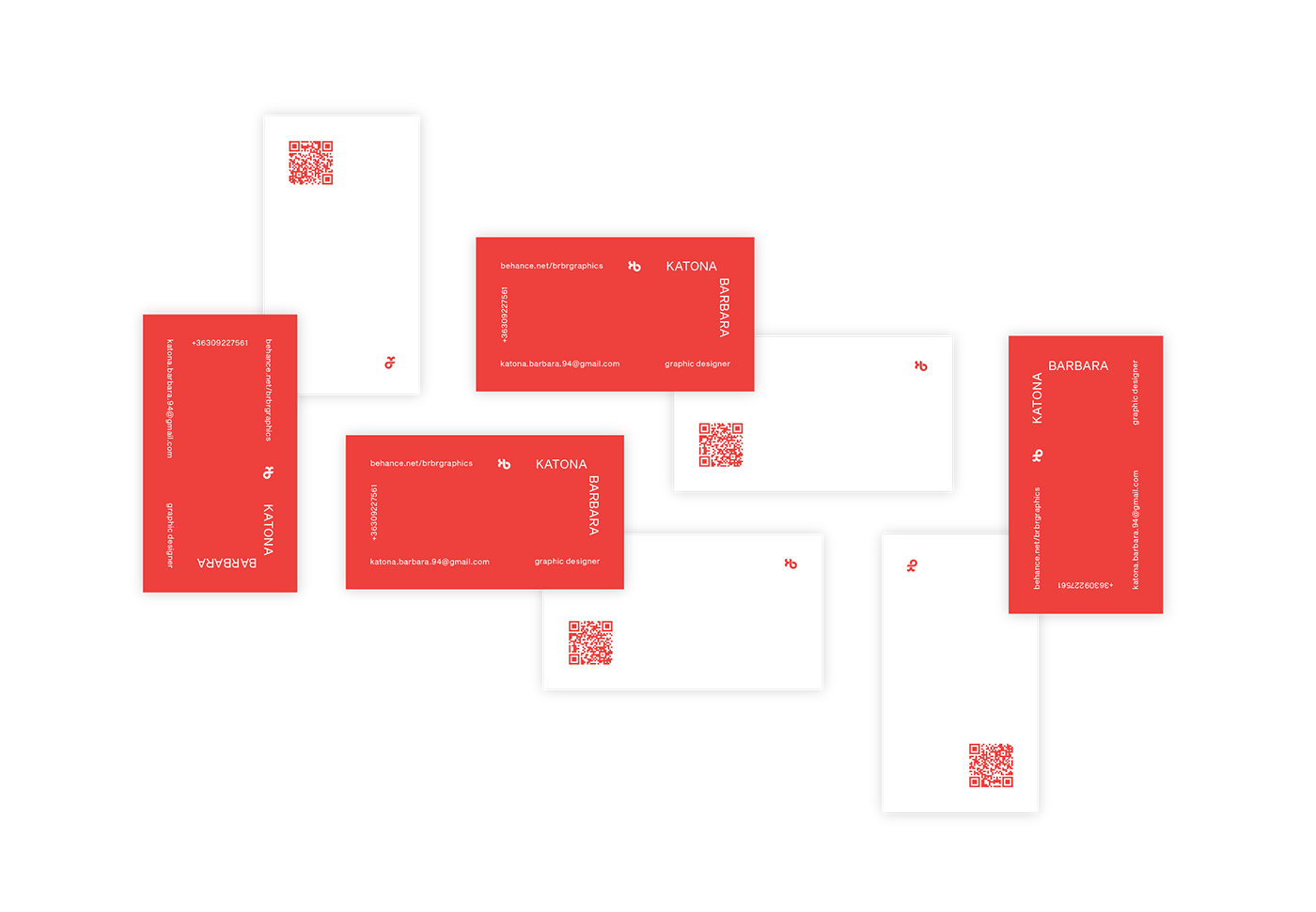
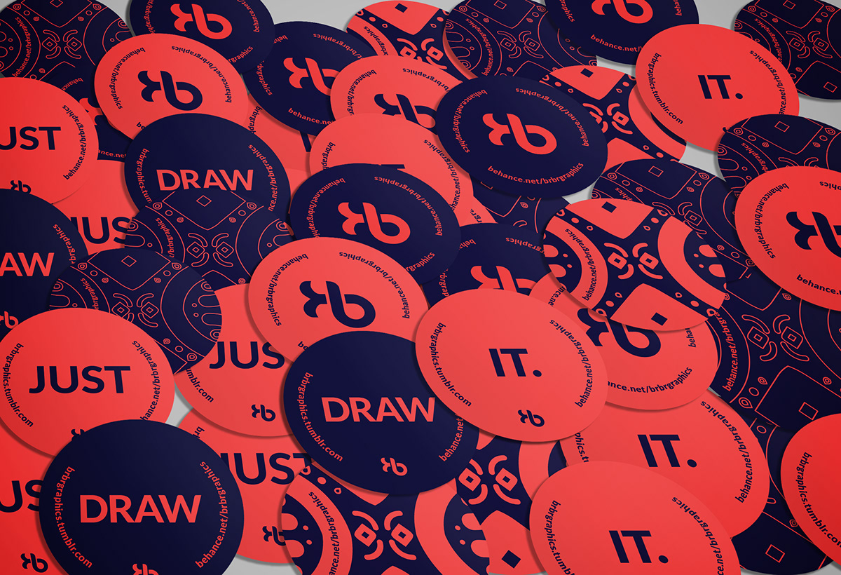
My logo was made of 2 alphabets from DANUBE font family. K stands for Katona and B stands for Barbara. I have arranged the K letter horizontally to put them together and create a one-shaped logo design.
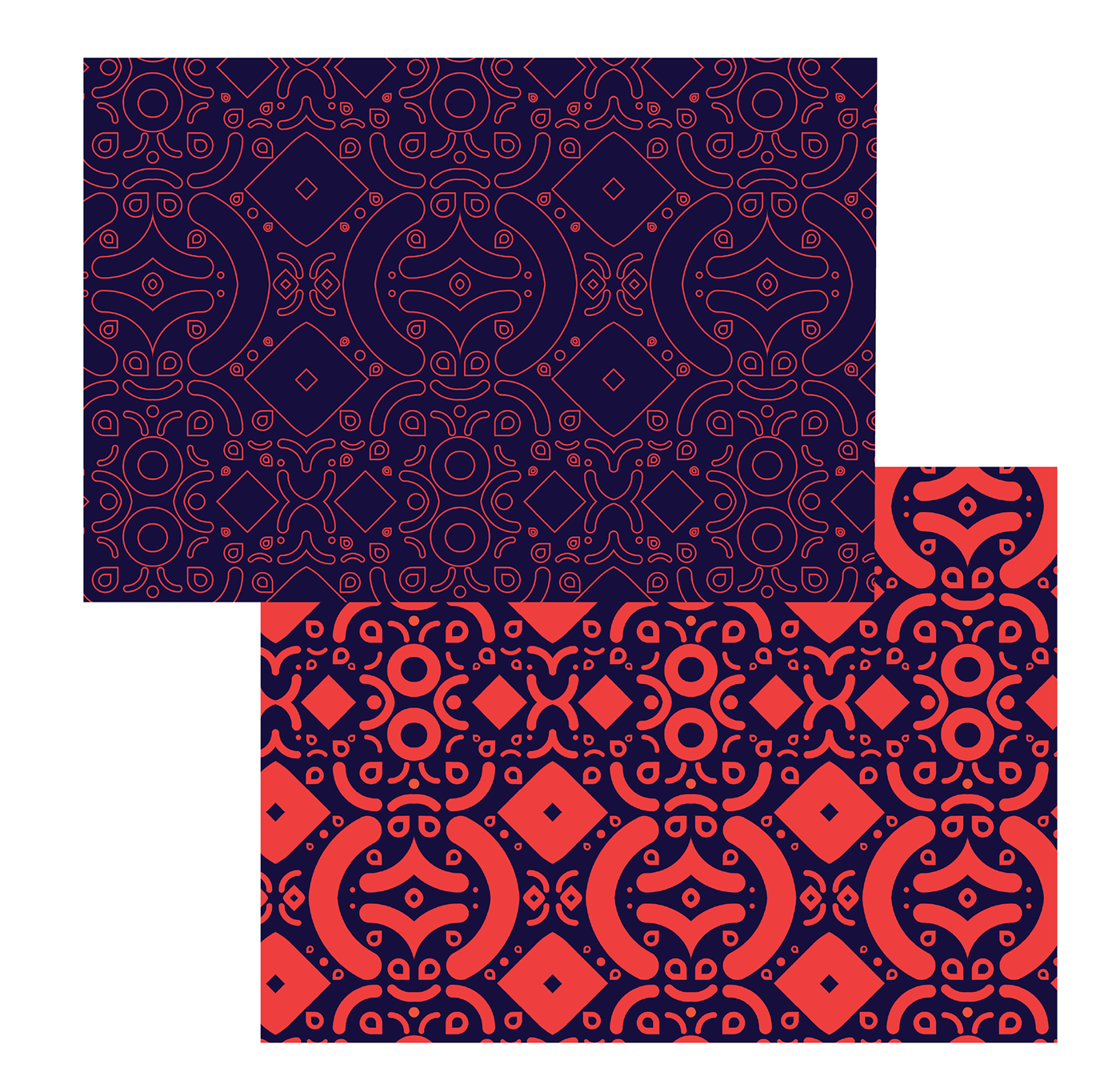
I choose two colors for this identity, bright red and deep blue. My reason for this is that they complement each other perfectly and it gives us a strong, striking look. As soon as you see it, it immediately grabs your gaze and you want to see even more of it.


Média és Design Tanszék, Vizuális Művészeti Intézet, Eger.
Made at the Media and Design Department, Visual Arts Institute, Eger, Hungary.
Consultant: Zeman Zoltán
Photos: Katona Barbara, pexels.com @cottonbro
2015-2020