Melted
Client
HECH
Role
Identity, Signage, Collateral, Space, Web Development, Consulting
Recognition
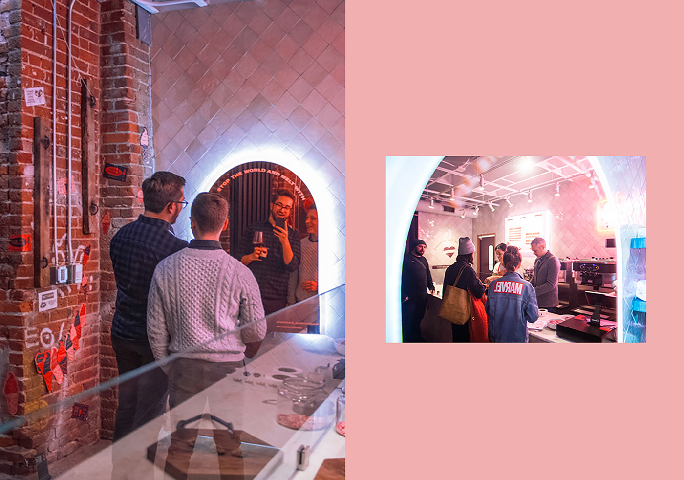
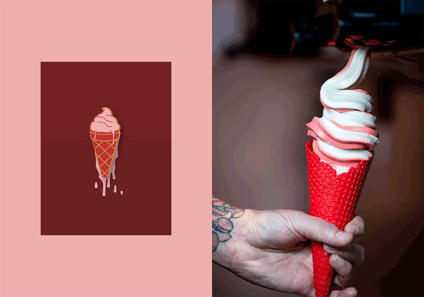
We like ice cream, a lot, so when we were asked to work on a new soft serve concept we were pretty excited. Our mission for Melted was to make ice cream sexy, edgy, and fun. We started with creating a brand ethnography followed by naming and brand positioning. We developed the visual identity in tandem with the space design, with the identity taking moves from our space design and vice versa.
Our goal was to make the Melted logomark as tasty as ice cream; from the distinctive, disconnected drip of the M, to the flowing easy curves and elongated counters throughout the letterforms. The soft melty logomark paired with a semi-ribald illustration system avoids ice cream clichés and excites a new narrative: ice cream can be sexy too! With the diverse illustrative system, we created sticker packs for customers to take the liberty of branding their own cup of ice cream. We also rolled out a wheat paste campaign that covers the interior and exterior brick walls of the space.


The color system was informed by the rich brick within the old Colorado Iron Works Building and paired with a tonal palette of luxe pinks and reds. Melted's interior is all about texture informing a sensory experience; heavy velvet, old brick, pink tile, marble, and neon. All of these finishes create a space that feels both luxurious and gritty.
For the main menu, we designed and built a pink perforated steel light box with magnetic menu items to create a unique, alluring, and easy-to-use menu system. We also had a custom mirror made that appears to be melting to the ground and offers a moment of you with your cone, bun, or cup of ice cream.