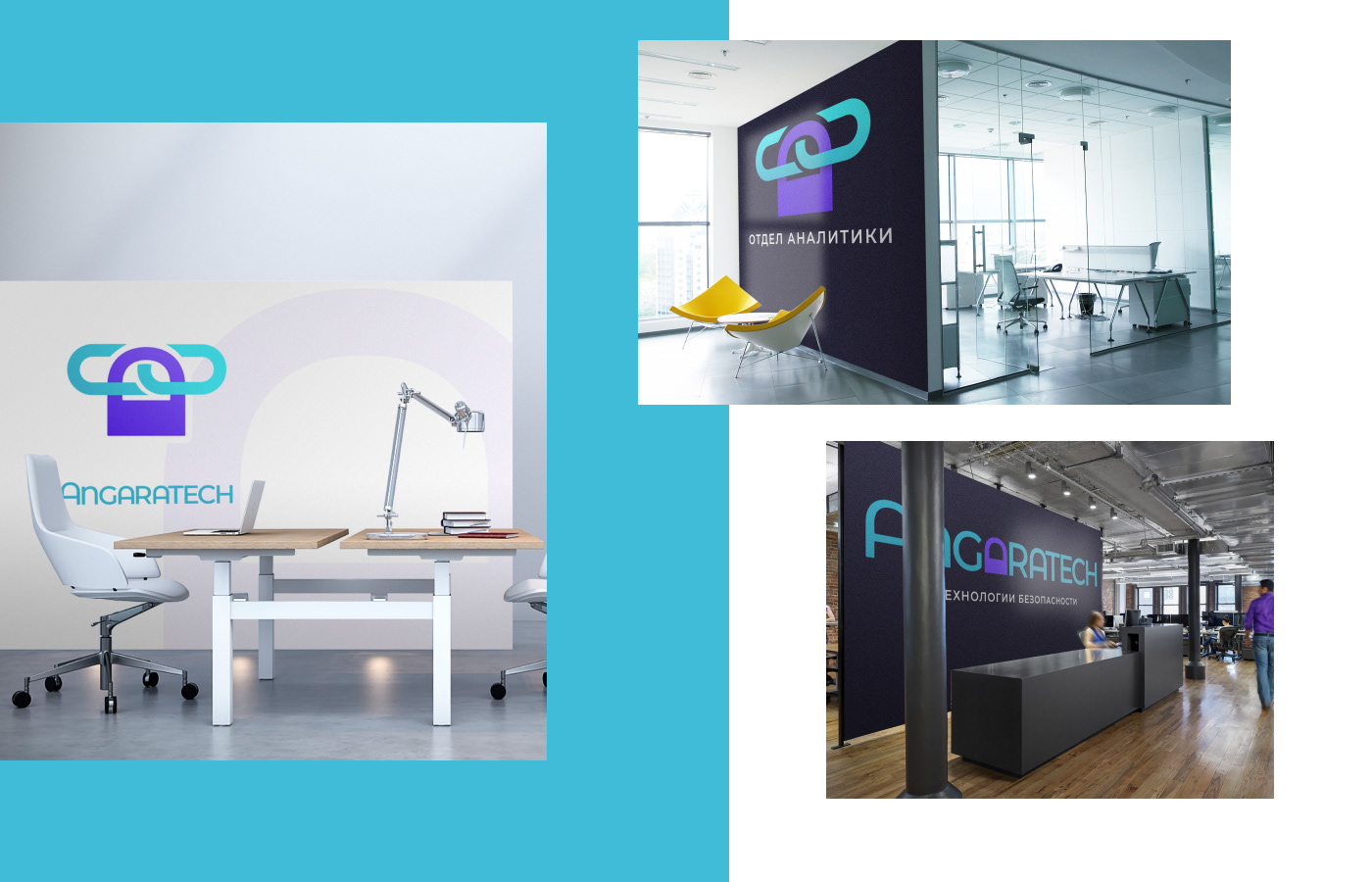
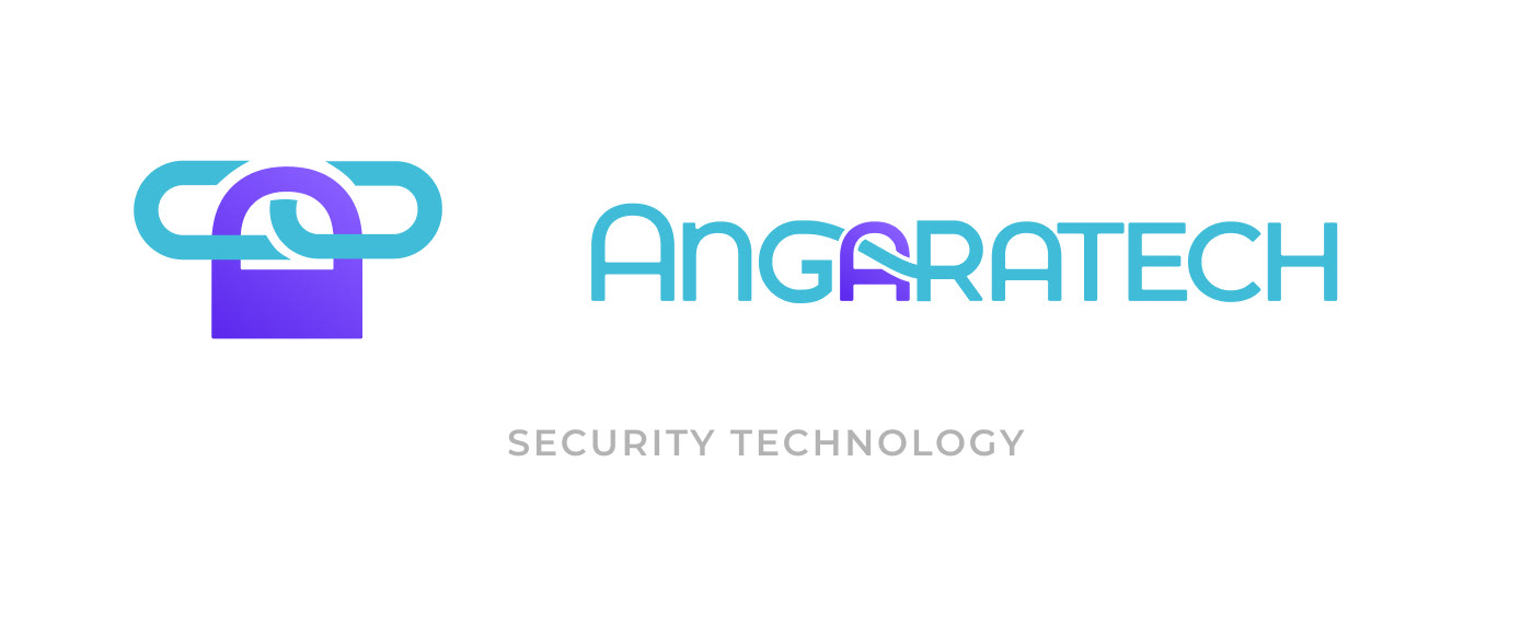
Logo design for Angaratech – cyber security systems integrator.
Task
1. The logo must look consistent
2. Design and integrate the symbol into the typeface
3. Develop a color scheme that is different from competitors
2. Design and integrate the symbol into the typeface
3. Develop a color scheme that is different from competitors
The message
Trust, Caring, Comfort, Safety, Willingness to change, Dynamism, Cohesion, Innovation, Expertise, Ambitiousness, Youth, Flexibility, Customer focus, Focus on results
STEP 1: Find a color different from competitors

Main competitors


Colors based on Angaratech message

The first combinations based on the selected colors

STEP 2: Typeface and symbol
After a couple of hours of "playing" I finally came up with two basic concepts.


The first concept
moved towards dynamism and ambition.
The interlacing of the letter gives integrity to the name. The italics is dynamics.
Not bad. But more suitable for a racing team or engine oil.
You expect reliability more than dynamic for a network security.

The second concept
is based on youth, modernity, readiness for changes. The symbol denotes the integration of one system into another. Additional meaning is satellite. This means manufacturability and observation.


The trouble with both signs is that they poorly reflect the Angaratek niche (security system integrator). It was necessary to choose a form based on a combination of meanings: Integration, system, security
This is what people mean when they google for integration and system or security

NEXT STEP: Combine familiar understandable associations into a single sign

Either way, the integration of security systems Angaratek linked to the web. All decisions on integration are inextricably linked to the transfer of data over the network, and the network itself. In this case, the link icon is a collective image of the entire web.
lock symbol firmly associates with digital security. The lock symbol in the browser bar shows that the connection is secure.

The first sketch showed that the idea has potential - the interlacing resembles the letter A and incomplete letters G and R
But there is a problem – too large padlock pulls the logo down.


The sign fits well into the name. But they needs to highlighted with a color.

Purple and green are great colors: strength and safety, ambition and concern.
Trying to use it in the title

That's better, but there are problems:
1. Poor readability of letters GAR;
2. The meaning of combining letters is not clear;
3. The sign cannot be used separately.
2. The meaning of combining letters is not clear;
3. The sign cannot be used separately.


It seems we are at the finish line. Lacks modernity and statements. By itself, a blue-violet speaks for itself: the power, ambition, integrity. But the area of application is not clear.
Looking for complementary colors


Used by competitors

Doesn't reflect values.

Yellow is outweighs the "optimism"

Marine blue-green. It combines safety, trust and innovation.

This shade looks good on light and dark backgrounds.
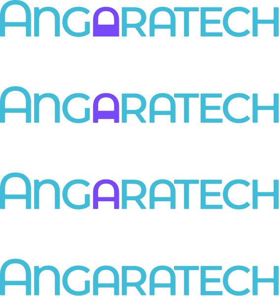
Different degrees of integration of the mark in a font