


Foscarini new brand identity
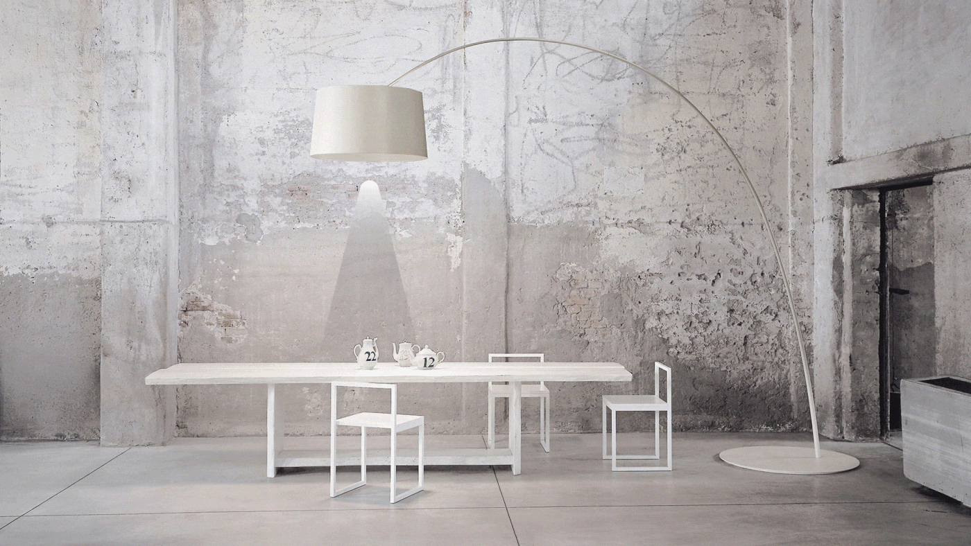
Foscarini is an italian company founded in 1981 in Murano, Venezia. Foscarini designs, develops and produces decorative lamps. At night time or during the day, whether they’re on or off, they seduce, surprise and inspire.
Foscarini lights are conceived as design objects that transform spaces: they bring beauty, they stir emotions.
Freedom, project, passion, innovation, charisma, poetry and “italian spirit” are the brand values.
The goal of my project is to express all of these values, while keeping the focus on another concept dear to the brand: create light.
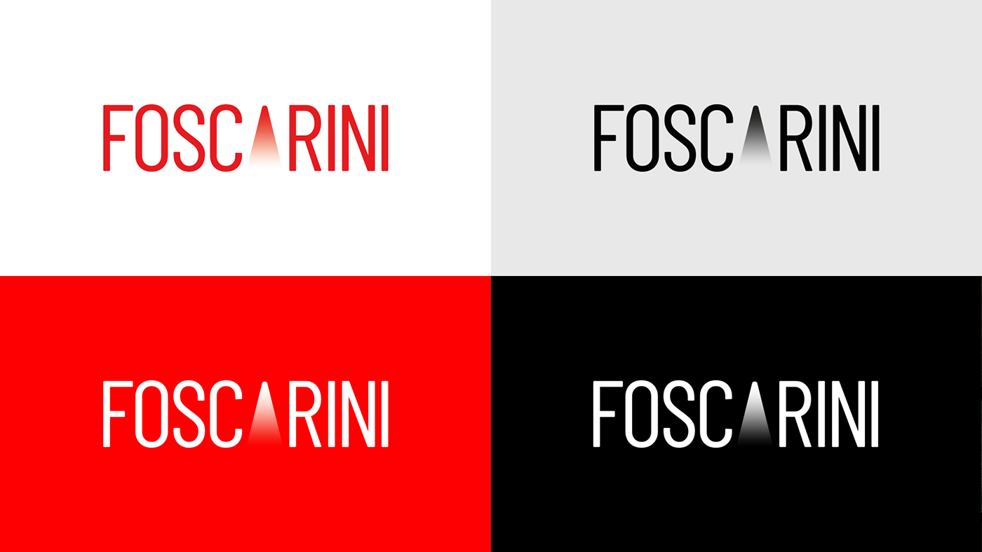
The previous logo had a minimal style and an elitist rigor, but the name of the brand alone wasn’t able to fully communicate the mission of the company.


A new logo to talk about light
Light is dynamic, it changes all the time. It is full of contrasts: shadow, light. Day, night. Hot, cold. The goal is to give the brand a dynamic identity, just like that of the light. A distinctive sign, which adapts to any eventuality and any media, without compromising the brand assets that have successfully accompanied Foscarini for almost 40 years.
To do this, I kept a condensed font for the logo, but I streamlined it, making it more fluid and adaptable. The real protagonist, however, is the cone of light that replaces the "A", effectively breaking the typography in two. It gives a more modern and recognizable look to the logotype, but it also works alone, as a monogram.


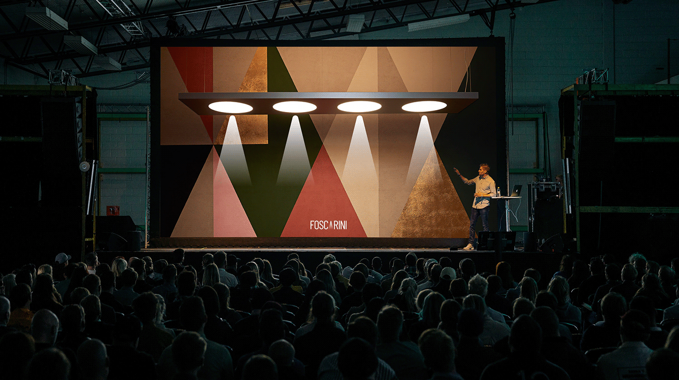
The light direction.
The light cone is dynamic: it can change in color, intensity, width and height. Just like a real beam of light would behave.
It works both as a logo and as a signature in ADV campaigns, but also as a graphic sign. In fact, by rotating it it can act as an indicator, for example within the website or the paper catalog. By changing the intensity, it can identify day and night lamps. Tightening and widening it it can differentiate the spot lamps from those with diffused light. Varying the color can suggest a cold light rather than a warm one.
Despite the ductility it remains a clearly recongnizable graphic sign that identifies both the brand and the company mission: create light.


Creative and Art Direction: Andrea Talone


