FNSY Designs Rebranding
After 7 years of using the old geometric logo, a new identity logo is presented. With more modifications and modern design directions applied, the new logo is created for the future!

The New Logo

Verdana Bold Typeface
The Verdana typeface is used for the identity of FNSY Designs and the boldface was chosen for the logo.
It was chosen for its cross-platform availability and humanist design which makes it easily acceptable by the eyes.
For more on Verdana typeface: https://en.wikipedia.org/wiki/Verdana

Color Palette
Extending the 4 main colors palette from the previous logo, with using more vivid hues especially for the green and red colors.
Also, the flat design approach is adopted in this design to follow the current logo design approach, ditching the bevelled N letter in the previous logo.

Dimensions & Ratios
Applying some modifications on the original Verdana typeface letters' sizing and between-letters spacing.

Color Variations
As it has always been, the main idea of the logo is to retain clear visibility with minimal edits and adjustments on all our designs. Thus, the letters' black outline is added in a fancy way to act as a frame to ensure full logo visibility on all colors, even the original colors of the logo itself!

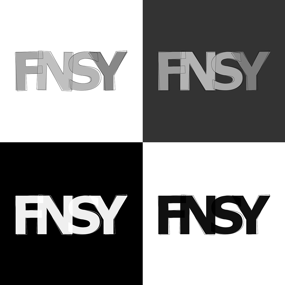
Monotone & Greyscale
Taking into consideration the colorful backgrounds, we didn't ignore the monotonic and greyscale designs. The new FNSY Designs logo is created to be adaptive and clearly visible with all colors variations and even the monotone ones!
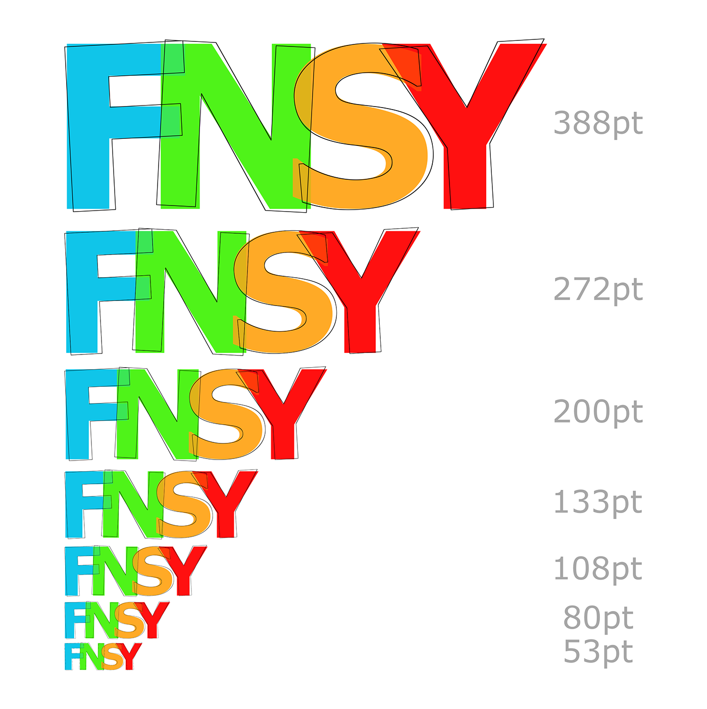
Scaling & Resizability
As usual being a pioneer in the designs field requires producing several sized designs and publications. The new FNSY Designs logo is set to be clearly noticeable in a spectrum of sizes and scales.