
Brand identity
New social networking brand Мама на Море
I love working for my friend`s projects. Is like helping a family of alike minded people. This was the case. A girl that I admire and had luck to study with, work with and become friends with started her own thing. She became mom and moved to live to the Black Sea coast from crowdy Moscow. This was the time of new starts, new searches and new goals. So the project for moms who live near by was born. They organize educational and festive events, make family trips to the mountains and woods, serve as an educational portal and much more. So there was the task. To have visual elements to show that to be mom now can be also cool and stylish.
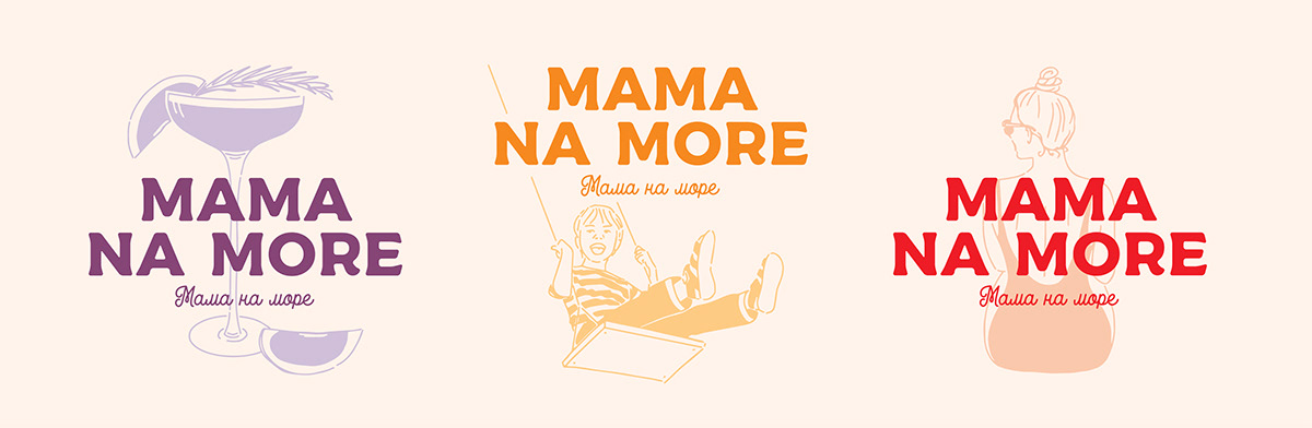
A pastel gamma was chosen to transmit the kindness and softness of motherhood. The images are made by outlines to be alike a child`s drawing, manual, but still keep on being clean. We were deciding between English writing of the name and a Russian one. Stayed with Russian one to be more coherent.
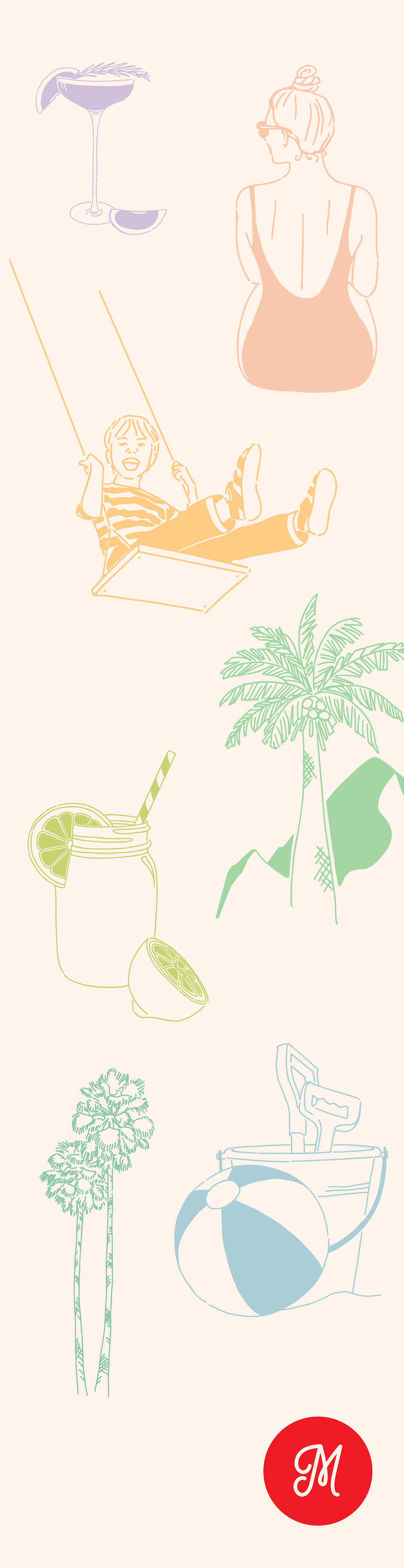
Here are all the visuals that were made to highlight every aspect of the activity of the company. Later on you will see how they were combined with the logo, though could be used separately as well.
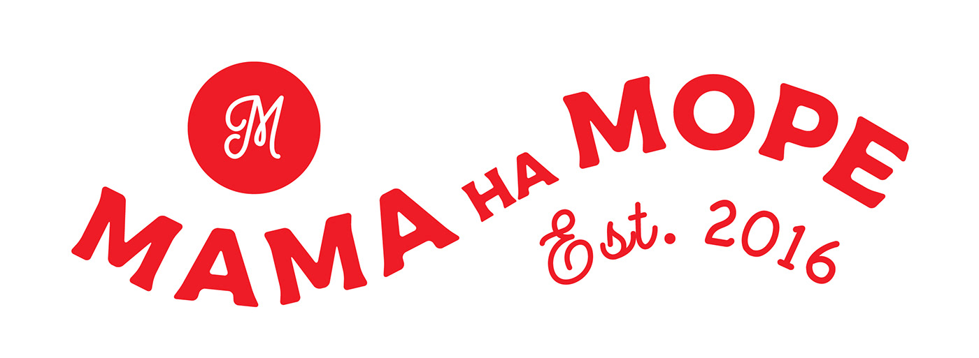

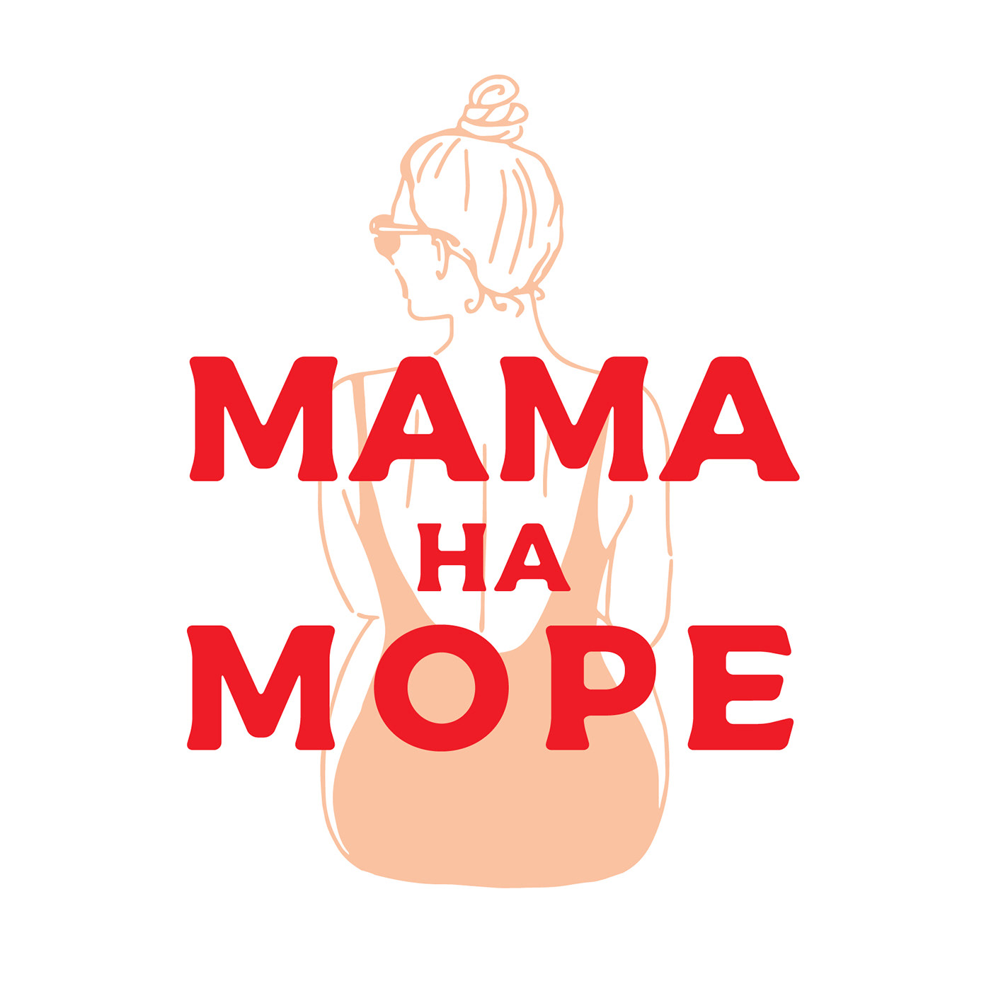
These are two main logos. One is more quadrate another horizontal rectangular (to keep in mind different spaces they will need to place the logo).
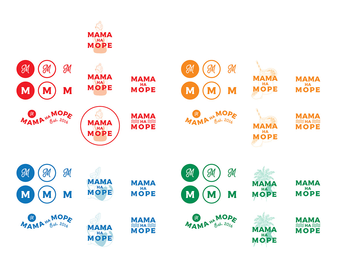
This was the final identity set that was presented. Besides of that I made black and white versions of everything to have the possibility to use them in different occasions.
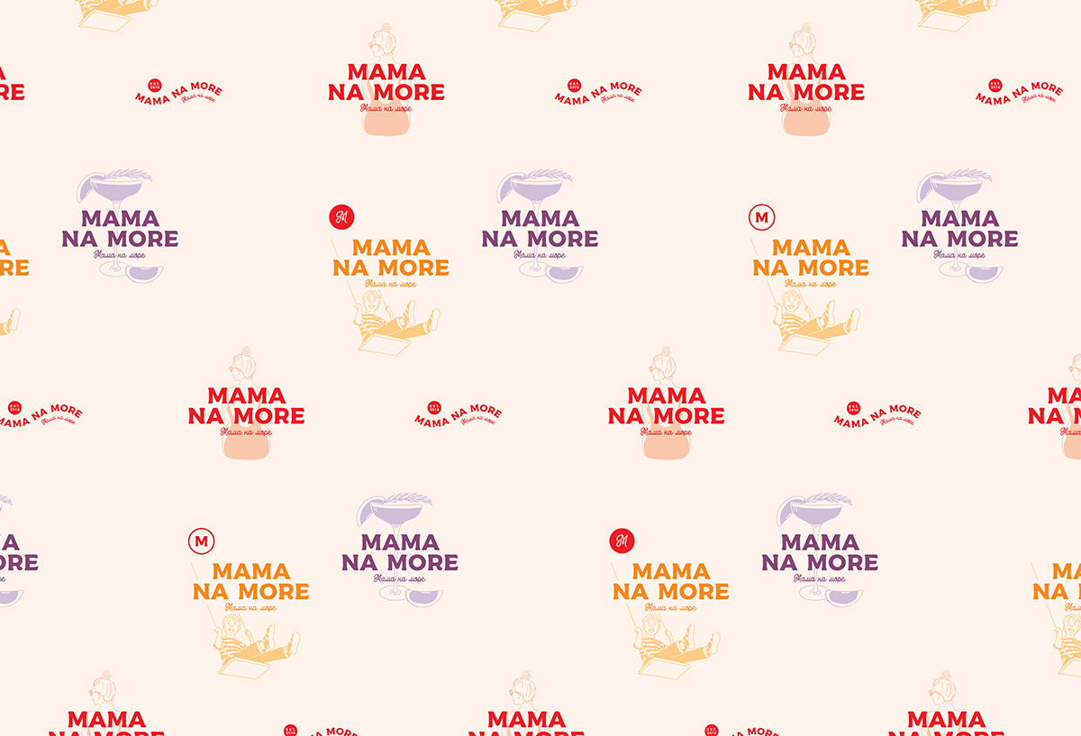
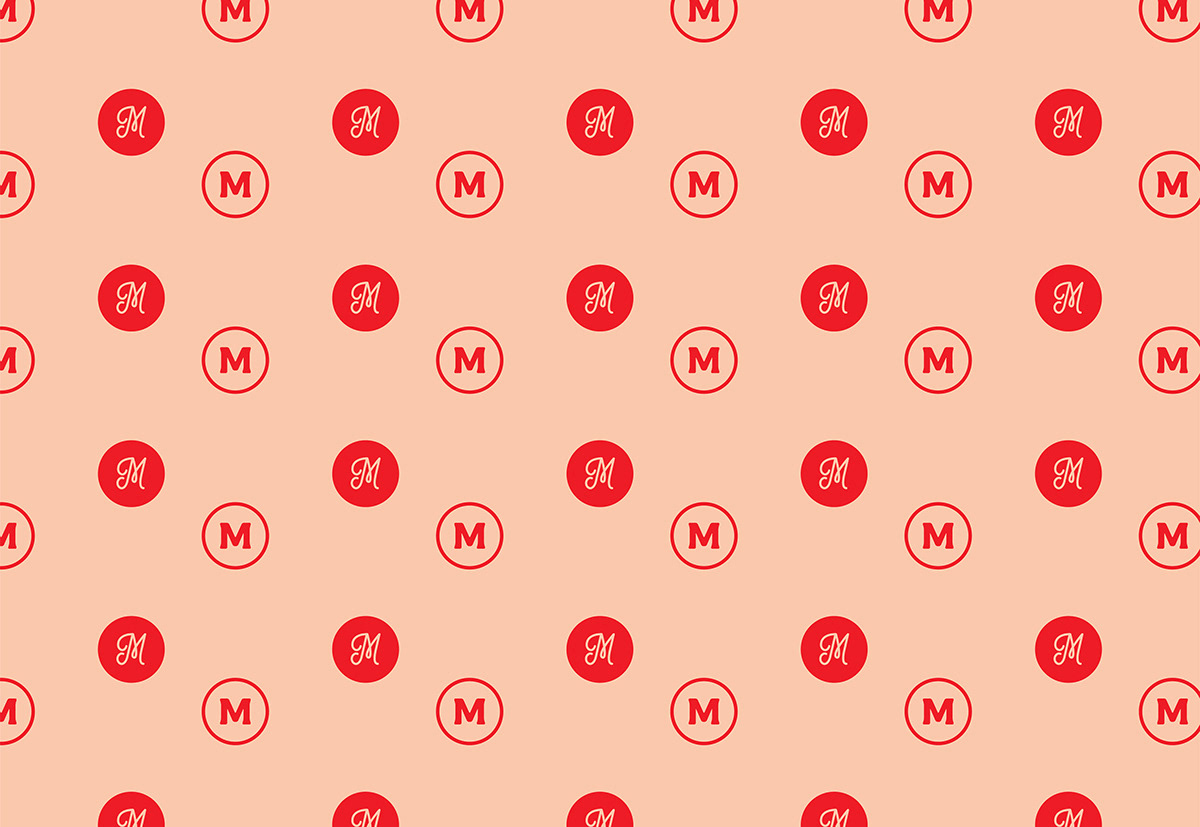
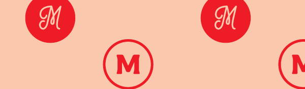
These two are patterns they can use for backgrounds, press walls, packaging paper or any other materials.

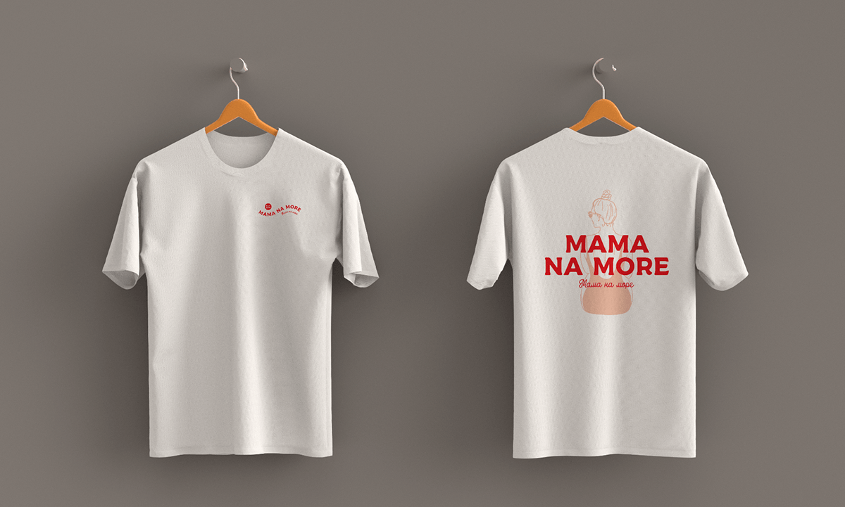

And finally some t-shirts for the promoters on one of the events.
I hope you liked.


