/the challenge
The folks over at Iron Pyrite Production were gearing up to launch their new high end online fashion retail shop. They wanted a logo that reflected the luxury and curated nature of their brand, while still having a rugged touch that alluded to the thrill of venturing into the unknown.
In alchemy, iron pyrite is also known as Fool’s Gold, and while that may feel like a counterintuitive name for a luxury apparel store, it actually refers to the idea that customers of this store understand the value of their products and know how to tell the difference between cheap imitations and the real deal.

/the result
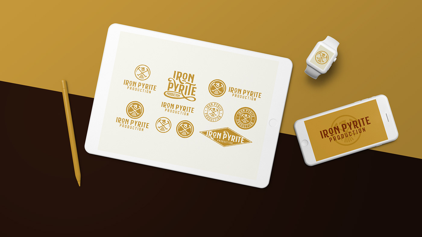
In order to get into the spirit of the brand, I spent a lot of time looking into old, vintage logos and designs from the Gold Rush era. During that time, typography was bold, daring, and in some ways, as wild as the terrain it was found in. Taking inspiration from the brave nature of the designers of that time period, I created a suite of marks that could be used to represent the Iron Pyrite brand in multiple instances, including apparel and merchandise. The challenge became finding a way to tie all of these different marks together in a way that still represented this new brand without causing any confusion with its growing audience.
The hero for the brand became the main icon, which was designed to be bold luxurious and rustic. I stared at photography from the great Ansel Adams, and tried to visualize what mark could sit on top of one of his photographs and represent the daring feeling that comes from venturing into the unknown.

The logo has a handful of hidden imagery in it that allude to the brand’s emotional connection with the Gold Rush. From a glimmering gem, to the classic symbol of crossed pick axes, to a fierce bald eagle, and even the gold bar beneath the “O” in the wordmark, this mark was designed to feel as if it could have been found on a shipping crate at a general goods store in an old mining town.