

Ensuring better customer retention using Ferry's Business Dashboard
The Problem:
Businesses had no real solution to keep track of the customers who walk in and out of their business. Their regulars were rarely spotted by them or validated by the manager or staff member at the outlet. This caused the customer to become lethargic about their visiting experience and thereby affected the business' overall retention rate of a customer.
The Solution:
Keeping retention & loyalty as the primary focus, Ferry helped faciliate interactions with customers by encouraging loyalty and rewarding them when necessary. This helped improve overall customer retention rates.
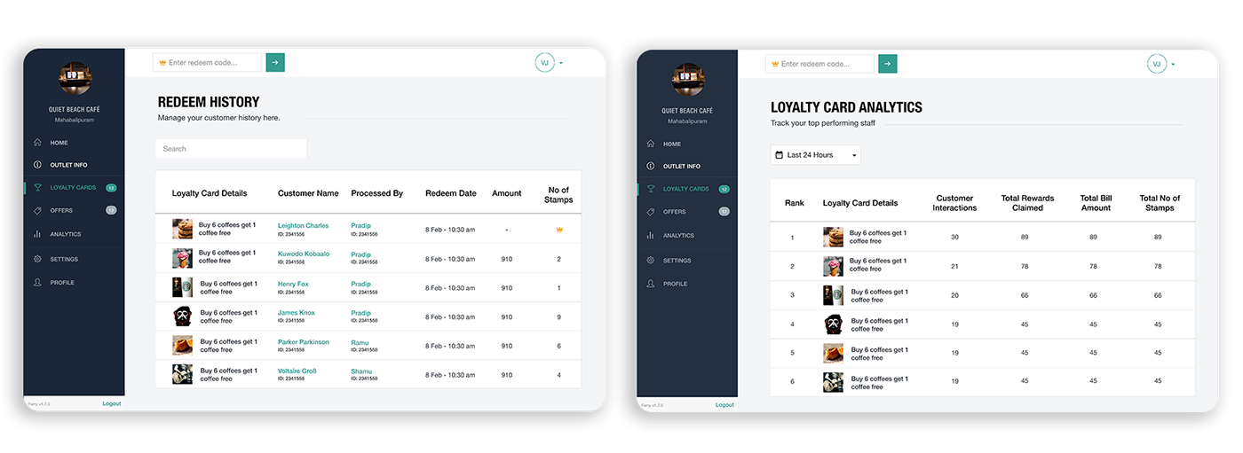
The Ferry Dashboard also helped keep track of a customer's expenditure by entering bill amount per visit on whatever their purchases are.
The dashboard also provided the ability to view data and analytics seamlessly for owners to see how their outlet and staff are performing.

My Role:
UI/UX Design
Timeline:
August 2016-Jan 2020
Team Members:
Ranjith Nair(Product & Design), Bharath Tejsinghani(Product & UX), Nikhil Panju (Product & Android Developer),
Andrew Lopez (CEO), Vasanth Gigi(iOS Developer), Vishal Joseph (Sales & Marketing), Pranav Narayanan (UI/UX Design)
Andrew Lopez (CEO), Vasanth Gigi(iOS Developer), Vishal Joseph (Sales & Marketing), Pranav Narayanan (UI/UX Design)
Tools:
Sketch, Figma, Invision, Marvel

My contribution
As the UI/UX designer behind this project, I had to be involved with the research, creating wireframes, produce high fidelity designs & prototypes and also participate in brainstorming sessions with our small yet talented team to get the right solutions for a business owner's problems.
Working closely with the engineers was integral to reach the goal in terms of design standard and usability of the Ferry Dashboard. As a team we focused on constantly refining the experience for a business and always finding solutions to any problems they may have faced.

RESEARCH
───
───
Our idea to create a tool for a business approached reality whilst building reward programs for our user base. It fell in line with our thought process that a business must be able to validate their customers and be able to track the number of visits and amount spent by them on each visit. This ensures proper effort in allowing them to retain their customers better by rewarding them for their loyalty.
Domain Research & Interviews
To better understand our approach and actions we decided to review certain platforms to understand how certain forms were built and how a business owner would input their outlet information and create a program to enable retention.

We also used our sales force to interview business owners and the problems they faced using these services. We curated our findings from their experiences and our research together.
Our primary findings were:
• A lot of content regarding deals/offers and promotions by business owners are lost in a user's social media feed as posts by friend's are prioritized over businesses and the like. This showed there was struggle in getting their message across effectively.
• Services like flok, were not yet available to business owners in India and due to a lack of foothold in the country, not many knew about it's existence as well.
• nearbuy & groupon had killer deals but did not oversee retention from business owners. Business owners would also talk about certain "deal-hunter" users would just visit and claim the killer deal only to never be seen ever again. (eg: Buy a beer and chicken wings for only Rs.1)
• Business owners loved to execute loyalty programs but were hasty to do so as there were numerous issues using physical cards. Issues such as Loss of Card, Different individuals using the same card, etc were some of the issues business owners faced.
• Hashtag Loyalty was a loyalty program centric platform adding only limited value to the customer by having loyalty programs for specific outlets. They were limited to just one type of loyalty program across all outlets.

DESIGN
───
───
Ideation
Based on some of the evidence we collected during our research stage, we conducted a brainstorming session.
We narrowed our ideas to certain key features we felt were extremely important to shape the foundations of the Ferry Dashboard:

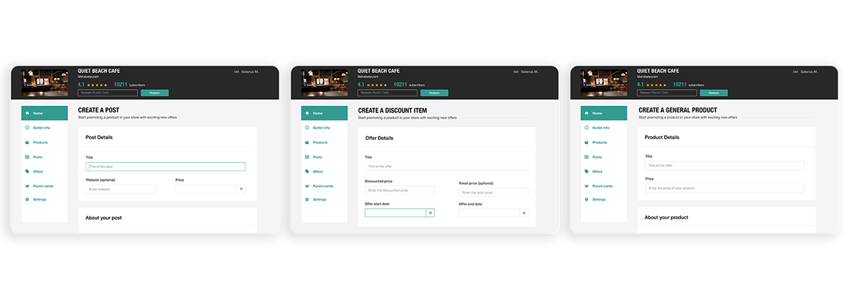
Wireframes
We worked on the following wireframes to get some feedback from a few business owners we had been in touch with.
We worked on the following wireframes to get some feedback from a few business owners we had been in touch with.

Collecting Feedback & Revising Design Goals
Our sales personnel showcased the flow of the dashboard to a few business owners and it was generally well received by them. They found it highly useful from a business perspective and found certain features quite useful in planning their promotions moving forward. They also suggested a few small changes to help refine it a little better. Few business owners agreed to try out the product and we were more than happy to be accomodative of this thought as this would help us in our iteration process.
At this point, we decided to start developing our dashboard and make it functional.


The Soft Launch - Collecting Feedback from the Business
Ferry had a soft/beta launch at the Slate Hotels, which had two outlets catering to food and beverages: - Studio and AYR. The team and I were at the outlet to assist the staff with any questions or hiccups they might have. We also used this opportunity to collect more user feedback from staff members to help in our upcoming iteration process.
• Staff Members found the current version of the mobile app a little challenging in their first attempt
• They also found the dashboard to be overwhelming visually.
• We assisted Staff Members in pitching the product to customers. Speaking to the staff afterwards, we understood it is imperative to have a guidebook or manual of sorts to help staff members whenever they require.
• Our first version of the Ferry Dashboard on mobile devices showcased analytics and the ability to create content from the home page, this seemed to overwhelm the staff user.
• Customers complained they didn't have space on their phone for "another app" to staff members, but were very keen on getting rewards for their purchases and visits.

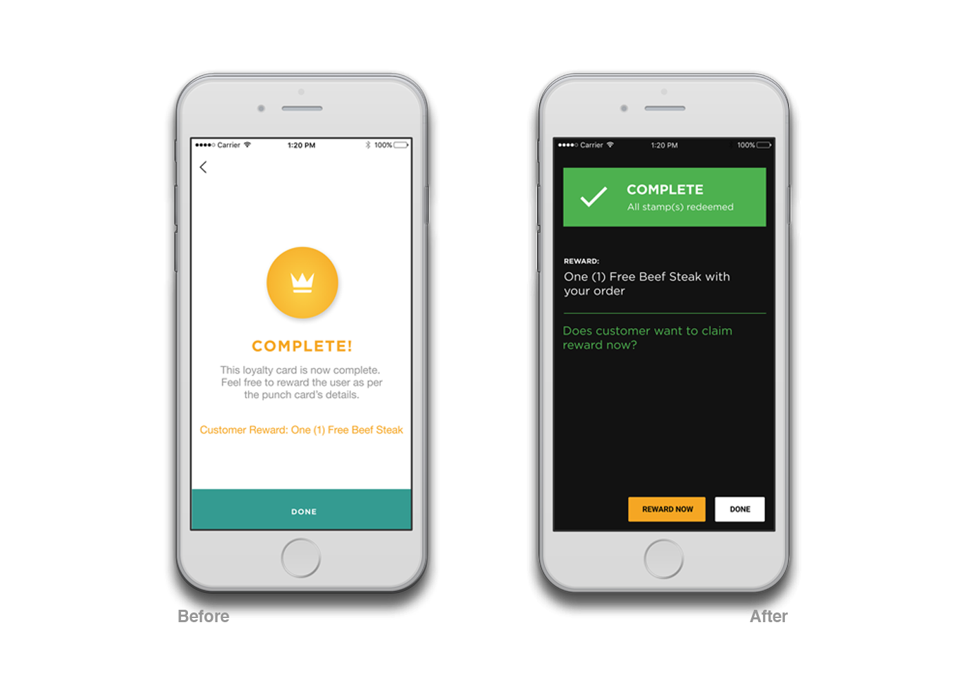
High Fidelity Design
Using the feedback from the staff members, who used the mobile application for redeeming a customer more than a business owner, we decided to address the primary issue - feeding them too much information on the mobile application. We decided to revamp the layout of the application by changing the home screen to black so it would be easy on the eye and key elements would stand out much better for staff members.


EVALUATION & ITERATIONS
───
───
Testing across verticals:
With these changes now live, we allowed the dashboard to be in use by existing businesses while onboarding new businesses from different verticals. We onboarded a few salons and a few entertainment places. We even partnered with kiosk/over-the-counter restaurants. Our hopes were to see how different verticals would respond to the product and measure different levels of familiarity among the plethora of staff members across various business.

Key Feedback & Design Iterations:
01) Eliminating clutter - by removing products & posts
While in the beginning few business owners did see value in "creating posts & products" feature, a lot of newly onboarded business owners barely interacted with these features. Some would even say their days are extremely occupied and would email our team details of reward programs they wanted on the app.
They primarily focused on the analytics to see the validity of the product and if retention was happening. Since this behavior was starting to showcase in the majority of business owners, we decided to remove the posts & products feature on the Ferry platform (business and customer app).
This helped take away a level of responsibility in updating these pieces of content when clearly there wasn't much interest on both sides as users didn't seem to notice it or complain about it being taken down. This was a positive sign for us as this further proved that we made the right move in removing something unnecessary.
Users only focused on offers and rewards they could get using the programs available.Navigation around the app became much easier and the focus was much more centered with this removal. Ferry evolved more into a rewards based platform due to this iteration.

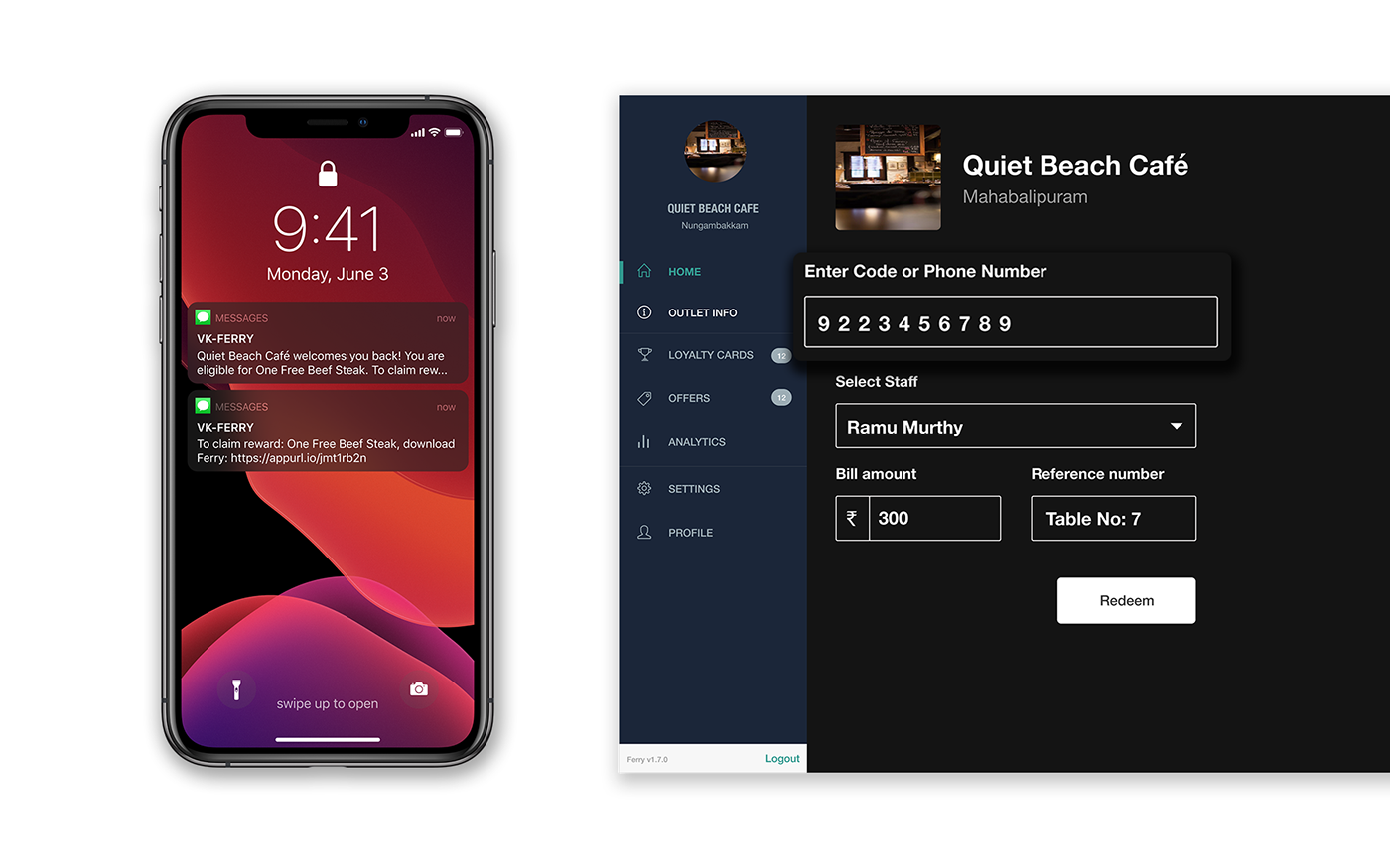
02) Using mobile numbers to validate a reward program
The earlier version required customers to download the Ferry app to redeem any sort of reward program.
Over time we began noticing that not all customers were keen to download an app they hadn't heard of. Despite being keen on rewards, they always had a reason not to download the app in the moment (lack of storage space, "download the next time they visit", etc.)
We figured the best way to approach this would be to input a customer's mobile number to validate the redeem flow on the Ferry dashboard. This would allow the process to be more effective and quicker and the customer is only encouraged to download the app when they are due for a reward. If they were due for a reward, customers were prompted both by staff and an SMS from our end.
This proved effective and we were able to onboard a lot of users using their mobile number and a vast number of them even downloaded the app upon being intimated for a reward.
03) Altering the redeem flow for efficiency
As mentioned earlier, we focused on changing the redeem flow to be more accomodative of mobile numbers being inputted.
Normally, when a merchant inputs a 4 digit alphanumerical code in the input dialog, he/she would have to select the reward program the customer is claiming for and then input certain fields (no of stamps or bill amount) to proceed.
Normally, when a merchant inputs a 4 digit alphanumerical code in the input dialog, he/she would have to select the reward program the customer is claiming for and then input certain fields (no of stamps or bill amount) to proceed.

With the introduction of the phone number we allowed it to be entered through the same dialog box, and only if mobile numbers were entered would a merchant need to select a reward program.
If the alphanumerical code was used, they would now be redirected to the actual program the customer is claiming.
If the alphanumerical code was used, they would now be redirected to the actual program the customer is claiming.
Feel free to demo the flow using the interactive prototype below:
This took responsibility away from the customer and the staff and helped make the process more efficient. Only relevant reward programs were shown, no locked cards or expired validity cards would be shown. It also helped cause significantly lesser confusion while using the dashboard for redeeming.
Future Steps
Dashboard Lite Version
One of our next steps would have been to create a Lite version of the dashboard that accomodated the redeem flow only and this would make the process effortless for the merchant using the Dashboard. The merchant redeeming customers didn't require features like editing outlet information, analytics & creating a reward program so we decided it would be best to showcase a dashboard that seemed much simpler and easier to use than the current one.
Creating custom notifications for each user:
We wanted to give our business owners a better reach to their customers, both new and loyal. Using our extensive database of users, we were planning to create a feature for our clients to target certain demographics and send them custom push notifications.
For instance, Users between the age 20-24 could get a special loyalty card exclusively.
Creating unique programs for particular users:
Simply put, we wanted to build a feature that would enable businesses to create special and unique programs for their favourite customers. This is something that a lot of business owners expressed to us as they always had a few customers they wanted to keep hold of at all costs. These could be unique Instant Rewards, Loyalty Cards or Spend Meters specifically built for a customer of their choice.
Overall a majority of businesses found the dashboard extremely useful especially in the case of promoting retention. Many businesses noted several return customers and even were glad to notice a portion of their new customers did return to their outlet more than once.
Ferry was forced to shut down due to the recent Covid-19 pandemic.
Thanks for scrolling this far. Thumbs up if you dig it. ^^


