China is where every major brand wants to be right now, but western brands regularly fail to find continuity of their visual identity when reinterpreted to Chinese characters.
Coca Cola’s distinctive logo is recognisable worldwide, even when interpreted into non-latin script such as Arabic, Thai or Chinese. Despite having official Chinese names, many Western brands shy away from reinterpreting their logo into Chinese for fear of diminishing their brand identity.
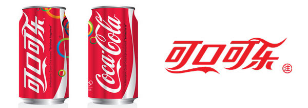
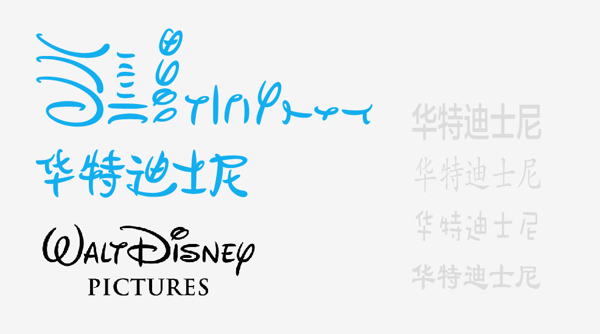
Together with my creative partner in crime, Stephen Wright , I set out to reinterpret six famous Western logos into Chinese characters. We followed the visual code of lines, curves, font style and colour to maintain the distinctive look and feel of the original typography.
The result is six Chinese logos that maintain the brands’ identities and should be recognisable even for non-Chinese readers.
All logos were made using the official Chinese name (where available) or the closest phonetic transcription.
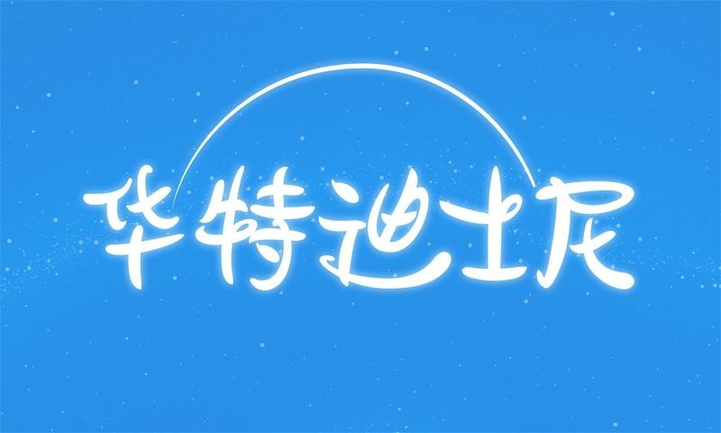
Walt Disney, view the original logo here
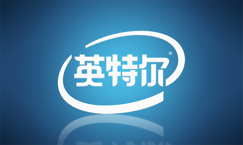
Intel, view the original logo here

Mars chocolate bar, view the original logo here

Sega, view the original logo here

Kit Kat, view the original logo here

The New York Times, view the original logo here
Behind the Scenes
We started by creating a shortlist of typography-based logos. We excluded any logos containing distinctive iconography or emblems as we wanted our Chinese logos to be recognisable from the letterforms alone.
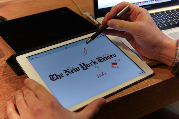
We analysed the individual letter forms highlighting distinguishing features such as ligature, swashes and flourishes.

Extracting shapes from the Latin typeface helped us piece together the Chinese characters without loosing the look and feel of the original font.
DISCLAIMER: This personal project may not reflect the views or plans of any of the above mentioned companies.


